Contrast is what makes an artwork impossible to ignore. Put light beside dark, rough beside smooth, or tiny beside huge, and suddenly your eyes know where to look.
Contrast in art examples can be as simple as a red flower against green grass or as dramatic as a bright figure in a shadowy scene.
This contrast element of art adds focus, mood, depth, and energy without adding more detail.
Once you know what to look for, contrast art examples are everywhere, from paintings and photography to posters, websites, and everyday design.
Why Contrast is Important in Art
Contrast is important because it helps an artwork feel clear instead of confusing. When different colors, shapes, sizes, or light areas stand out, the viewer can more easily understand the main focus.
It also adds mood and feeling. A bright figure in a dark space can feel hopeful, lonely, or dramatic, depending on how the artist uses it.
Contrast also keeps the artwork interesting. Without it, everything may look too similar, and the viewer might not know where to look first, which is part of why understanding a few types of composition guide choices makes such a difference early on.
In simple words, the contrast element of art helps art speak more clearly. It guides the eye, supports the message, and strengthens the artwork.
How Contrast Takes Your Eyes to Where the Artist Intended
Contrast matters because it takes your eyes to where to look first. When one part of a soft gray-and-blue painting has a bright red umbrella, your eyes go straight to it.
Artists use contrast to:
- Highlight the main subject
- Create mood or drama
- Show distance and depth
- Make an artwork easier to understand
- Add energy and interest
Famous Examples of Contrast in Art
The easiest way to understand contrast is by looking at real artworks. These famous examples of contrast in art show how artists use differences to create focus, mood, and meaning.
1. The Starry Night by Vincent van Gogh
Source: Sanctuary Mental Health Ministries
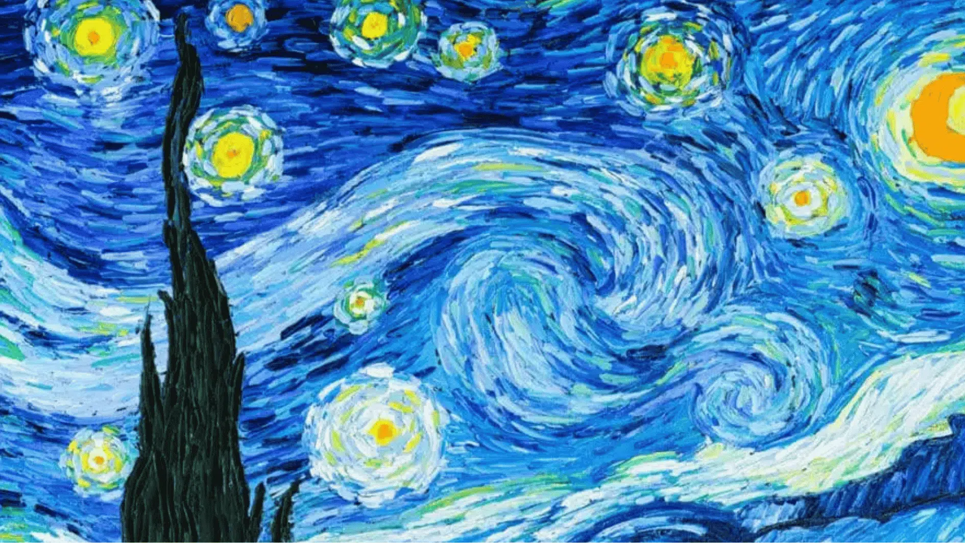
Vincent van Gogh’s The Starry Night is a strong example of contrast in art. The bright yellow stars and moon stand out against the deep blue night sky. This light-and-dark contrast makes the sky feel glowing and full of energy.
There is also a contrast between movement and stillness. The sky looks full of swirling motion, while the village below feels calm and quiet. This difference helps make the painting feel emotional and dreamlike.
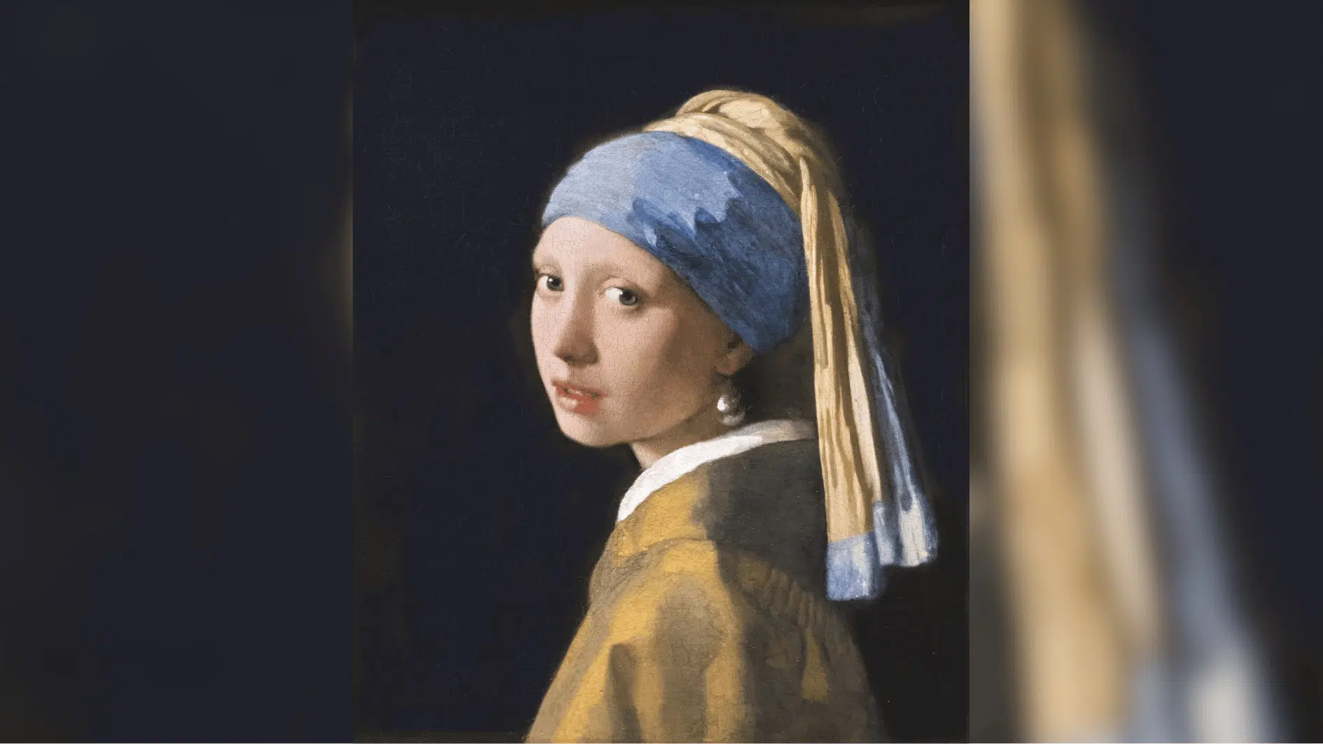
2. Girl with a Pearl Earring by Johannes Vermeer
Source: Britannica
In Girl with a Pearl Earring, Vermeer uses strong light-and-dark contrast. The girl’s face, collar, and pearl earring are softly lit, while the background is very dark.
Because of this contrast, your eyes go straight to her face and the pearl. The dark background does not distract you. Instead, it makes the main subject feel more focused and graceful.
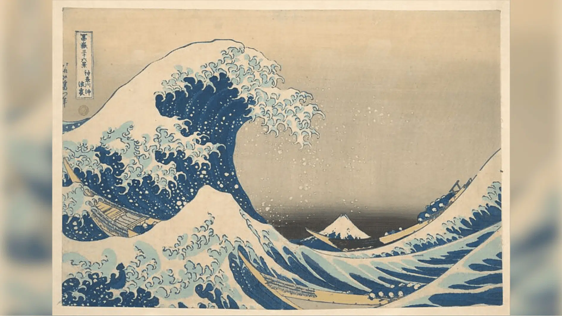
3. The Great Wave off Kanagawa by Hokusai
Source: The Metropolitan Museum of Art
Hokusai’s The Great Wave off Kanagawa uses contrast in size and movement. The huge wave rises above the tiny boats, making the sea look powerful and dangerous.
The curved, crashing wave contrasts with the small, fragile-looking boats below it. This makes the artwork feel tense and full of motion. It also shows the power of nature compared to people.
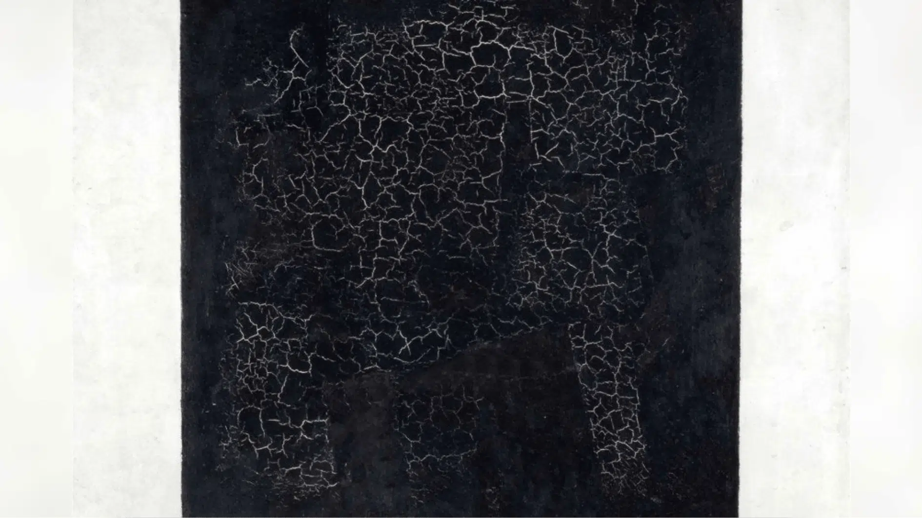
4. Black Square by Kazimir Malevich
Source: Art in Context
Kazimir Malevich’s Black Square is one of the simplest examples of contrast art. It shows a dark square placed against a lighter background.
There are no detailed figures or scenery, but the contrast is still strong. The black shape stands out clearly, showing how even a basic difference between dark and light can create a bold effect.
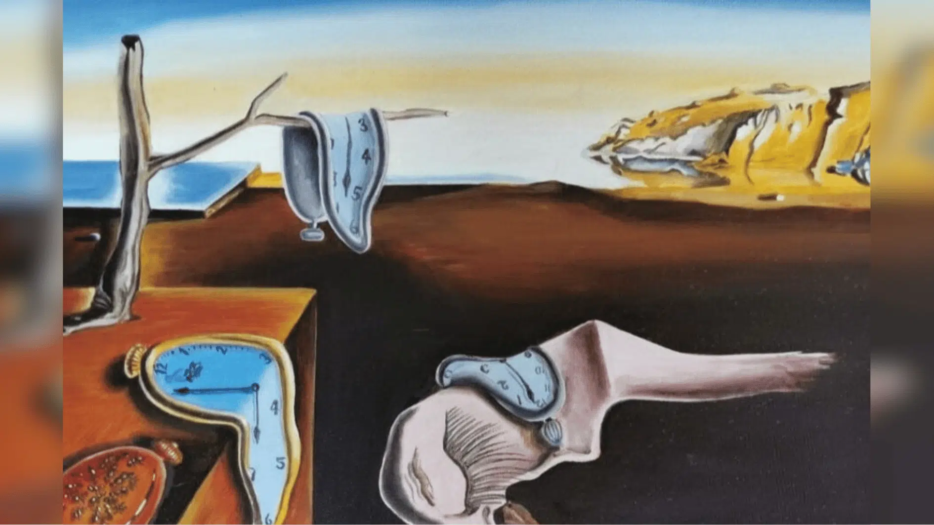
5. The Persistence of Memory by Salvador Dalí
Source: Dipi – Medium
Salvador Dalí’s The Persistence of Memory uses contrast between soft and hard objects. The melting clocks look soft and bendable, while the table, cliffs, and landscape feel solid.
This contrast makes the painting feel strange and memorable. It also helps show the difference between real objects and dreamlike imagination.
6. Nighthawks by Edward Hopper
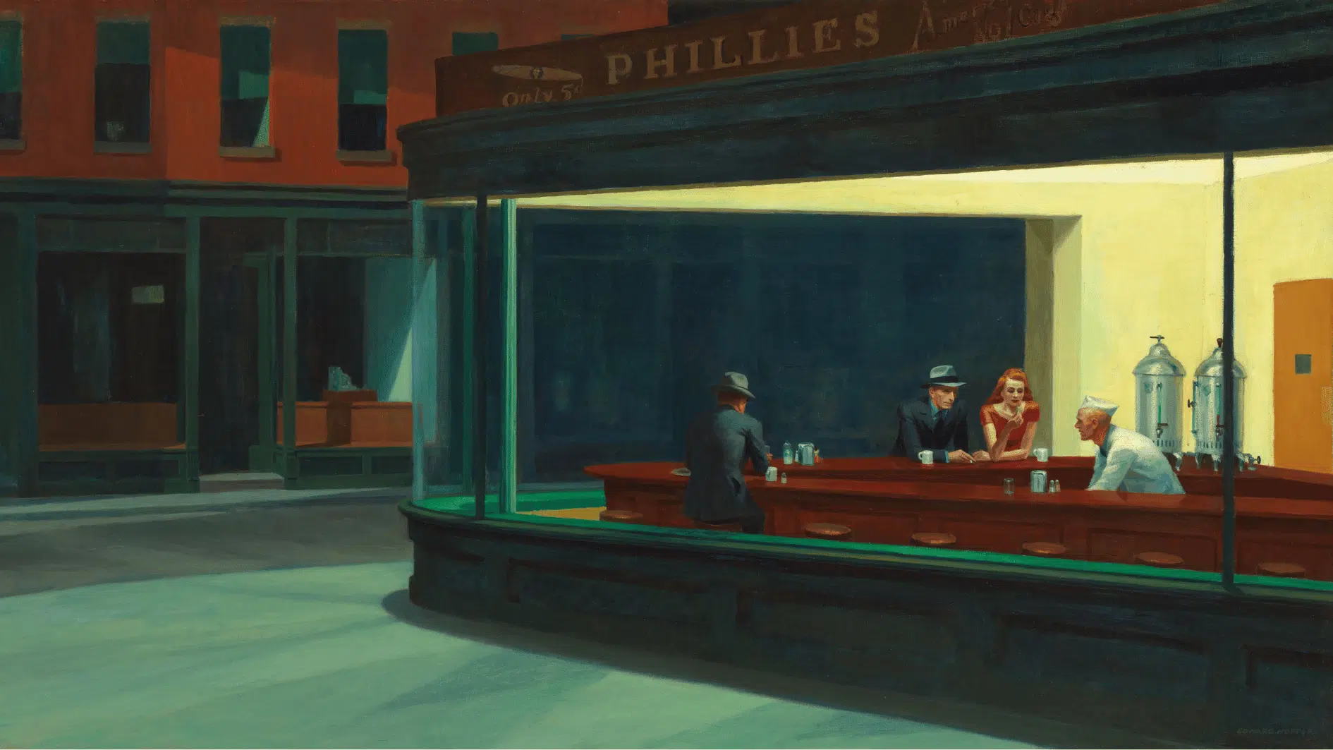
Source: Smarthistory
Edward Hopper’s Nighthawks uses strong contrast between light and dark. The bright diner stands out against the dark, quiet street outside.
This contrast creates a lonely mood and pulls your eyes toward the people inside the diner. It makes the scene feel still, quiet, and slightly mysterious.
Contrast shows up just as often outside these six, including in the dramatic figure work covered in these famous Picasso paintings analysis pieces.
Different Ways Artists Use Contrast
Artists do not use contrast in only one way. It can appear through color, size, texture, shape, and light. This table makes the contrast in art examples easier to understand.
Type of Contrast | What It Means | Simple Example |
|---|---|---|
| Light and Dark Contrast | Bright and dark areas placed together | A glowing candle in a dark room |
Color Contrast | Different or opposite colors used together | A red flower in green grass |
| Size Contrast | Large and small objects placed together | A tiny person beside a huge building |
| Texture Contrast | Smooth, rough, soft, or shiny surfaces compared | Silk fabric beside rough stone |
Shape Contrast | Different shapes placed together | A soft circle beside a sharp triangle |
Light and dark contrast connects directly to the value element of art, color contrast draws on the same principles covered in this guide to color theory for artists, and size contrast ties back to how the space element of art creates depth and distance on a flat surface.
How to Use Contrast in Your Own Art
Contrast can make a composition feel clearer and more intentional. Start with one area you want viewers to notice, then place a contrasting element nearby.
You can also vary the amount of contrast across the artwork, keeping larger differences around the main subject and softer ones elsewhere, a balance that pairs well with the proportions of the golden ratio in art.
A few well-placed differences can give your artwork a stronger sense of focus without making it feel crowded.
The Last Stroke
Contrast turns difference into impact. From bold contrast in art examples to subtle shifts in light, color, texture, and size, it helps artists control what we notice and how we feel.
The best examples of contrast in art show that even a small difference can change an entire composition. As a contrast element of art, it gives artwork focus, depth, emotion, and visual energy.
Look for contrast the next time you see a painting, photo, poster, or design; you may be surprised by how much it is doing.
Frequently Asked Questions
Can Contrast Be Used in Abstract Art?
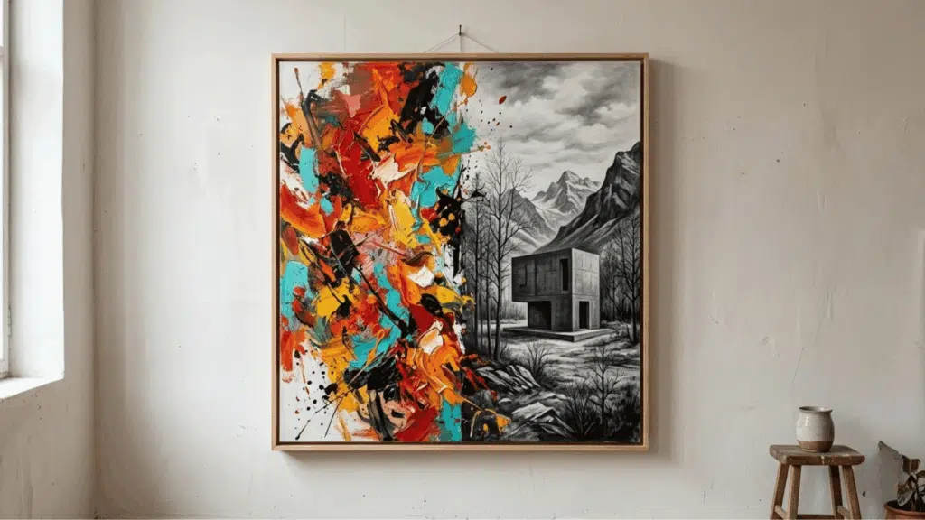
Yes, contrast can be used in abstract art through color, shape, line, size, and space. Even if the artwork does not show real objects, contrast can still help create focus and movement.
Is Too Much Contrast Bad in Art?
Too much contrast can make an artwork feel busy or harsh if everything is fighting for attention. Good contrast helps guide the eye without making the whole piece feel confusing.
How is Contrast Different from Balance in Art?
Contrast highlights differences, while balance keeps the artwork feeling steady, and artists often use both together for clarity and interest.