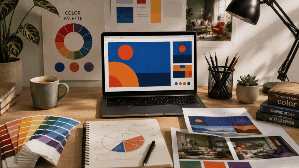
Some color combinations feel balanced right away, while others feel too loud or hard to use. Often, the difference comes down to how the colors sit together on the color wheel.
Designers do not always choose colors by guessing. Many use simple color rules to create palettes that feel interesting without looking messy.
If you have been searching forsplit complementary colors examples, you are probably looking for color ideas that feel creative but are still easy on the eyes.
That is wheresplit complementary colors can help. They add contrast, variety, and balance without making the final result feel too intense.
What are Split Complementary Colors?
Color theory gives designers a few simple ways to build a palette.
One useful method is the split-complementary scheme because it adds contrast without feeling too sharp, a middle ground between full contrast and the softer flow found in analogous vs complementary color schemes.
When people ask what split-complementary colors are, the simple answer is this: a color scheme made with one main color and two colors placed beside its opposite on the color wheel.
For example, if your main color is blue, its opposite color is orange. Instead of using orange directly, you use the two colors beside it, such as yellow-orange and red-orange.
This creates a palette that feels colorful but still controlled. It is softer than using two colors that sit directly opposite each other.
How do Split Complementary Colors Work?
This color scheme is easier to understand when you break it into small steps. You only need a color wheel, one main color, and the two colors placed near its opposite side.
- Choose one main color: Start with the color you want to use most in your design, such as blue, green, or purple.
- Find its direct opposite: Look across the color wheel to find the color sitting opposite your main color. For example, blue sits opposite orange.
- Skip the direct opposite color: Instead of using the opposite color directly, look at the two colors next to it.
- Pick the two nearby colors: These become your split complements. For blue, the split complements are yellow-orange and red-orange.
- Use one color more than the others: The main color usually takes the most space, while the two split complements work better as accents or supporting colors.
- Apply it in real designs: This is why split complementary colors are useful in branding, web pages, posters, packaging, and room styling.
Split Complementary Colors Examples
Looking at real combinations makes the idea much easier to understand. These split-complementary color examples show how one method can create different moods for different design needs.
Split Complementary Schemes Used in Graphic Design
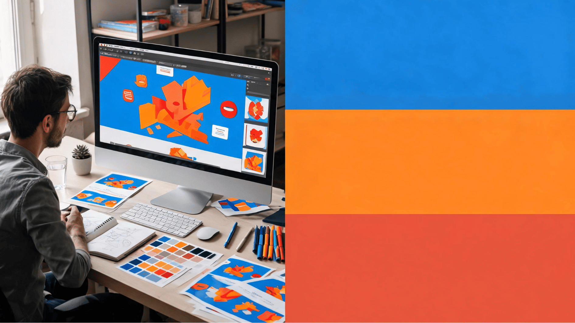
Split complementary color schemes are widely used in graphic design to create visually appealing layouts with strong contrast and balance.
1. Blue
Blue creates a sense of trust, stability, and professionalism in graphic design. It is commonly used in branding, marketing materials, and corporate identities to establish credibility.
Blue also helps create visual balance when paired with warm accent colors, the blue orange color mixing relationship that makes sunset paintings glow.
Its versatility makes it suitable for both modern and traditional design styles.
2. Orange
Orange adds energy, enthusiasm, and creativity to graphic compositions. Designers often use it to attract attention and encourage user engagement.
It creates a vibrant contrast when paired with cooler colors in a split-complementary palette. Orange is particularly effective for promotional graphics and call-to-action elements.
3. Red-Orange
Red-orange combines the passion of red with the warmth of orange, creating a bold visual impact. It is frequently used to highlight important design elements and focal points.
This color evokes excitement and urgency, making it ideal for advertisements and event promotions. Its dynamic appearance helps designs feel livelier and more engaging.
Split Complementary Schemes Used in Interior Designing
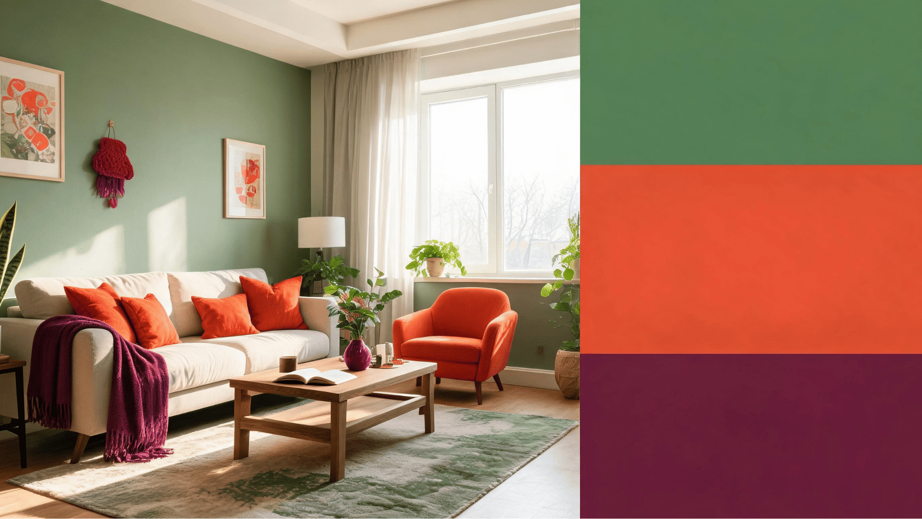
Split complementary color schemes are popular in interior design because they bring balance, depth, and visual interest to living spaces.
4. Green
Green brings a sense of nature, freshness, and harmony to interior spaces.
It promotes relaxation and comfort, making it a popular choice for living rooms and bedrooms, and getting the right shade often comes down to the same steps covered in this guide to mixing green paint colors.
Green pairs well with split-complementary accent colors to create balanced and inviting interiors. Its calming qualities help establish a peaceful atmosphere throughout the space.
5. Red-Orange
Red-orange introduces warmth and vibrancy into interior environments. It can be used as an accent color to add personality and visual interest without overwhelming a room.
This color creates a welcoming and energetic atmosphere when balanced with cooler shades. It is often featured in decorative accessories, furniture, and statement walls.
6. Red-Violet
Red-violet adds sophistication, luxury, and creativity to interior design schemes. It provides depth and richness while maintaining an elegant appearance.
This color works particularly well in accent pieces, textiles, and decorative elements. Its unique blend of warmth and coolness helps create visually appealing and refined spaces.
Split Complementary Schemes Used in Web Design

Split complementary color schemes are frequently used in web design to improve visual hierarchy and create engaging user experiences.
7. Purple
Purple conveys creativity, innovation, and elegance in web design. It is often used by brands seeking a modern and distinctive visual identity.
Purple can create strong visual contrast while maintaining a sophisticated appearance, a principle rooted in the same science behind this pointillism color contrast technique of placing hues side by side.
Its versatility makes it effective for both professional and artistic websites.
8. Yellow-Green
Yellow-green introduces freshness, positivity, and energy to digital interfaces. It helps create a vibrant and engaging user experience without being overly intense.
This color is often used to emphasize interactive elements and important content areas. Its natural appearance contributes to a friendly and approachable website design.
9. Yellow-Orange
Yellow-orange brings warmth, optimism, and enthusiasm to web pages. It effectively captures user attention and enhances visual hierarchy within layouts.
Designers often use it for buttons, highlights, and promotional sections to encourage interaction. Its bright and welcoming nature helps create an engaging online experience.
Tips for Choosing the Right Palette
Choosing colors becomes easier when you know the mood you want to create. These simple tips can help you pick a palette that feels balanced and useful for your design.
- Start with the mood: Blue often feels calm and professional, green feels natural, purple feels creative, and red feels energetic.
- Use softer shades when needed: You do not need the brightest version of each color. Muted or lighter shades usually feel cleaner and are easier to match.
- Test colors in the final design: Colors can look different on a screen, in print, or inside a room because of light and surrounding shades.
- Let one color lead: Pick one main color first, then use the other two as supporting colors or accents.
Final Thoughts
Learning color theory becomes easier when you see how colors relate to each other. A split complementary scheme is useful because it gives you contrast without making the design feel too strong.
The more you study examples of split complementary colors, the easier it becomes to choose palettes for websites, graphics, branding, and interiors.
So, if someone askswhat split complementary colors are, you can explain it simply: it is a color scheme that uses one main color and two colors beside its opposite on the color wheel.
Frequently Asked Questions
Can Neutral Colors Be Used with This Scheme?
Yes. White, black, beige, gray, and cream can make the palette easier to use and help the main colors stand out.
Is This Color Scheme Good for Beginners?
Yes. It gives you a clear structure to follow, so you do not have to guess which colors might work together.
Should the Colors Always Be Bright?
No. Muted, dark, or pastel shades often look cleaner and are easier to use in professional designs.