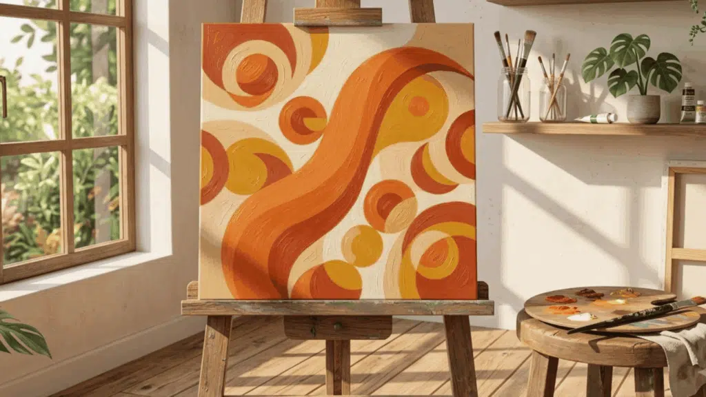
Understanding how harmony works can help you bring together different colors, shapes, textures, and elements in a way that feels both natural and intentional.
If you are a beginner understanding art principles or an experienced artist looking to strengthen your compositions, knowing how to use harmony is essential.
In this blog, you’ll learn what harmony in art means, how artists apply it in practice, and how to use examples and insights that can help you create more cohesive and visually attractive artwork.
What is Harmony in Art?
Harmony in art is the principle of arranging visual elements such as color, shape, line, texture, and form so they feel unified and work together as a whole; it is one of several ideas covered in this broader principles of art guide.
When harmony is achieved, every element supports the others rather than competing with them. It works through repetition and consistency of one or more design elements across a composition.
Monet’s Water Lilies are a prime example, where soft blues, greens, and purples echo across the canvas, making the entire work feel visually resolved.
It signals intention and gives the work a sense of completeness that makes it feel finished and deliberate.
Types of Harmony in Art
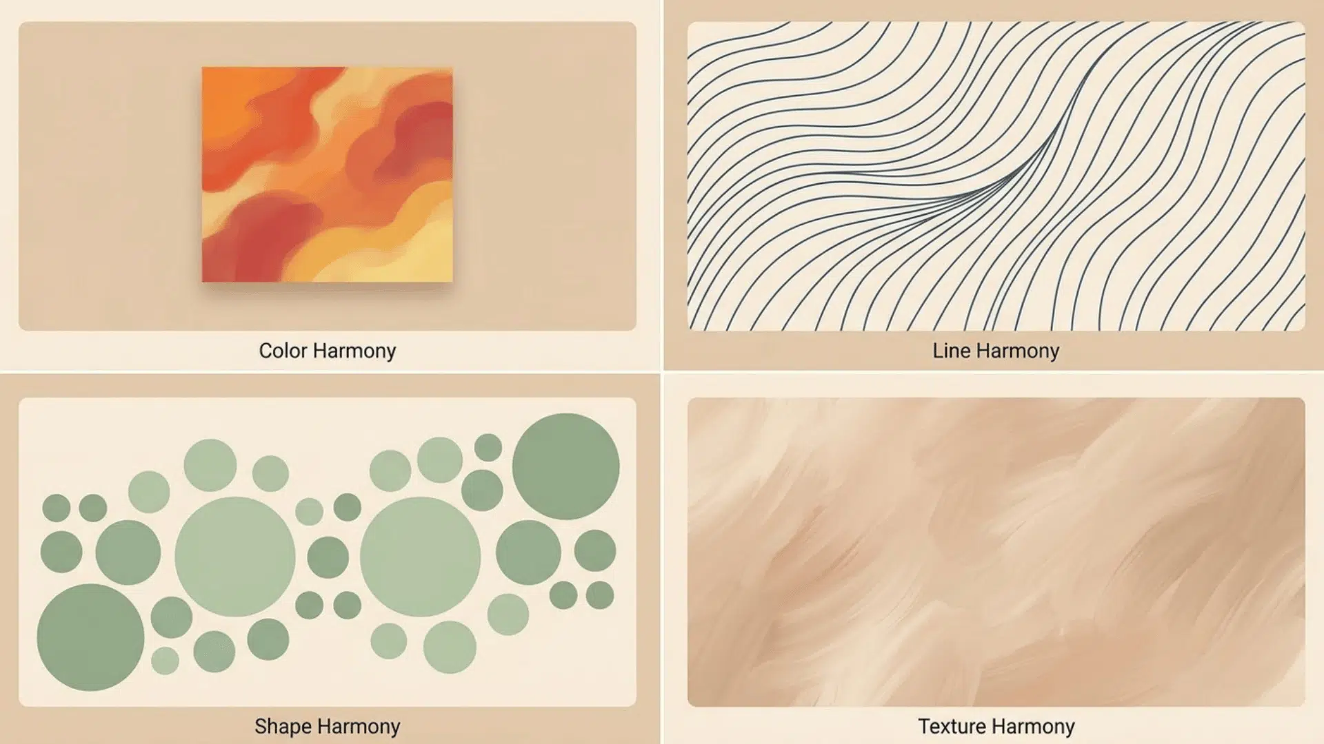
Harmony can be achieved through different visual elements depending on the medium, style, and intent of the work. Here are the main types of harmony in art, with examples.
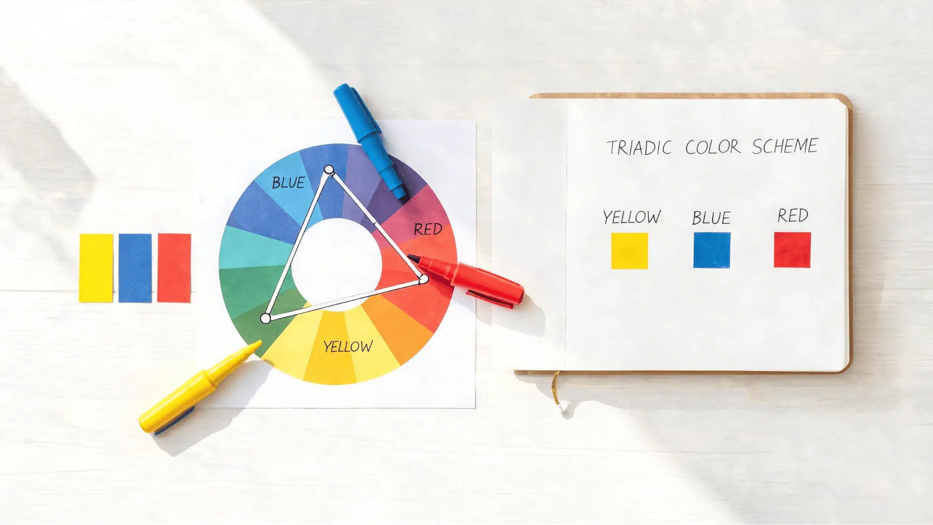
- Color Harmony: Analogous or complementary colors from the color wheel create a natural, unified flow; this guide to color theory for artists breaks down the exact relationships.
- Line Harmony: Consistent line direction or quality ties every element together.
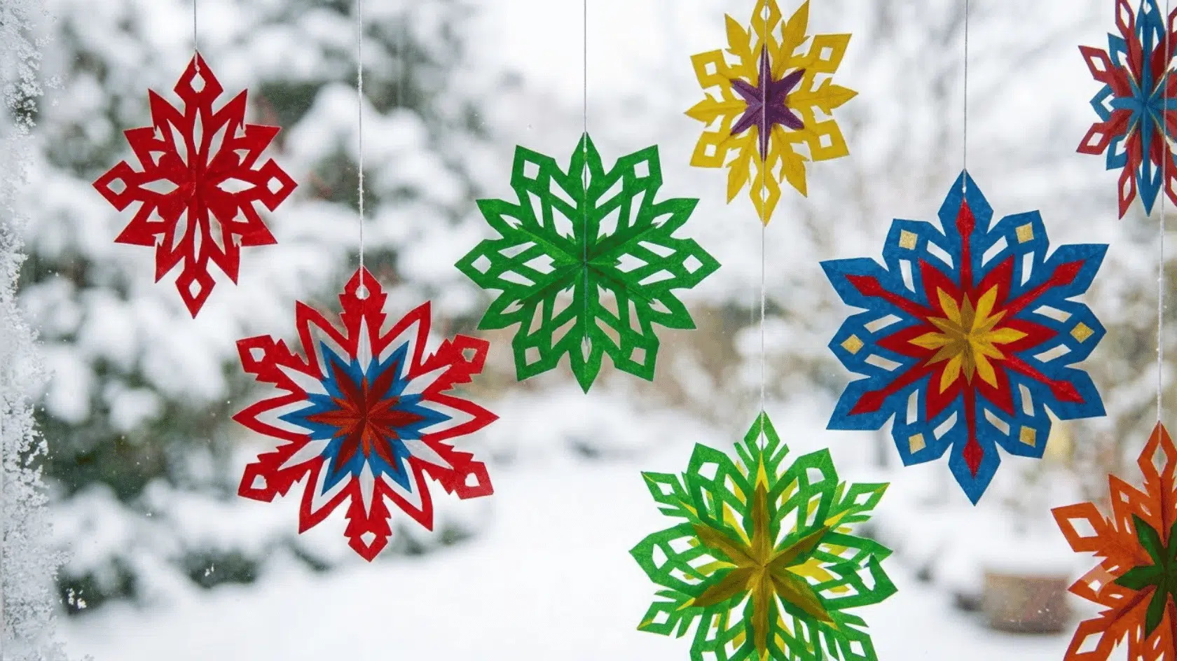
- Shape Harmony: Repeating similar shapes in varied sizes creates rhythm and guides the eye, the same repetition explained in this pattern definition in art.
- Texture Harmony: Consistent, intentional textures make the composition feel polished rather than pieced together.
How Artists Build Harmony: Step by Step
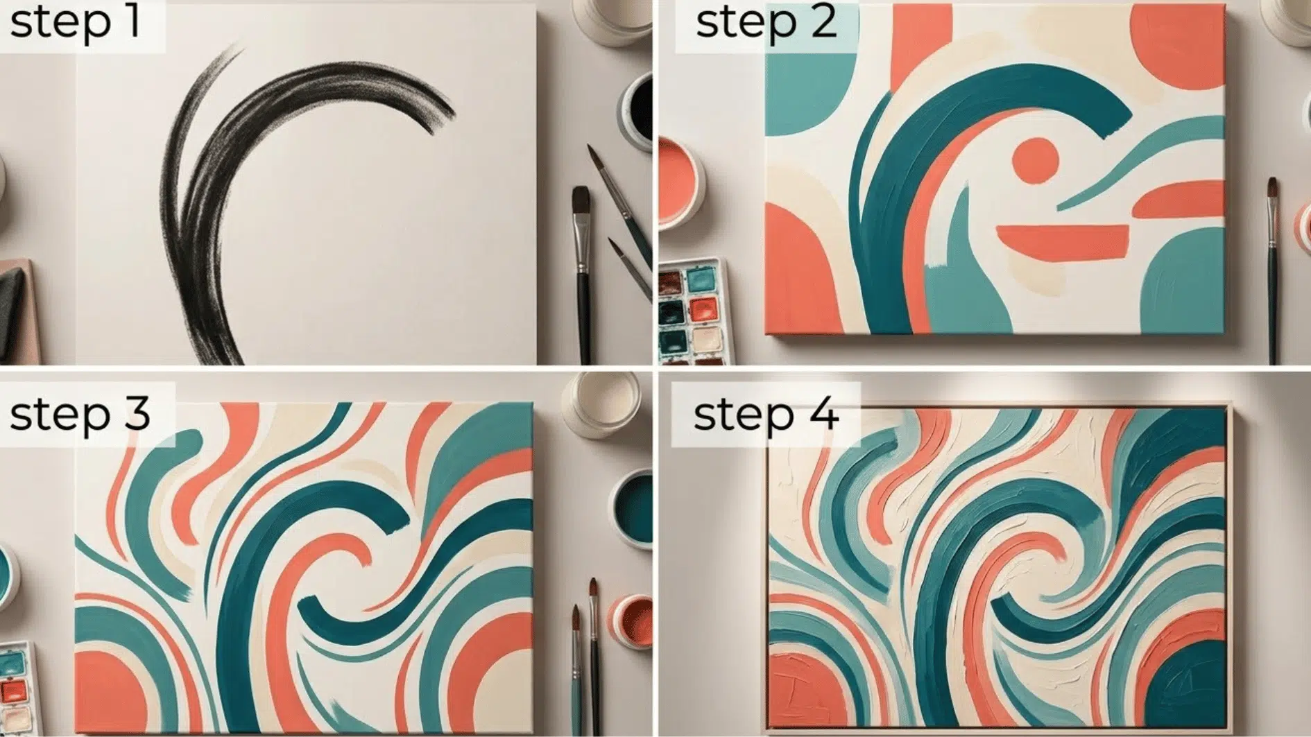
Great harmony rarely happens by accident. Artists build it through a clear process: choosing a dominant element, then repeating color, shape, and texture with intention
Step 1: Choose a Dominant Element
Begin by selecting one element with the strongest visual presence.
This could be a bold color, a large shape, a sweeping line, or a noticeable texture placed near the main area of interest, and understanding a few composition types in art makes it easier to decide where that element should sit.
Let this element influence the smaller choices throughout the artwork. Supporting details should strengthen it through size, placement, contrast, or repetition without competing for equal attention.
Step 2: Limit Your Color Palette
Choose two or three colors that work comfortably together before adding paint, paper, or digital details. Analogous shades can create a calm result, while complementary colors can add controlled energy.
Repeat the selected colors in different areas instead of introducing a new shade for every object. You can adjust their lightness, darkness, and intensity to create variety without losing unity.
A limited palette also makes decision-making easier. Each color has a clear role, helping separate the focal point, supporting elements, and background.
Step 3: Repeat Shapes and Lines
Take a shape or line from the focal point and echo it in smaller areas of the composition. A rounded subject might be supported by curved leaves, circular marks, or gently arched background lines.
Repetition does not require every form to look identical. Change the size, direction, or spacing while keeping the original visual quality recognizable.
These repeated details connect separate areas and help the viewer’s gaze travel through the artwork. They create rhythm and keep objects from looking unrelated or randomly placed.
Step 4: Keep Texture Consistent
Choose a main surface quality that supports the mood of the artwork. Smooth blending can create a calm finish, while visible brushstrokes, grainy shading, or layered paper can make the piece feel more tactile.
Apply the chosen texture across the focal point, background, and supporting details. Small variations are useful, but they should still feel connected to the main treatment.
How to Use Harmony Effectively in Art?
Effective harmony balances consistency with intention, letting one element lead while allowing subtle variety and deliberate contrast to keep artwork engaging.
- Balance Harmony with Variety: Vary size, value, or weight slightly to avoid monotony, an idea covered in more depth in this design balance principles guide.
- Let One Element Lead: Choose one unifying force and let others support it.
- Know When to Break Harmony: Add a deliberate contrast to create emphasis.
- Use Repetition Wisely: Repeat key colors, shapes, or lines to reinforce cohesion.
- Test with Distance: Step back and view your piece to spot disruptions early.
- Limit Competing Focal Points: Keep one clear focus so harmony doesn’t dilute impact.
- Revisit Often: Review your work at each stage to keep harmony intact throughout.
Examples of Harmony in Art
Seeing harmony in action makes the concept far easier to understand and apply. Here are some famous harmony in art examples that show the principle at work.
1. Monet’s Water Lilies (1906)
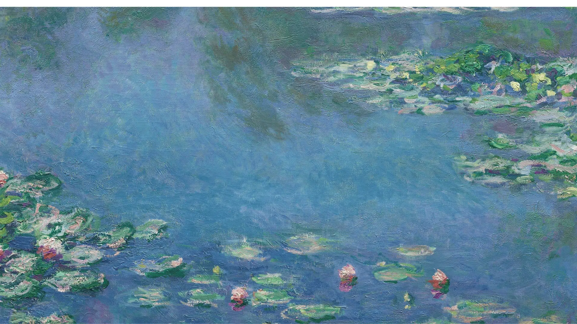 harmony in art through a consistent range of blues, greens, and purples repeated across the entire composition.”s Water Lilies showing <echighlighted><echighlighted>harmony in art</echighlighted></echighlighted> through a consistent range of blues, greens, and purples repeated across the entire composition.” width=”871″ height=”490″>
Source: commons.wikimedia.org
The entire composition runs on a narrow range of blues, greens, and purples repeated across the water, reflections, and lily pads.
Every element belongs to the same color family, which is what makes the painting feel so immersive and visually complete
2. Vermeer’s Girl with A Pearl Earring (1665)
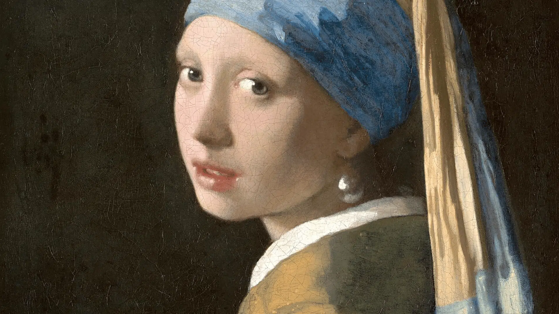
Sources: Wikipedia
Vermeer limits his palette to warm browns, soft yellows, and deep blues, repeating them consistently across the figure, clothing, and background.
The shared light quality across every element is what holds the composition together.
3. Raphael’s the School of Athens (1511)
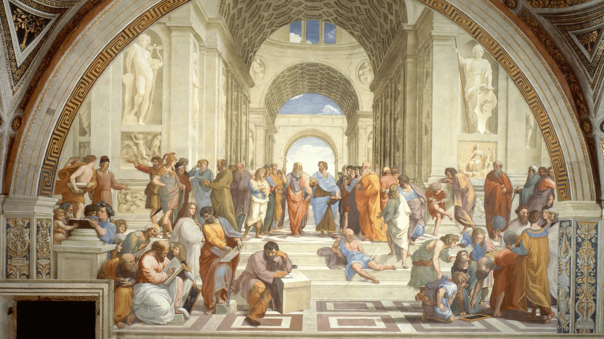
Source: Wikipedia
Raphael unifies a complex composition filled with dozens of figures through consistent warm stone tones and the repeated architectural arch that frames the entire scene.
The harmony of color and shape prevents the crowded subject matter from feeling chaotic.
Unity vs Harmony: What’s the Difference in Art?
Harmony and unity are closely related, but they are not the same thing.
This distinction is one that even intermediate artists often overlook, and it’s worth reading this dedicated breakdown of the meaning of unity in art if the difference still feels blurry.
| Aspect | Harmony | Unity |
|---|---|---|
| Definition | The pleasing relationship between visual elements such as colors, shapes, and textures. | The overall sense is that all elements belong together as one complete artwork. |
| Focus | How individual elements connect and complement each other. | How the entire composition works as a cohesive whole. |
| Purpose | Creates visual consistency, balance, and flow. | Creates a feeling of completeness and wholeness. |
| Example | Repeating similar colors or patterns throughout a painting. | Ensuring every element supports the same theme or visual message. |
Conclusion
Harmony is one of the most powerful principles in art because it helps individual elements work together as a unified whole.
By understanding what harmony is, how it is created through color, shape, texture, and composition, and how artists apply it in practice, you can begin to recognize and use it more intentionally in your own work.
As your next step, choose one artwork or create a simple sketch and identify the colors, shapes, or patterns that create harmony.
Seeing this principle in action is one of the best ways to strengthen your artistic eye.
Frequently Asked Questions
Does Harmony Always Make Art Look Calm or Soft?
No, a bold and high-contrast composition can still feel balanced as long as its elements are used consistently and intentionally.
Can Two Contrasting Colors Create Harmony?
Yes, complementary colors can create harmony when they are used consistently and in balanced proportions throughout a composition.
Is Harmony only Relevant to Painting?
No, harmony applies equally to sculpture, photography, graphic design, and interior design.
Can Harmony Exist in Abstract Art?
Yes, abstract art achieves harmony through repeated colors, shapes, or lines, even without a recognizable subject.