A logo, a poster, and a website banner can use the exact same three colors, in the exact same order, and still look nothing alike.
That’s the pull behind triadic color scheme examples: seeing one color rule played out across completely different projects, not just described on paper or listed as hex codes.
Before touching a color wheel, it helps to see what are triadic colors when they’re actually applied, on a real page, in a real palette, not plotted as three dots on a triangle with nothing built around them.
What are Triadic Colors?
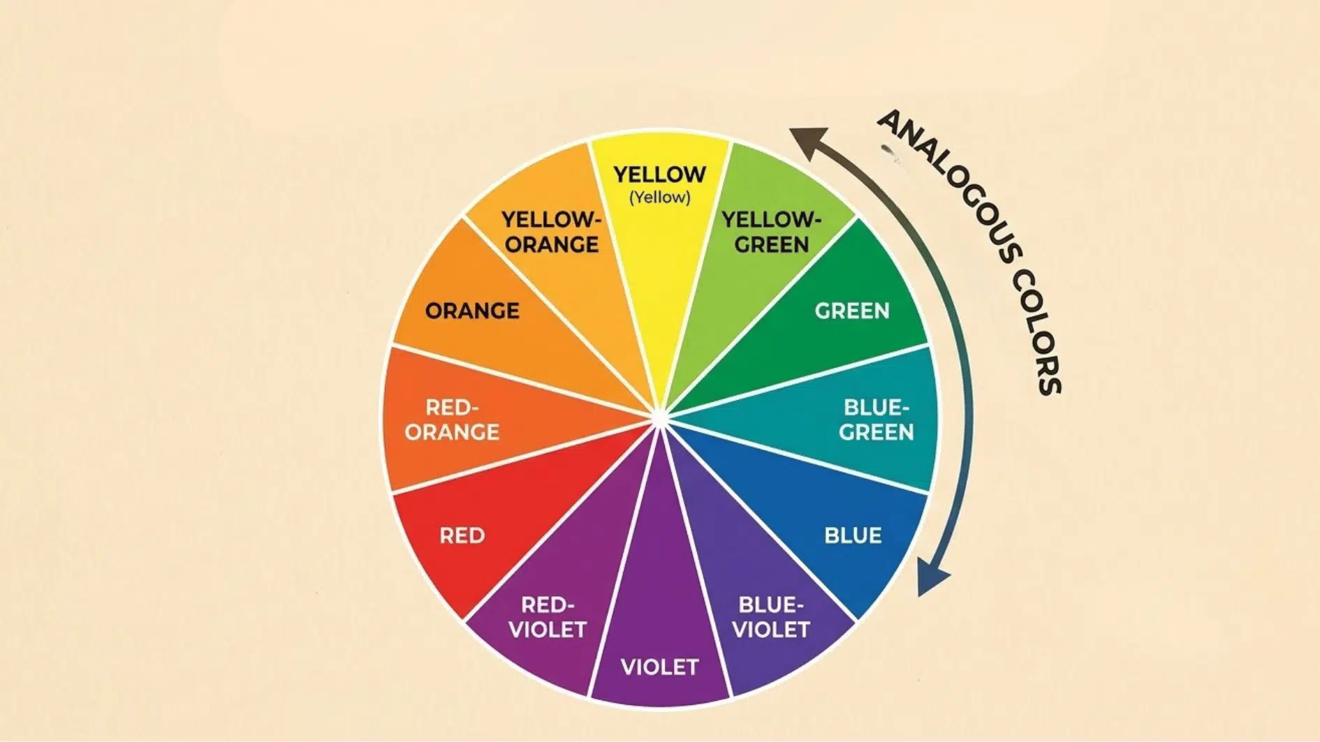
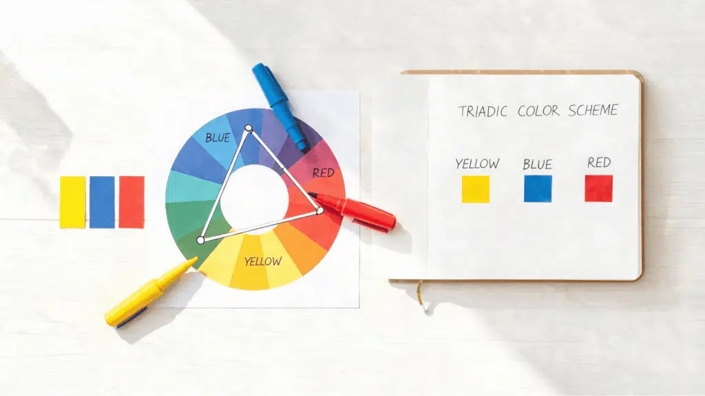
Triadic colors are three colors spaced 120 degrees apart on the color wheel. Connect those three points, and you get a triangle, which is where the name comes from.
That spacing is what gives the scheme its contrast. No two colors sit close enough to blend into each other, but all three still came from the same wheel, so nothing feels out of place next to the others.
Full brightness isn’t required either; muted or darker versions of the same three hues still follow the rule and often look cleaner on a page.
Triadic Color Scheme Examples
Triadic color scheme examples look different depending on where they’re used. The same red, yellow, and blue rule can build a toy logo or a moody film still.
1. Web Design and UI

Web design and UI examples usually split the three triadic colors by role. The background holds one color, the navigation bar takes a second, and buttons or links get the third.
That kind of split keeps a page easy to scan. A visitor’s eye lands on the button first, instead of fighting the header for attention.
2. Logo and Brand Identity

Logo and brand identity examples lean on one color doing most of the work. A single dominant hue carries the mark itself, while the other two colors show up only in supporting brand pieces.
Business cards, packaging, and social icons are where the second and third colors actually get to appear. The logo stays simple on purpose.
3. Photography and Film

Photography and film examples rarely start with paint. A colorist pushes existing tones in a shot toward a triad using color grading, adjusting skies, skin, and backgrounds until three hues dominate the frame.
A green field, an orange sunset, and a violet sky can all get nudged toward the same triangle on the wheel. Nothing about the scene changes except its color balance.
4. Interior and Product Design
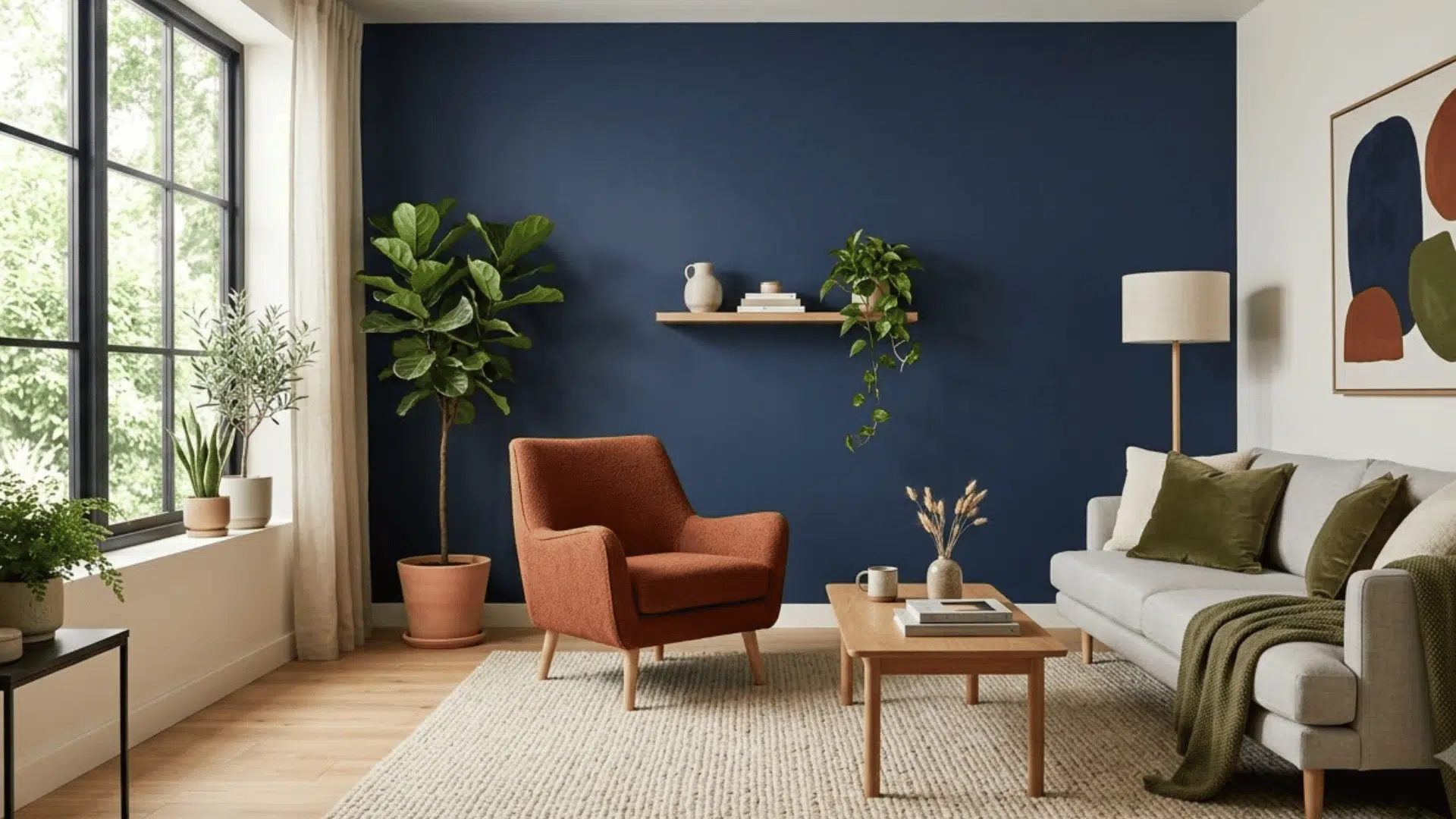
Interior and product design examples almost always mute the palette down. A living room or a product box can’t handle three colors at full brightness the way a poster can.
Navy walls, rust colored furniture, and olive green accents show the same triad softened into something livable. The colors are still triadic, just quieter.
How to Choose a Triadic Palette
Picking a triadic palette comes down to matching brightness to context, not just liking three colors together.
- Match the context first: a poster can hold full-brightness red, yellow, and blue since it’s viewed once from a distance, but a website or app at that strength turns hard to read fast.
- Pick the dominant color based on where it lives: a business site leans toward navy or another darker option; a kids’ app can go straight to the primary triad.
- Let the other two colors support, not compete: once the dominant color is set, the remaining two only need to back it up.
- Check it against your industry, not just your taste: teal, coral, and mustard read lifestyle; navy, rust, and olive read corporate. The same three colors can send the wrong signal in the wrong context.
- Test the muted version before the bright one: a softened palette works in more places than a saturated one, and it’s easier to add brightness later than to tone down a loud palette.
Triadic Color Palette Gallery

Triadic color schemes look different depending on the shades you pick. The five below show how the same rule stretches across different design needs, from playful to formal.
1. Red, Yellow, and Blue
Red, yellow, and blue are the most classic triadic colors. This palette feels bold, clear, and easy to recognize because it uses the three primary colors.
The classic version, bold and instantly recognizable at full primary strength.
Best for:
- Kid’s products
- Educational graphics
- Posters
- Learning apps
2. Orange, Green, and Purple
Orange, green, and purple form a secondary color triad. This mix feels creative, fresh, and full of personality without looking too random.
The secondary-color version, creative and less rigid than red/yellow/blue when the shades are softened.
Best for:
- Event posters
- Social media graphics
- Brand visuals
- Product packaging
3. Teal, Coral, and Mustard
Teal, coral, and mustard are a softer take on a triadic color scheme. This palette has enough contrast to stand out without feeling too loud.
A quieter, editorial take on the same triangle, with enough contrast to hold attention without primary-color energy.
Best for:
- Lifestyle blogs
- Personal brands
- Interior design graphics
- Website banners
4. Navy, Rust, and Olive
Navy, rust, and olive create a darker triadic color scheme. This palette feels grounded, mature, and suitable for more professional design projects.
An earth-toned version built for restraint, with navy carrying the weight and the other two in support.
Best for:
- Business websites
- Editorial layouts
- Presentations
- Premium packaging
How to Use a Triadic Color Scheme (The 60-30-10 Rule)
Most triadic palettes fail for one reason: people use all three colors at equal strength. A rough 60-30-10 split fixes that: 60% for the dominant color, 30% for the support color, and 10% for the accent.
Pick the dominant color first. It carries the background or the biggest shapes on the page. The second color takes smaller spots like subheadings or icons. The third gets the smallest, loudest job, usually a button or a single highlight.
A saturated 33-33-33 split of red, yellow, and blue looks like a toy box. The same three colors at 60-30-10 looks like a finished design.
How Does Triadic Compare to Other Schemes?
Triadic isn’t the only color option, and it works differently than the other wheel-based schemes when it comes to contrast and balance.
| Scheme | Color Placement | Contrast Level |
|---|---|---|
| Monochromatic | 1 color in different shades and tints | Low |
| Analogous | 3 colors next to each other on the wheel | Low |
| Complementary | 2 colors directly opposite each other | High |
| Split-Complementary | 1 color plus the two next to its opposite | Medium |
| Triadic | 3 colors spaced 120° apart | Medium-High |
| Tetradic (Square) | 4 colors spaced evenly, 90° apart | High |
Best Tools to Build a Triadic Palette
Building a triadic palette by eye works, but a few free tools speed up the process and keep the math accurate.
- Adobe Color: set the harmony rule to “Triad” and it generates all three colors 120 degrees apart automatically from any starting hue.
- Coolors: lets you lock one color in place and shuffle through triadic combinations until one feels right.
- Paletton: shows the full color wheel visually, so you can see the triangle move as you adjust the base color.
- Canva Color Wheel: built into Canva’s design tool, useful if you want to test a palette directly inside a layout instead of switching apps.
Final Thoughts
Triadic color schemes are a simple way to create designs that feel balanced, clear, and full of contrast. Because the colors are evenly spaced on the wheel, they naturally work together when used with care.
The most important step is choosing one color to lead the design. Once you do that, the other two colors can support the layout through buttons, icons, headings, or small details.
The triadic color scheme examples above show how flexible this color setup can be. You can use bright shades for playful designs or muted shades for a cleaner, more professional look.
If you are still learning what triadic colors are, start with simple palettes like red, yellow, and blue. Then test softer or darker versions until the design feels balanced and easy to read.
Frequently Asked Questions
What is a Common Triadic Color Scheme?
Red, yellow, and blue are the most common colors in the triadic color scheme.
Are Triadic Color Schemes Good for Websites?
Yes. They work well for websites when one color is used as the main shade and the other two as accents.
How Many Colors Are in A Triadic Color Scheme?
A triadic color scheme always has three colors.