There is something about opening a fresh set of oil pastels that just makes you want to start immediately.
The colors are vibrant, the sticks feel satisfying in your hand, and the moment you drag one across paper, something genuinely exciting happens.
Oil pastels have this rare quality of making art feel less like a skill and more like pure creative play.
In this blog, you will learn how oil pastels work, which easy techniques to try, and how to use them for simple, beautiful art projects.
How Oil Pastels Create Rich Color?
Oil pastels are packed with rich pigments and very little filler, which is why they produce bold, vibrant colors with just a few strokes.
Their soft, waxy texture allows colors to blend directly on the paper, creating smooth transitions and natural gradients. Oil pastels art make it easy to build depth, add highlights, and create shadows that give artwork a more realistic and eye-catching look.
The pressure you apply also changes the intensity of the color. Light strokes create soft effects, while heavier pressure produces strong, saturated tones, giving you more control over the final result.
Easy Oil Pastel Techniques to Try
Oil pastels are easy to use, and these simple techniques can help you create smoother blends, richer colors, and more textured artwork.
| Technique | How to Do It | Best For |
|---|---|---|
| Blending | Gently rub two colors together using your finger, tissue, or a blending stump. | Soft skies, flower petals, skin tones, smooth backgrounds |
| Layering | Apply multiple light layers, gradually building darker or richer colors. | Depth, shadows, realistic coloring, vibrant effects |
| Scratching (Sgraffito) | Cover one color with another, then scratch into the top layer to reveal the color beneath. | Hair, grass, fur, fine details, textured patterns |
| Stippling | Build up color and texture using small, closely spaced dots. | Sand, leaves, flower centers, stone, rough surfaces |
| Short Strokes | Use quick, short pencil strokes following the direction of the subject. | Fur, hair, grass, feathers, textured objects |
| Smudging | Blend pigment with a finger, tissue, or blending tool for a soft finish. | Skies, shadows, smoke, soft backgrounds |
| Highlighting | Add white or light-colored pencil over darker ar | Reflections, shiny objects, glowing edges, final details |
Oil Pastels Art Ideas
Oil pastels can be used in many creative ways. Some projects are quick and calm, while others help you build blending, shading, layering, and texture skills.
1. Sunset Landscape
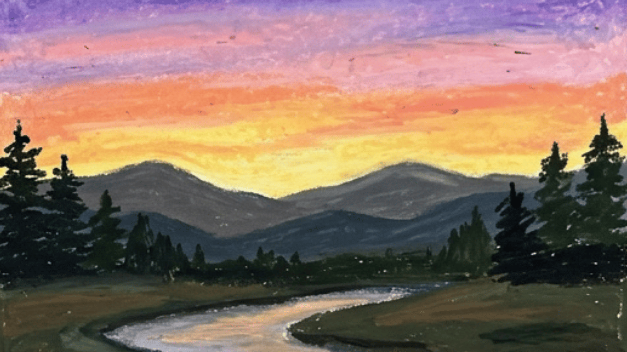
A sunset landscape is a simple place to start. Use orange, yellow, pink, and purple for the sky. Add dark trees, birds, or mountains to create contrast.
The blend of warm colors makes this subject perfect for practicing smooth transitions, and even simple silhouettes can make the finished artwork look striking.
2. Mountain View
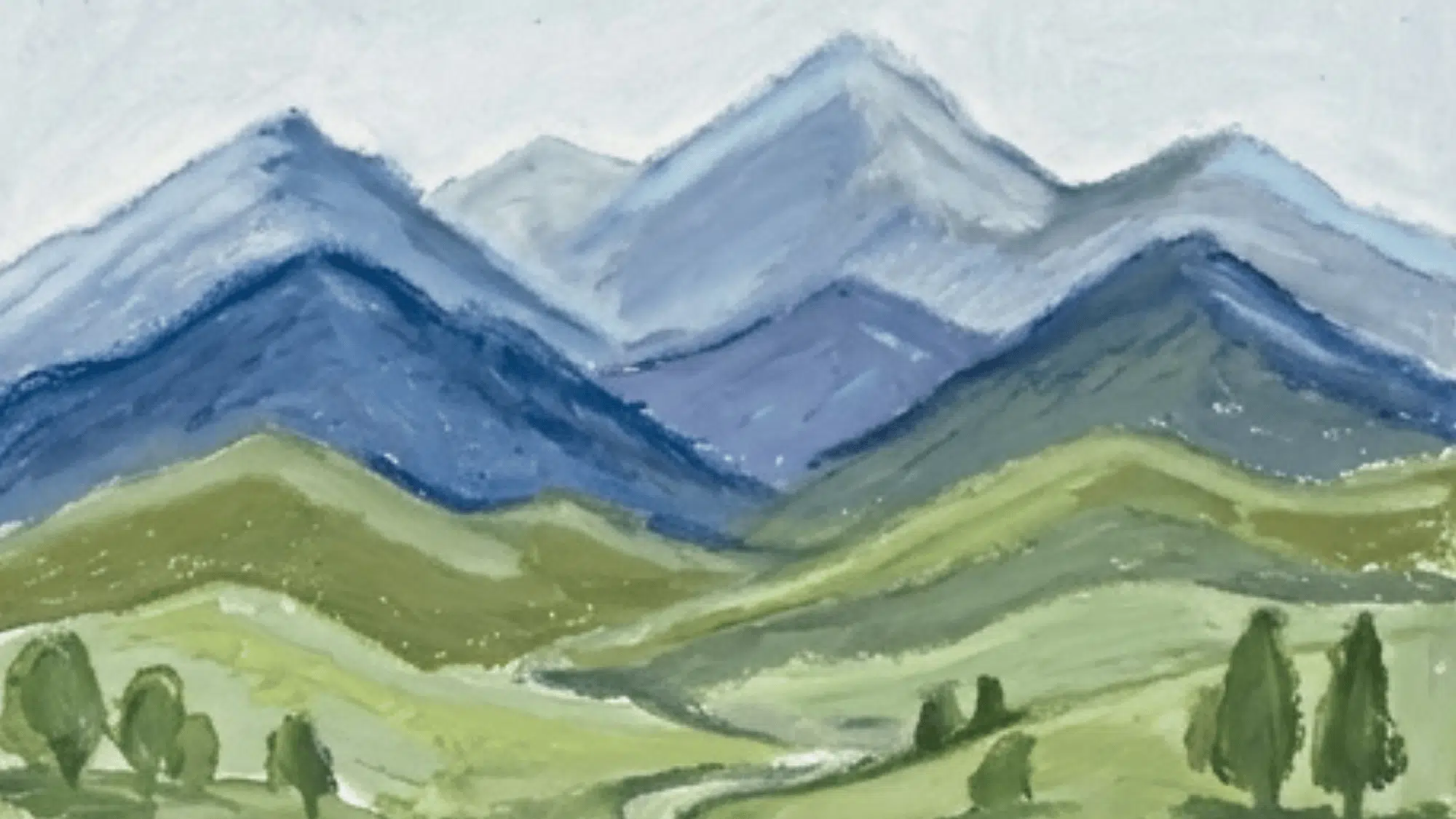
Mountain scenes are great for practicing depth. Layer blue, gray, green, and white. Keep the far mountains lighter and the front mountains darker so the scene feels more open.
A simple foreground can help the mountains stand out, while layering several mountain ranges creates a stronger sense of distance.
3. Ocean Waves
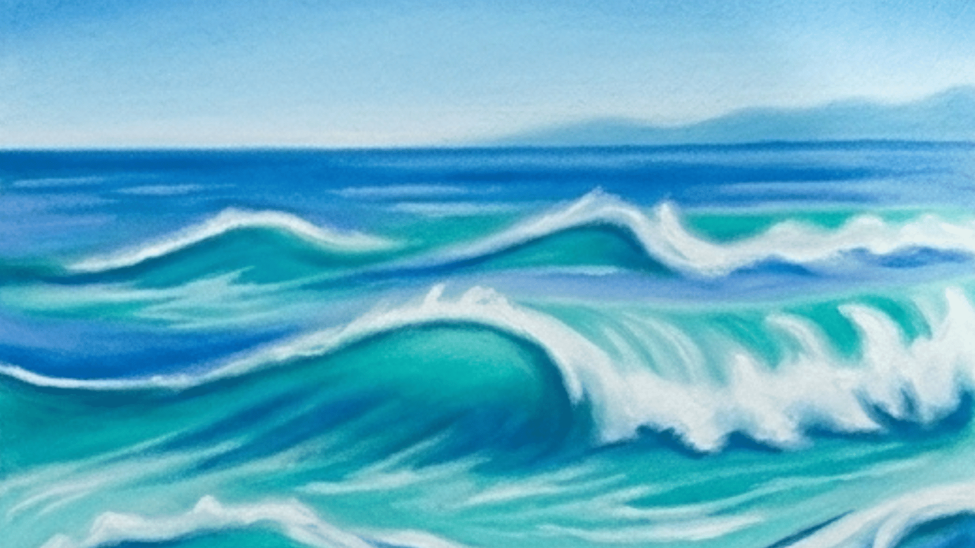
Ocean waves help you show movement. Build the water with blue, teal, white, and green. Use curved marks for waves and white strokes for foam.
This subject is great for practicing energy and motion, and varying the size of the waves can make the scene feel more natural.
4. Flower Garden
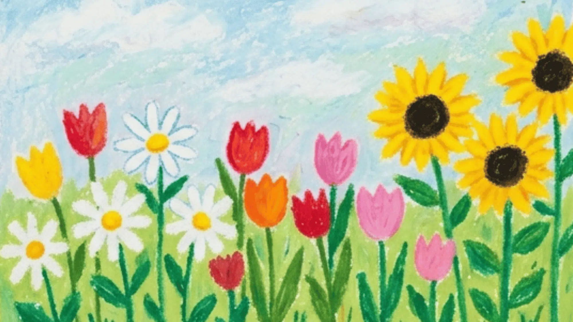
A flower garden lets you use many colors in one artwork. Draw daisies, tulips, sunflowers, or roses. Add green stems and leaves, then fill the petals with bright shades.
Mixing different flower shapes can make the scene look fuller, and you can customize the garden with your favorite flowers.
5. Still Life Fruit Bowl
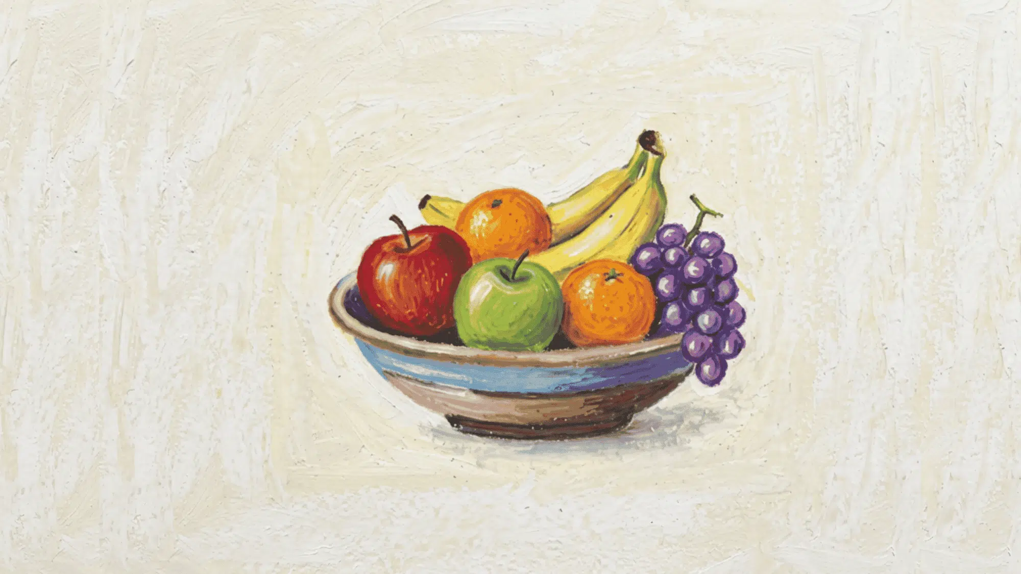
A fruit bowl is a useful subject for learning shape and shadow. Try apples, bananas, grapes, pears, or oranges. Round fruits are good for practicing highlights and soft shading.
You can arrange the fruit in different ways each time, and it is useful for learning how light falls on curved objects.
6. Starry Night Sky
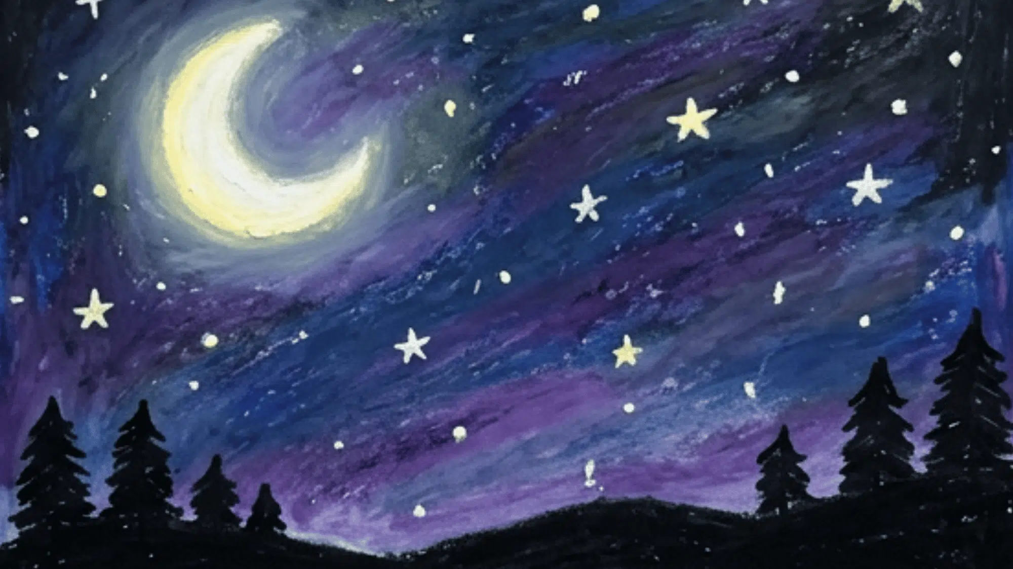
A night sky can feel soft and peaceful. Use dark blue, purple, and black for the background. Add stars, a moon, clouds, or a glow near the horizon.
Small white highlights can make the stars appear brighter, while scattered clouds can add extra depth to the scene.
7. Butterfly Drawing
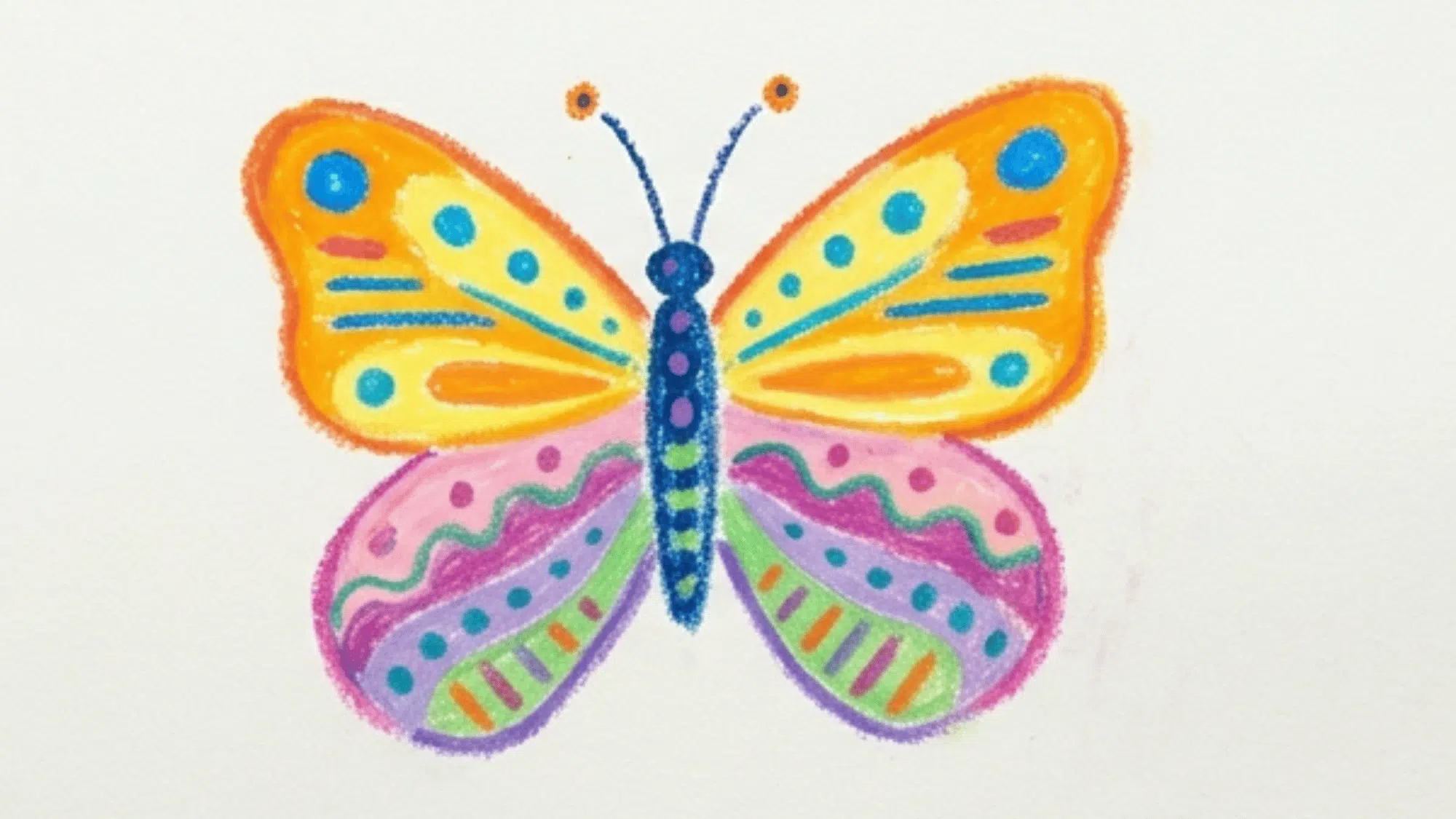
Butterflies are easy to personalize. Draw matching wings, then fill them with dots, lines, shapes, and color blends.
Try using one warm color group on one side and cool colors on the other for contrast. You can experiment with different color combinations, and the wing patterns give you plenty of room for creativity.
8. Abstract Color Blending
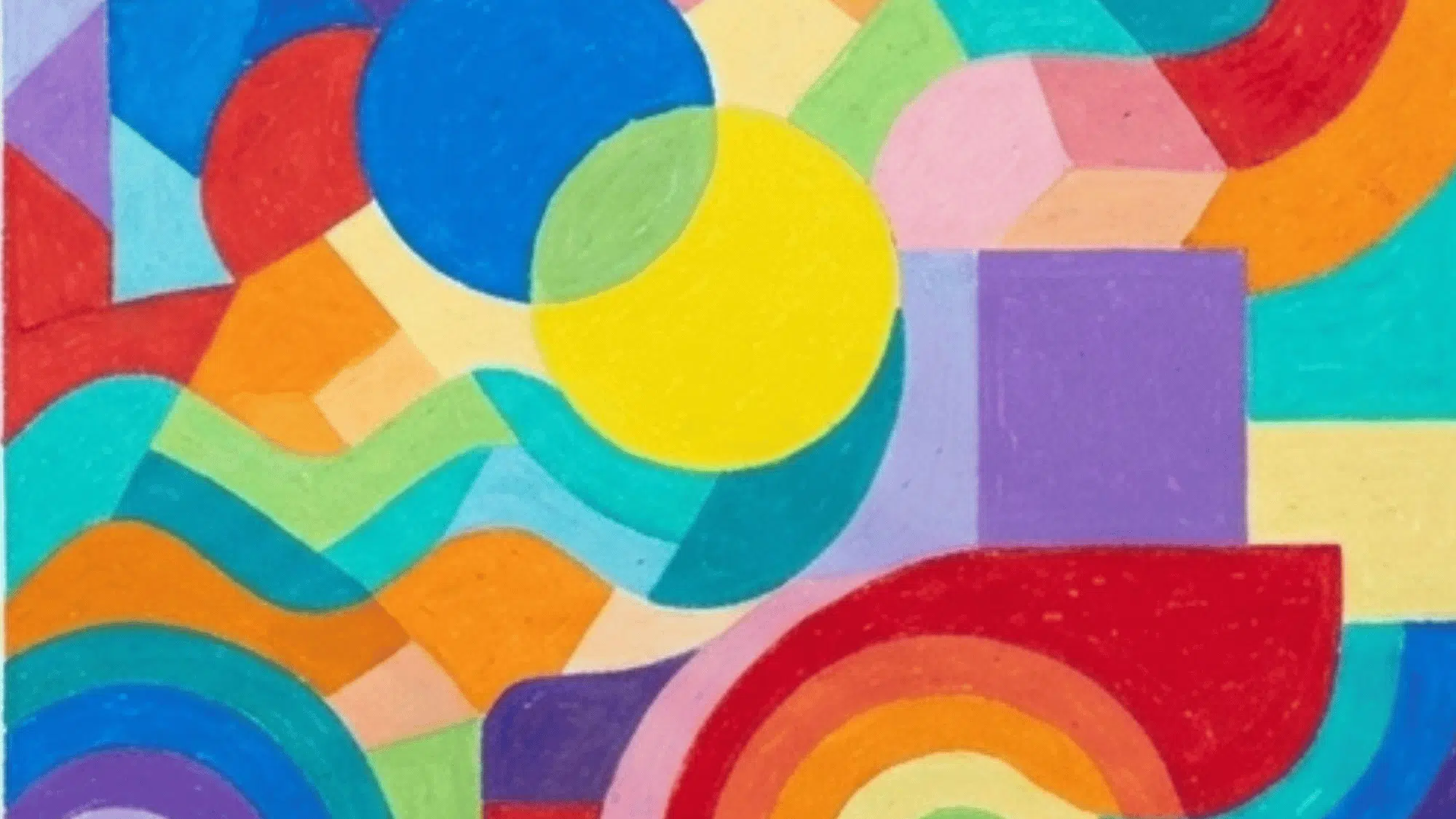
Abstract work is helpful when you want to focus only on color. Blend a few shades into waves, circles, blocks, or curved forms. The goal is flow, not perfect shapes.
This style encourages creativity without realistic details, making it a great choice when you want to focus on color alone.
9. Tree in Different Seasons
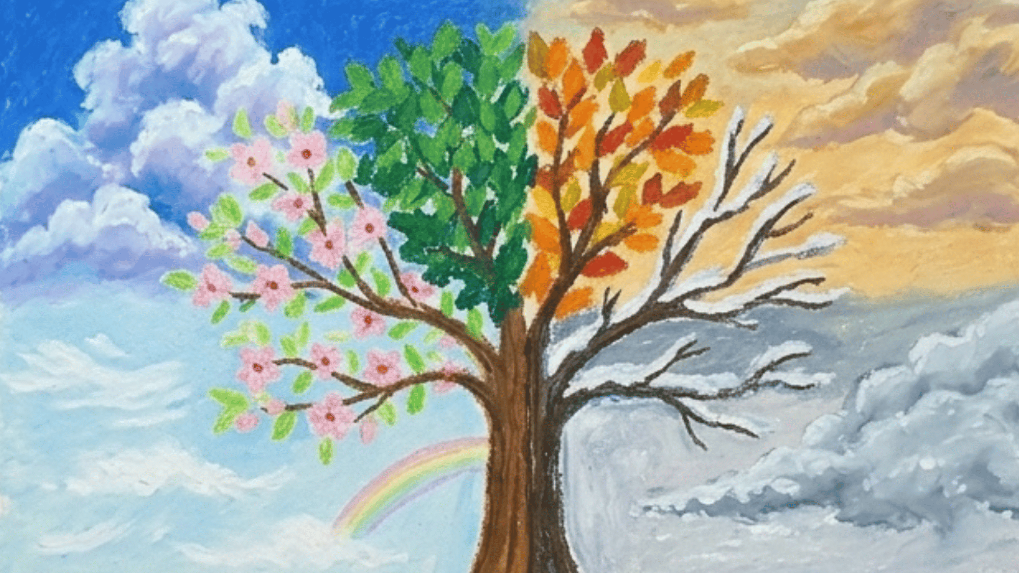
This idea shows change clearly. Divide the page into four parts and draw the same tree in spring, summer, autumn, and winter.
This idea helps you compare seasonal colors, and the divided layout keeps the design organized and easy to follow.
10. City Skyline
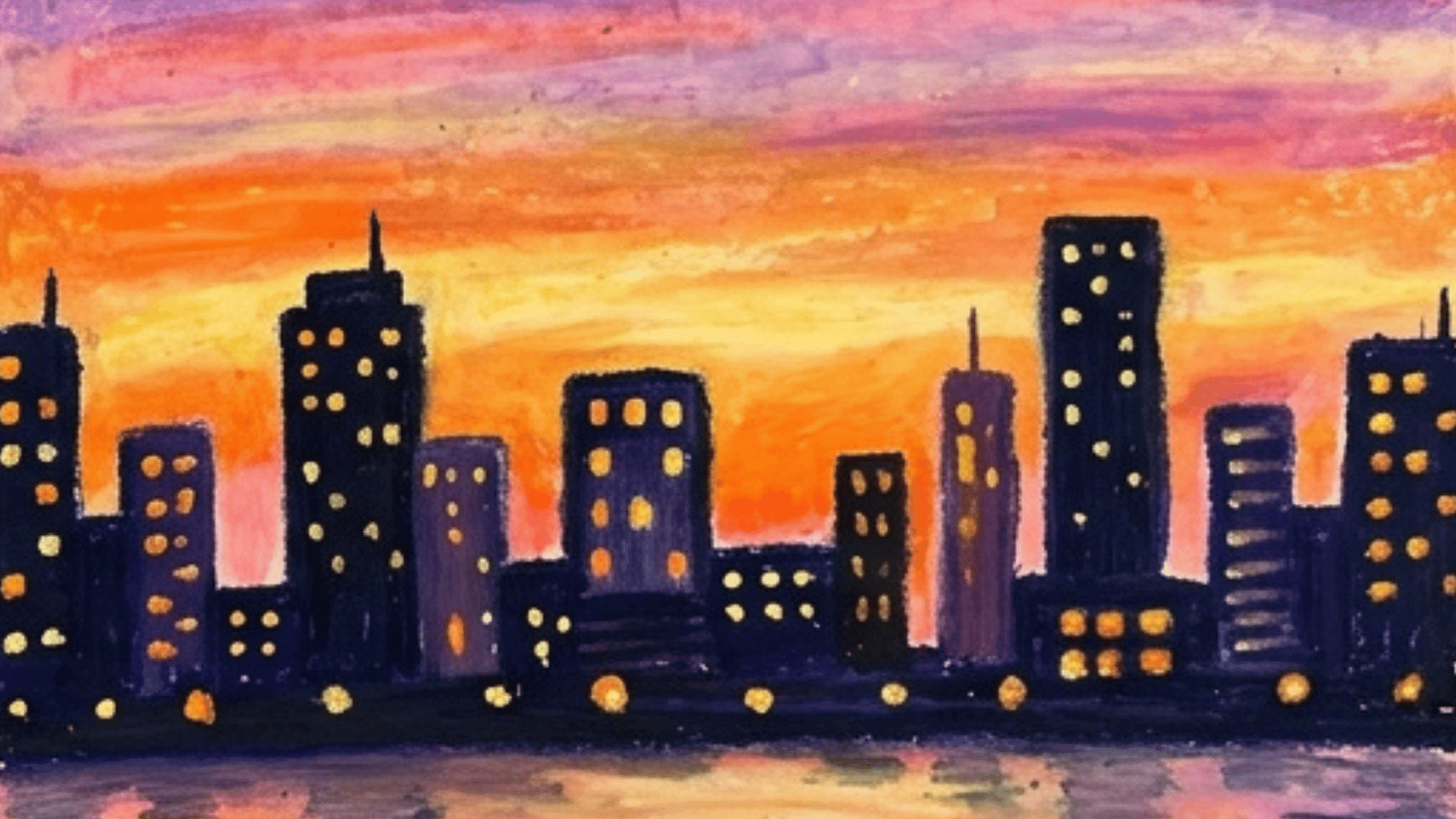
A city skyline can look strong with simple shapes. Draw dark buildings against a bright sky. Small windows and lights can add extra detail.
You can add reflections or clouds to make the scene feel complete, and simple building shapes are enough to create a clear city view.
11. Cute Animal Portrait
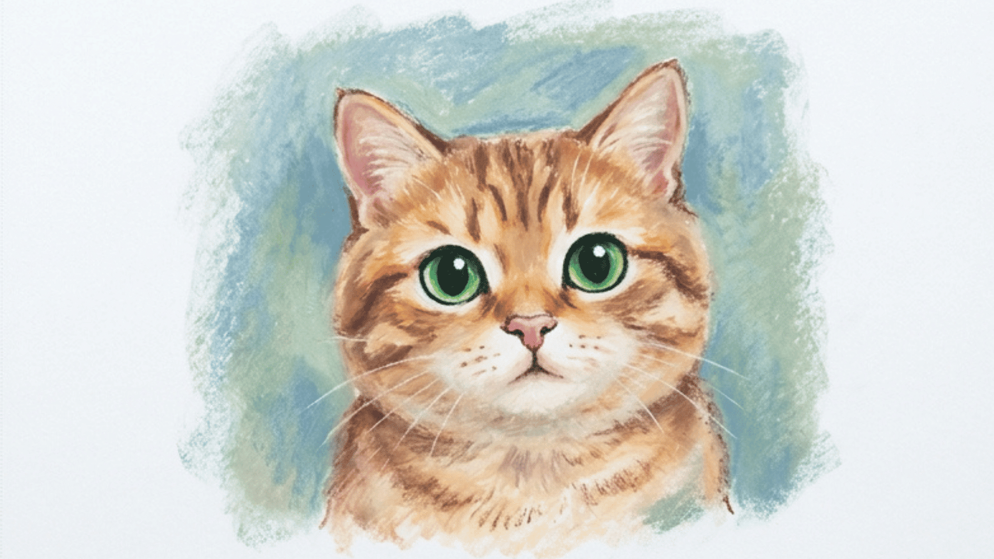
Choose a cat, dog, rabbit, bird, or panda. Use short strokes for fur or feathers. Give extra care to the eyes, since they add expression.
Simple backgrounds keep the focus on the animal, while short strokes help you practice fur or feather texture.
12. Galaxy Art
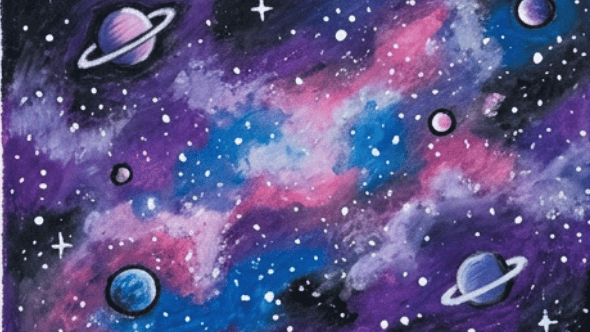
Galaxy art is full of deep color. Blend black, purple, blue, and pink. Add stars, planets, and cloudy patches to create a space scene.
Bright stars and planets create strong contrast, and layering multiple shades helps add depth to the space scene.
13. Beach Scene
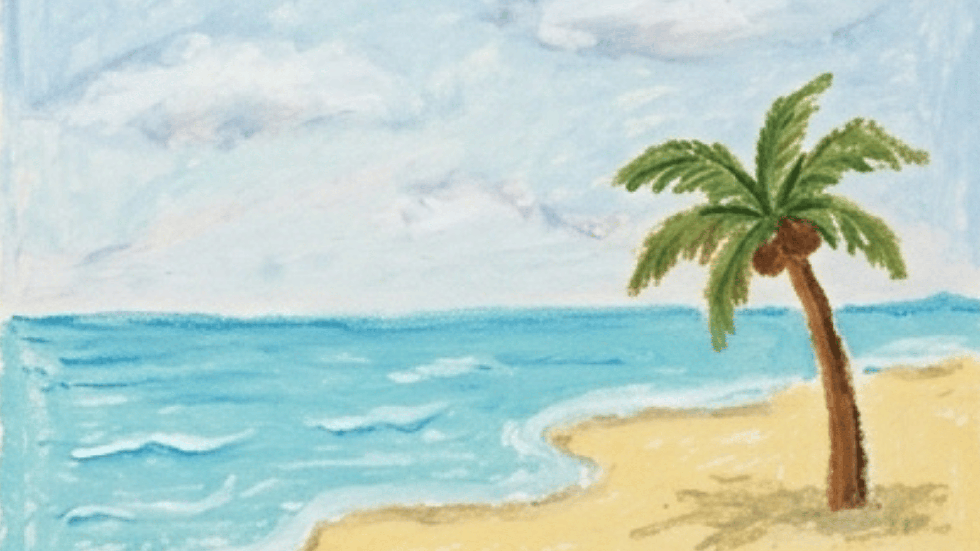
A beach scene is useful for soft color changes. Draw sand, water, sky, clouds, and a palm tree or umbrella. Light blue and warm beige work well together.
The mix of sand, water, and sky gives you blending practice, and even simple details can make the scene feel calm.
14. Portrait with Bold Colors
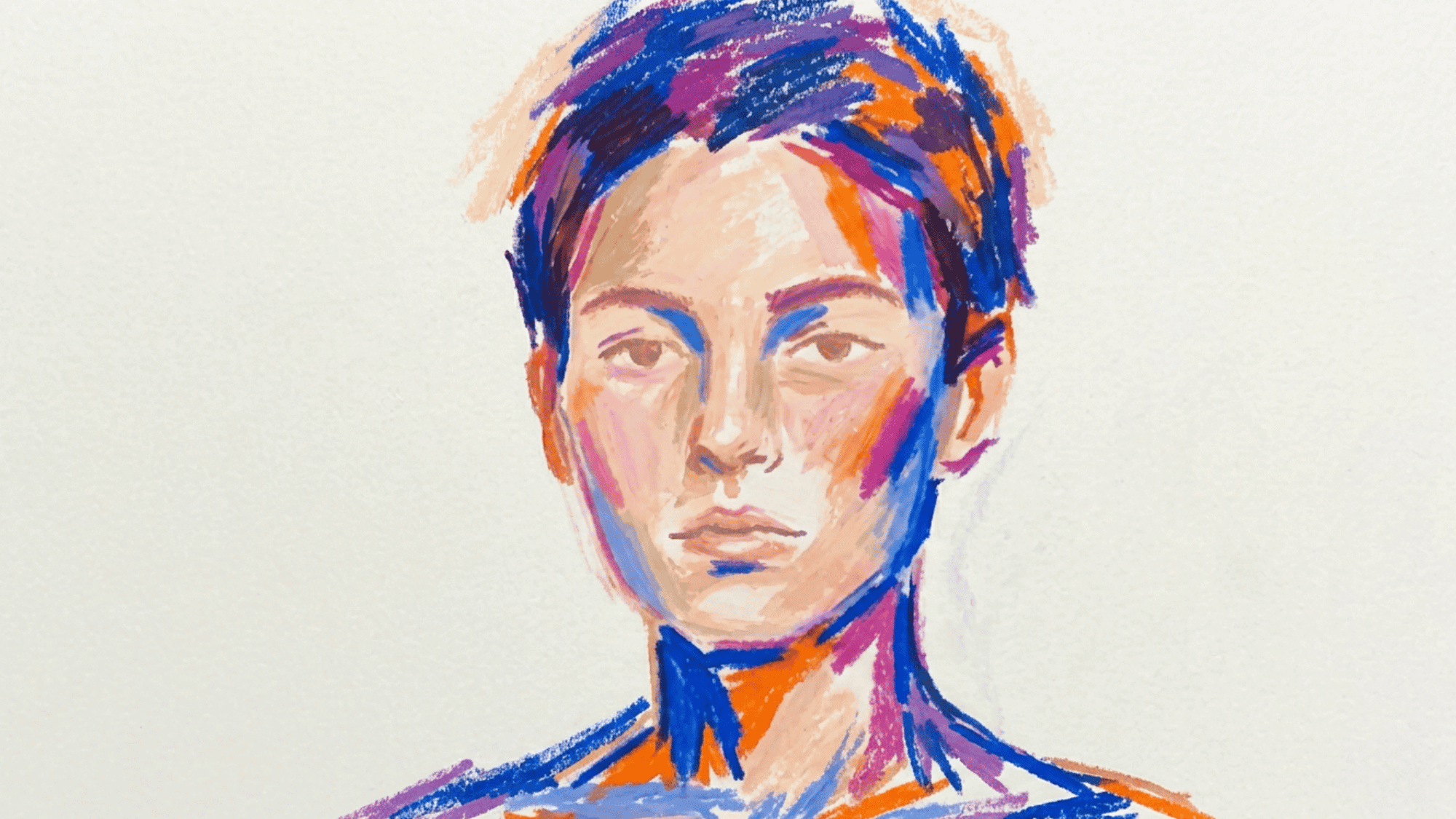
Portraits do not always need realistic colors. Start with a basic face shape. Then use peach, brown, pink, orange, blue, or purple for shadows and highlights.
This approach builds confidence in color choices and lets you focus on expression rather than perfect realism.
15. Rainy Window Art
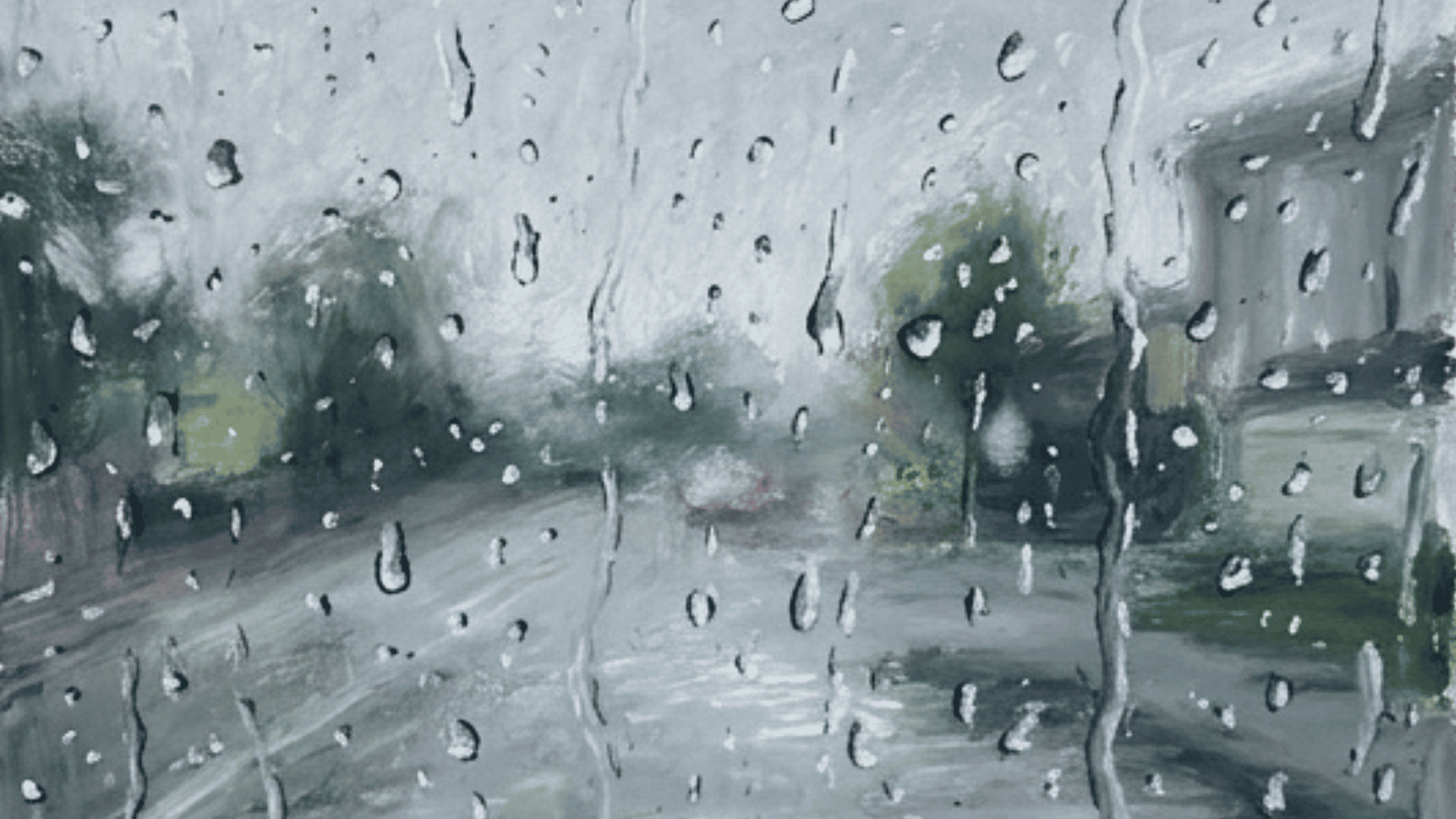
A rainy window scene has a quiet, moody feel. Make a blurred background first. Add raindrops on top with white, gray, and light blue.
Soft blending creates a misty, rainy-day look, while sharp raindrops against a blurred background add interest.
16. Sunflower Art
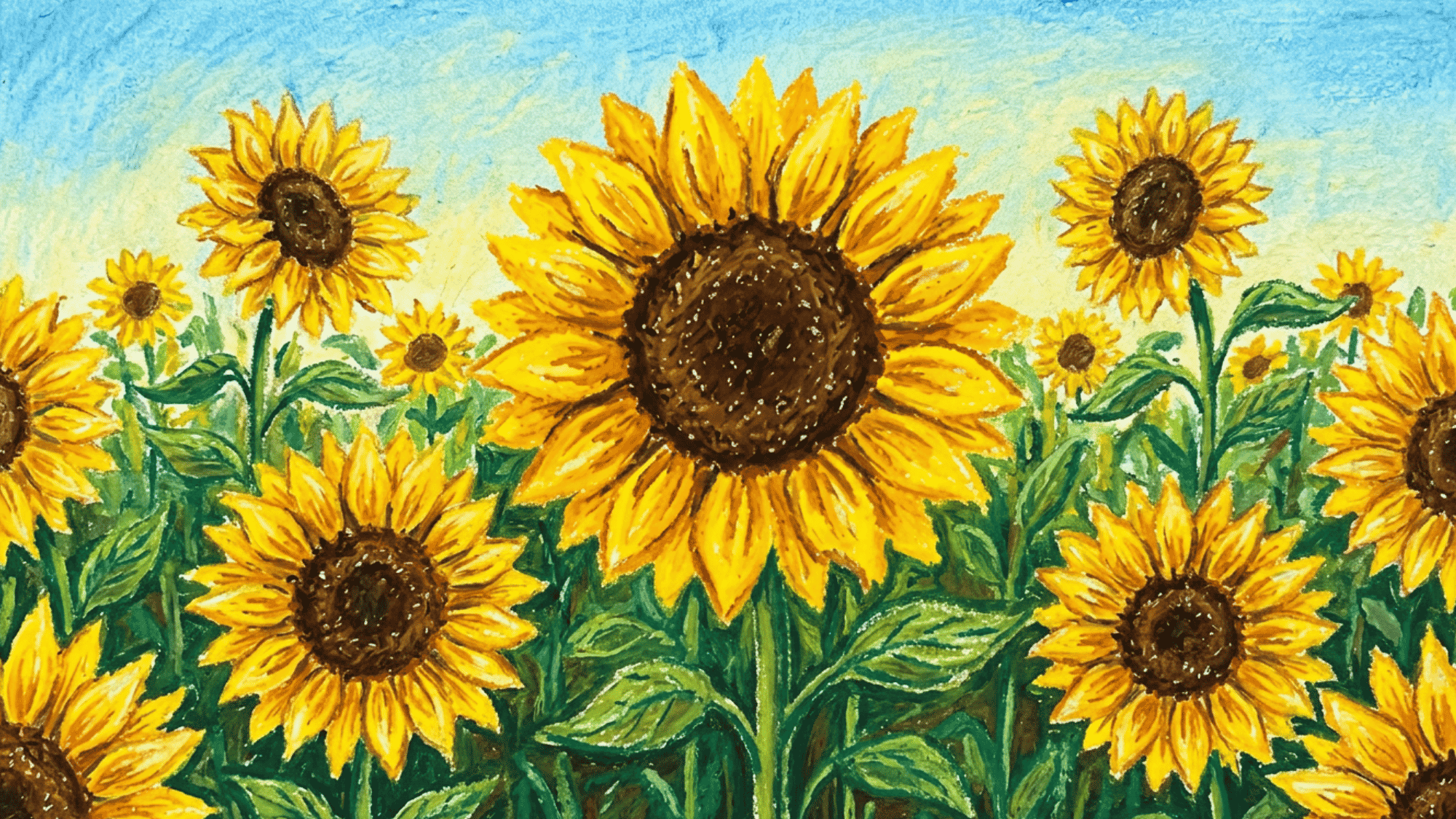
Sunflowers are cheerful and simple to build. Use yellow and orange for the petals, brown for the center, and green for the stem and leaves.
The large petals give you space for warm color layering, and the simple structure makes sunflowers easy to build.
17. Northern Lights
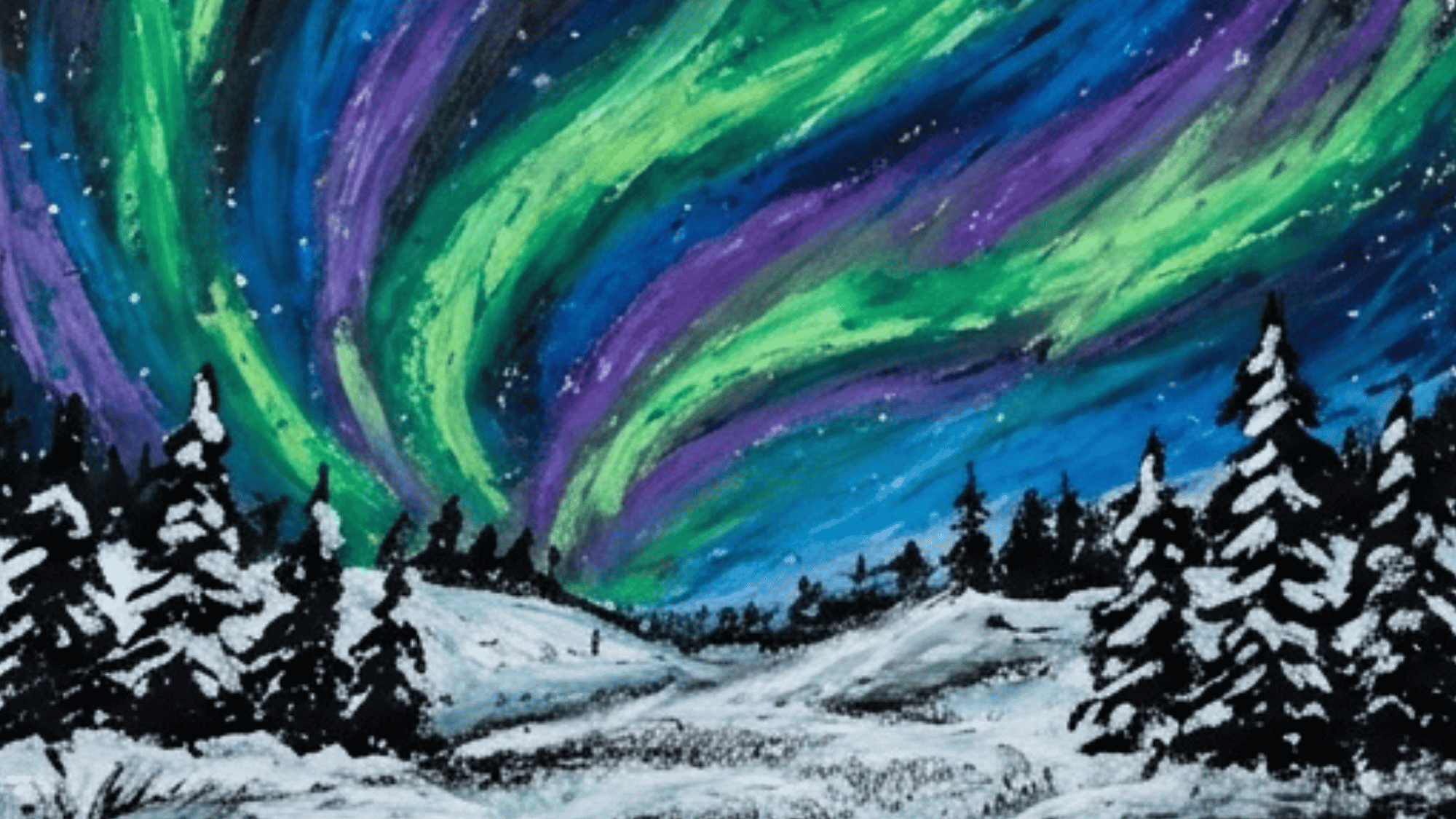
Northern Lights are perfect for smooth blending. Use green, blue, purple, and white over a dark sky. Pull the colors upward to show soft motion.
The flowing colors make this relaxing for blending practice, and the dark sky helps the bright lights stand out.
18. Bird on a Branch
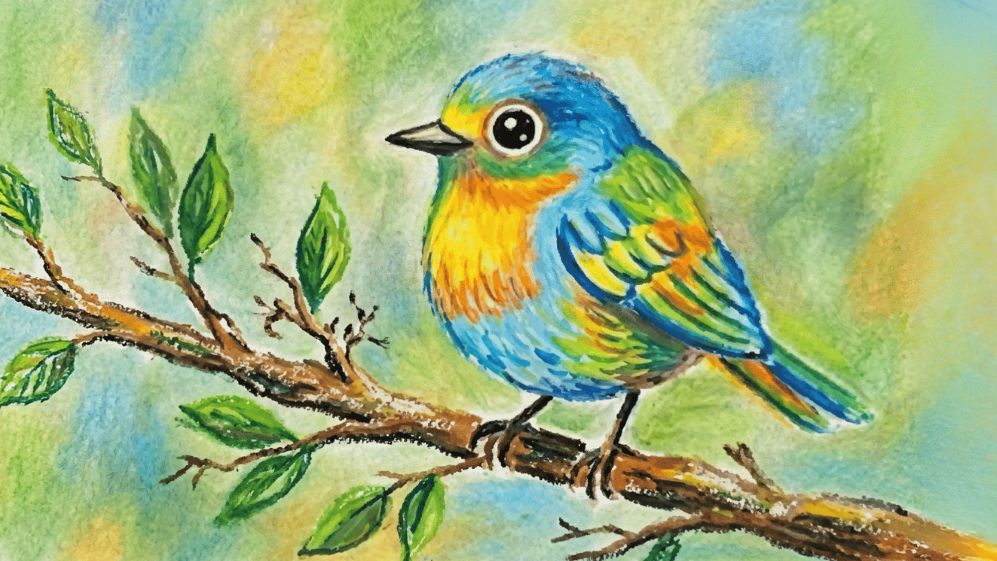
A bird on a branch can be plain or detailed. Try robins, parrots, peacocks, or kingfishers. Small marks can show feathers. Leaves or flowers can create a natural setting, while different bird species let you experiment with color.
19. Candle Light Scene
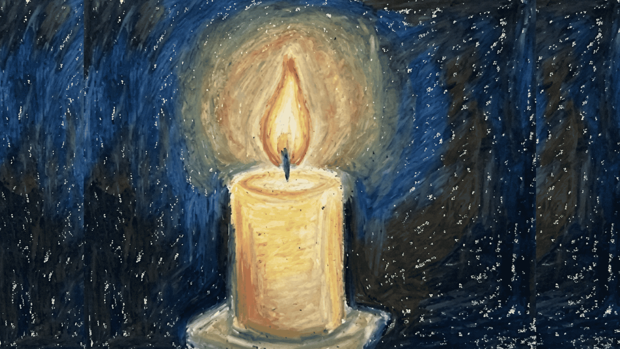
A candle scene teaches warm light and shadow. Use yellow, orange, red, brown, and black around the flame. Blend outward for a soft glow.
This project helps you understand how light affects nearby objects, and the contrast between light and dark creates drama.
20. Underwater Scene
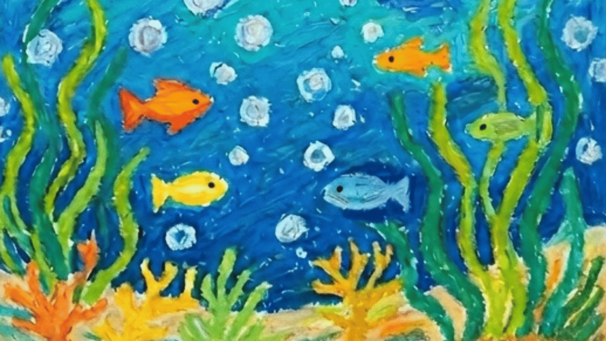
An underwater scene gives you room for cool colors. Add fish, seaweed, bubbles, shells, and coral reefs. Use lighter colors in the back to show distance.
Different shades of blue can make the water feel deeper, and small details like bubbles can bring the scene to life.
21. Dessert Drawing
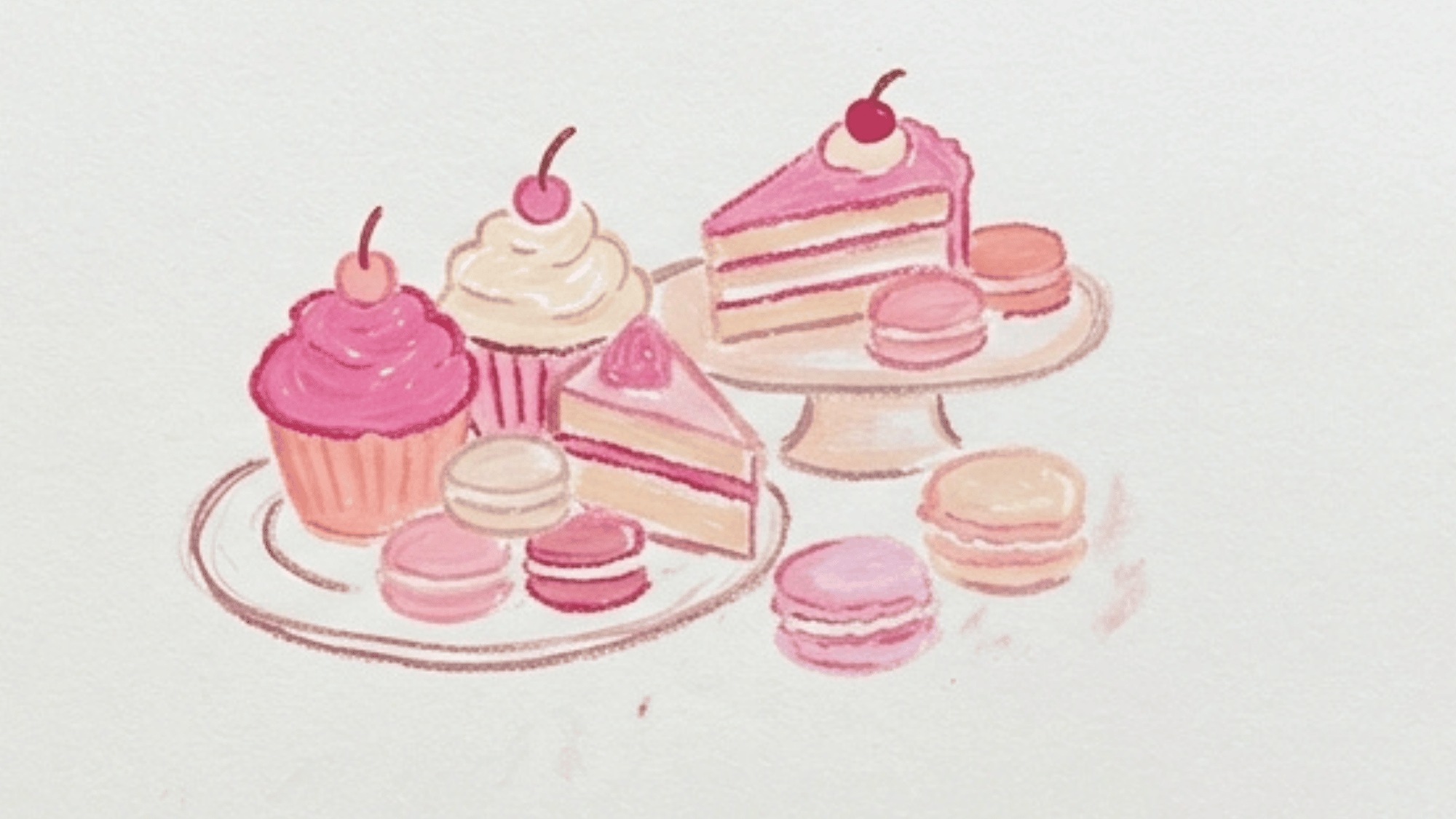
Desserts are playful subjects for color practice. Draw cupcakes, donuts, ice cream, or cake slices.
Add soft pinks, browns, and creams, along with bright toppings.
Bright colors and simple shapes make desserts fun for beginners, while highlights help frosting and toppings look more realistic.
22. Autumn Leaves
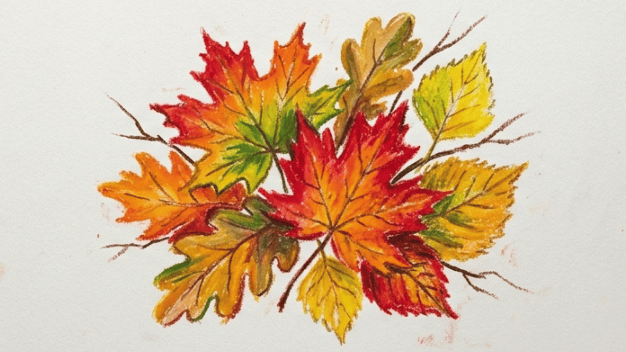
Autumn leaves are great for warm color layering. Use red, orange, yellow, brown, and gold. Add darker veins and edges to shape each leaf.
Different leaf shapes add variety, and warm colors make this a strong project for layering practice.
23. Mixed Media Oil Pastel Art
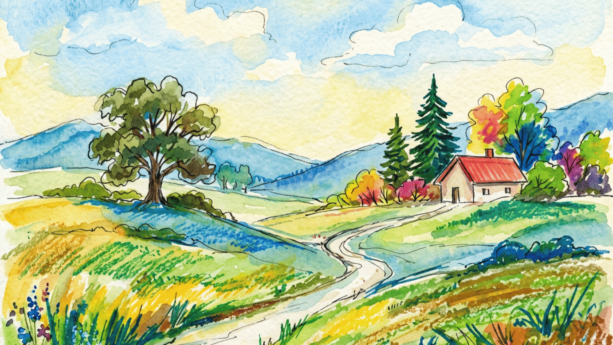
Oil pastels art work well with watercolor, acrylic paint, ink, colored pencils, and markers.
Use oil pastels for bold color areas, then add smaller details with another art tool. You can also draw with oil pastels first and paint around them, since the oily surface can resist water-based paint.
Tips for Better Oil Pastel Art
Even simple habits can make a big difference. These tips will help you get cleaner blends, brighter colors, and better results every time you use oil pastels.
- Use thick paper: Oil pastels need a surface that can hold pressure, layers, and blending without tearing.
- Start with light colors: Dark oil pastel is hard to cover, so begin with pale shades and build deeper colors slowly.
- Keep a tissue nearby: Oil pastels can leave color on your fingers, and dirty hands can muddy clean areas of your artwork.
- Use a cotton swab: It gives you more control when blending small areas like eyes, petals, clouds, or highlights.
- Try dark outlines: Black or dark brown can sharpen soft pastel edges and help the main shapes stand out.
- Store artwork carefully: Oil pastels can smudge because they stay soft, so place a blank sheet over finished work before storing it.
It’s a Wrap
Oil pastels art are a friendly medium because they let you work fast, make mistakes, blend again, and keep building color.
The ideas in this list are not meant to be strict projects; they are starting points for learning how color, pressure, and texture work together.
Pick one subject, try one technique, and see what happens on the page. As your confidence grows, you may find yourself combining ideas and creating artwork that feels completely your own.
Every finished piece adds to your understanding of how this colorful medium works.