Something holds every great design together, not a rule you can see, but a force you can feel. That force is known as the principles of design unity.
It’s the subtle foundation that connects every color, shape, and line seamlessly together.
When it’s missing, something feels off. Designers have chased this balance for centuries, but the real question is, does your design have it?
What Are the Principles of Design Unity?
Unity is what makes a design feel finished. When your layout, colors, fonts, and shapes work together, viewers just feel it.
Without unity, a design looks scattered. Unity means all visual parts feel connected, like they come from the same family.
Nothing looks out of place. It improves readability, boosts user experience, and builds trust. A cohesive design signals professionalism and care, and the brain remembers things that feel whole.
Unity vs Harmony in Design
Both unity and harmony help designs feel visually connected and balanced. Harmony improves how elements work together, while unity creates the overall sense of completeness.
| UNITY | HARMONY |
|---|---|
| Creates overall consistency | Creates smooth visual relationships |
| Focuses on the whole design | Focuses on individual elements |
| Makes layouts feel complete | Makes designs feel balanced |
| Example: consistent website layout | Example: matching colors and fonts |
Why Unity in Design Improves User Experience?
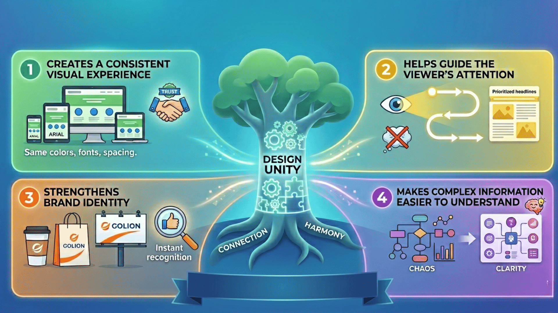
Unity does not just set rules for how a design should look. It is the invisible force that connects every element and makes the whole feel stronger than its parts.
1. Creates a Consistent Visual Experience
Consistent typography, matching colors, and repeated spacing patterns make a design feel intentional. Every element looks like it belongs to the same family.
When viewers see this consistency, they trust the design instantly and engage with it more deeply.
2. Helps Guide the Viewer’s Attention
Unity supports visual hierarchy and reduces confusion, helping viewers always know where to look next.
A well-unified design leads the eye naturally from one element to another without any effort from the viewer.
3. Strengthens Brand Identity
A unified style across platforms builds recognition over time. People start to identify your brand before they even read your name.
This consistency turns casual viewers into loyal followers who connect with your visual language.
4. Makes Complex Information Easier to Understand
Whether it is an infographic, a website layout, or a presentation, unity organizes complexity. It turns a wall of information into something easy to follow.
When everything feels connected, readers absorb and retain information much faster
Types of Unity in Design
Unity in design can be visual or conceptual. Visual unity improves the look and consistency of a design, while conceptual unity connects the message and ideas across all elements.
| VISUAL UNITY | CONCEPTUAL UNITY |
|---|---|
| Consistent colors and typography | Aligned content and messaging |
| Repeated shapes and design patterns | Logical storytelling flow |
| Uniform layout and spacing | Consistent brand voice and theme |
| Makes designs look connected | Makes ideas feel connected |
| Example: matching website UI | Example: campaign with one clear message |
Core Principles of Design Unity That Create Visual Harmony
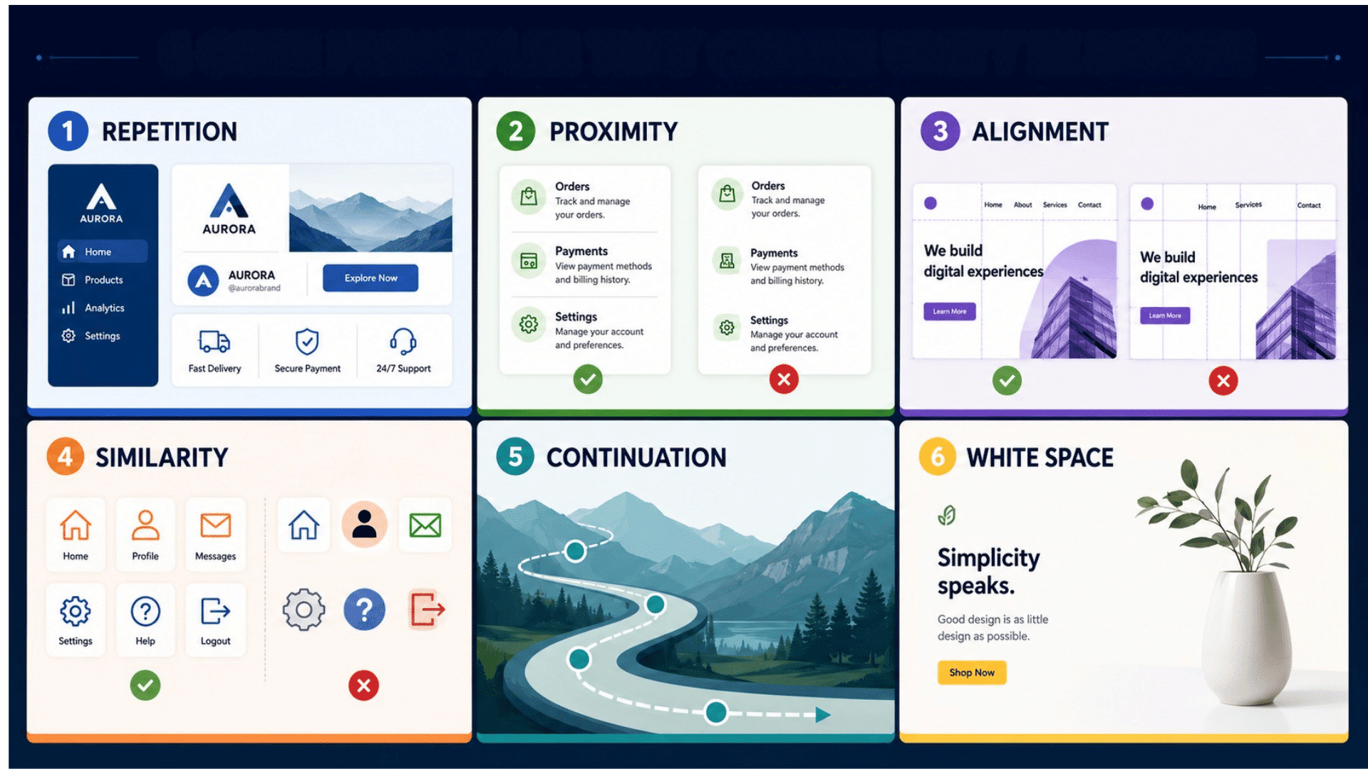
Every unified design is built on a set of core principles. Master these, and you will always know how to make your designs feel complete.
1. Repetition
Repeating fonts, colors, and shapes across a design creates a sense of consistency. It is how brands like Apple and Nike make every touchpoint feel instantly recognizable.
Without repetition, a design feels random and disconnected, making it harder for viewers to build a mental picture of your brand.
2. Proximity
Grouping related elements together tells the viewer they belong to the same idea. This follows Gestalt theory, which holds that the human brain naturally organizes nearby objects into a single unit.
When elements are placed near each other, viewers understand their relationship without needing labels or extra explanation.
3. Alignment
Placing elements along a common axis creates clean, structured layouts. Good alignment improves readability and gives every design a polished, professional look.
Even a slight misalignment can make a design feel careless, so consistent alignment is one of the fastest ways to lift your work.
4. Similarity
Elements that share the same color, shape, or style feel connected even without borders or boxes. Consistent icon styles across a website are a simple example of similarity in action.
When viewers see similar elements, they instantly group them together and understand how the design is organized.
5. Continuation
The eye naturally follows lines, curves, and patterns through a layout. Designers use continuation to guide viewers effortlessly from one section to the next.
A strong sense of continuity keeps viewers engaged and moving through your content in the exact order you intended.
6. White Space
Empty space is not wasted space. It prevents clutter, improves balance, and gives every element room to breathe so the design never feels overwhelming.
Strategic use of white space also draws attention to the most important parts of a design by removing everything that competes with them.
How to Achieve Unity in Design
Strong unity makes designs feel organized, professional, and visually balanced. Consistent colors, layouts, and content help every design element work together smoothly.
- Use a Limited Color Palette: Apply the 60-30-10 color rule to balance primary, secondary, and accent colors. A controlled palette creates visual consistency, making the overall design feel more connected and professional.
- Stick to 1–2 Fonts: Using too many fonts can create visual chaos and reduce readability. Limiting typography choices keeps the design clean, consistent, and easier for users to scan.
- Create a Consistent Layout Structure: Use grids and equal spacing to organize content clearly. Consistent layouts improve flow and help users navigate the design more comfortably.
- Maintain a Clear Visual Hierarchy: Use heading sizes, contrast, and focal points to guide attention. A strong hierarchy helps users quickly and naturally understand important information.
- Repeat Design Elements Strategically: Reuse buttons, icons, shapes, and image styles throughout the design. Repetition strengthens consistency and keeps the visual experience unified.
Real-World Examples of Unity in Design
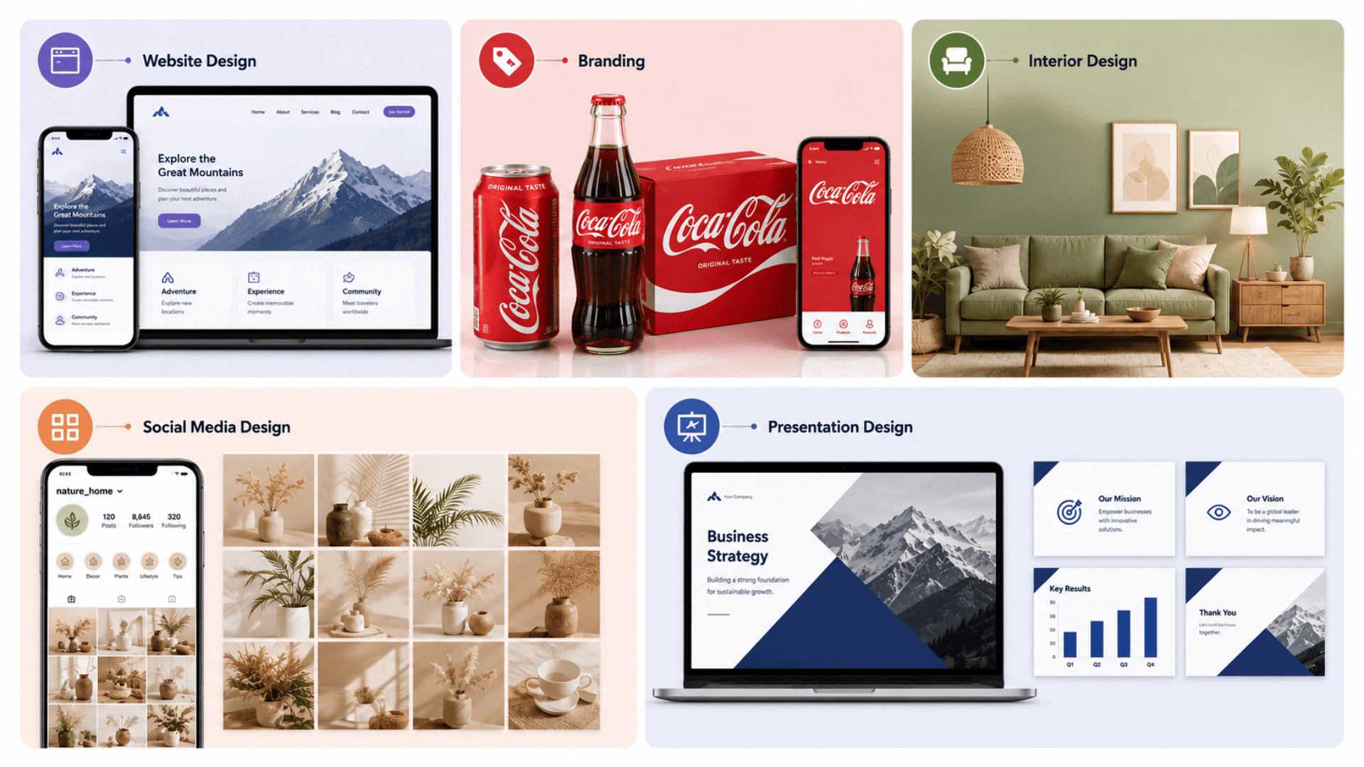
Unity appears in websites, branding, and digital design through consistent styles that improve navigation and strengthen the overall message.
| DESIGN AREA | EXAMPLE OF UNITY |
|---|---|
| Website Design | Consistent buttons, typography, colors, and navigation styles across all pages. |
| Branding | Apple and Coca-Cola maintain the same visual style in packaging, ads, and websites. |
| Interior Design | Matching materials, furniture, and color themes creates a cohesive room design. |
| Social Media Design | Unified Instagram grids use consistent filters, fonts, and layouts for brand identity. |
| Presentation Design | Slides follow the same layout, typography, and color scheme throughout the presentation. |
Common Mistakes That Break Unity in Design
Even well-designed projects can lose visual balance when consistency is ignored. Avoiding common design mistakes helps maintain a clean, professional, and cohesive user experience.
- Using Too Many Fonts: Excessive font styles make designs look cluttered and difficult to read. Limiting typography choices improves consistency and readability.
- Inconsistent Color Schemes: Random or mismatched colors can confuse users and weaken brand identity. A consistent palette creates stronger visual harmony.
- Poor Spacing and Alignment: Uneven spacing and misaligned elements make layouts appear unorganized. Proper alignment improves structure and visual flow.
- Mixing Too Many Design Styles: Combining unrelated styles, such as minimalist and retro elements, can create confusion and reduce overall cohesion.
- Ignoring Visual Hierarchy: Without clear headings, contrast, or focal points, users may struggle to know where to focus first.
Unity vs Other Principles of Design
The principles of design unity work with other design elements to create clear, balanced, and visually effective compositions that improve overall communication.
| PRINCIPLE | DIFFERENCE FROM UNITY |
|---|---|
| Unity vs Balance | Unity creates consistency, while balance distributes visual weight evenly across the design. |
| Unity vs Contrast | Unity connects elements, while contrast highlights differences to draw attention. |
| Unity vs Emphasis | Unity supports overall cohesion, while emphasis draws focus to specific elements or messages. |
| How They Work Together | Balance, contrast, emphasis, and unity combine to create organized, engaging, and visually appealing designs. |
Best Practices for Maintaining Unity in Modern Design
A unified design built on the principles of design unity improves consistency, strengthens brand identity, and creates a smoother, more user-friendly digital experience.
- Use design systems to standardize colors, typography, and UI components across all platforms.
- Create clear brand guidelines to maintain consistency in visuals, tone, and messaging.
- Implement grid frameworks to keep layouts structured, balanced, and visually aligned.
- Test designs across devices and screen sizes to ensure a seamless responsive experience.
- Prioritize user experience by focusing on intuitive navigation, accessibility, and usability.
Wrapping It Up
Great design never happens by accident. Every powerful piece of work you admire, every layout that stops you mid-scroll, carries the same secret underneath.
Now you know what it is. The principles of design unity are not just rules for the classroom.
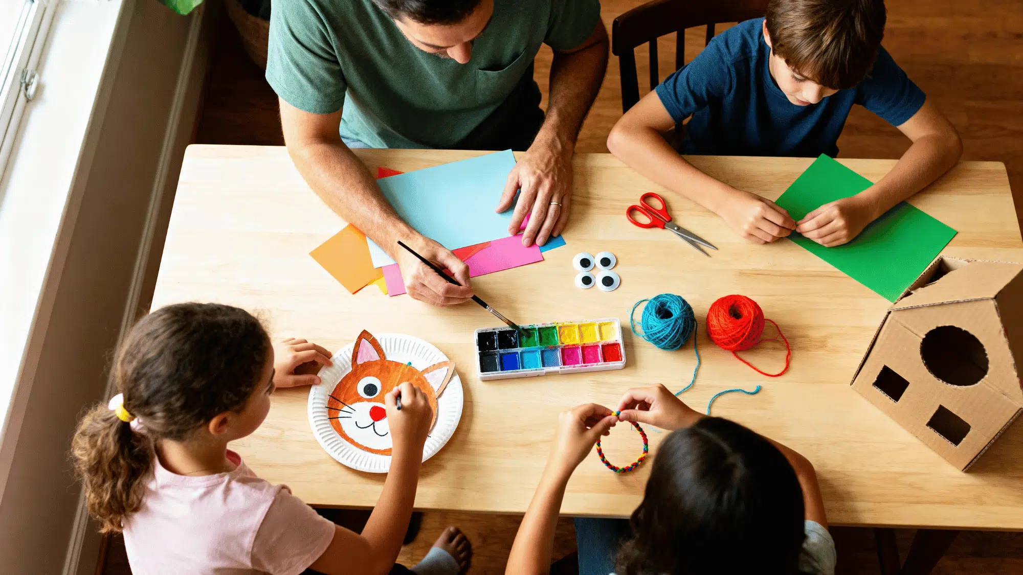
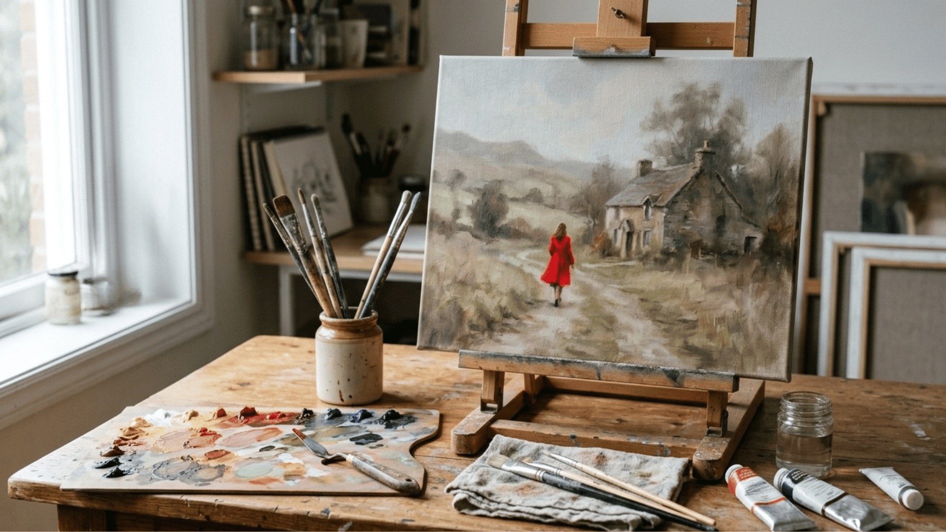
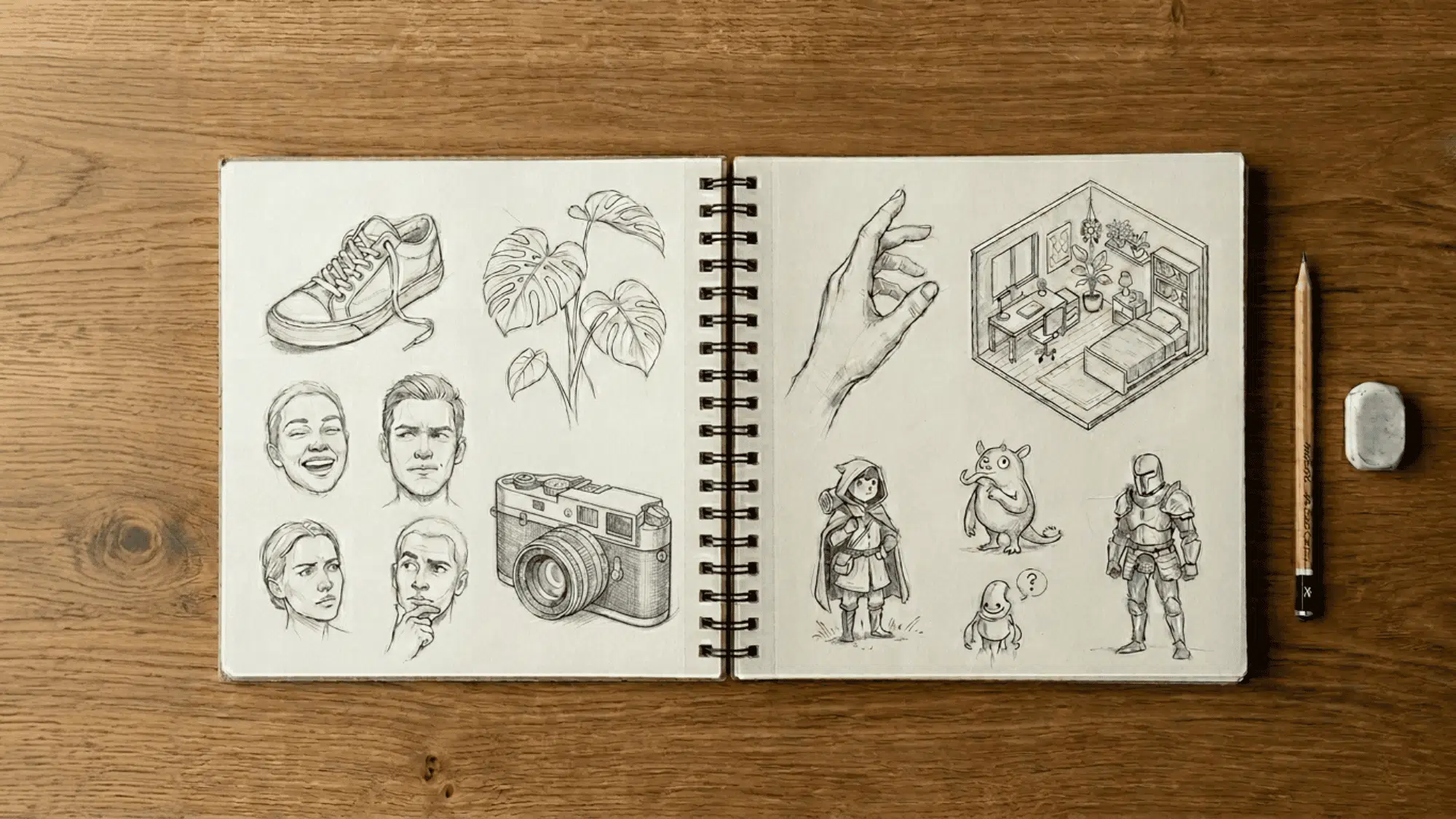
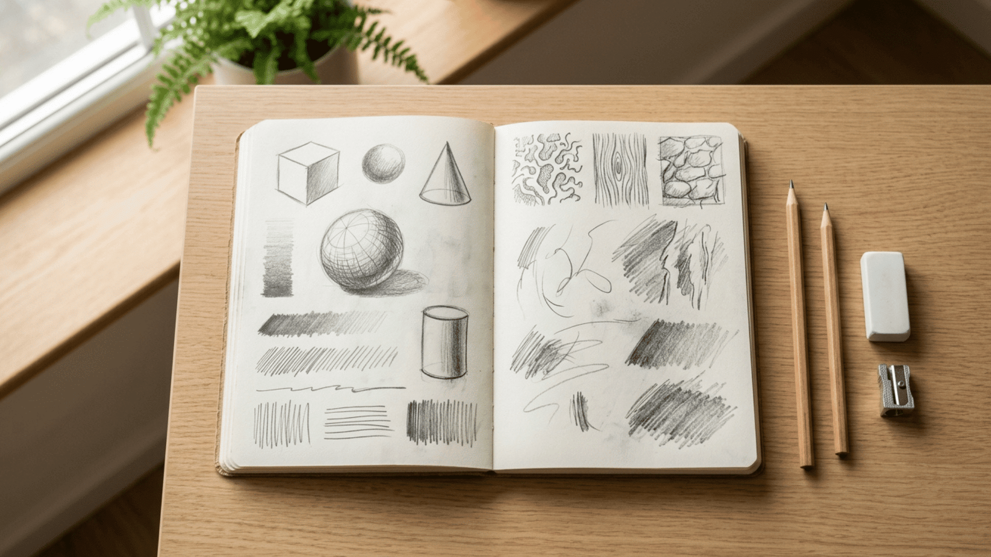
They are tools for anyone ready to create something that truly connects. So open your sketchbook, pull up your canvas, and start building something that holds together.


