Have you ever admired a painting and instantly felt something powerful, calmness, excitement, or even mystery just from its colors?
That reaction is no coincidence; it shows how deeply color influences our emotions and thoughts.
When we learn to see color beyond its surface value, we uncover the hidden language artists use to tell stories, send messages, and connect with viewers on a deeper level.
In this blog, you’ll find what color truly means in art, how it has shaped different eras, the emotions behind various shades, and especially the mistakes to avoid when interpreting colors.
By the end, you’ll not only appreciate artworks more but also read their colors like a visual code.
Decoding Color Definition in Art
Have you ever stood in front of a painting and wondered why certain colors made you feel happy or sad?
Understanding color definition in art is like learning a secret language that artists use to speak directly to our hearts and minds.
What does color mean in art? Simply put, color is one of the most powerful tools artists use to create emotion, depth, and meaning in their work. Yet many people find themselves confused when trying to grasp how colors work together.
The definition of color in art goes far beyond just naming red, blue, or yellow. It includes how colors interact, what feelings they create, and how artists use them to tell stories.
Once someone learns these basics, they can appreciate art on a completely new level and even create more meaningful artwork themselves.
The Building Blocks of Color in Art

Every color is composed of three basic parts that work together:
- Primary colors: They are red, blue, and yellow. These colors cannot be made by mixing other colors together. They are like the main ingredients in a recipe.
- Secondary colors: They come from mixing two primary colors. Green comes from blue and yellow. Orange comes from red and yellow. Purple comes from red and blue. These six colors form the foundation of all art.
- Color temperature: It divides colors into warm and cool groups. Warm colors like red and orange feel exciting and energetic. Cool colors like blue and green feel calm and peaceful
The Psychology of Color in Art
Colors profoundly affect human emotions and behavior. Artists have long known this secret and use it to influence how viewers perceive their work.
Warm colors make hearts beat faster. Red, orange, and yellow create excitement and energy. They make spaces feel smaller and more intimate. This is why restaurants often use warm colors to evoke a sense of hunger and sociability.
Cool colors slow down the mind. Blue, green, and purple help people relax and think clearly. They make rooms feel bigger and more peaceful. Hospitals use these colors to help patients stay calm.
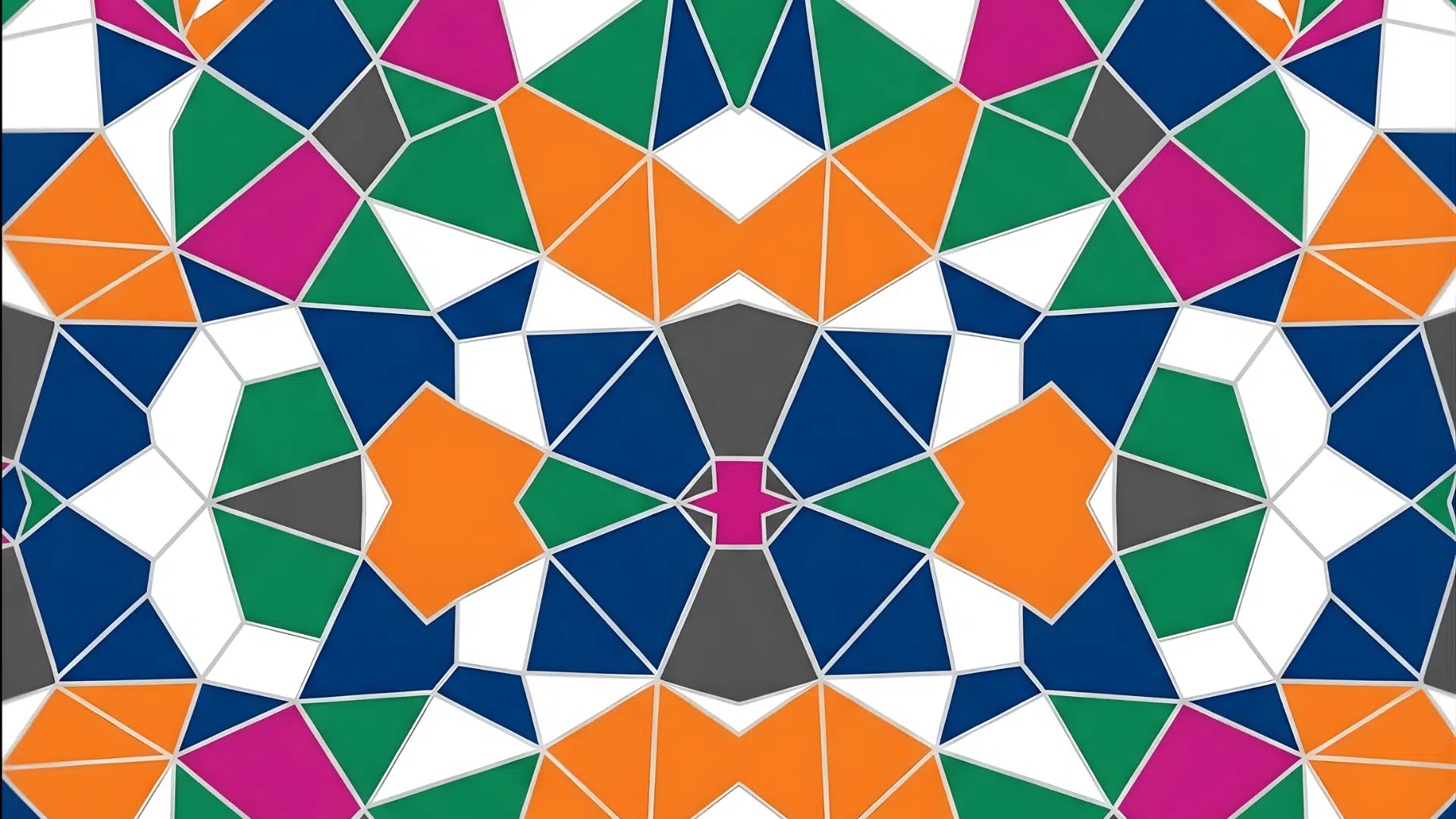
Color combinations create different moods. Bright contrasts feel stylish and playful. Soft, similar colors feel gentle and harmonious.
Artists pick combinations based on the emotions they want to create
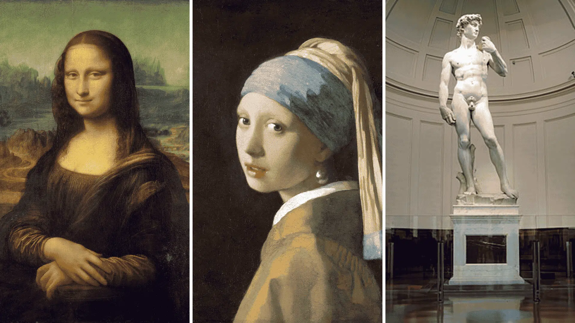
How Does the Meaning of Color Shift Across Art History?
Color meanings change as societies and art styles develop. Each time period brought new ways to think about and use colors.
| Art Period | Color Approach | Key Examples |
|---|---|---|
| Ancient & Medieval | Sacred Pigments and Gold Leaf | Expensive blue and purple are only for holy figures. Gold leaf showed divine light and heaven’s glory in religious paintings. |
| Renaissance & Baroque | Realism With Symbolism | Realistic skin tones with hidden symbols. Red robes meant power while white lilies showed purity in portrait backgrounds. |
| Impressionism | Light and Perception | Painters stopped using black shadows. Mixed purple and blue instead to show how real light changes colors outdoors. |
| Fauvism | Color as Emotional Liberation | Bright, unnatural colors on purpose. Green faces and orange trees depicted emotions rather than replicating real life exactly. |
| Modern & Contemporary | Political and Conceptual Palettes | Colors became tools for social messages. Red, white, and blue showed patriotism, while rainbow colors supported equality movements. |
The Symbolic Meanings of Major Colors

Each color speaks its own language in the artwork. Artists use these common meanings to connect with viewers on a deeper level. The colors can be categorized as:
1. Warm Colors Which Carry Strong Emotions
- Red: passion, power, violence, love
- Orange: energy, creativity, enthusiasm
- Yellow: happiness, wisdom, sometimes betrayal
2. Cool Colors Which Bring Calmer Feelings
- Blue: trust, sadness, peace, stability
- Green: nature, growth, money, jealousy
- Purple: royalty, mystery, spirituality
3. Neutral Colors that Provide Balance
- Black: death, elegance, mystery
- White: purity, innocence, emptiness
- Gray: calm, depression, uncertainty
A Framework for Reading Color in Art
Want to understand how artists use color? Here’s a simple way to look at any painting or artwork like a pro.
- Spot the main colors first: Look at which colors jump out at you and take up the most room in the picture
- See how colors work: Observe if the colors evoke calmness or excitement when placed together in contrast
- Think about what the art shows: A church painting might use different colors than a family portrait or a nature scene
- Remember when it was made: Artists from different time periods had their own color styles and meanings
- Look for warm versus cool areas: Reds and yellows feel warm, while blues and greens feel cool
Practice this step-by-step method on different artworks. Soon you’ll start seeing color choices everywhere!
Common Mistakes in Interpreting Color
Many people make the same mistakes when viewing artwork. Avoiding these mistakes leads to better understanding and enjoyment.
- Don’t assume a color’s meaning is fixed; its interpretation depends on context.
- An artist’s cultural background can shift the meaning of colors.
- Subtle and muted colors often carry deeper significance than bright ones.
- How colors interact or mix can express tension, harmony, or conflict.
- Overlooking neutral tones like black, white, and gray that provide balance and symbolism.
- Assuming warm colors only mean excitement and cool ones only mean calmness.
- Ignoring the effect of lighting, which can drastically change color perception.
- Forgetting that the placement and proportion of colors affect their impact.
- Relying only on personal feelings without considering cultural or historical context.
Conclusion
Understanding color in art unlocks a deeper appreciation for an artist’s work. Artists spend years mastering color, and knowing their techniques uplifts the viewing experience.
The process of interpreting color starts with observation. Notice the dominant colors, their relationships, and the context of the piece.
Remember that understanding color in art requires both technical knowledge and cultural awareness.
The next time you visit a gallery, you’ll see colors in a different light. You’ll understand the artist’s language, feeling more connected to the work.