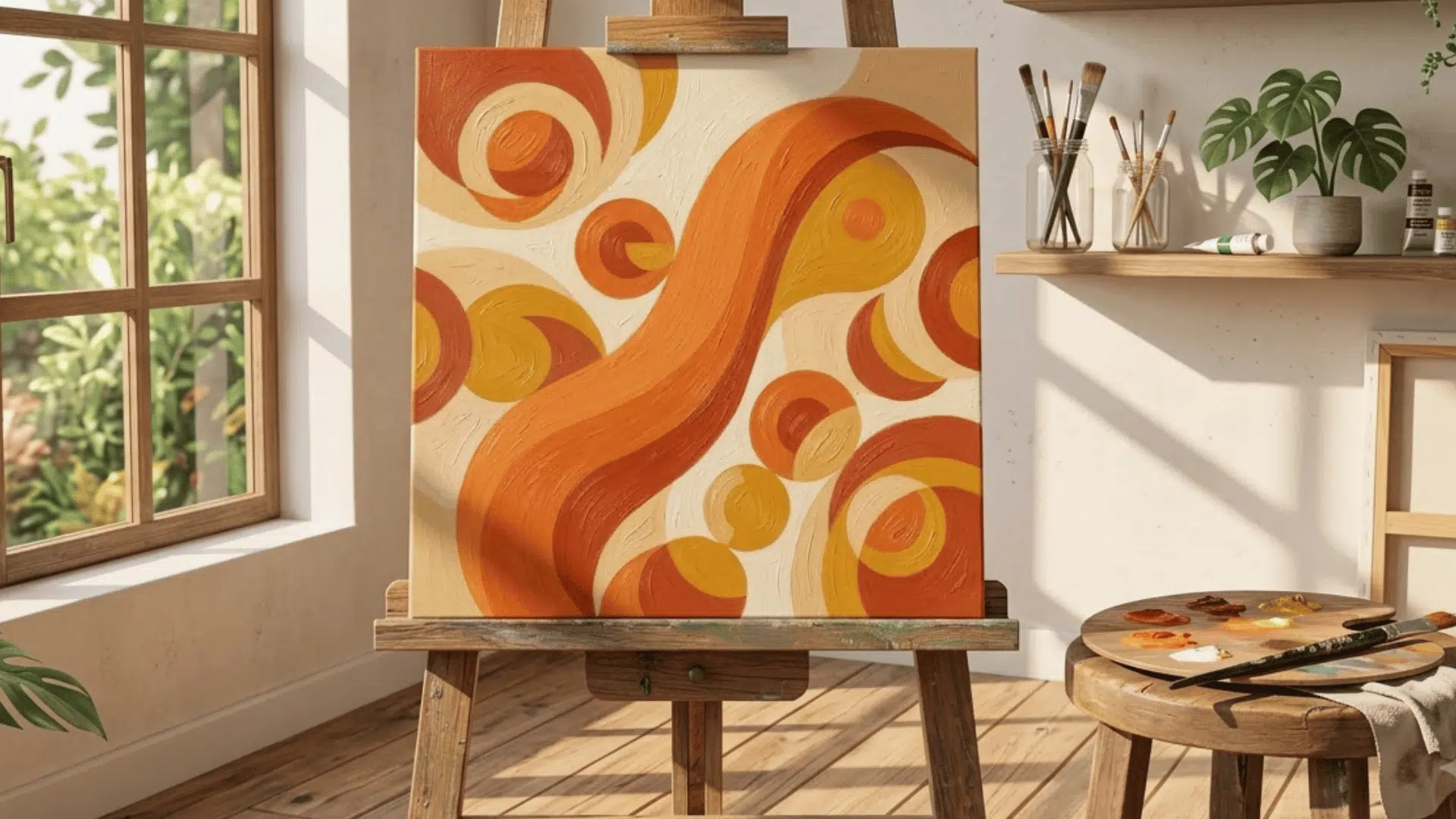
Colors can feel calm and connected or bold and attention-grabbing depending on how they are paired. Analogous colors create the first effect by pairing closely related hues.
This color relationship plays an important role in color theory because it helps create harmony, consistency, and a natural visual flow.
This blog introduces you to it, its types, and its significance. Making it easier to see why some combinations feel smooth while others feel energetic and striking.
What are Analogous Colors?
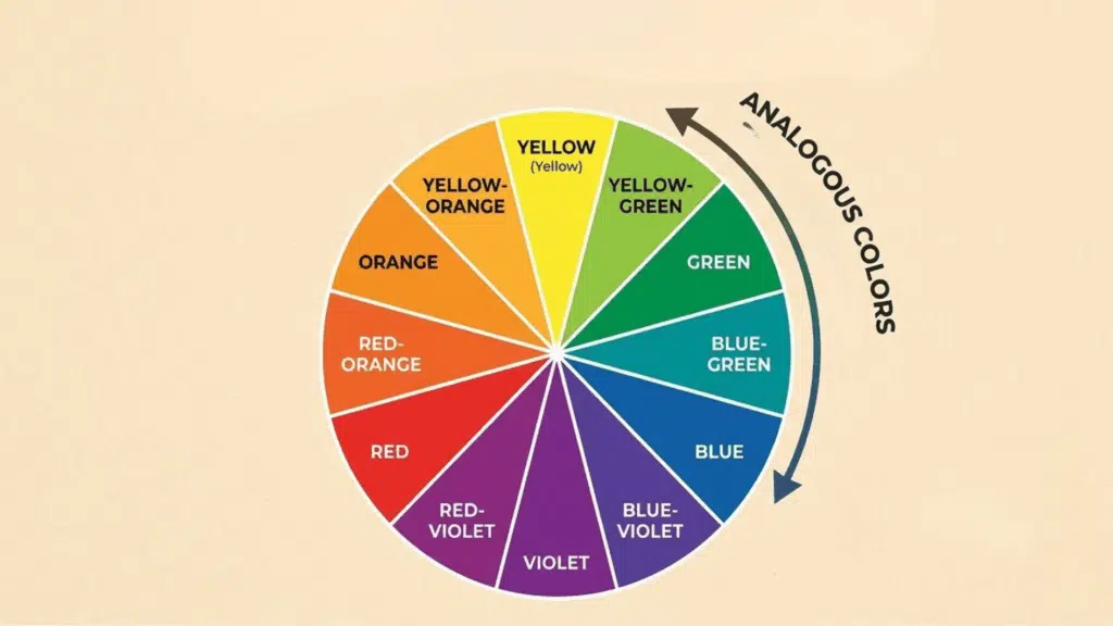
They are a group of colors that sit next to each other on the color wheel, typically three to five hues in a row. They’re neighbors and get along.
What makes them work is that they share undertones, a relationship that becomes clearer once you understand the primary-color color wheel they all branch out from.
The term “analogous” comes from the idea of similarity and correspondence. In color, it refers specifically to that side-by-side relationship on the wheel.
That shared quality is what gives any palette built around them an instant sense of cohesion. There’s no jarring contrast, no color fighting for attention, just a smooth, easy flow from one hue to the next.
Types of Analogous Colors
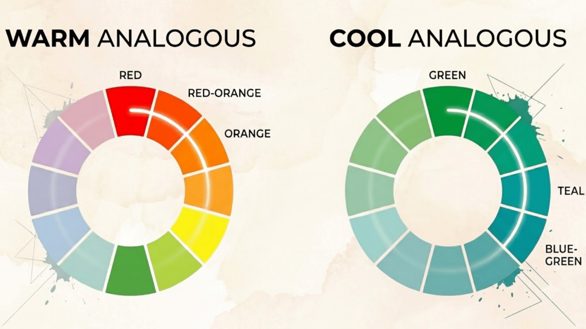
Not all analogous palettes feel the same. The mood shifts depending on which part of the color wheel you’re working with. Here are the three main types:
| Aspects | Warm Analogous | Cool Analogous |
|---|---|---|
| Colors | Reds, oranges, and yellows | Blues, greens, and blue-greens |
| Mood | Energetic, inviting, and grounded without being aggressive | Calm, clean, and settled |
| Key Trait | Attention-grabbing without being loud | Makes rooms feel larger and more airy |
| Association | Food, warmth, and comfort | Water, nature, and open space |
| Best For | Spaces and designs that need to feel welcoming | Brands and spaces that want to communicate trust, clarity, and calm |
| Common Industries | Restaurants, bakeries, and lifestyle brands | Healthcare, tech, and finance brands |
Analogous Color Scheme Ideas
Not all analogous palettes feel the same. The mood shifts depending on which section of the color wheel you’re working with.
Reds, Oranges, and Yellows
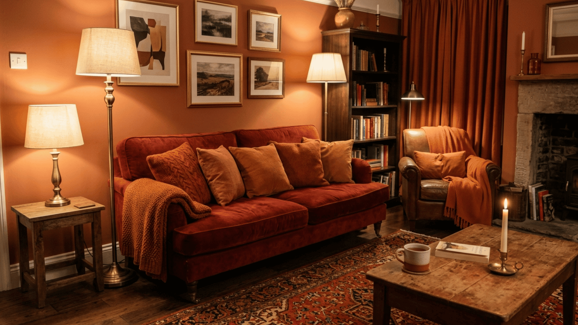
Reds, oranges, and yellows carry the warmth of autumn leaves and the energy of a sun-drenched afternoon.
This combination is one of the most instinctively welcoming palettes in color theory, and it’s the exact palette broken down in this guide to warm sunset color mixing.
It’s the palette you’ll find in restaurants, bakeries, and living rooms designed to draw people in. If you want a space to feel generous and full of life, this is where you start.
Blues, Greens, and Blue-Greens
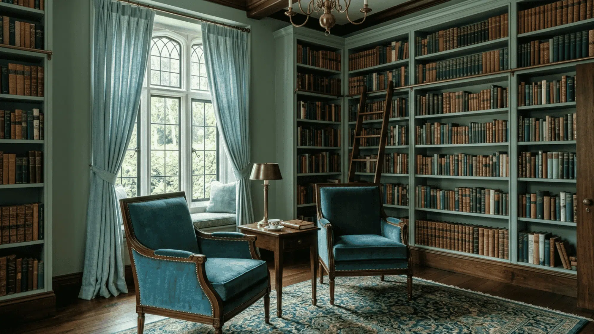
Blues, greens, and blue-greens together create a palette that feels like a deep breath.
There’s a quiet openness to it that few other combinations can match, and this walkthrough on mixing green paint colors breaks down exactly how those blue-green and yellow-green pairings come together.
It’s the palette that makes a room feel larger, and a brand feel more trustworthy. Healthcare, tech, and wellness spaces reach for it because it communicates calm without saying a word.
Beiges, Taupes, and Warm Whites
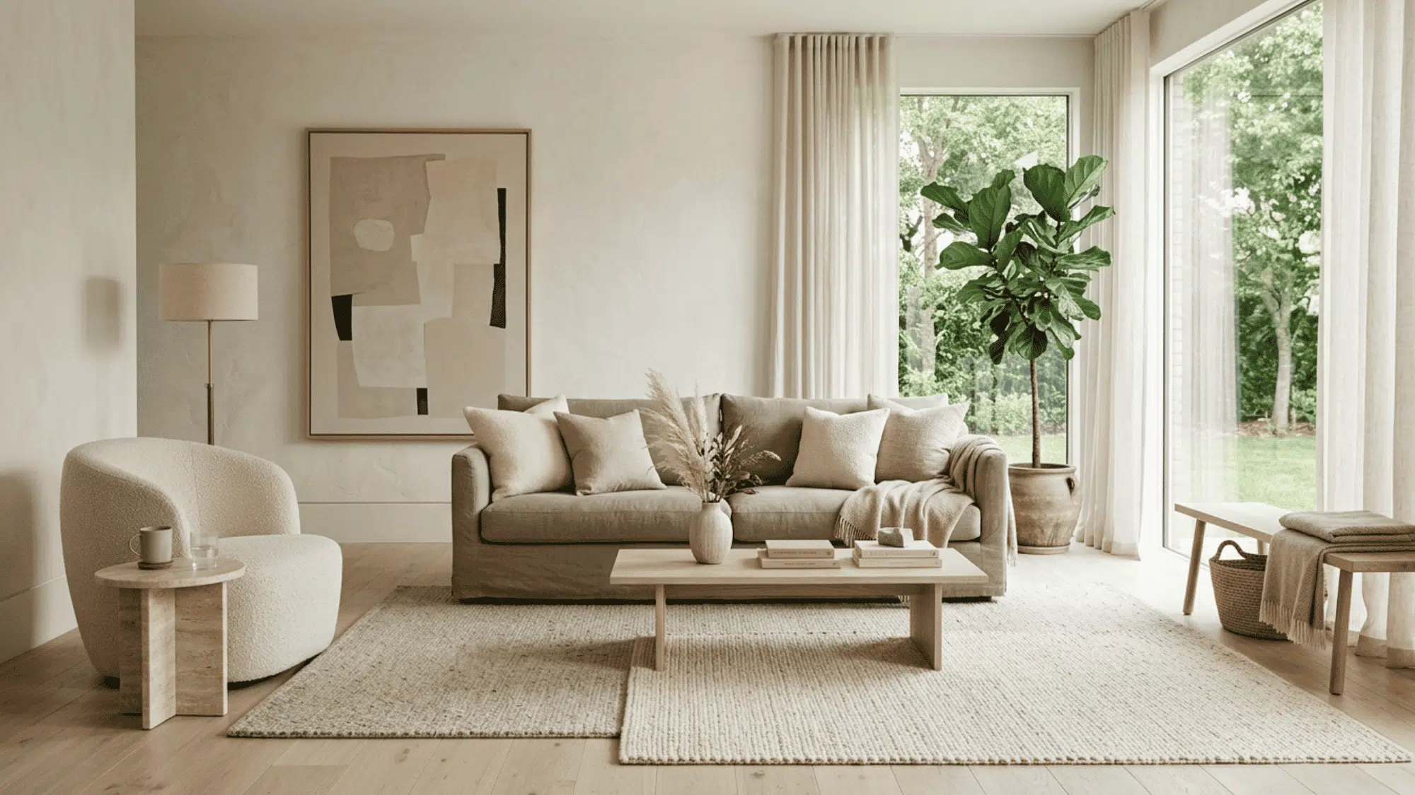
Beiges, taupes, and warm whites work through restraint. This palette lets texture and light do the heavy lifting while the colors hold everything together quietly.
It’s a favorite in minimalist interiors and luxury branding for good reason. Nothing competes, and yet the result never feels empty, just intentional and beautiful.
Yellows, Yellow-Greens, and Greens
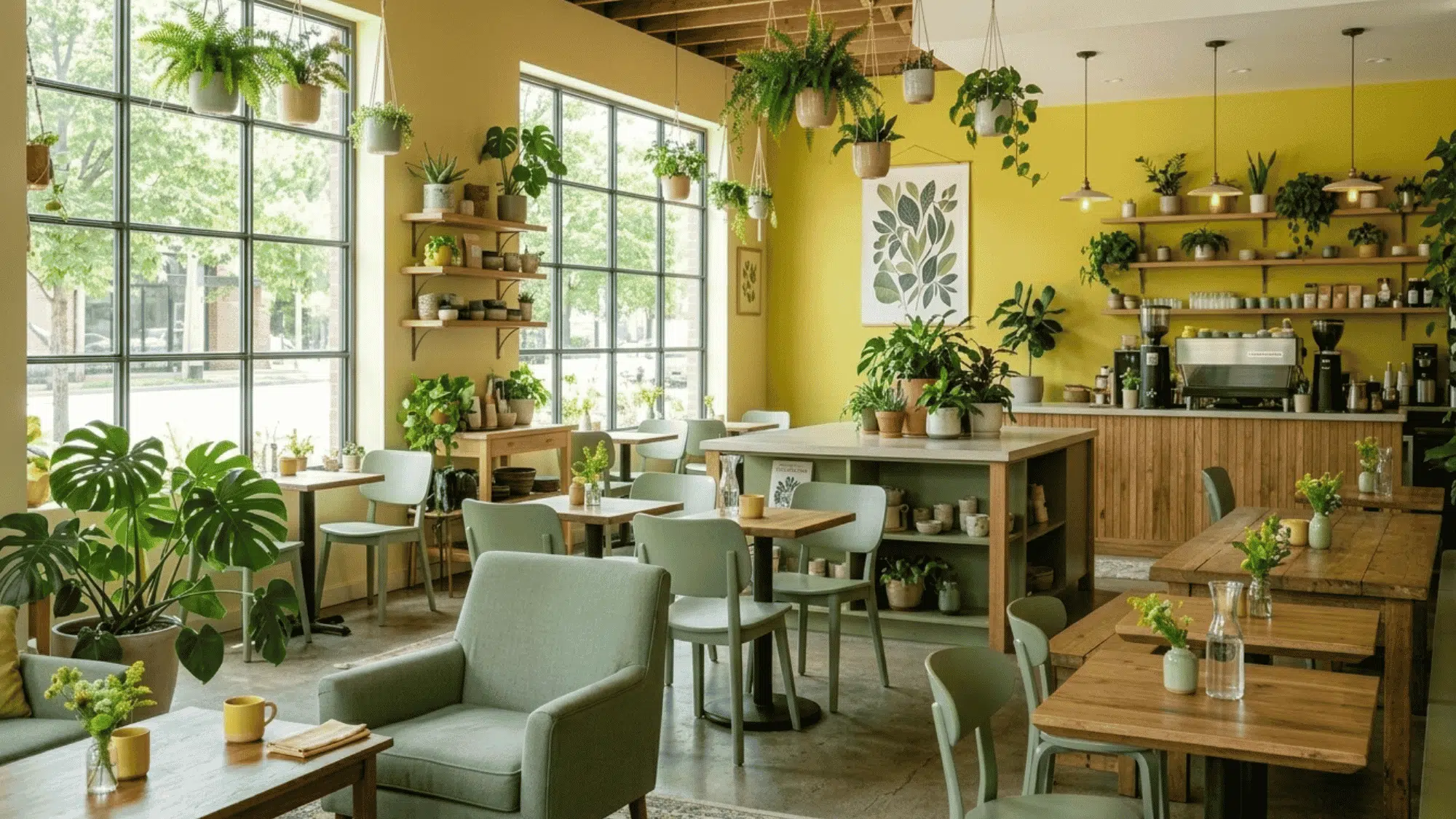
Yellows, yellow-greens, and greens sit right at the meeting point of warm and cool. This palette carries the brightness of sunlight and the freshness of new growth at the same time.
It’s a strong choice for spaces and brands connected to nature and wellness. The palette feels alive without being restless, grounded without feeling heavy.
Significance of Analogous Scheme in Color Theory
These colors matter because they show how closely related hues work together in a composition. They carry real weight in how one perceives and responds to visuals.
- Visual balance: Creates a unified look with little color tension.
- Mood control: Helps convey calm, warmth, freshness, or energy.
- Color temperature: Shows how warm and cool hues affect perception.
- Natural eye movement: Leads the viewer smoothly across a composition.
- Simpler palettes: Keeps color choices focused and easier to manage.
- Practical application: Commonly used in art, branding, interiors, and illustration.
The Psychology Behind Analogous Colors
Color doesn’t just look a certain way; it feels a certain way. Analogous palettes are particularly consistent in the responses they trigger, which is a big part of why they’re so widely used.
Sense of Calm and Low Visual Tension
Since these hues don’t compete, they create a low-tension visual environment. Your eye isn’t being pulled in different directions, and that ease registers as calm.
It’s why cool analogous palettes show up in spas, hospitals, and meditation apps. The color settles the space before anything else does.
A Feeling of Cohesion and Intent
A palette where every color feels related signals careful decision-making. Nothing looks randomly chosen, and that consistency builds a quiet sense of trust.
In branding especially, this matters. A cohesive analogous palette tells the viewer that someone thought carefully about every decision.
A Connection to the Natural World
We’ve been looking at analogous color progressions in nature our whole lives: sunsets, forests, oceans. Those palettes feel instinctively right rather than constructed.
It’s not something most people can explain, but they feel it immediately. That’s the psychological weight of a color scheme that mirrors what we already know.
Color Harmony Around You
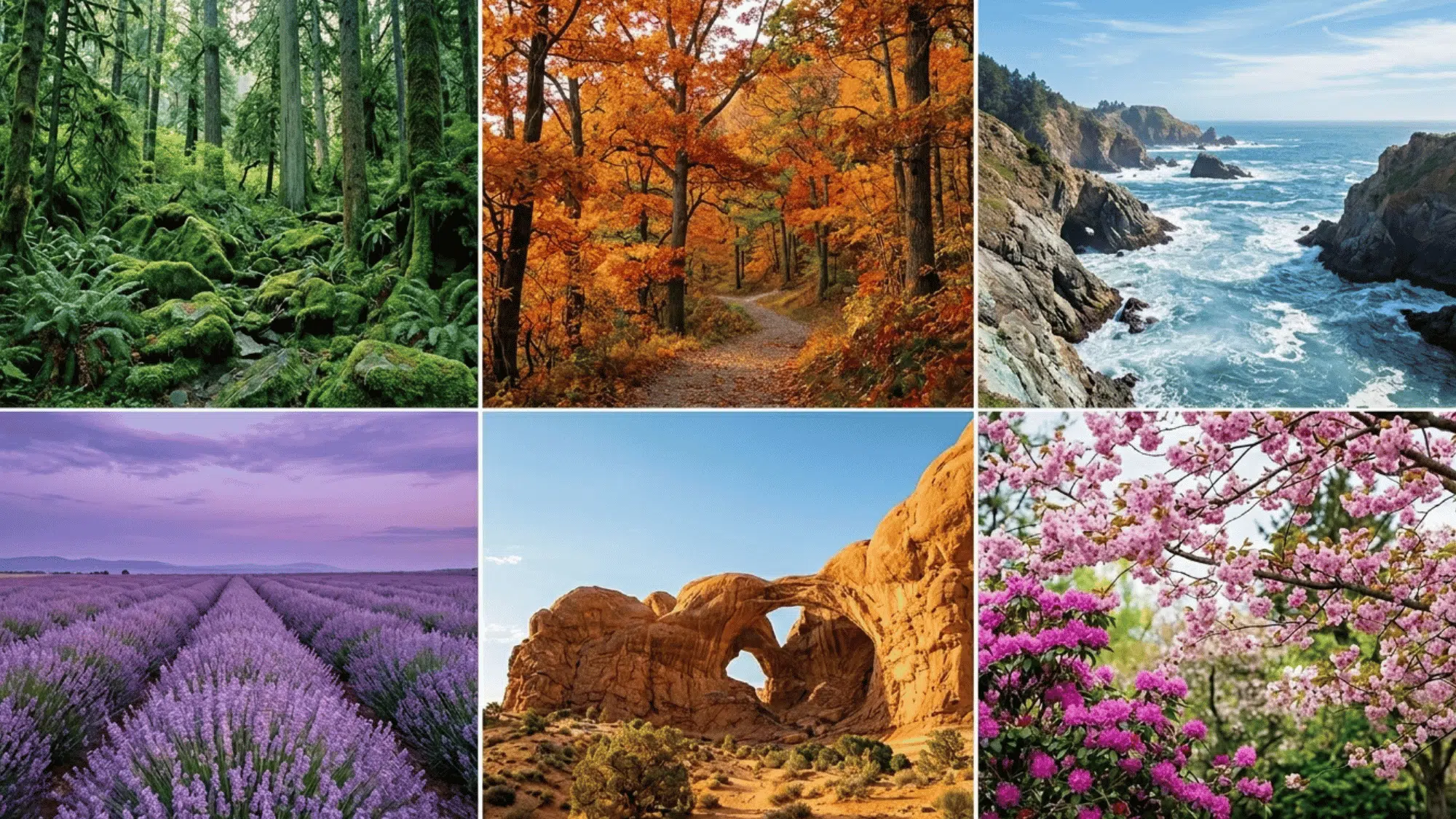
You’ve been looking at analogous color schemes your whole life without realizing it. A sunset moving from deep orange to soft pink to lavender. The ocean shifts from turquoise near the shore to deep cobalt further out.
A forest floor in autumn: burnt sienna, amber, golden yellow, all living together without a single clash.
Our eyes are wired to find this kind of progression restful and pleasing, which is a big part of why analogous palettes feel so right even before you know the theory behind them.
Analogous Colors vs. Complementary Colors: What’s the Real Difference?
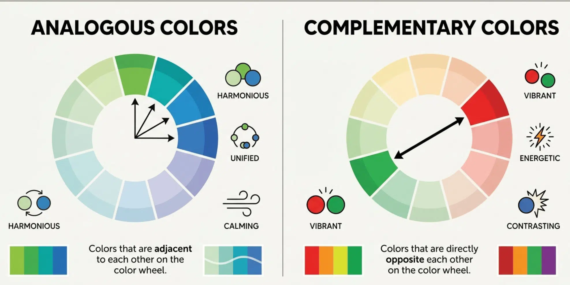
Complementary colors are the opposite of analogous, literally. They sit directly across from each other on the color wheel. Red and green. Blue and orange.
Here is a clean way to think about it:
| Criteria | Analogous | Complementary |
|---|---|---|
| Position on the wheel | Side by side | Directly opposite |
| Visual effect | Harmony, flow, calm | Contrast, tension, pop |
| Best used for | Backgrounds, mood, cohesion | Accents, highlights, emphasis |
| Real-world example | A spa interior in sage, mint, and soft teal | A red “Buy Now” button on a green page |
| Risk if overused | Can feel flat or low contrast | Can feel overwhelming or garish |
That contrast principle shows up directly in this breakdown of the pointillism color placement technique, where complementary dots placed side by side read as more vibrant than the same colors physically mixed together.
Wrapping It Up
This is not a complicated concept once you have spent a little time with them. They are just colors that belong together, and now you have the language and the eye to recognize why.
The next time you’re putting together a palette, decorating a space, or even just noticing why a brand feels a certain way, trust what you see.
It doesn’t have to feel like a rulebook. Analogous colors are proof that the most effective palettes are often the simplest ones, and if purples ever enter your palette, this guide to mixing purple paint shades covers how to keep them from turning muddy.
Frequently Asked Questions
Can Analogous Color Scheme Work on A Black or Dark Background?
Yes. Vary the saturation of your chosen hues so they don’t blend into each other, and the palette will hold up well against a dark background.
What Is the 60-30-10 Rule in Analogous Color Schemes?
60% dominant color, 30% supporting color, 10% accent. It keeps the palette feeling balanced without any one color taking over.
How Is an Analogous Color Scheme Different from A Monochromatic One?
Monochromatic uses shades and tints of a single color. Analogous uses multiple neighboring colors on the wheel.
Can Analogous Hues Be Used in Digital Design and UI?
Yes, and they are widely used. Cool analogous palettes are especially popular in UI design because they’re easy on the eye.
Are Analogous Shades Suitable for Logos?
They work well for brands in wellness, nature, or lifestyle spaces. A cohesive analogous palette signals consistency and calm.