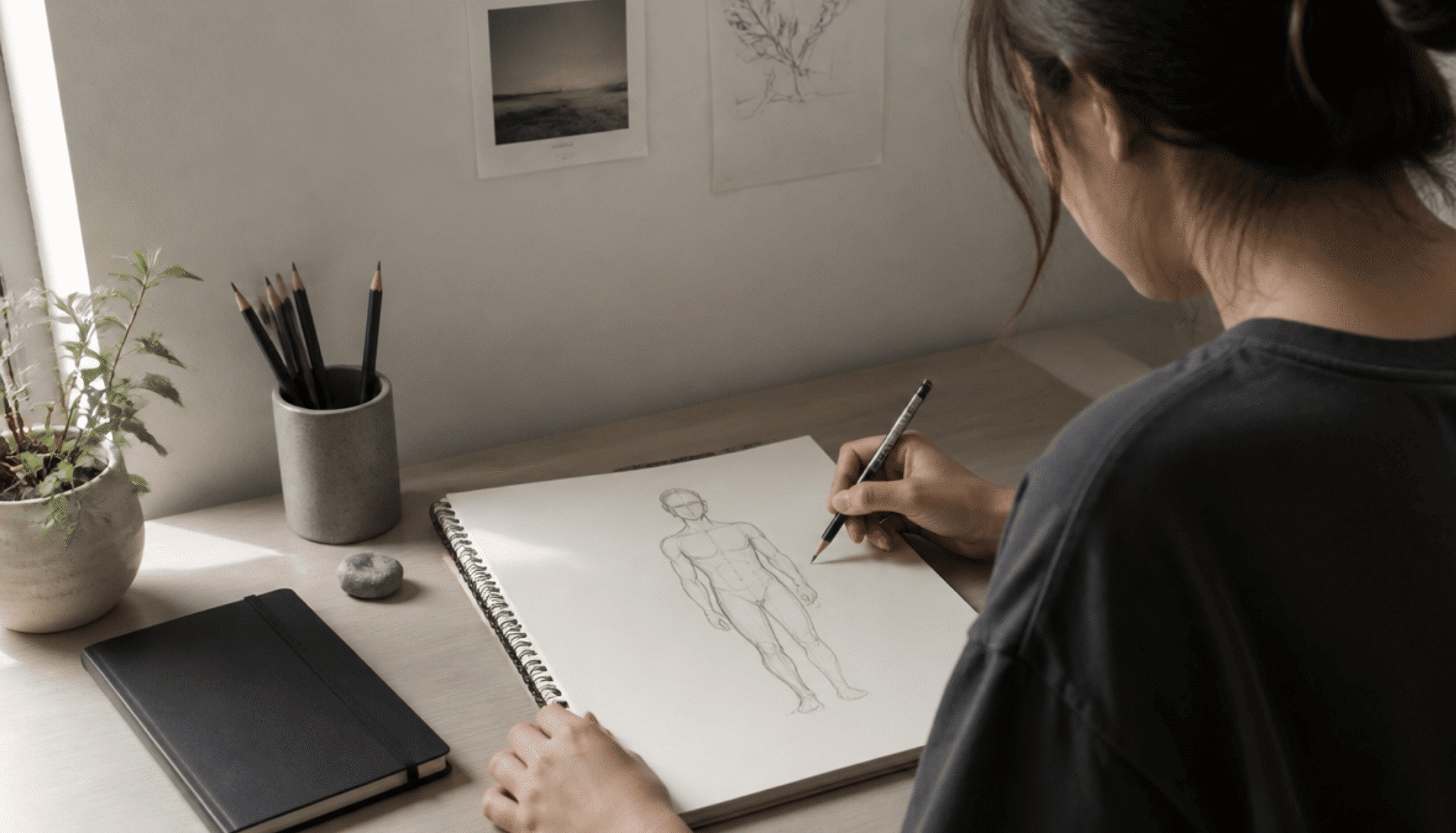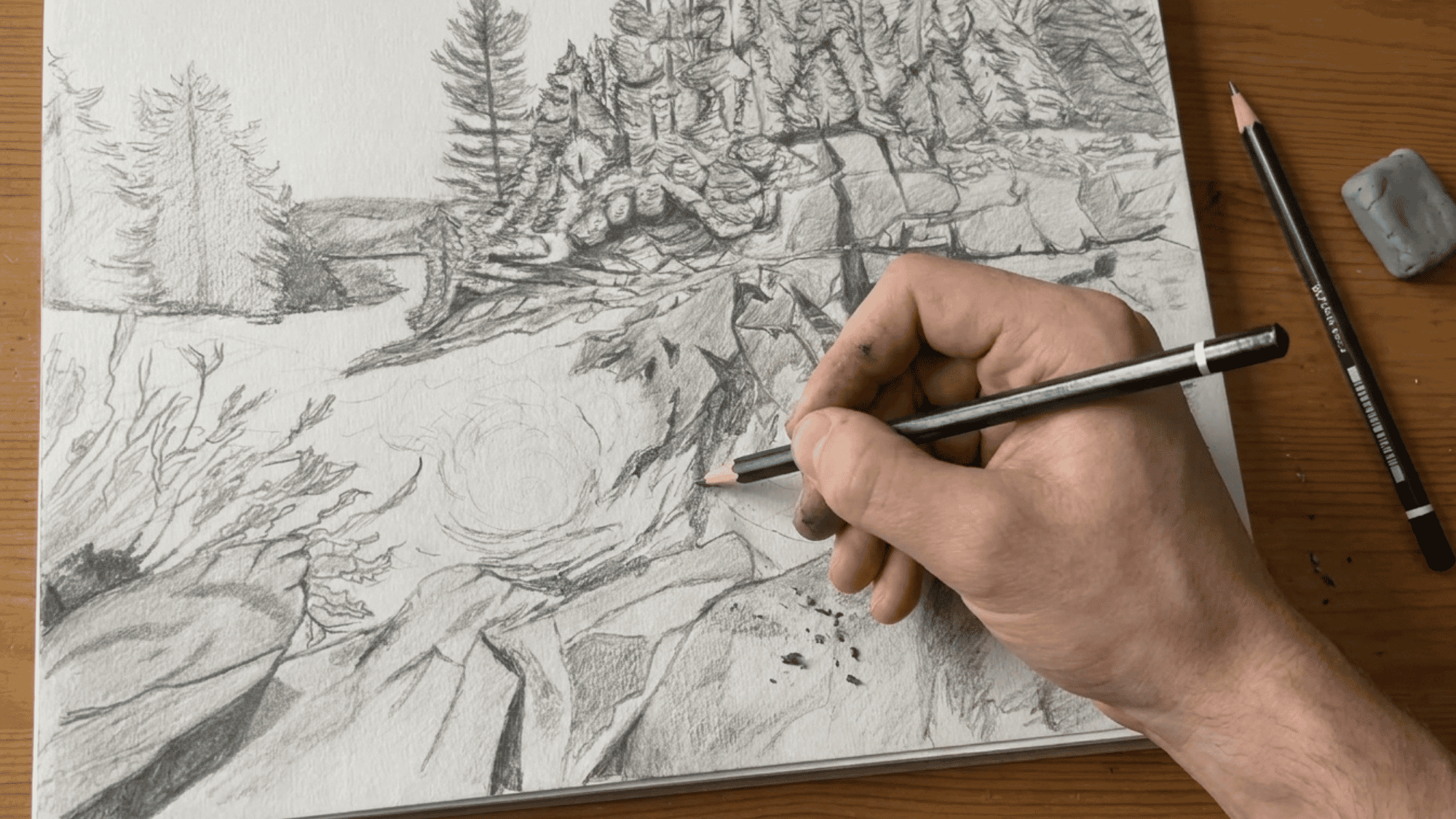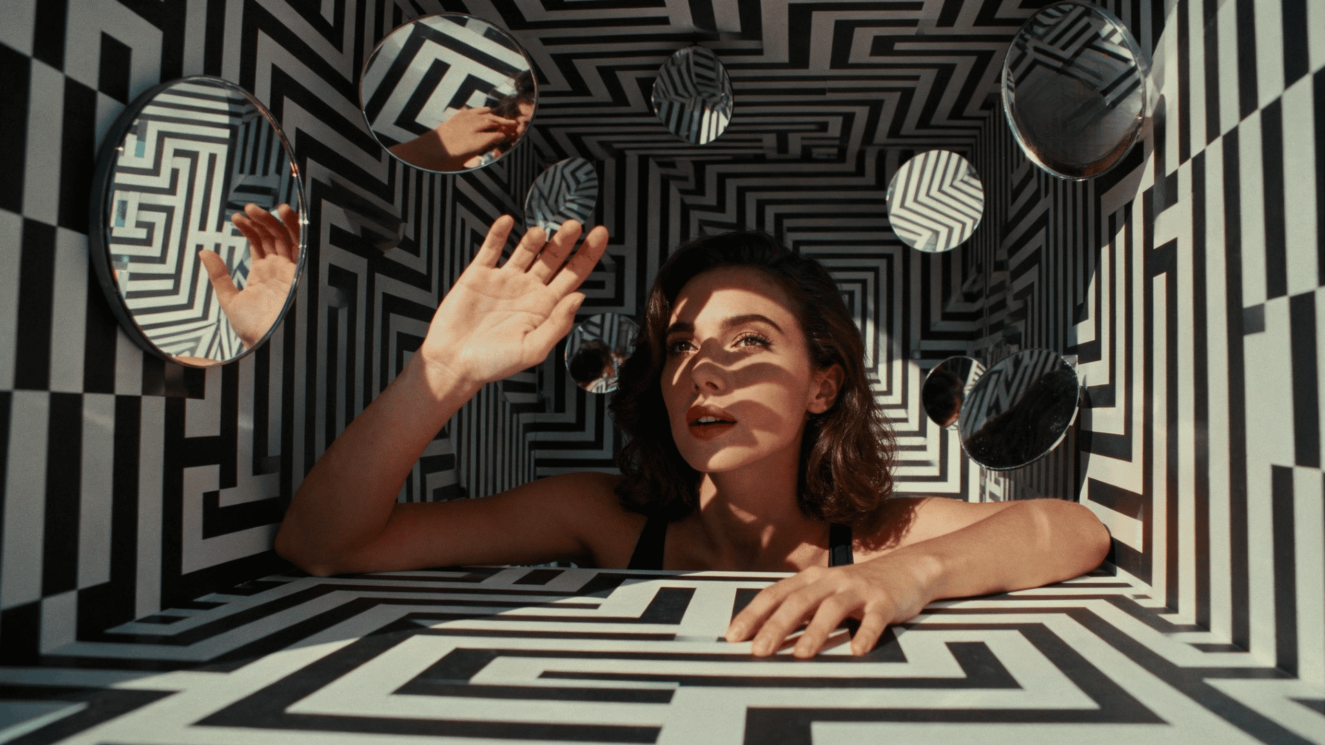
An artwork can have gorgeous colors, a compelling subject, and careful details, yet still feel like something is missing.
Most of the time, the problem is not what you painted. It is where you put it. Some artists figure this out by instinct; most spend years wondering why certain pieces click, and others do not.
There is a reason behind that feeling, and it is more learnable.
This guide breaks down types of composition in art, so you can stop second-guessing your layouts and start making deliberate choices that actually hold the viewer’s attention.
What is Composition in Art?
Composition in art is the arrangement of visual elements within an artwork.
This includes where you place the subject, how much space you leave around it, how shapes relate to one another, and how the viewer’s eye travels through the piece.
In simple terms, composition is the structure behind the artwork. It connects elements such as line, shape, color, value, texture, and space so they work together rather than feeling separate.
A strong arrangement helps an artwork feel intentional. It can create calm, tension, drama, movement, or balance depending on how the elements are placed.
Key Characteristics of Good Composition
A strong composition usually comes from several visual choices working together. These include:
- Focal Point: The main area that draws the viewer’s attention first and gives the artwork clarity.
- Visual Balance: The visual “weight” feels stable, even when both sides are not symmetrical.
- Unity and Cohesion: The elements feel connected instead of scattered or out of place.
- Movement and Flow: Lines, shapes, contrast, or color guide the viewer’s eye through the artwork.
- Use of Space: Empty areas are planned carefully so the subject has room to breathe and the image does not feel cluttered.
Types of Composition in Art
Different composition types give artists practical ways to arrange a subject, control attention, and make an artwork feel more complete.
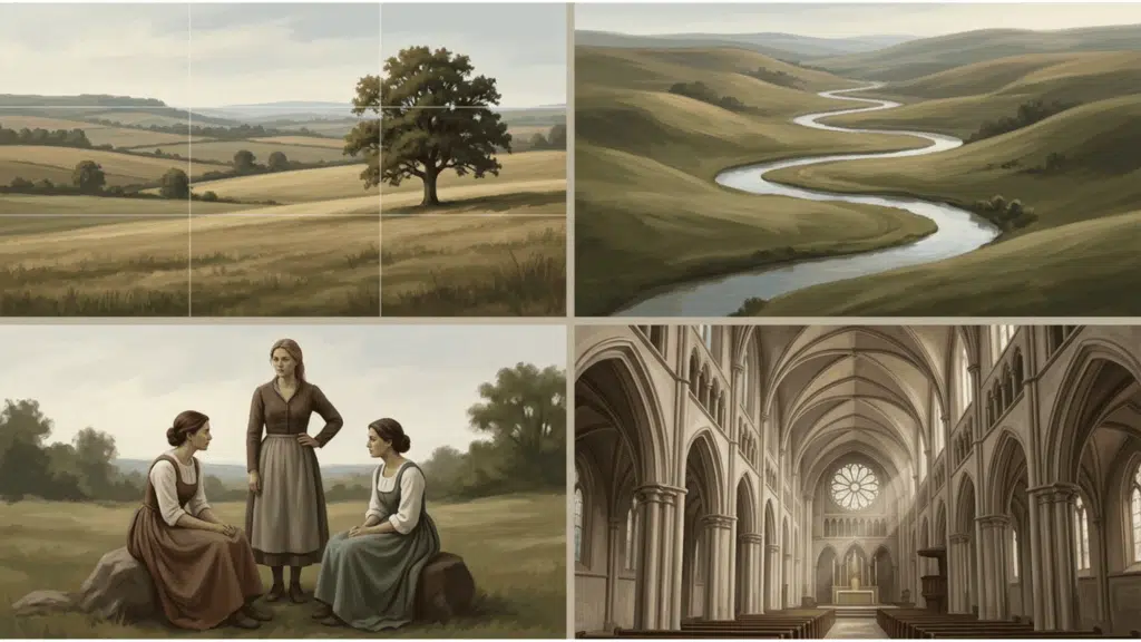
1. The Rule of Thirds
The rule of thirds divides the image into nine equal sections using two vertical and two horizontal lines.
Placing the main subject near these lines or where they meet often creates a more natural and pleasing layout.
This structure is useful when you want balance without making the image feel too centered. It works especially well in landscapes, portraits, photography, and illustration.
2. Symmetrical Balance Scale
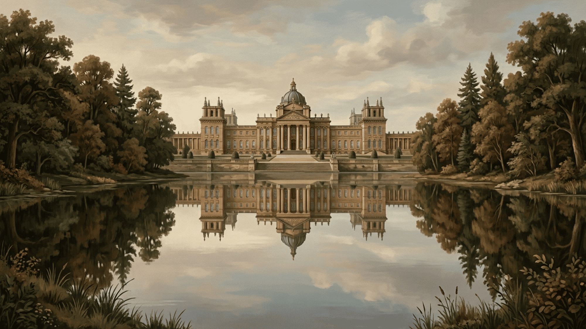
Symmetrical balance places similar visual weight on both sides of the image.
The result often feels calm, formal, stable, and organized. This art composition works well for architecture, portraits, spiritual imagery, and scenes where you want a sense of order.
For a deeper understanding of how visual weight works across all types of balance, symmetrical, asymmetrical, and radial principles of design break it down clearly with visual examples.
3. The Steelyard

The steelyard places a large visual weight on one side and balances it with a smaller but stronger element on the other.
For example, a large pale shape may be balanced by a small dark figure.
This approach creates interest because the balance is uneven but still controlled. It is useful when you want an active layout without making the image feel chaotic.
4. The Pyramid or Triangle Composition
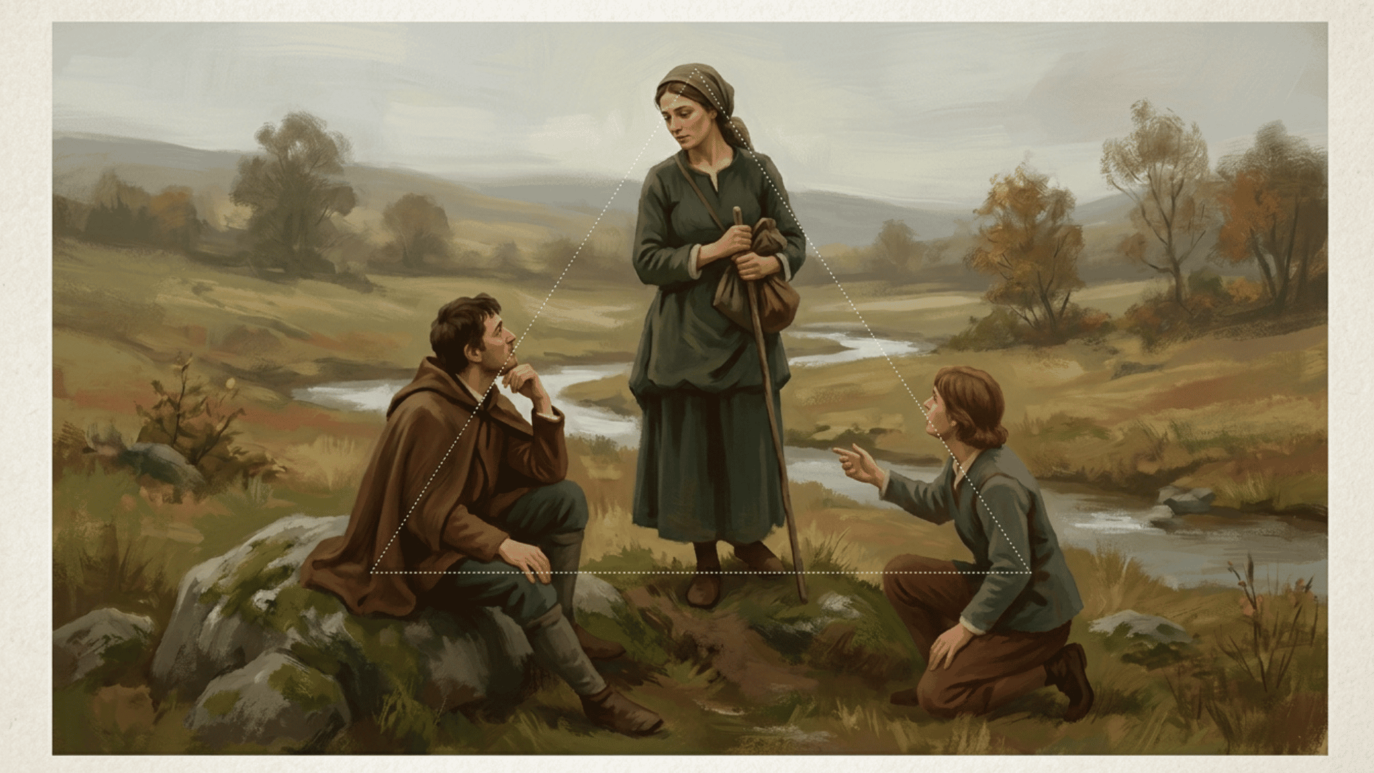
The pyramid structure arranges elements in a triangular shape. This creates strength, stability, and a clear visual hierarchy.
The viewer’s eye often moves from the base of the triangle up toward the main subject. This type is common in classical painting because it feels grounded and powerful.
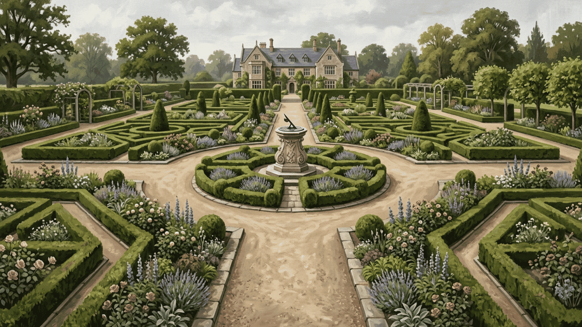
5. The Circle or O Composition
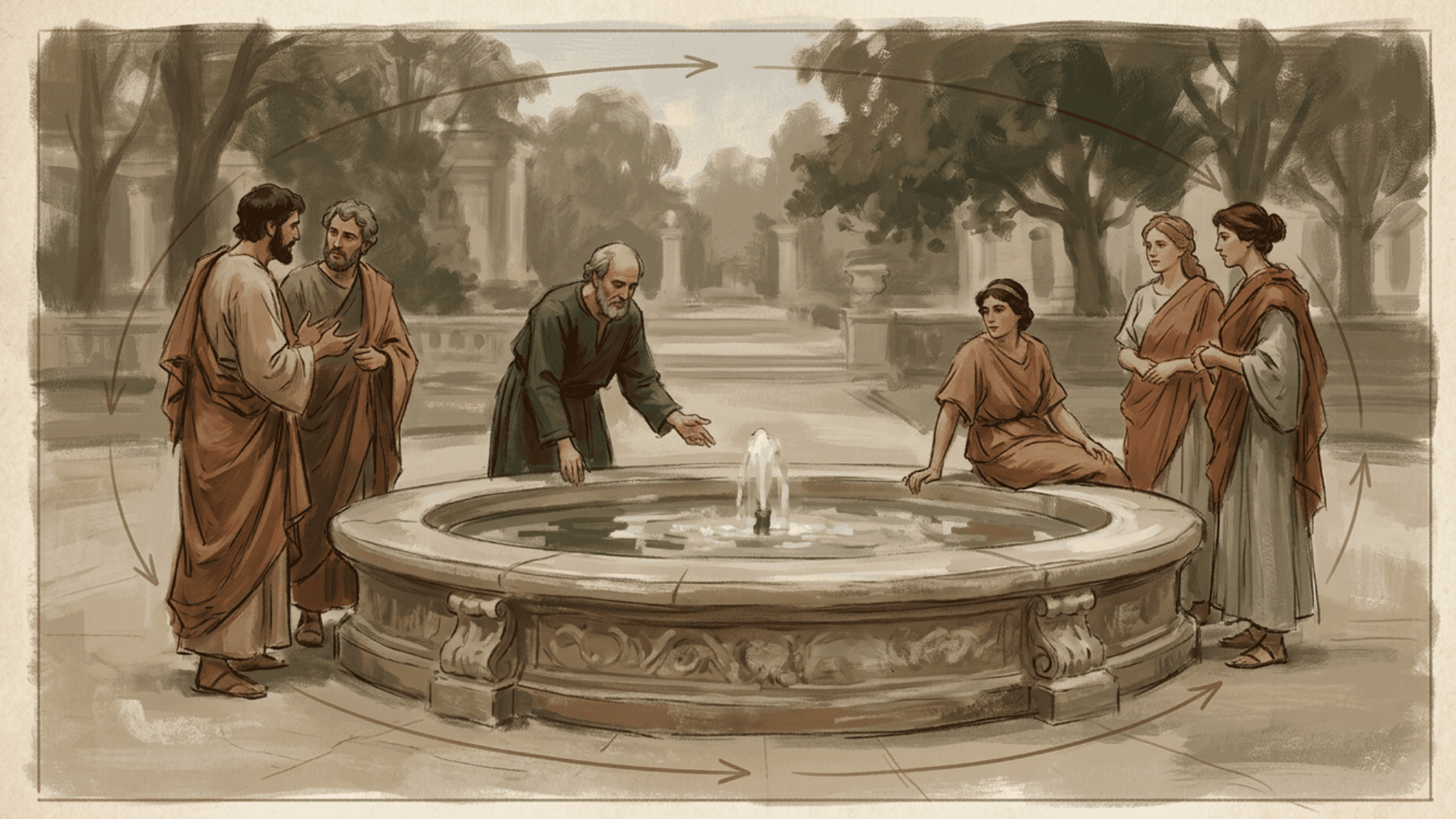
A circular layout places the main elements around an implied circle or oval. This keeps the viewer’s eye moving within the artwork instead of drifting away.
It can create unity, softness, and a sense of completion. This structure works well for group scenes, portraits, still life, and intimate emotional moments.
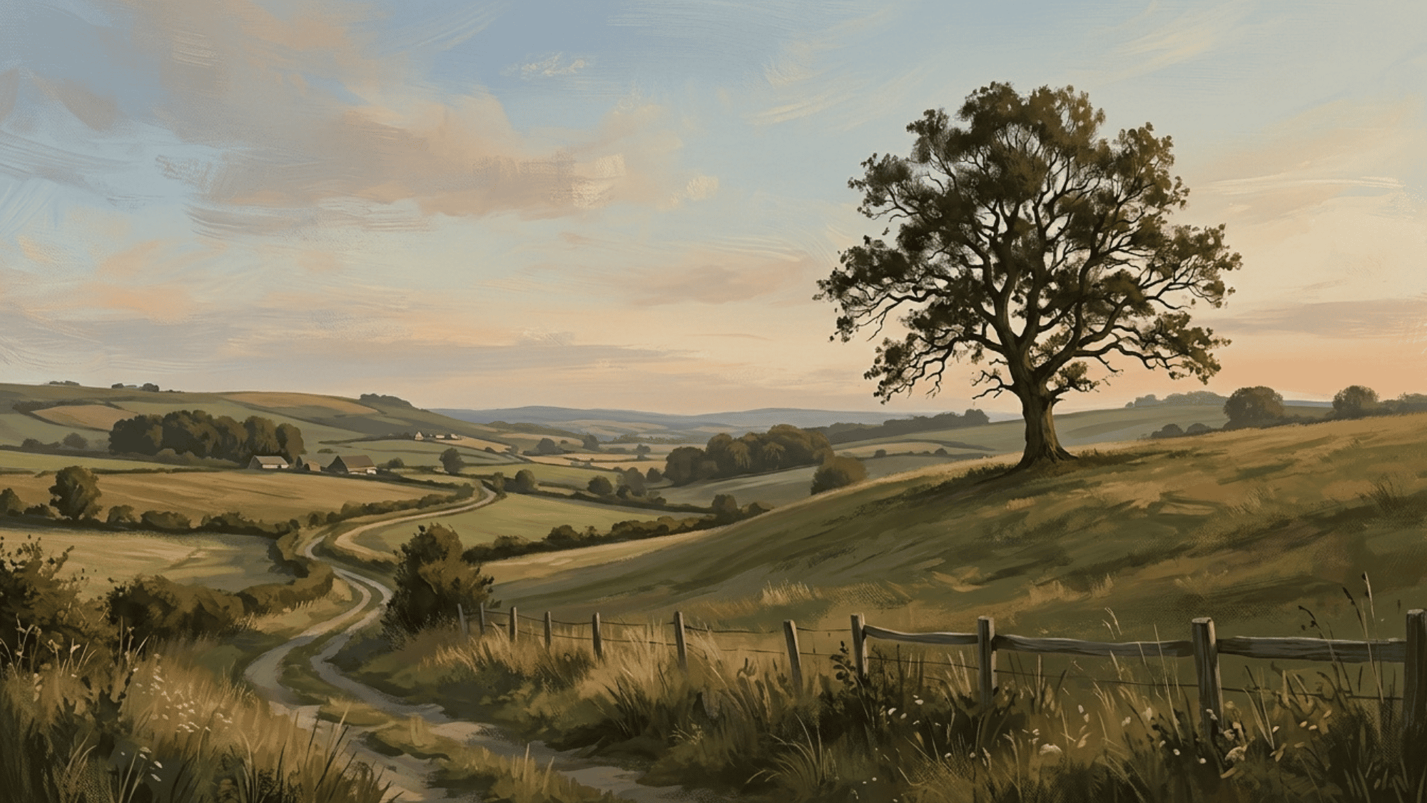
6. The S-Curve or Compound Curve

The S-curve uses a flowing curved path to lead the eye through the image. It often feels graceful, natural, and flowing.
You may see this structure in winding rivers, roads, fabric folds, or the pose of a figure. It is especially helpful when you want movement without harshness.
7. Diagonal Composition

Diagonal layouts use slanted lines or angled placement to create a sense of energy. They can make a scene feel active, dramatic, unstable, or fast-moving.
This type works well for action scenes, city views, battle scenes, and expressive figure work. Even a simple diagonal shadow can make an image feel more alive.
8. The Radiating Line Composition
Radiating lines spread outward from a central point. They naturally draw attention to the point where the lines meet.
This is useful when you want to create drama, focus, or a strong sense of depth. Sunbeams, roads, architectural lines, and pointing gestures can all create this effect.
9. The L-Shape or Ell Composition
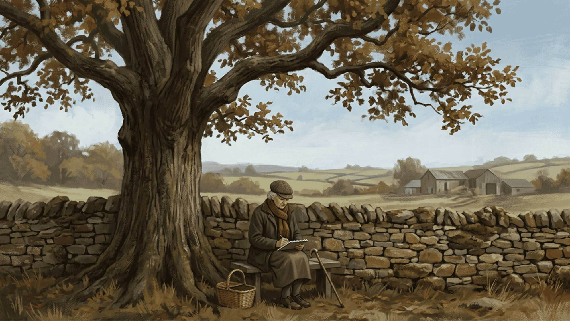
The L-shape uses a strong vertical and horizontal structure. This art composition creates a stable frame that supports the rest of the image.
It is often used to lead the eye inward while keeping the design grounded. You might see it in interiors, windows, trees, walls, or seated figures.
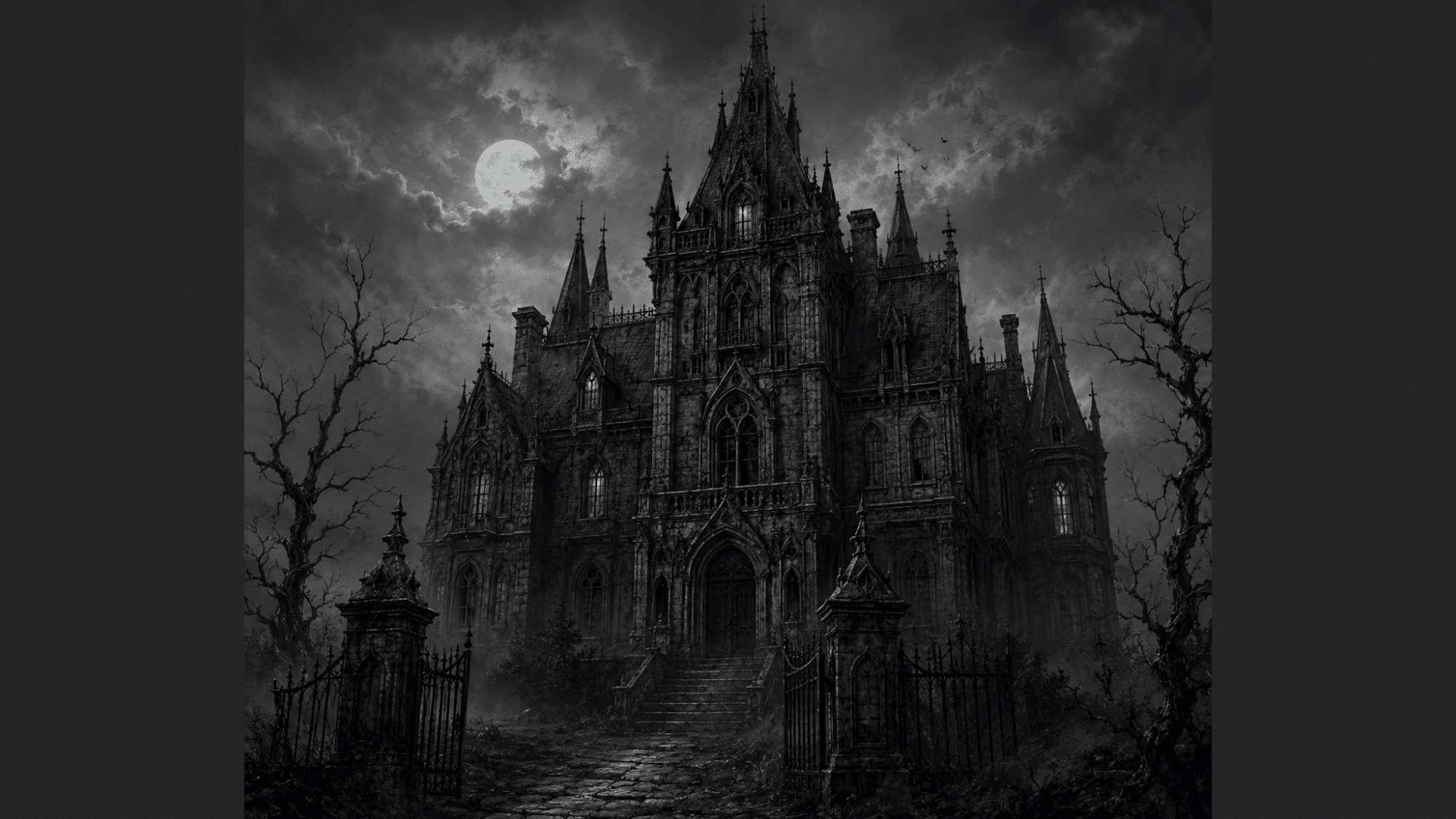
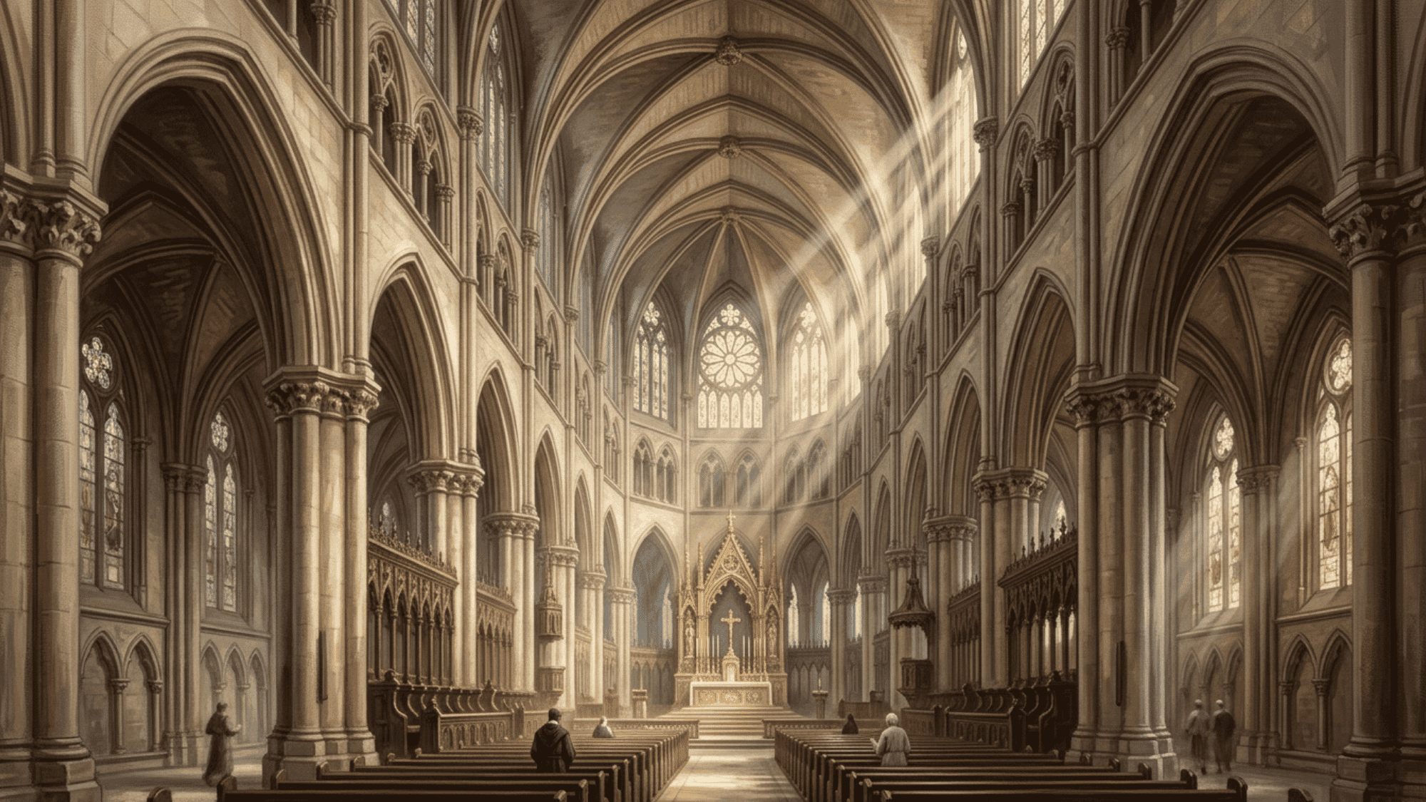
10. The Tunnel Composition

The tunnel structure frames the subject through surrounding shapes. The viewer feels as if they are looking through an opening toward the focal area.
This can create depth, mystery, and a strong sense of direction. Doorways, arches, trees, caves, and shadows are common elements in this type.
11. The Cross Composition
The cross structure uses strong vertical and horizontal lines that intersect. This creates a clear focal point and a sense of strength.
It can feel symbolic, calm, tense, or dramatic depending on the subject. This type works well when you want the image to feel direct and firmly structured.
12. The Suspended Steelyard
The suspended steelyard is similar to the regular steelyard, but the main weight appears to hang or float. This can create tension, softness, or a sense that something is about to shift.
It is useful for scenes that need visual balance but still feel light or unstable. Artists often use it when placing figures, clouds, hanging objects, or floating forms.
13. The Three-Spot Composition
The three-spot structure uses three main areas of interest. These spots create rhythm and help the viewer’s eye move around the artwork.
The three areas do not need to be equal in size. In fact, variety often makes the layout more interesting.
14. The Grouped Mass Composition
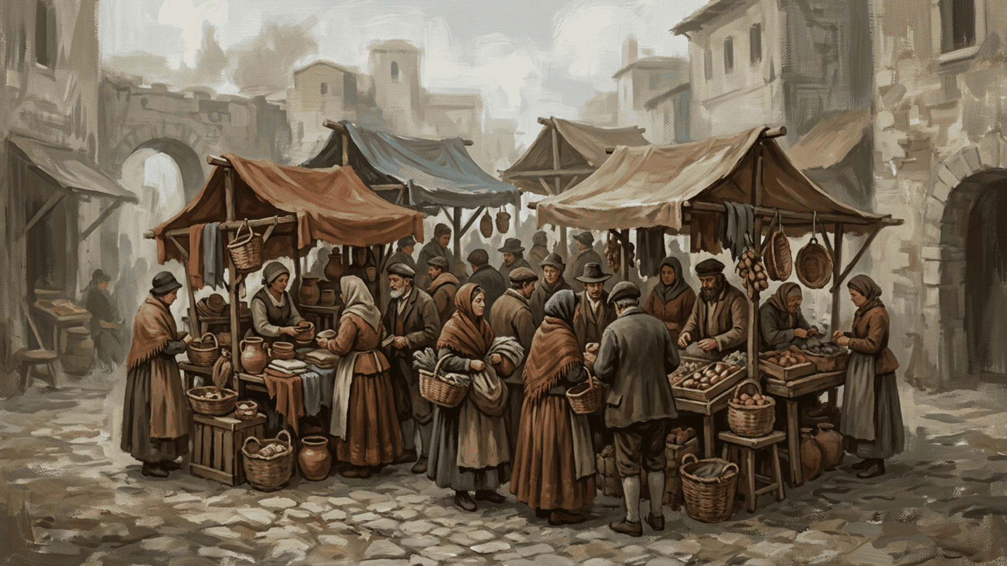
Grouped mass places several elements close together so they read as one larger shape. This art composition can make a busy subject feel simpler and easier to understand.
It is useful for crowds, trees, rocks, buildings, flowers, or still-life objects. By grouping details, you can create clarity without removing complexity.
15. The Silhouette Composition

A silhouette structure depends on the strong outer shape of the subject. If the image still reads clearly as a flat dark shape, the design is usually strong.
This is helpful for improving clarity, gesture, and impact. It works especially well in character design, posters, animation, and dramatic lighting.
16. The Pattern Composition
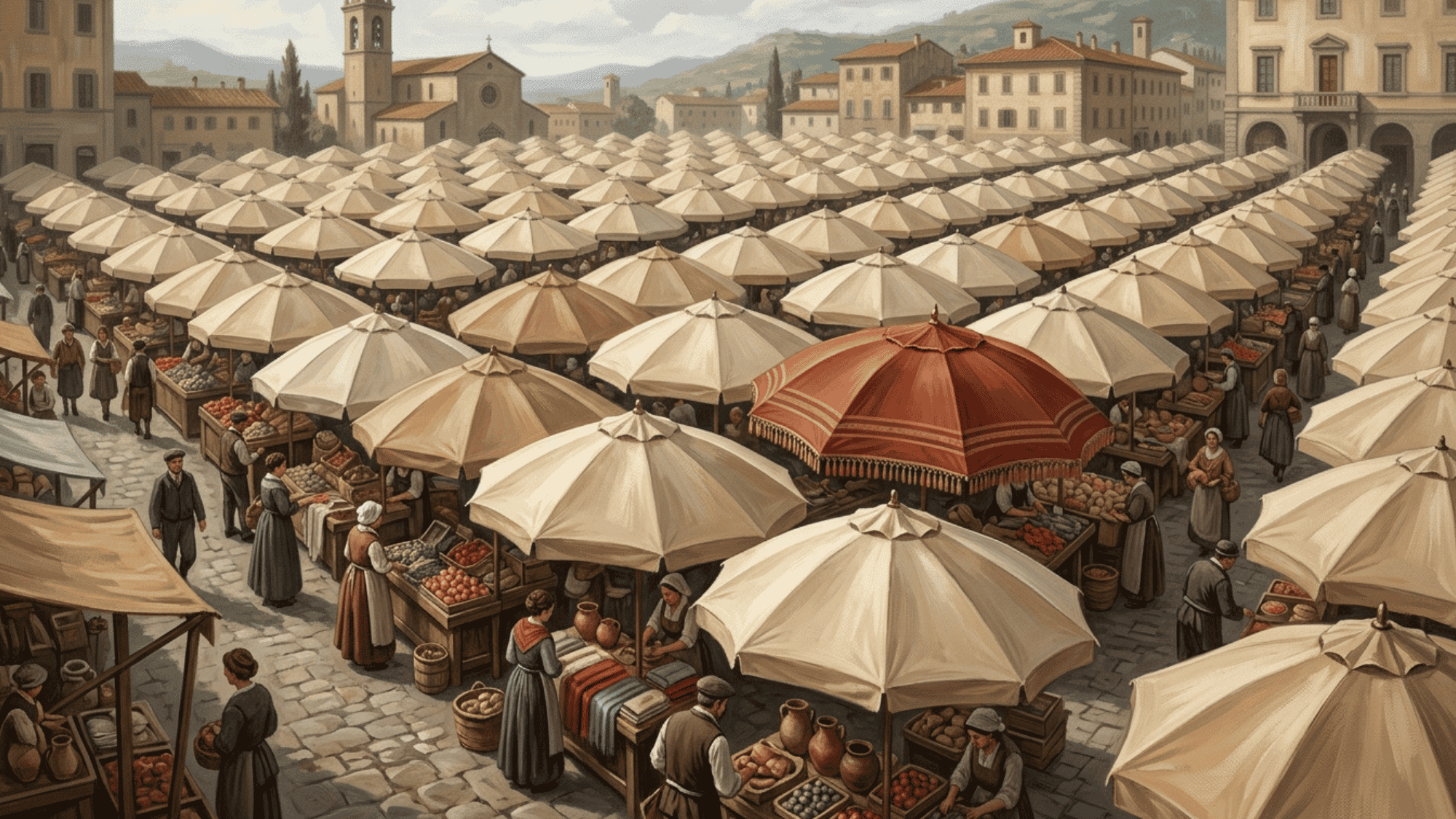
Pattern-based layouts use repetition to create rhythm and visual interest. Repeated shapes, colors, marks, or objects can make the artwork feel decorative, structured, or energetic.
The key is to include some variation. A break in the pattern can create a focal point and keep the design from feeling too predictable.
17. The Golden Ratio or Fibonacci Spiral
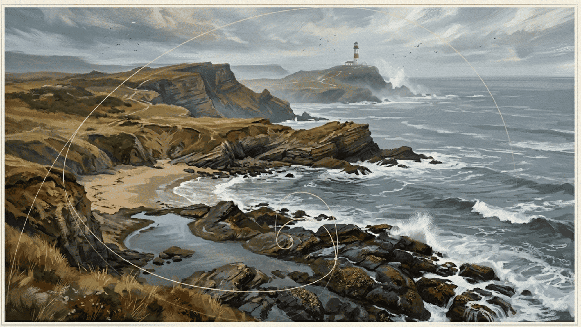
The golden ratio uses a spiral-like structure to guide the eye in a natural, flowing way. It is often associated with balance, beauty, and organic growth.
Artists may use it to place key elements along a curved path that gradually leads to the main subject. It can be subtle, but it is a helpful tool when you want a layout that feels both ordered and natural.
How to Use Composition Types in Your Own Art?
Knowing the structures is only half the work. Here is how to put them into practice:
- Sketch the Structure First: Rough out the layout as basic shapes before adding any detail. This prevents reworking a finished piece.
- Test It as a Silhouette: Flatten your layout into a single dark shape. If it still reads clearly, the foundation is solid.
- Combine Two Structures: An S-curve inside a tunnel or a pyramid within a circle can add depth without losing control.
- Use Contrast to Strengthen the Focal Point: Light against dark and large against small often do more work than placement alone.
- Try the Structure You Always Avoid: Stepping outside your usual layout builds more skill than repeating what already feels comfortable.
Putting it All Together
These types are not strict rules you must follow every time. Think of them as a troubleshooting toolkit you can return to when an artwork feels confusing, flat, too busy, or unfinished.
The more structures you understand, the easier it becomes to make intentional choices. You can use one type clearly, combine several, or start with a structure and then adjust it until the image feels right.
When you feel stuck, try a layout you do not usually use.
A small shift in placement, balance, or direction can change the entire feeling of a piece and help your work feel more confident.