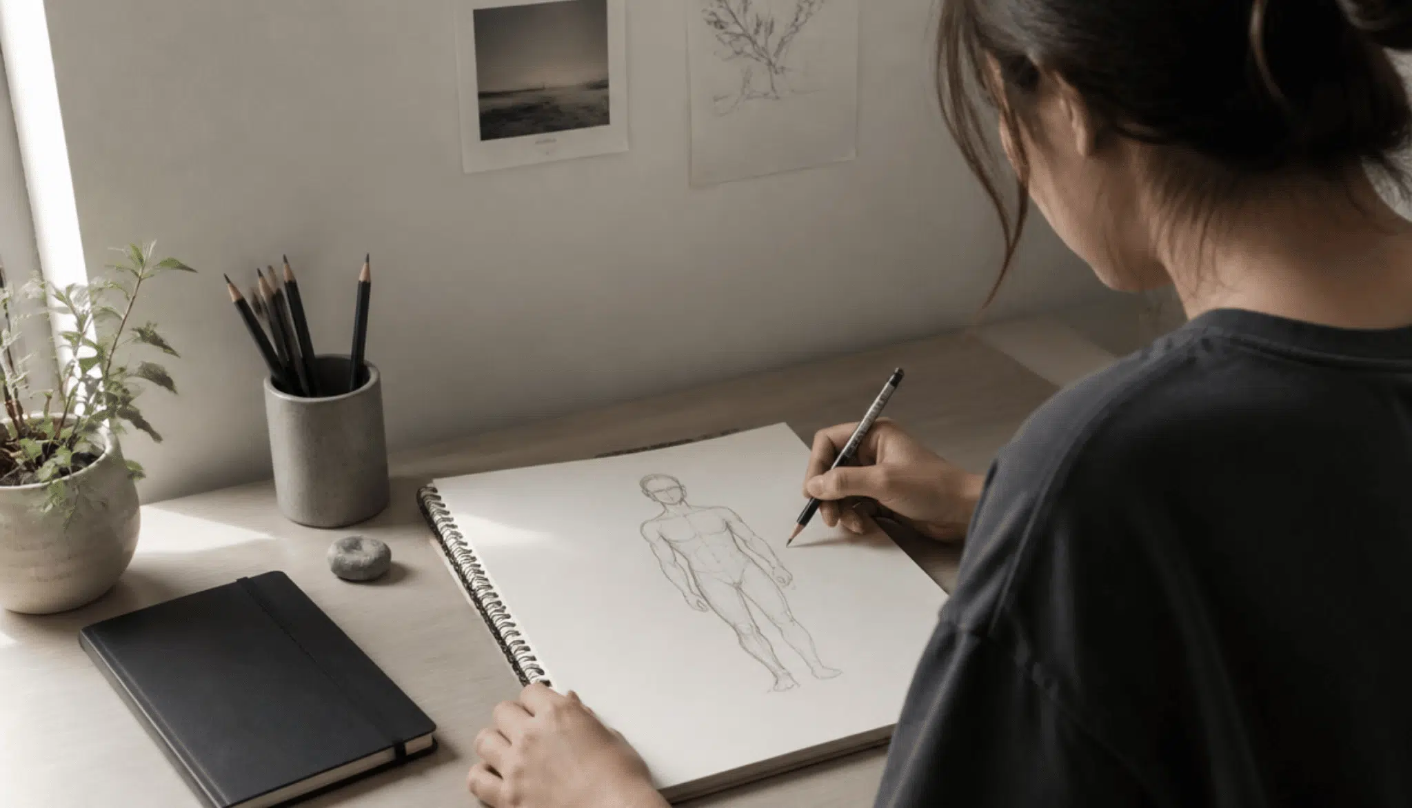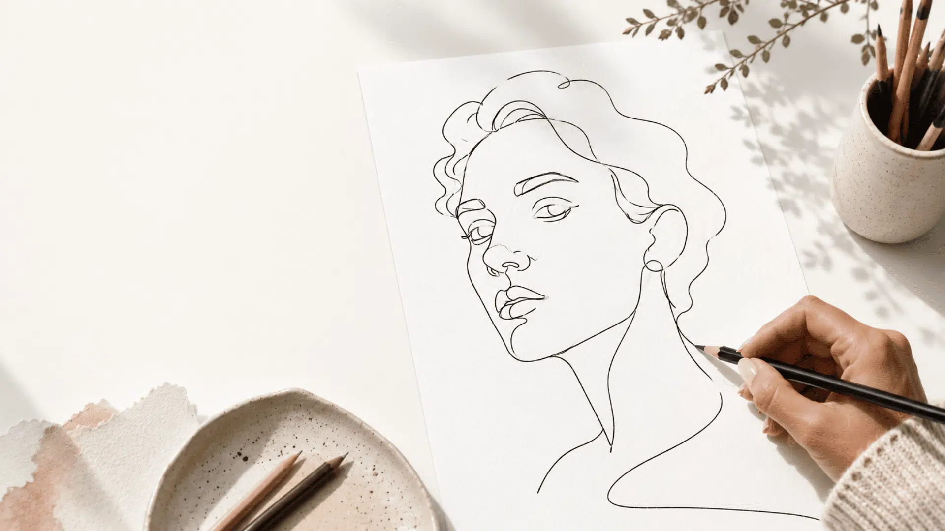
Ever looked at a design and felt something was off, but couldn’t quite explain why? That’s what poor design balance does.
It makes things feel uneasy, and your audience notices, even if they can’t name it.
The balance principle of design isn’t some complicated theory reserved for trained designers. It’s learnable, and once you get it, everything clicks.
If you enjoy experimenting with visual creativity, learning balance is one of the fastest ways to level up your work.
In this blog, you will find the principles of design balance in plain terms, walk through real-world examples, and see exactly how to apply them when designing a logo, webpage, or social media post.
What is the Principle of Design Balance?
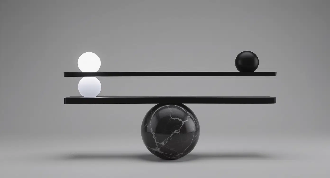
The principle of design balance refers to the arrangement of visual elements so that no part of a design feels either too heavy or too light.
It is about distributing visual weight in a way that feels natural and pleasing to the eye. Designers use balance to organize content and create a sense of order within a layout.
This can be done by adjusting the size, color, placement, and spacing of elements. When applied well, balance helps a design feel complete and thoughtfully structured rather than uneven or distracting.
Significance of Balance in Design
Balance in design helps create a sense of stability and harmony, making layouts feel calm and well-organized.
When elements are evenly arranged, it becomes easier for people to read and understand the content, improving the overall user experience.
Good balance also guides the viewer’s attention, helping them focus on key parts of the design without confusion.
It makes a design look more polished, which builds trust and gives a professional feel. At the same time, balance prevents clutter and keeps things from looking messy or overwhelming.
By using space, size, and placement wisely, designers can create clear and attractive visuals that are easy to engage with.
Elements that Influence Balance
Balance in design depends on how different visual elements work together to create a stable look. Factors like size, color, and placement all play a key role in shaping this balance, as explained below.
- Size and Scale: Bigger elements feel heavier and draw more attention, while smaller ones feel lighter, so designers adjust sizes to keep the layout balanced.
- Color and Contrast: Bright, bold colors carry more visual weight than soft tones, a concept you can see firsthand when painting on canvas, where contrast choices directly shape how a composition feels.
- Texture and Patterns: Busy textures feel heavier than plain areas, so mixing them carefully keeps the design from looking crowded.
- Position and Spacing: Elements placed far from the center feel heavier, and proper spacing helps create a clean and balanced look.
- Visual Hierarchy: Important elements are made larger or bolder, guiding the viewer while keeping the design stable and clear.
Main Types of Balance in Design
Balance in design can be achieved in different ways, depending on how elements are arranged within a layout. Each type offers a unique look and feel, which we’ll explore in detail below.
1. Symmetrical Balance
Symmetrical balance creates a mirror-like effect where both sides of a layout appear equal.
It gives designs a clean, stable, and organized look commonly used in logos, website layouts, and architecture.
The Taj Mahal is a classic real-world example. While symmetry creates harmony, overusing it can make a design feel predictable.
2. Asymmetrical Balance
Asymmetrical balance places different elements on each side while still feeling visually balanced.
Designers use contrast in size, color, and placement to manage visual weight, for example, a large image offset by smaller text.
This approach is popular in modern web design for its dynamic, flexible feel.
3. Radial Balance
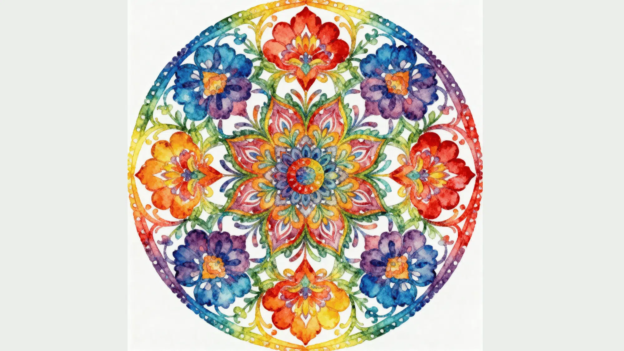
Radial balance is when elements are arranged around a central point, spreading out in a circular pattern. This creates a strong focal area that draws the viewer’s eye to the center.
You can often see this style in mandalas, logos, and circular layouts.
It works well in designs that need a clear center of focus, such as posters, icons, or decorative patterns, making the composition feel organized and visually engaging.
Additional Types of Balance in Design
Beyond the core types, designers also use these less common but equally effective forms of balance.
4. Mosaic/Crystallographic Balance
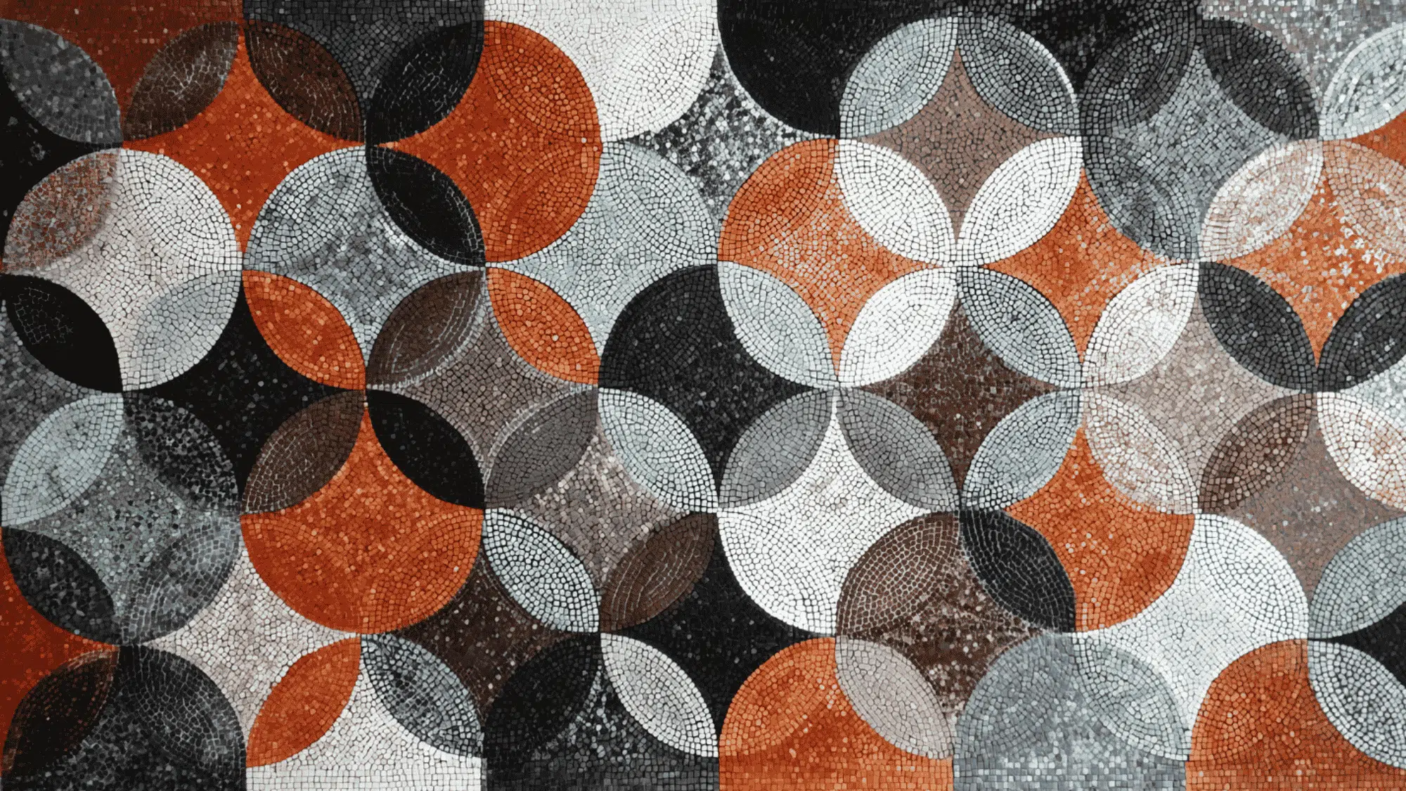
Mosaic balance spreads repeated patterns, shapes, or textures evenly across a design with no single focal point.
Though it can appear busy, the repetition maintains visual stability. It’s widely used in abstract art, textiles, wallpapers, and digital backgrounds.
5. Discordant/Off-Balance
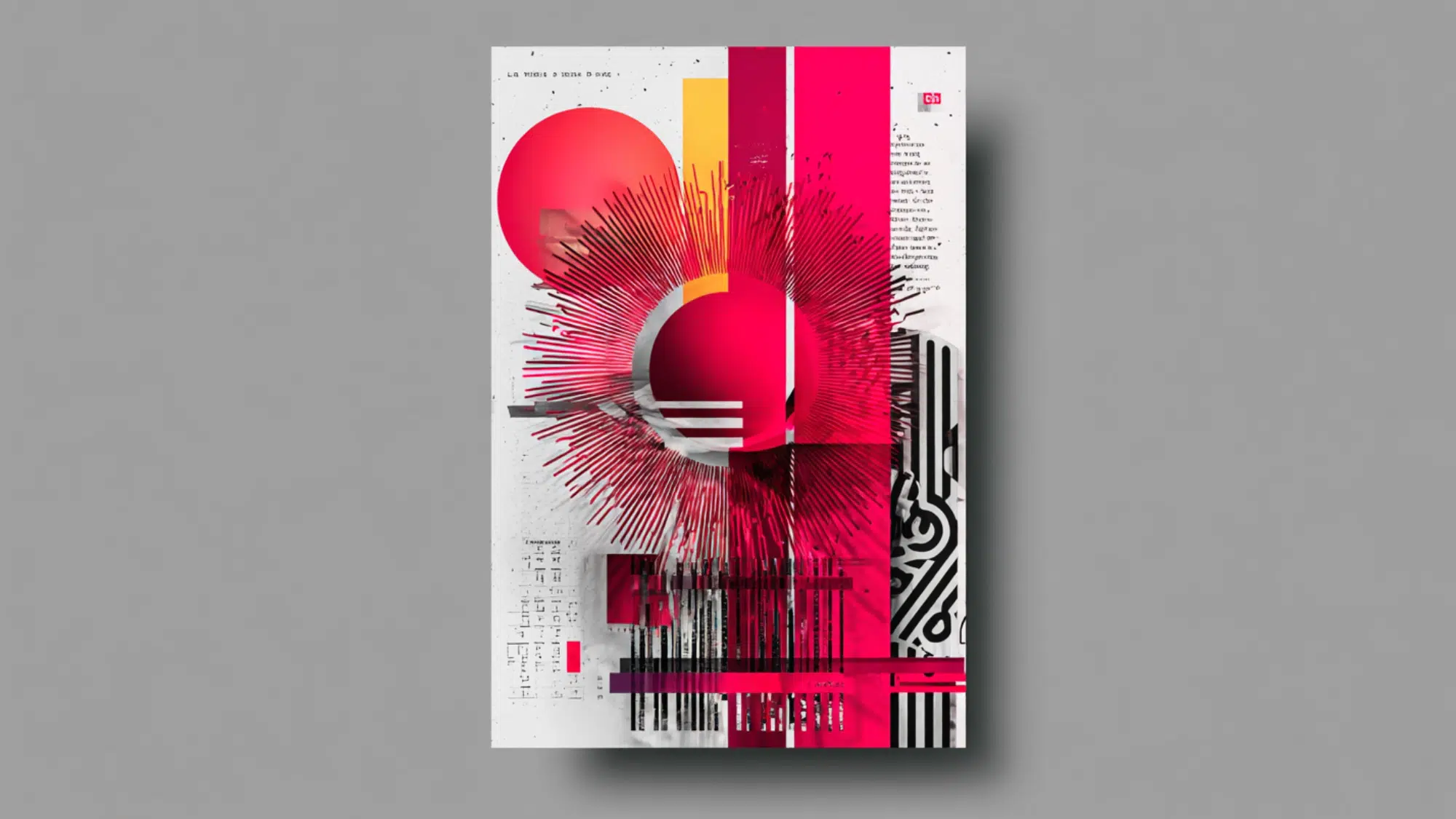
Discordant balance intentionally uses uneven placement to create tension and energy.
Rather than calm, it adds surprise and movement, often seen in bold ads, movie posters, and experimental layouts. When used deliberately, it produces dramatic, eye-catching results.
Balance vs Other Principles of Design
Balance does not work alone; it connects with other design principles to create a complete and effective layout. Knowing how these principles work together will help you design better, as shown below.
| Design Principle | How It Interacts with Balance |
|---|---|
| Contrast | Balance uses contrast in color, size, and shape to spread visual weight evenly and avoid one side feeling too heavy. |
| Emphasis | Balance helps highlight key elements without overpowering the design, ensuring the focal point stands out clearly. |
| Alignment | Proper alignment supports balance by organizing elements in a clean and structured way across the layout. |
| Proportion | Balance works through proportion, adjusting the sizes of elements so they feel visually equal within the design. |
| Unity | Balance supports unity by making all elements feel connected, creating a smooth and consistent overall look. |
How Balance is Applied Across Different Design Fields
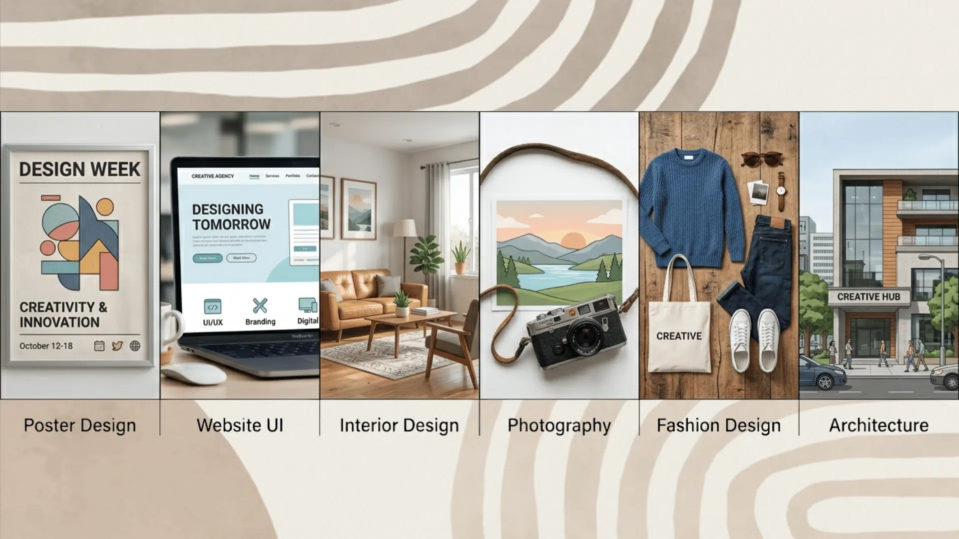
Balance plays an important role in many design fields, shaping how elements are arranged and experienced. From digital screens to physical spaces, its application varies across areas.
1. Graphic Design
In graphic design, balance is used to create clear, attractive layouts for posters, brochures, and branding materials.
Designers choose between symmetry for a clean, formal look or asymmetry for a more modern, creative style. It is also important to balance text and visuals so neither feels too heavy or distracting.
This helps the message stand out while keeping the design easy to read and visually appealing.
2. Web & UI/UX Design
In web and UI/UX design, balance is achieved through grid systems and proper alignment, keeping layouts clean and organized.
Designers arrange content to improve readability, so users can easily scan and understand the information.
Balance is also important in responsive design, where layouts adjust across different screen sizes. This ensures that content looks stable and easy to use on mobiles, tablets, and desktops.
3. Interior Design
In interior design, balance is created through careful furniture placement and proper spacing to avoid overcrowding. Designers also use color balance to make rooms feel calm and pleasing.
Some spaces use symmetry for a neat, formal look, while others use asymmetrical styling for a more relaxed, modern feel, adding variety without losing visual harmony.
4. Photography
In photography, balance is often achieved using the rule of thirds, where the subject is placed off-center to create a more natural look.
Proper subject placement and use of negative space help avoid clutter and keep the image clear.
Photographers also balance light and shadow to add depth and focus, making the image feel more engaging and visually pleasing.
5. Fashion Design
In fashion design, balance is achieved by combining patterns and colors in a way that pleases the eye. Designers use proportion to ensure clothing fits well and looks natural on the body.
Some outfits use symmetry for a clean, classic style, while others use asymmetrical designs to add a bold, modern touch, making the overall look more interesting and stylish.
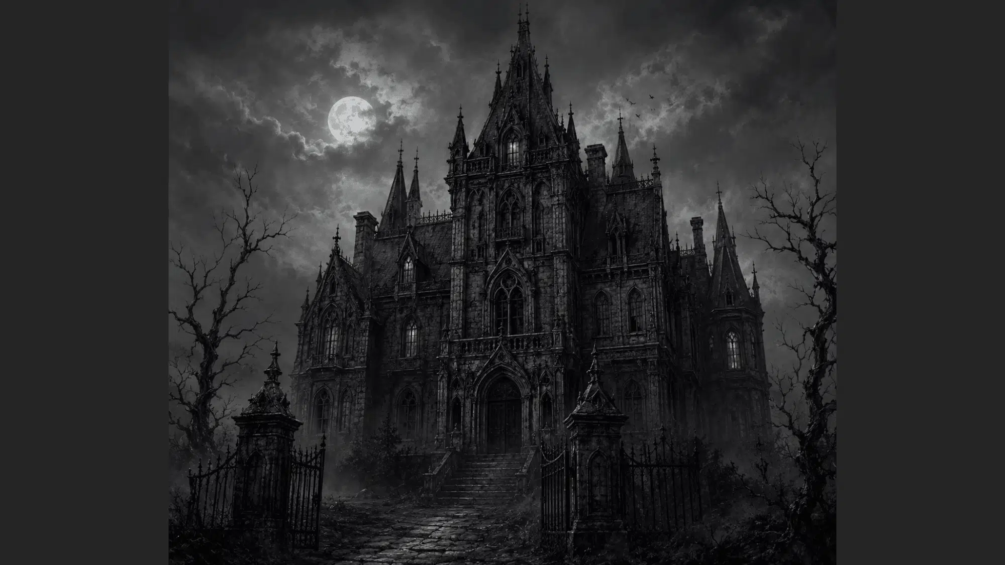
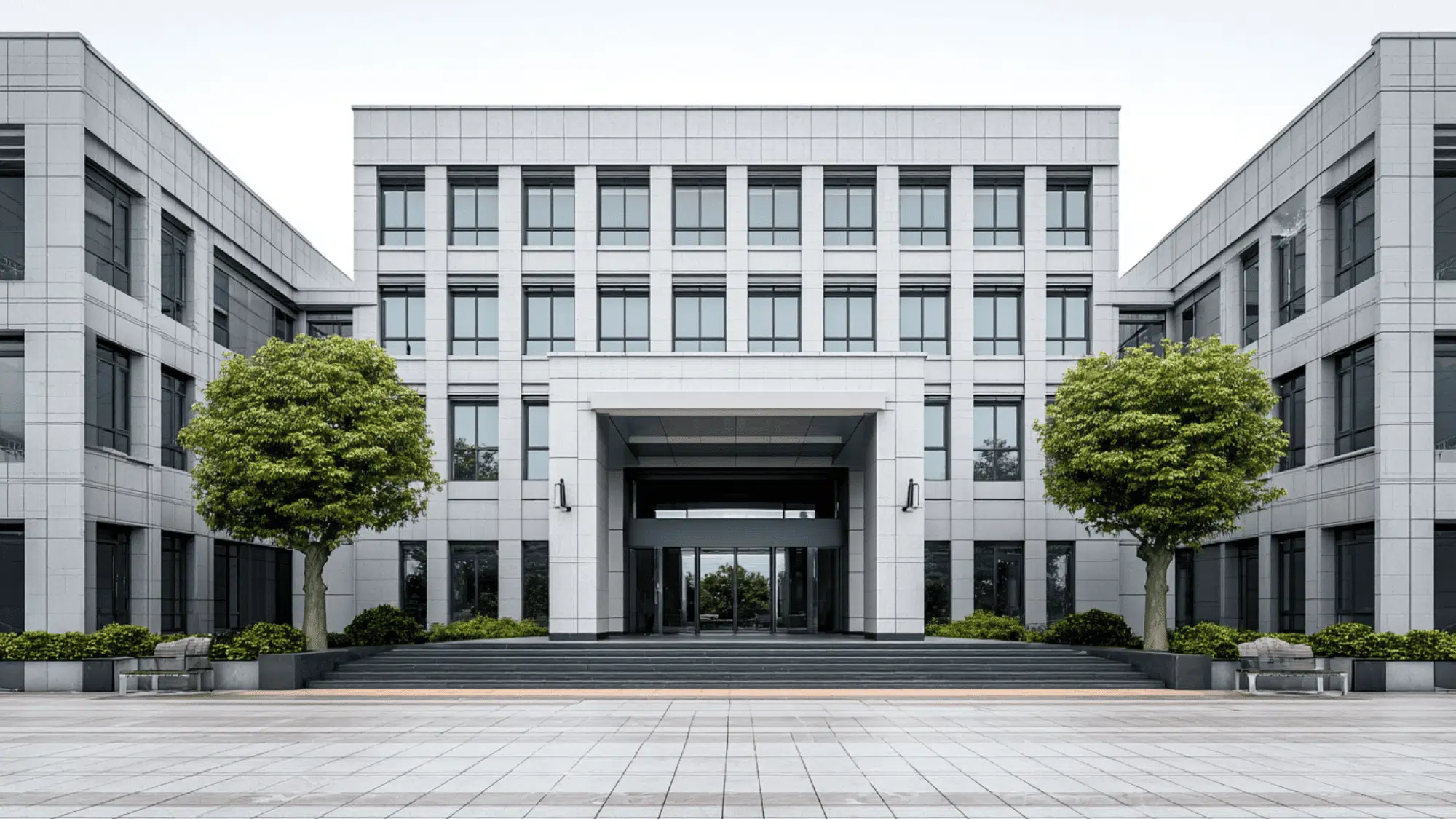
6. Architecture
In architecture, balance is achieved through structural symmetry, in which both sides of a building are designed to be equally balanced, creating a stable appearance.
Designers also consider the visual weight of materials, such as glass, wood, or concrete, to keep the structure balanced.
It is important to maintain a balance between form and function, so buildings not only look good but also serve their purpose effectively.
Famous Examples of Balance in Art
Many famous artworks use balance to create harmony and guide the viewer’s eye across the composition.
According to the J. Paul Getty Museum, balance is the distribution of visual weight across objects, colors, textures, and space, and great artists have always understood this intuitively.
1. The Adoration of the Mystic Lamb

Source: Portraitflip
“The Adoration of the Mystic Lamb” by Jan van Eyck is a strong example of artistic balance. The painting uses clear symmetry, with the central altar and lamb placed in the middle.
Figures on both sides are arranged evenly, creating a sense of order and harmony. The use of light, color, and spacing adds to the balance, guiding the viewer’s eye smoothly across the entire composition.
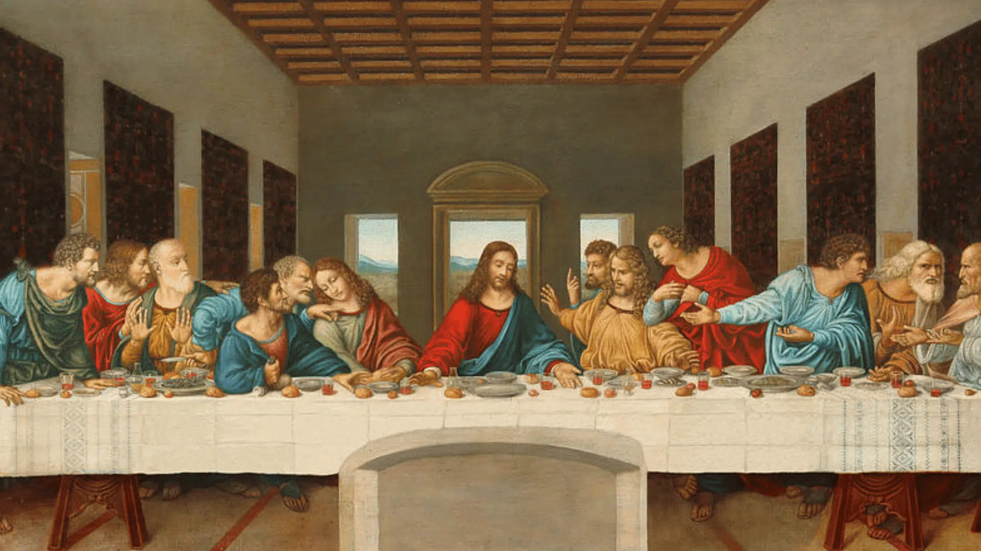
2. The Last Supper
Source: Singulart
“The Last Supper” by Leonardo da Vinci is a classic example of symmetrical balance in art. The composition centers on the figure in the middle, with equal groups on both sides.
The table, walls, and lines in the room guide the viewer’s eye toward the center. This careful arrangement creates harmony while still showing movement and emotion among the figures.
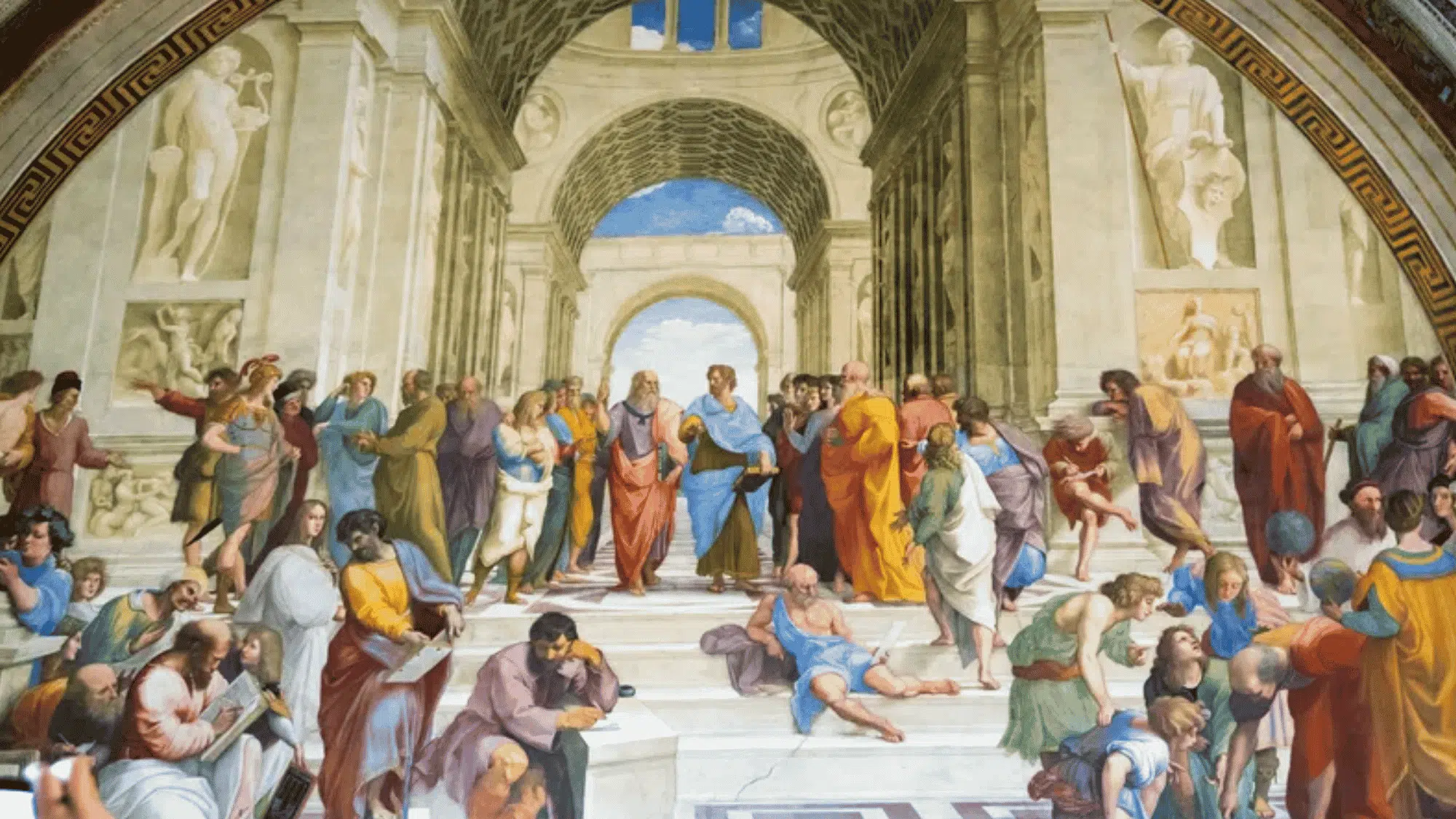
3. The School of Athens
Source: Britannica
The School of Athens, by Raphael, is a strong example of symmetrical balance in art. The painting centers on two main figures in the middle, with groups of people evenly distributed on both sides.
The grand arches and lines of the building guide the viewer’s eye toward the center. This balance creates a sense of order while still showing movement, making the scene feel both stable and lively.
4. American Gothic

Source: Britannica
“American Gothic” by Grant Wood demonstrates balance through a simple, clear composition. The two figures are placed side by side, creating a strong sense of symmetry.
The house in the background also adds to this balance with its centered shape and lines.
The use of similar colors and spacing helps keep the painting steady and calm, making it a strong example of visual balance.
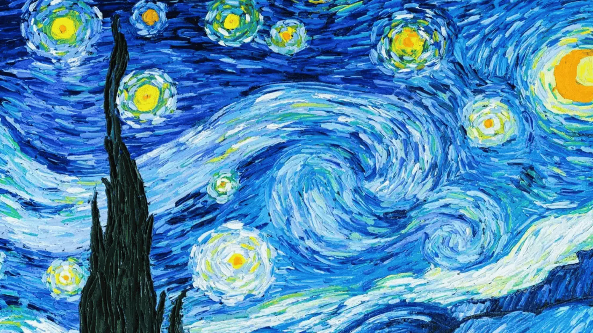
5. The Starry Night
Source: Sanctuarymentalhealth
The Starry Night” by Vincent van Gogh shows balance through an asymmetrical composition. The large dark tree on the left is balanced by the bright, swirling sky on the right.
The glowing stars and moon spread across the sky help distribute visual weight evenly. This creates movement while still keeping the painting stable.
The mix of light and dark areas makes the artwork feel lively yet well-balanced.
Tips to Achieve Balance in Design Perfectly
Achieving balance in design requires careful placement and thoughtful use of visual elements. By following simple techniques and best practices, you can create layouts that feel stable and clear, as explained below.
- Use Grids and Alignment: Grids help place elements cleanly, while alignment keeps everything organized and easy to follow.
- Apply the Rule of Thirds: Dividing the layout into thirds helps place elements in a balanced, natural way.
- Distribute Visual Weight Evenly: Spread elements across the design so no area feels too heavy or empty.
- Test with Grayscale: Viewing the design without color helps check if the balance works based on size and contrast.
- Use Negative Space Effectively: Space allows elements to breathe and prevents the design from feeling crowded.
- Keep Focal Points Clear: Highlight key areas so viewers know where to look without confusion.
Final Thoughts
Good design doesn’t happen by accident, and now you know why. The principles of design balance give you a clear framework for making intentional, confident design choices every time.
So, what changes when you actually apply the balance principle of design? Your layouts feel more structured, your audience stays engaged longer, and your work simply looks more professional.
Balance in design isn’t about making everything perfectly symmetrical; it’s about making everything feel right.
And once you start seeing it, you really can’t stop noticing it in logos, websites, posters, and just about everything around you.