Most painters keep adding colors, hoping the sky will finally glow. It never does. The real shift happens when you understand how contrast creates light.
A glowing sunset comes from pairing warm and cool tones with intention, not complexity.
That same control over light direction becomes clearer when practicing depth drawing, where space and light follow structure instead of guesswork.
What Makes a Sunset Sky Look Bright and Glowing?
Most painters chase color but miss the real secret: contrast and light behavior. A sunset glows because warm oranges and pinks sit next to cool purples and blues.
That boundary between warm and cool is where the magic lives. Light near the horizon spreads softly, not sharply, a principle you’ll also notice when studying sun highlights in more controlled lighting setups.
And vibrancy dies fast when painters reach for black, mix too many colors together, or rely on white to lighten; it just flattens everything.
The Only 2 Color Mixes You Need for a Glowing Sunset
No need for a complete palette, these two mixes capture all the warmth, depth, and drama that make a sunset truly special.
1. Mix 1: Warm Glow Base (Orange-Yellow Blend)
Combine Cadmium Yellow with Cadmium Red or Vermilion. More yellow gives bright sunlight; more red deepens the warmth.
Add the tiniest touch of white only for softness, never to brighten. Keep the mix clean and don’t overwork it on the palette, or the color will start to fade before it hits the canvas.
2. Mix 2: Depth Contrast Mix (Purple-Blue Blend)
Mix Ultramarine Blue with Alizarin Crimson for a rich, natural purple. This sits opposite orange on the color wheel, creating the contrast that makes your glow feel real.
It controls all the drama and depth. A little goes a long way; use it in the upper sky and shadow edges, not everywhere.
3. Why These Two Mixes Work Together
Complementary colors, orange and purple, trick the eye into seeing light. Keeping just two mixes also means less chance of muddy, overworked color killing your painting.
Simple palettes force smarter decisions and almost always produce cleaner, more vibrant results.
Step-by-Step: How to Paint a Glowing Sunset Sky Using Only These Mixes
Follow these five steps in order, and your sunset will build naturally from light to depth without fighting the paint.
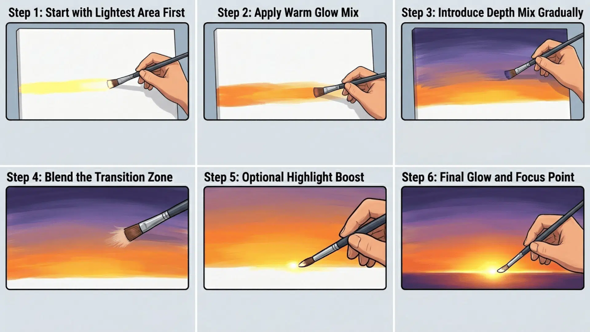
Step 1: Start with the Lightest Area First
Always begin at the horizon; it’s the brightest, most intense point of the whole sky. Lay your lightest warm tone here first before anything else touches the canvas.
Beginning with dark hair and attempting to lighten it later can be quite challenging, and it’s usually better to plan gradual, well-thought-out steps from the start.
Step 2: Apply the Warm Glow Mix
Spread your orange-yellow blend horizontally across the horizon zone using soft, even strokes.
Don’t scrub, let the brush glide. Keeping strokes horizontal mirrors how real light actually spreads across the sky at sunset.
Step 3: Introduce the Depth Mix Gradually
Starting at the top of the canvas, slowly bring your purple-blue mix downward toward the warm zone.
Please work gently, avoiding pressing too hard, so the two mixes don’t combine too early and become muddy.
Step 4: Blend the Transition Zone
This middle area, where warm meets cool, is where the glow truly lives. Use a clean, dry brush and blend with light feathery strokes.
Don’t overblend; a little edge left between the two colors keeps the painting feeling alive.
Step 5: Optional Highlight Boost
Mix a tiny amount of white with Cadmium Yellow and touch it only at the brightest horizon point.
This should be the last thing you do and the smallest amount you use; one small spot of this goes further than you expect.
Step 6: Final Glow and Focus Point
Add a small, concentrated highlight right at the brightest part of the horizon. Use a light yellow-white mix and apply it sparingly with the tip of your brush.
This final touch creates a natural focal point and enhances the glowing effect of the sunset. Avoid overworking it; just a subtle dot or soft stroke is enough to bring the entire sky to life.
Best Color Combinations for Different Sunset Styles
Different sunset styles require different color balances. The key is not just which colors you use, but how dominant each one is and how much contrast you introduce.
| SUNSET STYLE | KEY COLORS | COLOR BALANCE STRATEGY | OVERALL EFFECT |
|---|---|---|---|
| Soft Pastel Sunset | White, soft yellow, light pink | More white + yellow, low contrast | Calm, dreamy, gentle atmosphere |
| Dramatic Fiery Sunset | Red, orange, deep purple | Strong red + orange dominance, deep contrast | Intense, bold, eye-catching |
| Moody Sunset Sky | Blue, crimson, muted purple | Muted tones, more blue + crimson, low brightness | Dark, emotional, cinematic feel |
Common Mistakes That Kill the Glow
These four mistakes show up in almost every dull sunset painting; spot them early, and your colors will stay clean and vibrant.
- Using Black for Darkness: Black kills warmth instantly and flattens your sky. Mix Ultramarine Blue with Alizarin Crimson instead for rich, natural-looking darks.
- Overblending Colors: Working the brush too long in one spot turns your warm and cool zones into muddy brown. Blend once or twice and leave it.
- Adding Too Many Colors: Every extra color you introduce risks muddying the mix. Trust the two-mix rule. orange-yellow and purple-blue handle everything you need.
- Using Too Much White: White cools and chalks your warm tones fast. Use it only as a last small touch, never to lighten large areas of the sky.
Acrylic vs Watercolor: How the Technique Changes
The medium you choose plays a huge role in how your sunset looks and feels. Acrylics offer control and boldness, while watercolors create softer, more natural transitions.
| TECHNIQUE TYPE | Key Approach | HOW TO APPLY IT | RESULTING EFFECT |
|---|---|---|---|
| Acrylic Sunset Tips | Fast blending, wet-on-wet | Work quickly before the paint dries, blend colors while still wet | Smooth gradients, vibrant finish |
| Watercolor Sunset Tips | Natural bleeding, light-to-dark layering | Let pigments flow with water, build layers gradually | Soft, glowing, organic look |
Pro Tips to Make Your Sunset Sky Look Realistic
These small habits separate a flat-looking sky from one that genuinely feels like light is coming through the canvas.
- Use Horizontal Brush Strokes: Light spreads out to the sides at sunset, so your strokes should mirror that natural movement.
- Keep the Horizon Soft, Not Sharp: Blend the edge gently so light feels like it melts into the distance rather than being cut out.
- Add Silhouettes for Contrast: Dark trees, birds, or mountains against a warm glow instantly deepen the scene and make the sky look even brighter.
- Work Wet Into Wet: Blending while the paint is still wet gives you smoother, more natural transitions between warm and cool zones.
- Step Back Often: Your eye adjusts too closely when painting. Stepping back every few minutes helps you catch harsh edges or dull spots before they set.
Wrapping It Up
You don’t need a full palette to paint a sky that stops people mid-scroll. Two mixes, placed with intention, do everything.
Now pick up your brush, start at the horizon, and let the contrast do the work.
If this helped you see color differently, save this guide and come back when you’re ready to paint. The glowing sunset you’ve been trying to capture is closer than you think.