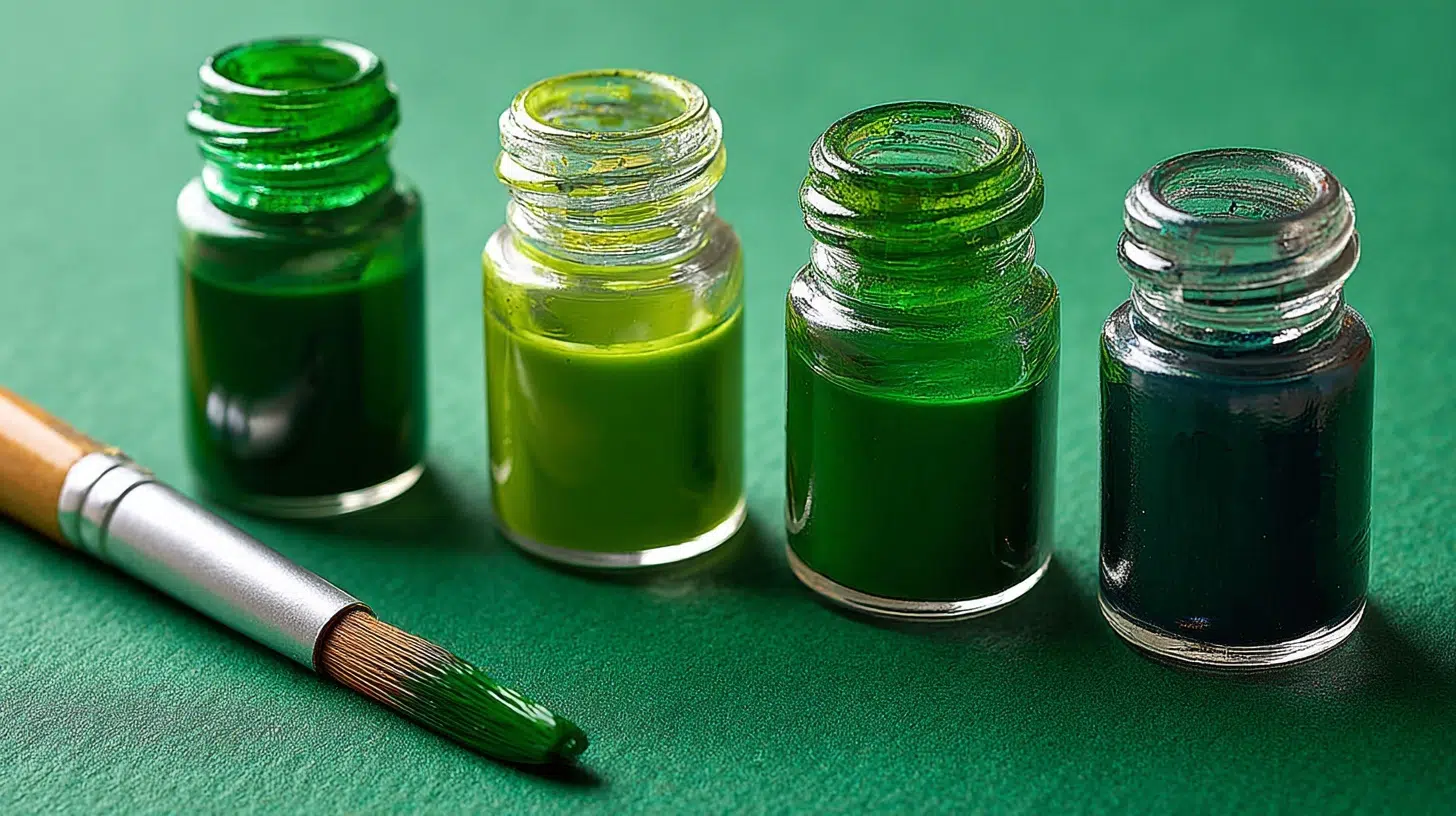
Most artists know how to make green, but many struggle to achieve the exact shade they envision.
Getting that perfect forest green, lime green, or sage green often feels like guesswork, leaving painters frustrated with muddy or dull results.
Understanding basic color theory and proper mixing techniques can help anyone create beautiful, lively greens consistently.
The right approach makes all the difference between amateur-looking muddy colors and professional-quality hues.
This guide will walk you through the science behind green color mixing, show you which company’s paint combinations work best, and teach you simple techniques to mix any green shade you need for your next project.
Understanding the Basics of Green in Color Theory
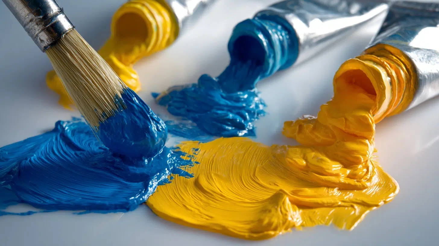
Green is a secondary color created by mixing blue and yellow, two primary colors that can’t be made from other hues. This simple combination opens up never-ending possibilities, but the key lies in understanding ratios and temperature.
What Makes Green Special
- Secondary color status: Always requires mixing two primaries
- Temperature flexibility: Can appear warm or cool based on the dominant primary
- Dual personality: Inherits traits from both blue and yellow parents
The color wheel tells the story. Green sits between blue and yellow, acting as a bridge between cool and warm territories. This positioning makes it diverse, but it also explains why getting the “right” green can be challenging.
Green’s Temperature Guide
- Cool greens: Blue-dominant (forest, evergreen)
- Warm greens: Yellow-dominant (lime, spring grass)
- Neutral greens: Balanced ratios (sage, olive)
Color Relationships That Matter
- Complementary partner: Red (creates lively contrast)
- Analogous friends: Blue-green and yellow-green (harmonious blends)
- Split-complementary: Red-orange and red-violet (calm contrast)
Understanding these relationships helps predict how greens behave in paintings and creates better color harmony.
Why Green Is Significant in Art and Design
Green has always held a special place in art and design, symbolizing life, balance, and renewal. From lush landscapes in paintings to calming interiors in modern design, it’s a color that instantly connects us to nature.
Artists value green because it sits at the heart of the color wheel, offering endless variations from bright lime to deep forest tones. In design, green is diverse; it can be refreshing and energizing when paired with lighter shades or grounding and calm when combined with neutrals.
Historically, pigments like malachite and verdigris gave green a rich legacy, though they were costly and unstable.
Today, modern paints and digital tools make it easy to explore countless greens, but the art lies in learning how to mix them intentionally.
Mastering green means more than using it; it’s about shaping mood, depth, and harmony in every creative work.
How to Make Green: Mixing It Across Different Paint Types and Techniques
Different paint types behave uniquely when mixing greens, and knowing these quirks can save both time and materials.
Each medium has its own personality; some blend smoothly while others need coaxing to create clean, lively results.
Acrylic Paint Mixing
Acrylics dry fast, so work quickly and mix larger batches than needed. The plastic binders can make colors appear different when wet versus dry; greens often look more lively when wet.
Key Techniques:
- Wet-on-wet blending: Mix colors directly on canvas while workable
- Palette mixing: Create exact shades before applying
- Retarding medium: Adds working time for complex mixtures
Watercolor Paint Mixing
Watercolors are the most unpredictable but rewarding medium for green mixing. The transparency means every layer affects the final result, and water behaves differently on various paper surfaces.
Pigment quality matters more; student-grade paints often muddy quickly, while professional pigments stay clean through multiple mixings.
Key Techniques:
- Wet-in-wet mixing: Drop colors into wet areas for soft, organic blends that create natural-looking foliage effects
- Glazing layers: Build complex greens through multiple transparent washes, allowing each to dry completely
- Granulation effects: Some pigments separate naturally, creating textured greens perfect for bark or rocky surfaces
- Salt techniques: Sprinkle salt into wet green washes for crystalline texture effects
Oil Paint Mixing
Oils stay workable longest, allowing subtle adjustments. The slow-drying nature means colors can be blended and reworked extensively.
Key Techniques:
- Alla prima mixing: Blend directly on canvas for fresh results
- Palette knife mixing: Creates clean mixtures without muddying
- Scumbling technique: Dry brush over existing colors for variations
Gouache Paint Mixing
Gouache combines watercolor’s water-solubility with opacity similar to acrylics. It dries to a distinctive velvety matte finish and can be reactivated with water even after completely drying, making it forgiving for beginners.
Key Techniques:
- Opaque layering: Build colors through solid, dense applications that completely cover underlying layers
- Wet blending: Work quickly before the paint sets to its characteristic matte finish
- Reactivation mixing: Add water to dried paint for reworking areas or creating gradual transitions
Tempera Paint Mixing
Tempera dries almost instantly to a flat, chalky finish. Less forgiving than other mediums, but they create unique effects.
Key Techniques:
- Direct application: Mix thoroughly before applying
- Dry brush technique: Creates textured effects
- Layered glazing: Thin applications for depth
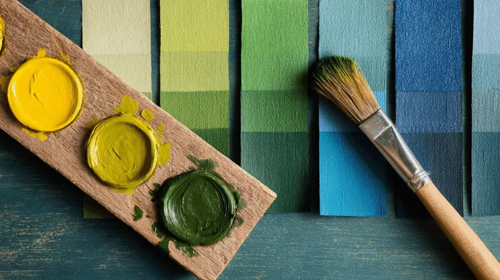
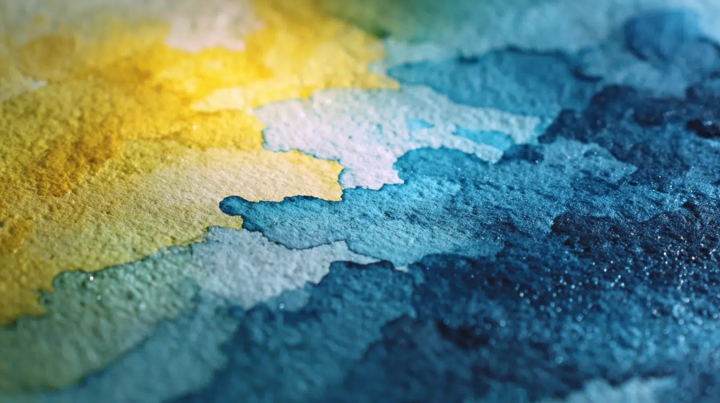
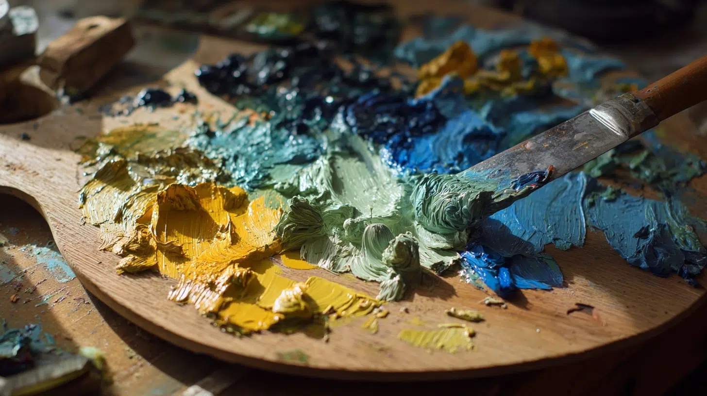
Creating Different Shades and Tones of Green
Understanding how to make green goes beyond basic blue-yellow mixing. Creating various shades, tints, and tones opens up a full spectrum of possibilities for any painting project.
| Shade/Tone | How to Mix It | Best Use Cases |
|---|---|---|
| Bright & lively Green | Lemon Yellow + Phthalo Blue (more yellow for lime) | Tropical leaves, lively highlights, abstract art |
| Earthy Natural Green | Yellow Ochre + Ultramarine Blue (add a touch of red if needed) | Forests, grass, landscapes, muted natural scenes |
| Dark Forest Green | Ultramarine Blue + Cadmium Yellow, add a small amount of black or burnt umber | Shadows in trees, deep foliage, dramatic settings |
| Light Pastel Green | Any green + Titanium White (or mix Lemon Yellow + White + touch of Blue) | Spring fields, interiors, mint tones, soft details |
| Muted Olive Green | Sap Green + Burnt Sienna (or add Red to green mix) | Camouflage effects, rustic tones, vintage artwork |
| Teal Green | Phthalo Blue + Cadmium Yellow, then add a touch of white | Tropical waters, modern designs, accents |
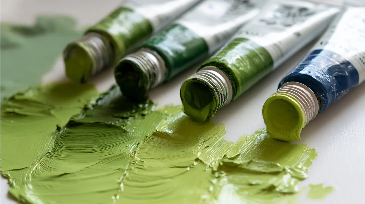
Top Paint Brand Recommendations
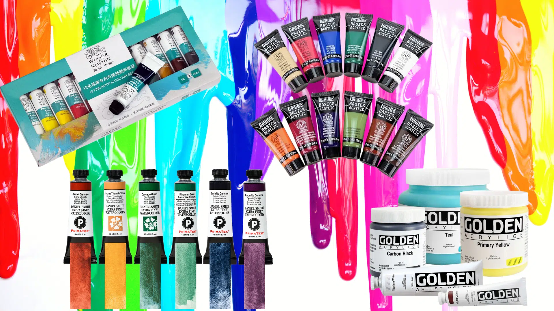
Choosing the right paint brands can make or break your green mixing success. Different manufacturers use varying pigment qualities and formulations, which directly affect how cleanly colors blend and how lively your final greens appear.
Professional-Grade Brands
Winsor & Newton
It stands out for consistent pigment quality across its range. The Artist’s Quality line uses single pigments rather than mixtures, giving you more control over your final results.
- Best for: Clean, lively green mixtures
- Price range: High-end professional
- Recommended colors: Phthalo Blue, Cadmium Yellow, Sap Green
- Mixing quality: Excellent blend compatibility
Golden Artists Acrylics
It offers unmatched color stability and mixing properties. Professional colorists often choose Golden for commercial work because the colors stay true under different lighting conditions.
- Best for: Professional acrylic work
- Price range: Premium professional
- Recommended colors: Phthalo Blue Green Shade, Hansa Yellow Light
- Mixing quality: Outstanding color retention
Gamblin Artists Oils
It provides excellent value in the professional category. Their 1980 line offers near-artist quality at student prices, making them perfect for practicing green mixing techniques without breaking the budget.
- Best for: Oil painting beginners to professionals
- Price range: Mid to high-end
- Recommended colors: Ultramarine Blue, Cadmium Yellow Light
- Mixing quality: Smooth, consistent blending
Student-Grade Options
Liquitex Basics
It delivers surprisingly good mixing results for the price point. While not as lively as professional grades, they blend cleanly and work well for learning color theory fundamentals.
- Best for: Learning and practice work
- Price range: Budget-friendly
- Recommended colors: Primary Blue, Primary Yellow
- Mixing quality: Good for basic techniques
Winsor & Newton Cotman
Their watercolors offer decent transparency and flow characteristics. The pigments aren’t as concentrated as artist-quality, but they’re perfect for understanding watercolor green mixing basics.
- Best for: Watercolor beginners
- Price range: Student budget
- Recommended colors: Ultramarine, Cadmium Yellow Pale Hue
- Mixing quality: Reliable transparency
Daniel Smith
Their watercolors include unique granulating pigments that create interesting textures in green mixtures, perfect for landscape work.
- Best for: Textural watercolor effects
- Price range: Professional specialty
- Recommended colors: Phthalo Turquoise, New Gamboge
- Mixing quality: Unique granulation properties
Practical Tips and Techniques for Better Results
Success in how to make green comes down to mastering a few key principles and avoiding common pitfalls. These practical techniques will help you achieve consistent, lively results every time you mix green colors.
- Start with a clean palette and separate brushes to prevent contamination that creates muddy green mixtures
- Always add darker colors to lighter ones in small amounts since darkening is easier than lightening
- Mix larger quantities than needed because matching custom green colors later is nearly impossible
- Test every mixture on scrap paper first, since colors appear different on canvas than on the palette
- Use palette knives instead of brushes for mixing to achieve cleaner, more even blends
- Control temperature by adding more blue for cool greens or more yellow for warm ones
- Start fresh when greens turn muddy rather than trying to fix overmixed, dull colors
- Document successful recipes in a journal so you can recreate favorite greens for future projects
Wrapping It Up
Mastering how to make green and color mixing changes ordinary paintings into lively, professional-looking artwork. From understanding basic color theory to selecting quality paint brands, each technique builds upon the last to create your personal mixing toolkit.
The key lies in practice and patience; every muddy mistake teaches valuable lessons about pigment behavior and color relationships.
Start experimenting with the temperature variations we discussed. Try mixing cool forest greens for background elements and warm lime greens for foreground details.
Remember to keep that color journal handy and document your successful combinations.
Ready to put these techniques into practice? Grab your brushes and start with simple blue-yellow combinations. Work through the brand recommendations that fit your budget, and don’t forget those practical mixing tips.