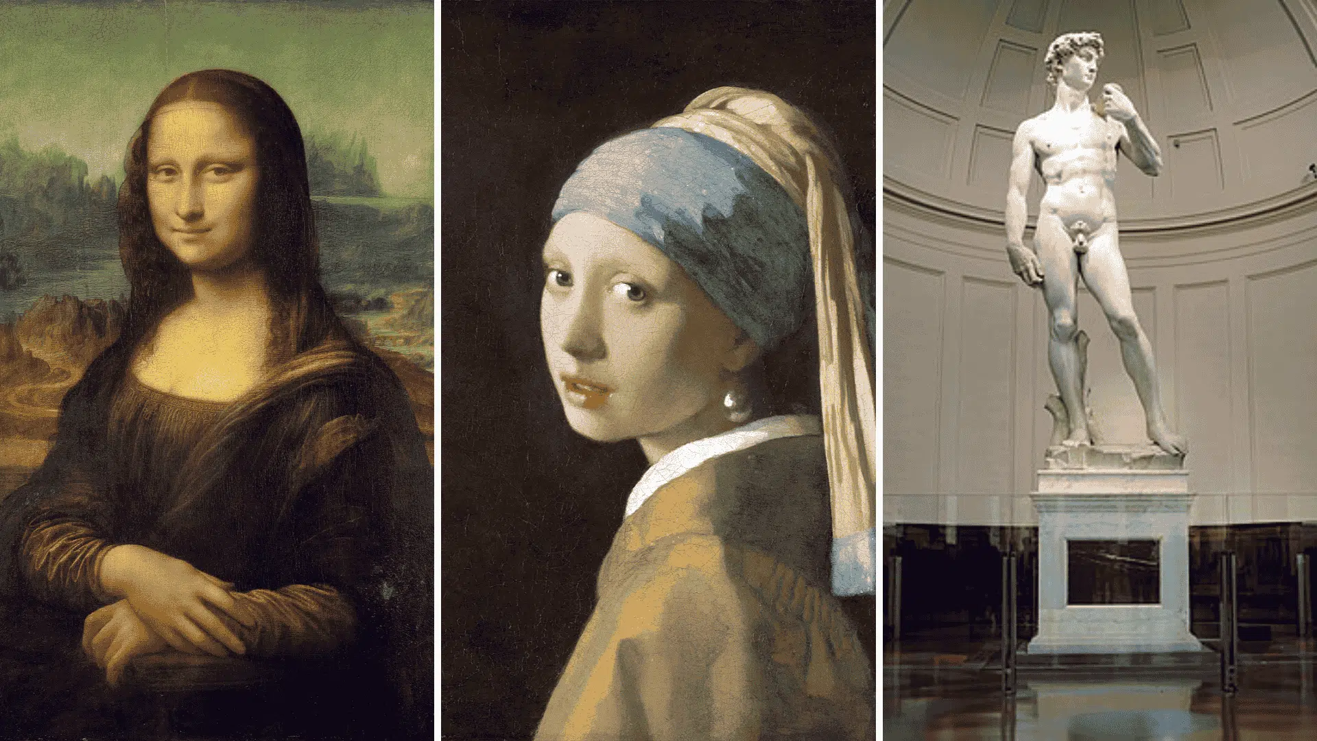
Here is a little secret that art teachers do not always spell out clearly enough: great drawing is not just about talent, it is about balance.
Practicing through engaging art club activities can make these concepts easier to understand in a fun, hands-on way.
The 80/20, 70/30, and 50/50 rules are not complicated formulas or intimidating theories. They are simple, practical guidelines that professional artists use all the time, often without even thinking about it anymore.
They also closely connect to deeper creative challenges, such as the artist burnout causes, where a lack of structure or frustration can affect motivation.
Once you understand them, every blank page starts to make a little more sense. So let’s break them down in the simplest way possible!
Balance in Art: The Secret Behind Every Great Drawing
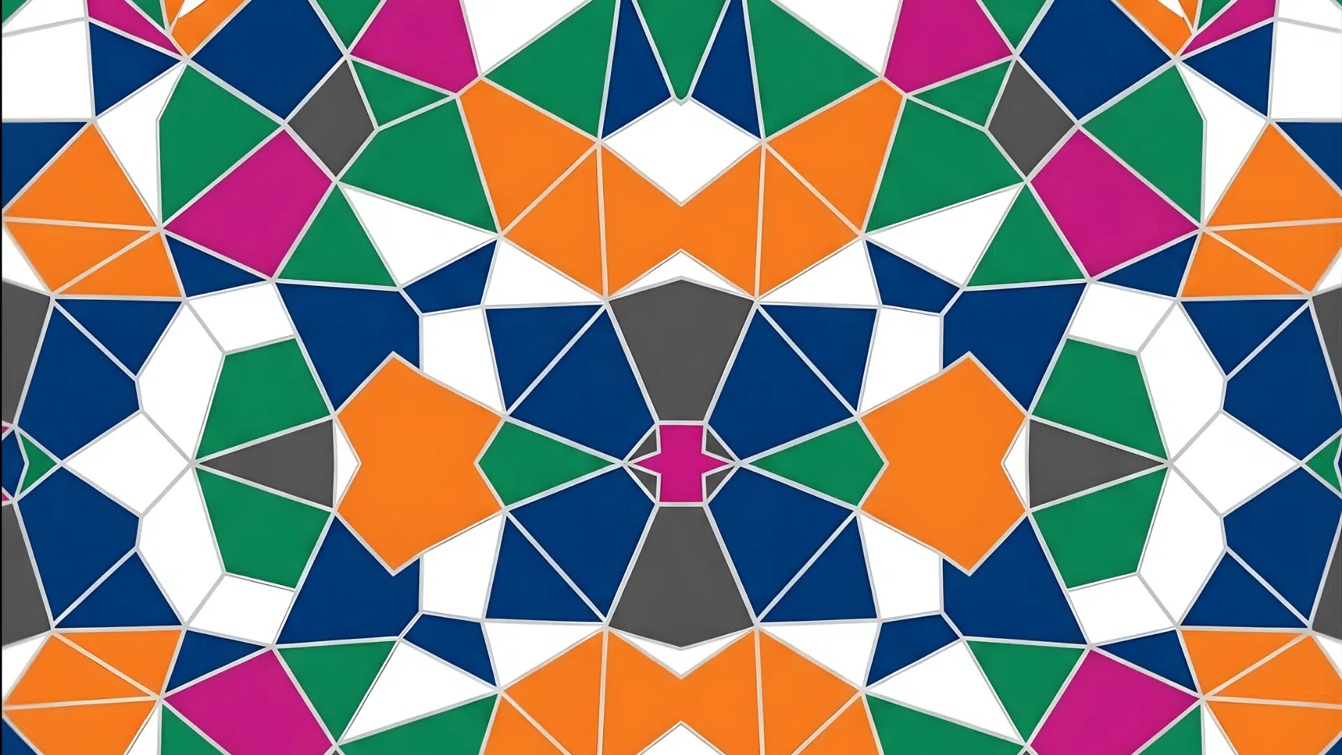
Balance in art refers to the arrangement of elements in a drawing or painting to create a sense of stability and harmony. It is about distributing visual weight so that no part of the artwork feels too heavy or too empty.
Applying these ideas in structured art class games can help reinforce balance while keeping learning interactive.
When a piece is balanced, it feels comfortable and pleasing to look at. Balance can be symmetrical, where both sides are equal, or asymmetrical, where elements are different but still feel even.
Artists use balance to guide the viewer’s eyes across the artwork. It also clearly highlights the main subject. Without balance, a drawing can look messy or confusing.
Understanding balance is key to creating strong and effective compositions.
Simple Balance Rules that Make Your Art Instantly Better
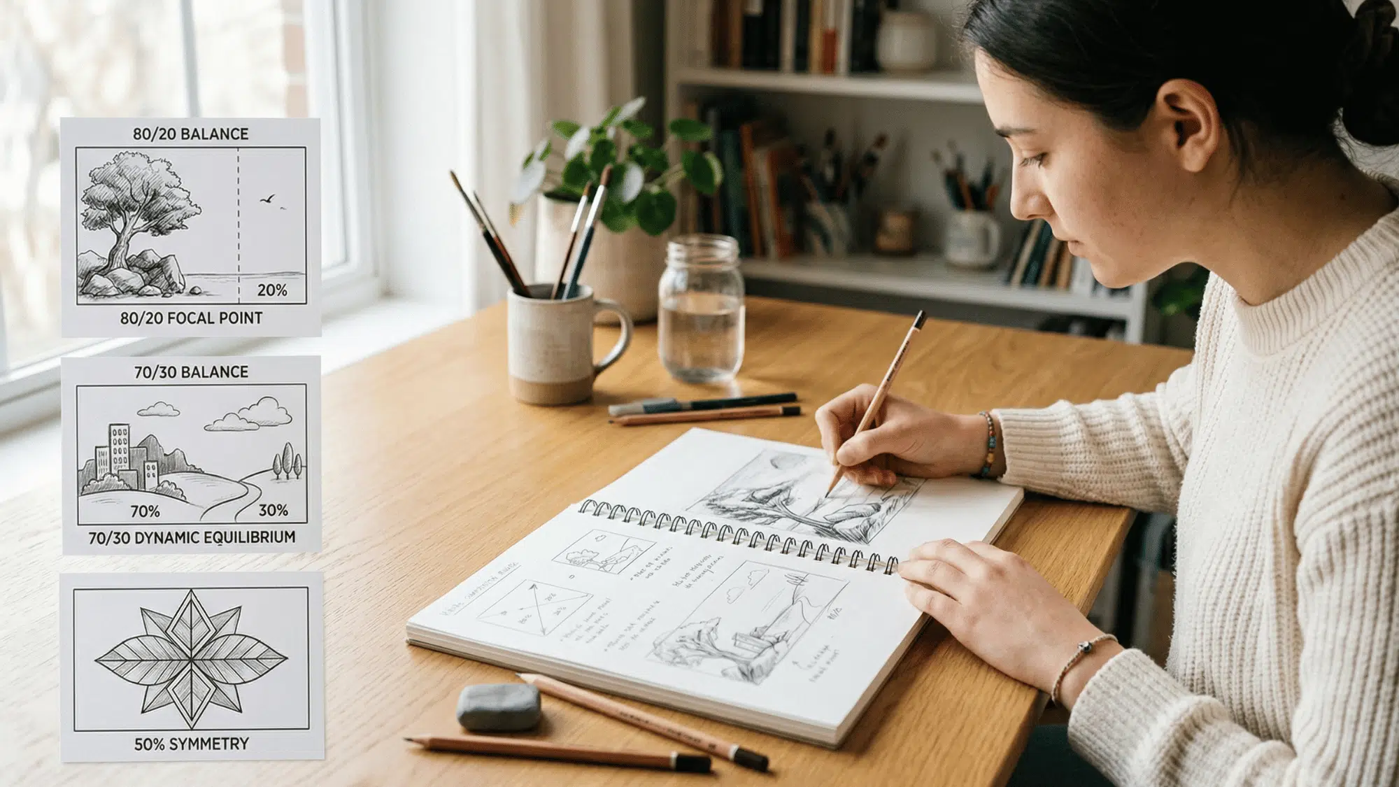
Simple balance rules like 80/20, 70/30, and 50% can instantly improve your drawings by helping you create clear focus, better composition, and more visually appealing artwork.
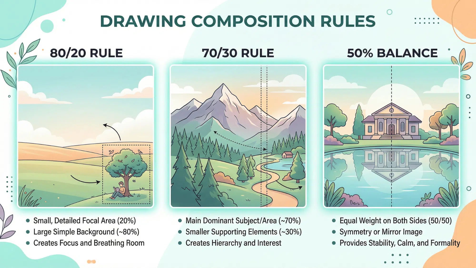
Understanding the 80/20 Rule in Drawing
The 80/20 rule means 80% simple and 20% detailed or focused. This helps create a strong contrast in your artwork. Most of your drawing stays calm, while a small part becomes the main attraction.
This is perfect for creating a focal point. For example, you can keep the background simple and add detail to the main subject. This makes your artwork more powerful and easier to read.
How to Apply 80/20 in Your Drawings
- Keep most of your drawing light and add darker tones in one area for contrast
- Use simple shapes in large areas and add detail only in a small section
- Limit colors and highlight one area with strong contrast
- Make sure one part stands out to guide the viewer’s eye clearly
The 70/30 Rule in Art
The 70/30 rule is similar but softer than the 80/20 rule. Here, 70% of the drawing is dominant, and 30% supports it. It creates balance without strong contrast.
This rule is useful when you want a natural and smooth composition. It keeps the artwork interesting but not too dramatic.
How to Apply 70/30 in Your Drawings
- Use one dominant color (70%) and a supporting color (30%) for balance
- Keep one main subject large and add smaller supporting elements around it
- Apply more detail in one area and keep the rest simple
- Balance textures by using one strong texture and a lighter one alongside
Knowing the 50% Rule (Equal Balance)
The 50% rule means that everything is divided equally. This creates a sense of stability and symmetry. It works well for patterns, reflections, or mirror-like drawings.
However, it can sometimes feel boring because nothing stands out. When everything has equal importance, the viewer may not know where to look.
How to Apply 50% Rulein Your Drawings
- Divide your drawing evenly to create a symmetrical and balanced layout
- Use equal visual weight on both sides for a stable and calm look
- Apply similar colors, shapes, or elements on each side for consistency
- Use this rule for reflections, patterns, or mirror-style compositions
80/20 V/s 70/30 V/s 50%: Which One Should You Use?
Choosing the right balance rule depends on your goal, as each one creates a different look and feel in your drawing.
| Rule | Best For | Effect on Artwork | When to Use |
|---|---|---|---|
| 80/20 | Strong focus & contrast | Creates a bold focal point and clarity | When you want one area to stand out clearly |
| 70/30 | Balanced but interesting design | Feels natural and visually pleasing | For most drawings and beginner compositions |
| 50% | Symmetry and stability | Looks calm, but can feel less dynamic | For patterns, reflections, or equal layouts |
Easy Ways to Practice Balance in Drawing
Practicing balance in drawing becomes easier when you use simple exercises that help you understand how to arrange elements effectively.
- Start with simple shapes and divide space using 80/20 or 70/30
- Make small thumbnail sketches before your final drawing
- Limit your colors to create a clear contrast
- Focus on one main subject and keep the rest simple
- Practice using light and dark areas for balance
- Study other artworks and observe how balance is used
- Step back and review your drawing to check overall composition
In a Nutshell
Balance in art is one of those things that sound complicated until suddenly they are not. The 80/20, 70/30, and 50/50 rules are not there to box you in or make drawing feel like a math class.
They are simply tools that help you make decisions with confidence, rather than staring at a blank page, wondering why something feels off. And the best part? The more you use them, the more natural they become.
You will stop thinking about them consciously and start feeling them instinctively.
That is when the real magic happens. So pick up that pencil, trust the rules, break them when it feels right, and most importantly, keep creating!