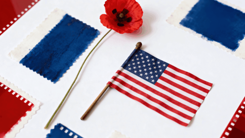
Memorial Day colors carry more meaning than most people realize. Every shade of red, white, and blue tells a story that goes deeper than decoration.
The colors you choose always send a stronger message than you think.
Get them right, and your work feels intentional. Get them wrong, and it shows. Here is everything you need to know.
What Are Memorial Day Colors?
Memorial Day is defined by three core colors: red, white, and blue. These colors come directly from the American flag and represent the nation’s identity.
Red stands for courage and sacrifice, white for purity and hope, and blue for loyalty and justice.
Together, they create a powerful emotional tone that blends deep remembrance for fallen soldiers with proud patriotism for the country they died to protect.
Meaning Behind Memorial Day Colors
Each Memorial Day color carries a distinct meaning that goes far deeper than decoration; together, they tell the story of a nation’s gratitude and grief.
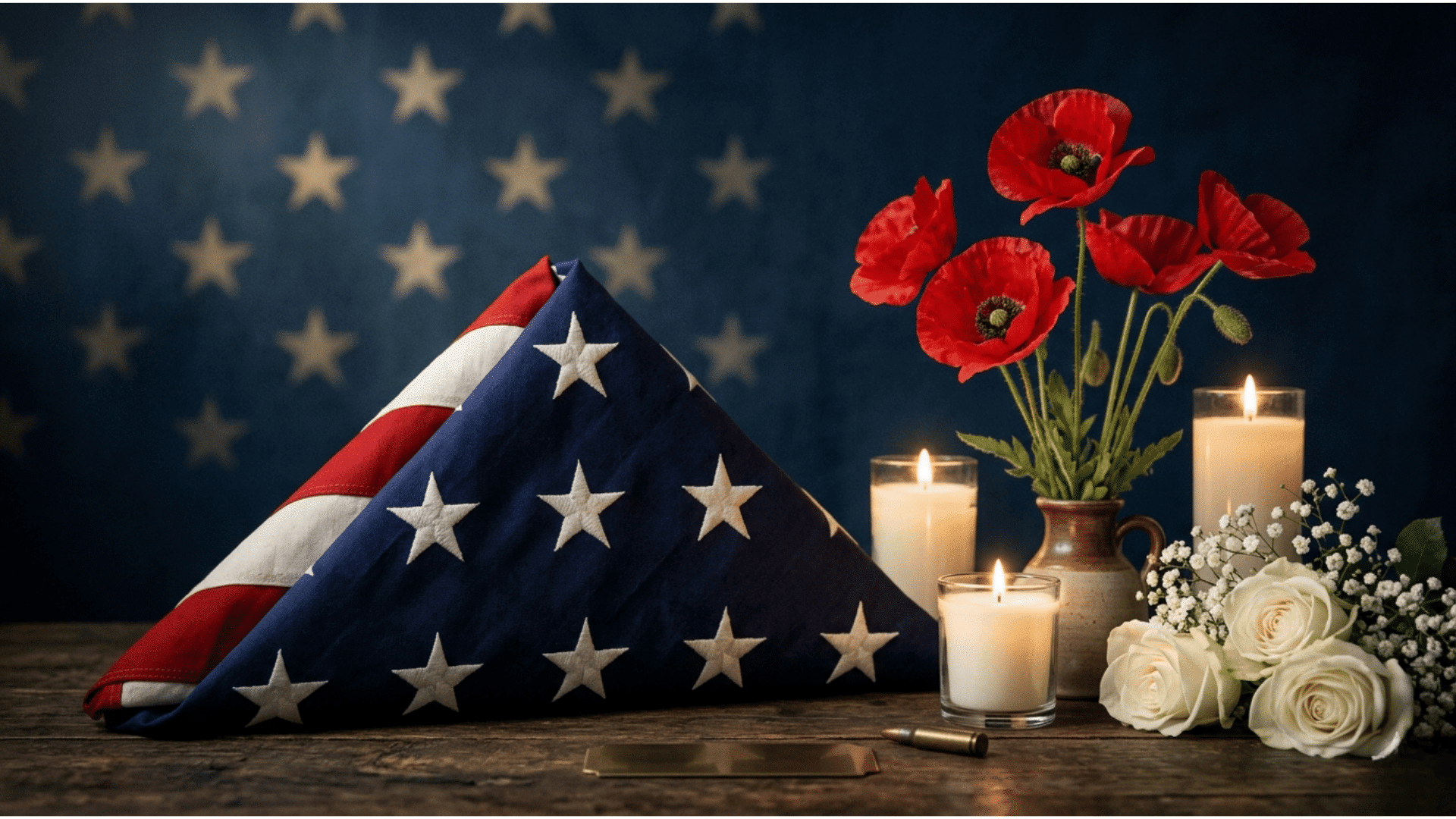
Red: Bravery, Sacrifice, and Remembrance
Red honors the bloodshed and courage of soldiers who gave their lives. It also connects to the red poppy flower, a longstanding symbol of remembrance for fallen troops.
This deep crimson shade serves as a constant reminder that freedom was never free; it was paid for in full.
White: Purity, Peace, and Honor
White reflects the innocence and pure intentions of those who served. It also represents the hope for lasting peace that their sacrifice was meant to secure.
Like a clean slate, white reminds us that honoring the fallen means committing to the values they believed in.
Blue: Vigilance, Justice, and Loyalty
Blue stands for the perseverance and integrity that define military service. It symbolizes the unwavering loyalty soldiers showed to their country and to each other.
That deep, steady blue reflects a promise kept, to stand firm in the face of danger and defend what matters most.
The Full Memorial Day Color Palette You Should Know
Most people stop at the flag’s three colors, but Memorial Day’s full visual language runs much deeper, drawing from military tradition, mourning customs, and modern design sensibility.
Secondary and Modern Memorial Day Colors
Memorial Day’s extended palette tells a richer story than red, white, and blue alone. Navy blue echoes naval uniforms, olive green nods to combat service, and gold honors distinction.
Black carries quiet mourning, while purple is associated with the Purple Heart, which recognizes courage through sacrifice and wounds endured in the field.
Popular Memorial Day Color Palette Ideas
These three curated palettes offer a meaningful starting point for any Memorial Day design project. The Classic Patriotic Palette combines Bold Red, White, and Navy Blue for timeless recognition.
The Vintage Americana Palette blends Faded Red, Cream, and Antique Gold for nostalgic warmth. The Minimal Modern Palette pairs Charcoal, Soft White, and Warm Gold for a clean, contemporary feel.
Memorial Day Color Palette Ideas for Design Projects
Memorial Day colors are more than symbolic; they are a powerful design toolkit that can shape mood, drive attention, and communicate respect across every creative format.
1. Graphic Design: Social Media, Ads, Posters
Bold red and navy contrast creates instant visual energy that stops the scroll and commands attention in any feed or print format.
White space works as a silent storyteller, giving the design room to breathe while keeping the tone clean, focused, and emotionally respectful of the occasion.
2. Website and UI Design
Red CTA buttons cut through any background with urgency and purpose, making them the strongest conversion tool in a Memorial Day-themed interface.
Muted blue tones in backgrounds create a calm, authoritative foundation that feels both patriotic and professional without overwhelming the visitor or diluting the message.
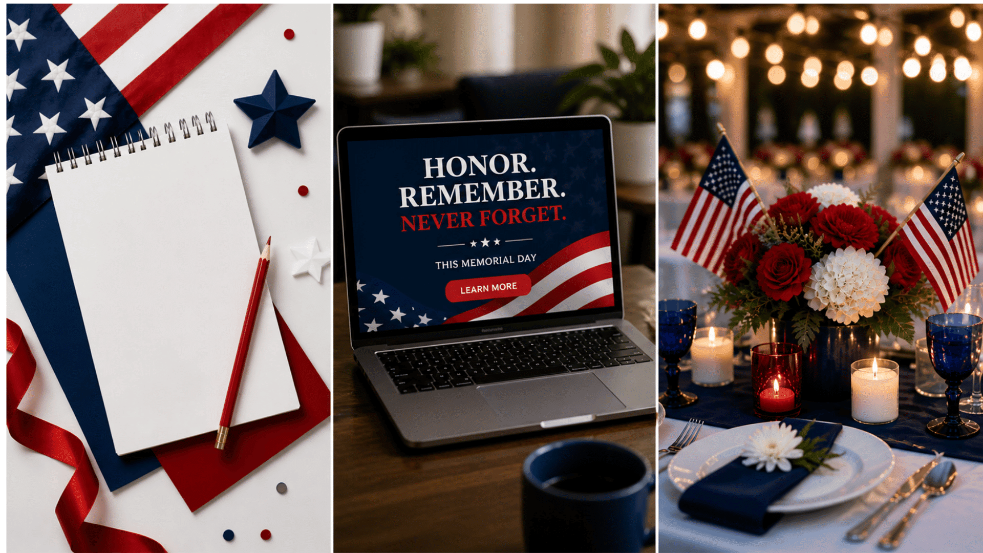
3. Event and Decor Design
Table settings in crisp white linen layered with red floral centerpieces and navy accents create a cohesive, elegant atmosphere for any Memorial Day gathering.
Soft warm lighting paired with gold or amber tones adds depth to banners and outdoor spaces, honoring the occasion with a visual warmth that feels both solemn and celebratory.
How to Use Memorial Day Colors Effectively
Getting patriotic colors right is harder than it looks. Red, white, and blue can easily tip from dignified to garish. These three principles will keep your designs grounded.
- Balance patriotism with subtlety: Avoid placing saturated red directly against saturated blue. Introduce white or navy as a buffer to prevent visual tension.
- Contrast drives readability: Deep navy on white outperforms pure red on white for body text; save bold red for headlines or accents where it earns its weight.
- Match tone to purpose: A sales banner can lean festive; a tribute graphic should feel restrained. Let the occasion guide your color intensity, not the other way around.
- Use white generously: White is not filler; it is the design’s breathing room, keeping the palette from feeling oppressive or cluttered.
- Desaturate when in doubt: Muted or slightly washed versions of red and blue read as respectful and polished rather than loud.
Memorial Day Color Combinations That Actually Work
Memorial Day design runs deeper than three colors. Each shade carries meaning, and the right combination translates that into visuals that feel both modern and respectful.
| COLORS | FEEL | USE CASE |
|---|---|---|
| Red + White | Clean, bold | Branding, logos, minimal banners |
| Blue + White | Calm, respectful | Email headers, tribute sections |
| Red + Navy + Beige | Modern Americana | Website banners, ads, packaging |
Memorial Day Colors in Marketing and Branding
Smart brands don’t just slap red, white, and blue on a banner and call it a day. Color strategy drives whether a campaign feels genuine or forced.
Seasonal campaigns work best when colors are dialed back. Soft navy and warm white outperform loud primaries in click-through tests.
Patriotic branding needs consistency, too. Pick two of the three colors as your anchors and use the third as a pop accent.
Common Mistakes When Using Memorial Day Colors
Most designs fail not because of poor skill, but because of poor judgment. Knowing what to avoid is just as important as knowing what works.
- Tone mismatch kills credibility. Bright, sale-focused visuals clash with a holiday rooted in remembrance. Festive is fine; flippant is not.
- Ignoring the solemn meaning. Memorial Day is not the Fourth of July. Designs that treat it like a generic summer sale miss the emotional mark entirely.
- Neon and off-brand colors undermine trust. Hot pink, lime green, or electric orange have no place here. Stick to the traditional palette and let it carry the weight.
- Overloading all three colors equally. Red, white, and blue used at full intensity with no hierarchy creates visual noise. One color leads; the others support.
Wrapping It Up
Memorial Day colors are more than a seasonal palette. They carry weight, history, and emotion that no other color combination quite matches.
Using them well means respecting what they stand for while still creating a visually strong design.
Whether this is your first time designing around the holiday or your tenth, intention always shows. Ready to put these principles into practice? Start with one project and let the colors do the talking.