
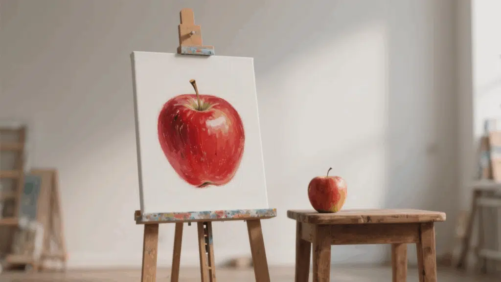
Most artists struggle with how to use color theory in art. They know colors matter, but picking combinations that truly grab attention feels overwhelming.
Understanding basic color theory can modify ordinary artwork into visually striking pieces that intrigue viewers. The right color choices create mood, guide the eye, and make art memorable.
This guide will show you simple color theory principles that work. You’ll learn about color relationships, how warm and cool colors affect emotions, and practical techniques to create visual impact.
Additionally, you’ll receive easy-to-follow tips for selecting color schemes that make your art truly stand out.
Psychological and Emotional Impact of Colors
Colors don’t just look pretty; they trigger powerful emotions and influence behavior in ways most people never realize. Research shows that humans respond to colors almost instantly, often before conscious thought kicks in.
Red, orange, and yellow create feelings of excitement, passion, and energy. Red increases heart rate and can make people feel hungry, which is why fast-food chains often use it.
Orange feels friendly and approachable, while yellow sparks creativity and optimism.
Blue, green, and purple have the opposite effect. Blue lowers blood pressure and creates trust; that’s why banks and hospitals use it everywhere.
Green feels natural and balanced, reducing eye strain and promoting relaxation. Purple suggests luxury and mystery.
Color meanings vary across cultures. White represents purity in Western cultures but mourning in some Asian countries. Smart artists consider both universal responses and cultural differences when selecting their palette.
History and Foundations of Color Theory
Color theory originated with three brilliant minds whose discoveries continue to guide artists today.
- Newton’s Scientific Foundation: Isaac Newton split white light through a prism in 1666, proving all colors exist within light itself. He arranged these into the first circular color wheel, establishing red, yellow, and blue as primary colors.
- Goethe’s Emotional Insights: German writer Johann Wolfgang von Goethe took a different approach in 1810. He studied how colors affect human emotions, discovering that warm colors energize while cool colors have a calming effect on viewers.
- Chevreul’s Contrast Discovery: Michel Eugène Chevreul worked at a tapestry factory where he observed colors changing based on their neighbors. His research on simultaneous contrast demonstrated how complementary colors influence each other more lively.
- Modern Applications: These historical insights remain essential today. Digital artists use Newton’s color wheel in software. Interior designers apply Goethe’s emotional theories. Graphic designers rely on Chevreul’s contrast principles to create visuals that grab attention.
The Color Wheel and Color Harmonies
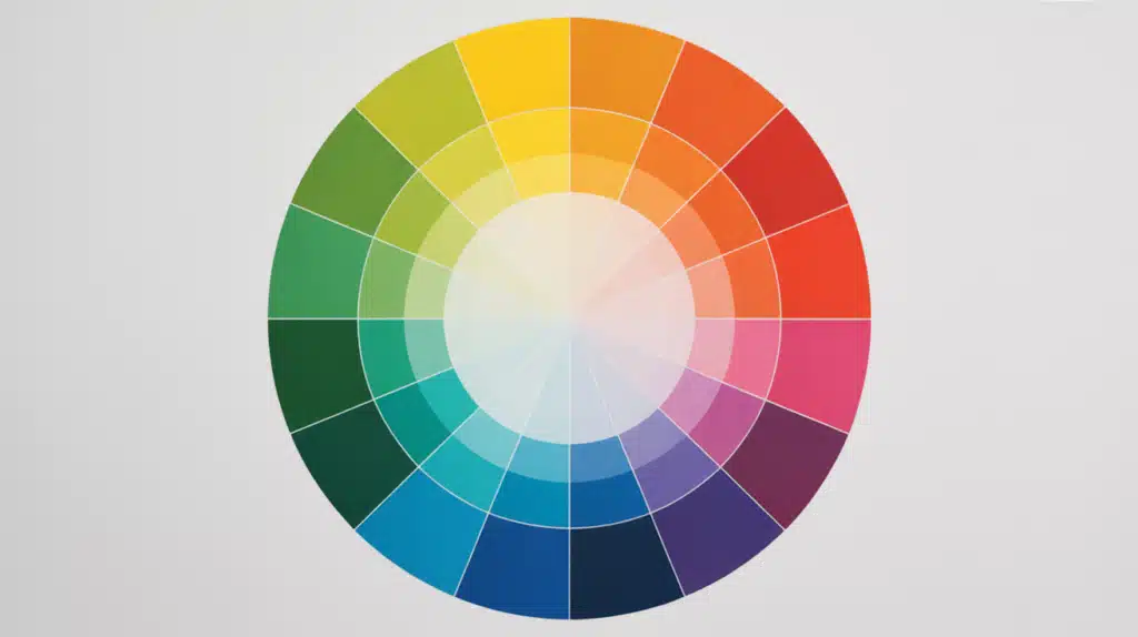
In learning how to use color theory in art, the color wheel arranges colors in a circle with primaries (red, yellow, blue) spaced equally apart.
Adjacent colors blend naturally, while opposite colors create contrast, with one half feeling warm and the other cool.
| Color Scheme | Description | Colors Used | Effect | Example |
|---|---|---|---|---|
| Monochromatic | Different shades/tints of one color | Navy, medium blue, light blue | calm harmony, no clashes | Blue portrait with varied blue tones |
| Analogous | Colors sitting next to each other | Red, orange, yellow | Natural, peaceful feeling | Sunset or autumn landscapes |
| Complementary | Opposite colors on the wheel | Red & green, blue & orange | Maximum contrast, lively impact | Van Gogh’s “Starry Night” |
| Split-Complementary | One color + two beside its complement | Red with yellow-green & blue-green | Strong contrast, more calm | Balanced but strong compositions |
| Triadic | Three equally spaced colors | Red, yellow, blue | lively balance with harmony | Bold, energetic artwork |
| Tetradic | Two complementary pairs | Red-green + blue-orange | Richest variety, complex | Market scenes, garden paintings |
Practical Application Tips:
- Harmony creates calm: Analogous and monochromatic schemes evoke a sense of peace and unity.
- Contrast creates excitement: Complementary and triadic schemes grab attention and energize viewers.
- Balance is key: Let one color dominate while others provide support and accents for the best results.
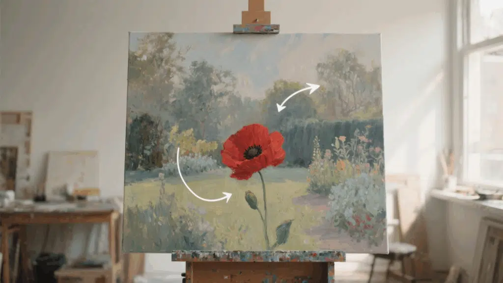
Techniques: Applying Color Theory in Art
Understanding color theory is just the beginning; the real magic happens when you apply these principles to actual artwork.
These practical techniques will show you how to use color relationships, temperature shifts, and harmony principles to create compelling compositions that grab attention and guide the viewer’s eye exactly where you want it to go.
Understand the Three Dimensions of Color
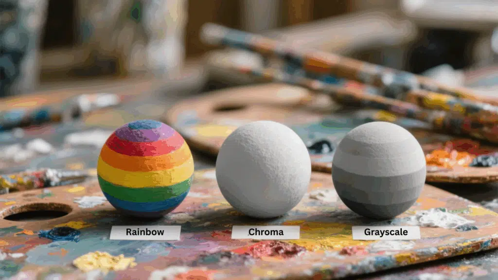
Always remember that color is more than just hue. To work effectively as an artist, you need to consider hue (the family of color), value (lightness or darkness), and chroma (intensity or saturation) together.
Leaving out one dimension will make your understanding incomplete and limit the depth of your paintings.
Begin With Hue Selection

When mixing, always start with hue. Identify the dominant hues you want to capture in your subject. Use your color wheel or system to choose pigments that lean closest to the target hue. This sets the foundation before adjusting anything else.
Adjust the Value for Light and Shadow
Once the hue is established, shift your focus to value. Ask yourself: Does the color need to be lighter or darker? Use white to lighten and add black (or dark pigments) carefully to deepen.
Think of value as the skeleton of your painting; it defines the structure of light and shadow.
Balance the Chroma for Vividness
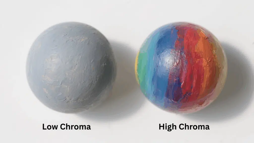
After setting hue and value, fine-tune the chroma. Decide if the color should feel vivid and intense or muted and subdued.
High-chroma pigments bring vibrancy, while mixing with neutrals like black, white, or gray will tone them down. This step ensures harmony rather than chaos.
Mix Colors Methodically

Instead of guessing, mix colors step by step: first hue, then value, then chroma. Make small adjustments rather than big jumps.
Think of it like tuning an instrument: gentle refinements help you reach the exact color you need with less frustration.
Compare Against Real Subjects
Don’t rely on theory alone; test your mixtures against the real object or scene you’re painting.
Colors often behave differently on canvas than in theory due to pigment properties. Let your eyes guide you while the theory gives you structure.
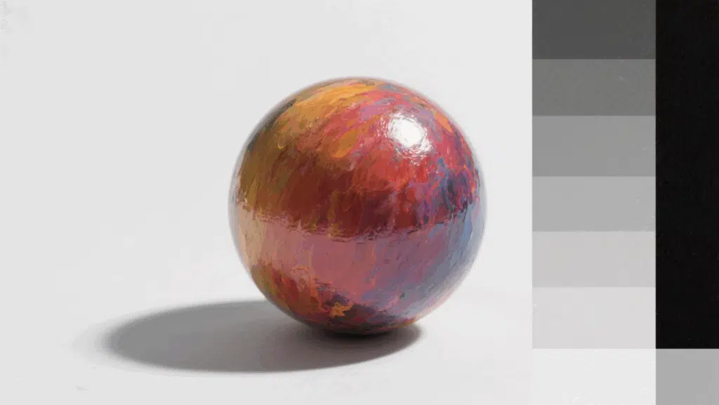
Use Value Studies for Harmony

Before jumping into full color, try creating a quick black-and-white or grayscale study of your subject. This ensures your composition works in value first.
If the painting feels balanced in grayscale, adding hues and chroma will only enrich it further.
Compose With Chroma and Hue Together
Think of chroma as the guide for the viewer’s eye. Keep most areas of your painting lower in chroma, and reserve bright, vivid touches for focal points.
Once value and chroma are set, bring in hue harmonies to complete the picture; this is the “icing on the cake” that adds style and emotional impact.
Essential Color Theory Terms Every Artist Should Know
| Term | Definition | How It’s Made | Example |
|---|---|---|---|
| Hue | The pure color itself, without any white, black, or gray added. It’s the color’s basic identity on the spectrum. | Natural position on the color wheel | Red, blue, green, yellow, orange |
| Saturation | Measures how pure, intense, or vivid a color appears. High saturation means bold colors; low saturation creates muted tones. | Varies naturally or by adding gray | Bright fire truck red vs muted dusty rose |
| Value | How light or dark a color appears on a scale from white to black. Every color has an inherent value level. | Natural property of each hue | Yellow (naturally light) vs purple (naturally dark) |
| Tint | A lighter, softer version of any pure color is created by adding white. Makes colors appear more delicate and gentle. | Add white to any pure hue | Pink (red + white), sky blue (blue + white) |
| Shade | A darker, more intense version of any pure color is created by adding black. Creates drama and weight. | Add black to any pure hue | Forest green, burgundy, navy blue |
| Tone | A muted, calm version of pure color is created by adding gray or mixing black and white together. | Add gray to any pure hue | Most earth tones and natural colors |
| Temperature | Whether colors feel warm (energetic) or cool (calming). Affects emotional response and spatial perception in artwork. | Inherent property based on wheel position | Warm: reds/oranges, Cool: blues/greens |
| Chroma | Technical term for color purity and intensity. Similar to saturation, but measures the color’s distance from neutral gray. | Technical measure of color purity | Brilliant emerald vs grayish olive green |
How to Use Color Theory in Art? Exercises & Practical Applications
- Begin with monochromatic studies: Choose one color and paint using only its tints, shades, and tones to master the relationships between value.
- Practice complementary contrast: Paint identical objects against complementary backgrounds to see how colors intensify each other.
- Create temperature studies: Paint the same scene twice, using warm colors first, then cool colors, to understand the emotional impact.
- Build analogous palettes from nature: Match natural color harmonies found in leaves or flowers to train your eye for visual relationships.
- Mix grays using complementary pairs: Combine opposites, such as red-green, instead of black-white for richer neutral tones.
- Analyze master paintings: Identify color schemes in famous artworks to understand successful composition strategies.
- Study objects under colored lights: Paint white objects under various lighting conditions to observe how ambient color affects their appearance.
- Keep a color observation diary: Record interesting daily color combinations to develop an intuitive understanding of your palette.
Wrapping It Up
Newton’s foundational color wheel to modern digital applications, these principles remain essential tools for every artist.
Understanding Using color theory in art involves warm colors energizing and cool colors calming, allowing control over viewer emotions. Complementary contrasts add drama, while analogous harmonies create peace compositions.
The color schemes and terminology covered here provide a solid foundation, but real mastery comes through practice.
Remember, rules exist to guide creativity, not limit it. Use these color theory fundamentals as your launching pad, then develop your unique artistic voice through consistent experimentation and bold creative choices.