Orange is the color of vitality, warmth, and creativity. It bridges the fiery intensity of warm tones with the inviting glow of softer hues, making it both energetic and comforting.
From the brilliance of harvest fields to the cozy glow of autumn evenings, orange is a shade that instantly commands attention while uplifting the spirit.
Artists, designers, and makers turn to it when they want to evoke emotion, create a striking visual statement, or infuse their work with meaning.
This guide describes how to craft orange in paints, inks, and dyes, covering professional techniques to achieve everything from bold neon variations to earthy, burnt tones, so you can confidently design, decorate, or create with this color.
The Basics of Mixing Orange
Orange comes to life when red meets yellow, but the magic lies in choosing the right versions of each color.
Understanding how to make orange paint depends on how warm and cool color biases affect your mixture changes, taking you from someone who gets orange by accident to an artist who creates exactly the shade they envision.
The magic happens when you recognize that not all reds and yellows are created equal. Some reds lean toward orange (warm), while others hint at purple (cool).
Similarly, yellows can lean toward orange (warm) or green (cool). These subtle biases determine no matter if orange will glow like a sunset or appear muted like autumn leaves.
Professional artists know that selecting the right red-yellow combination is more important than perfecting ratios.
How to Make Orange Paint: Master the Shade with Easy Steps
Mixing the perfect orange isn’t about luck; it’s about following a systematic approach that professional artists use every day.
This proven 5-step method guides you from color selection to final documentation, ensuring you can consistently create and recreate your ideal orange shade.
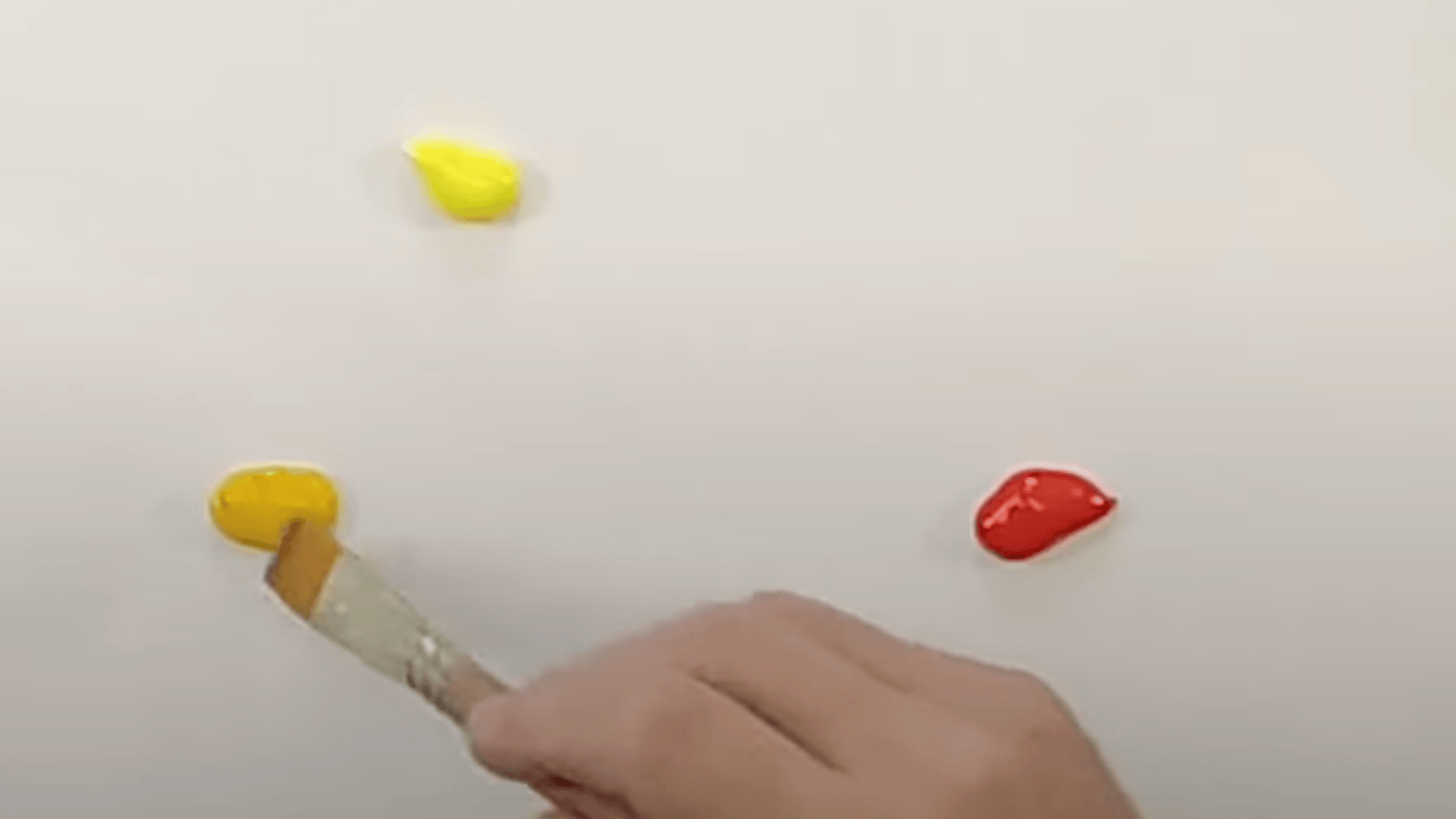
Step 1: Pick the Right Red + Yellow
Many beginners wonder what colors make orange? The foundation of perfect orange lies in selecting colors with the right temperature bias.
Your choice of red and yellow determines whether you’ll create a Bright summer sunset or a calm autumn tone.
- For bright orange: Use warm-biased colors like Yellow Deep + Scarlet that naturally lean toward each other
- For burnt orange: Choose cool-biased colors like Crimson + Lemon Yellow that contain subtle blue undertones
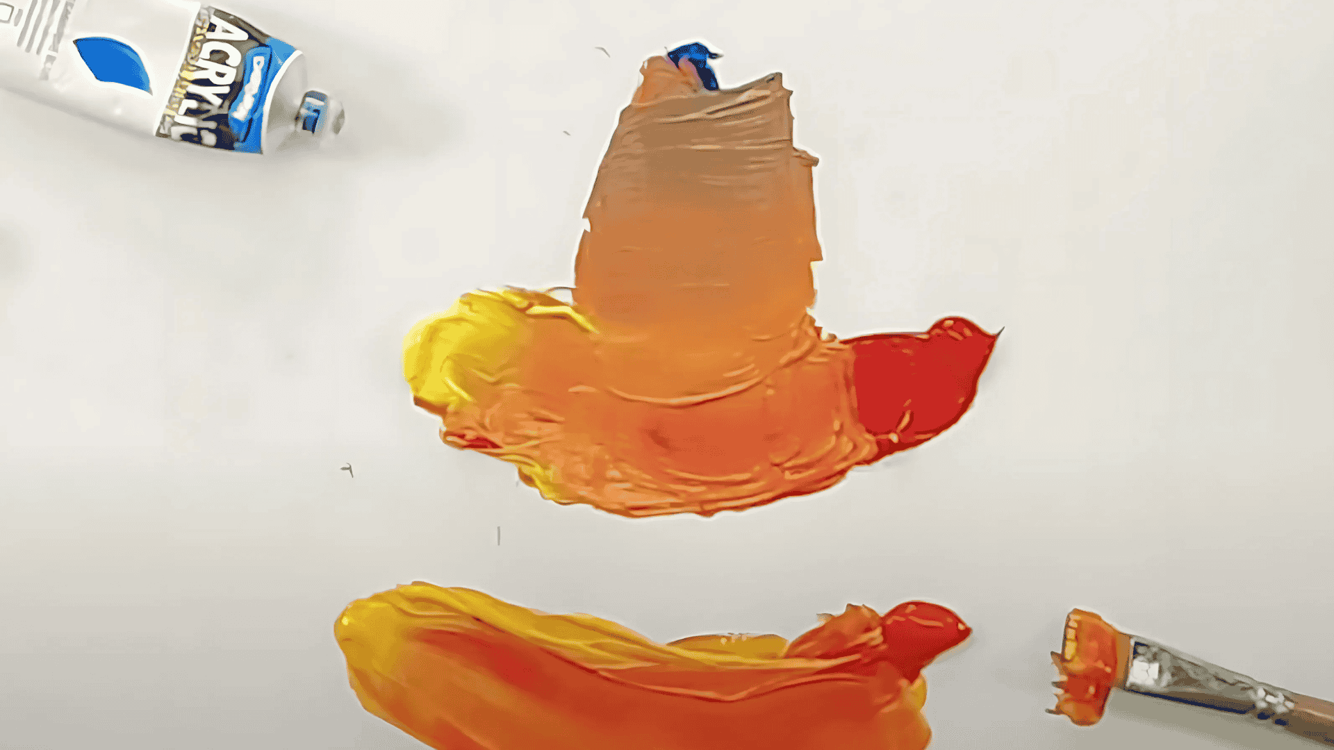
Step 2: Start the Base Mix
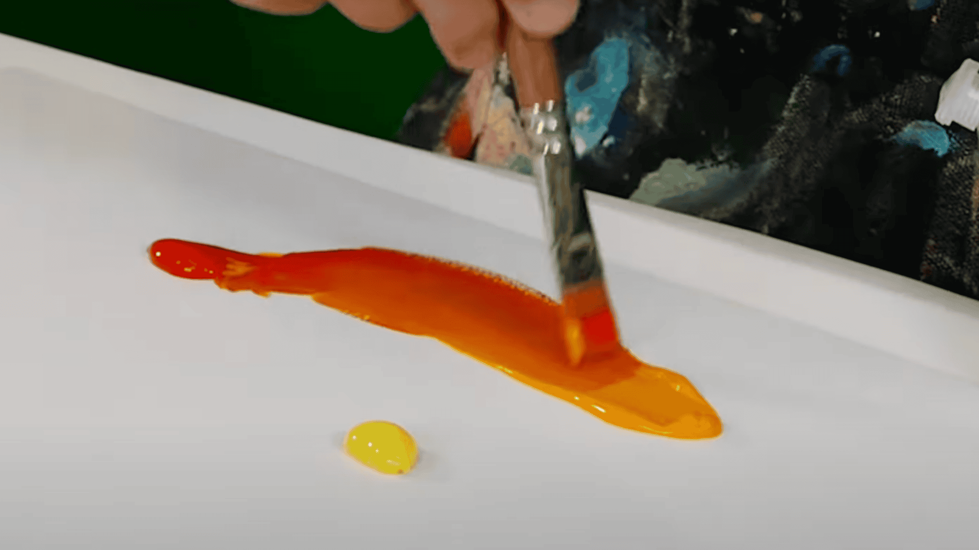
Always begin with yellow as your foundation and gradually introduce red, which prevents overpowering the mixture since red pigments are typically stronger. Starting light and building up gives you better control over your final shade.
- Load your brush generously with yellow paint first
- Add red in small increments, mixing thoroughly between additions
- Use a 2:1 ratio (yellow to red) for bright, Bright tangerine
- Try a 1:1 ratio for classic mid-orange that’s perfectly balanced
Step 3: Fine-tune the Hue
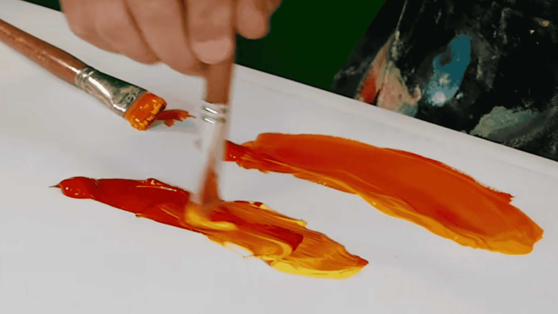
Now comes the artistic part, adjusting your orange to match your vision. Small additions of either primary color can dramatically shift the mood and temperature of your mixture.
- Add more yellow to create lighter, sunnier, peachy-orange tones
- Increase red for warmer, deeper pumpkin or rust-orange shades
- Make tiny adjustments; it’s easier to add more than to correct an overpowering color
Step 4: Build Depth & Shadows
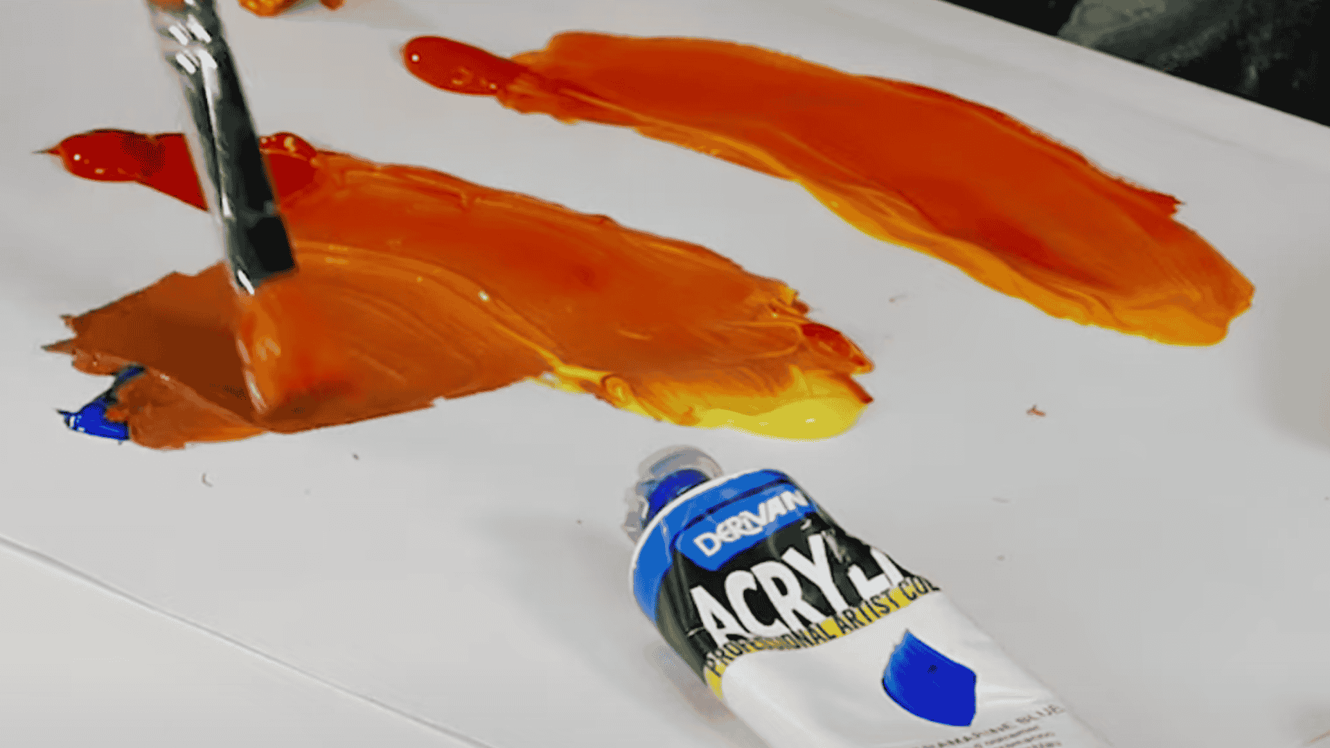
Change flat orange into a complex, dimensional color by introducing complementary tones.
This technique distinguishes amateur mixing from professional-level color work, producing oranges with genuine depth and sophistication.
- Add a tiny pinprick of ultramarine blue for instant burnt/rust tones
- Use complementary purple to darken while maintaining orange brightness
- Mix in raw umber for natural, earthy shadow colors
- Apply sparingly; too much of any darkening agent quickly turns orange to muddy brown
Step 5: Test, Dry, and Note Ratios
Never trust wet paint; colors shift as they dry, especially in watercolors and acrylics. Testing and documenting your successful mixes saves time and frustration in future projects.
- Swatch your mixture on scrap paper, matching your final surface
- Let dry completely, most oranges lighten by 10-20% when dry
- Write down exact paint names, brands, and mixing ratios
- Create a color recipe card for consistently repeating a perfect orange
For more detailed instructions, refer to the YouTube video below:
How to Mix Orange in Different Mediums
Each painting medium has its own quirks when mixing orange, but the red-plus-yellow foundation remains constant.
Understanding how different paints behave helps you achieve consistent results, whether working with fast-drying acrylics or slow-blending oils.
| Medium | Basic Mix | Special Techniques | Pro Tips |
|---|---|---|---|
| Acrylic Paints | Primary red + primary yellow |
| Works fast, mix quickly before the paint dries |
| Oil Paints | Same red + yellow principle |
| Work slowly; blend while wet for smooth gradients |
| Watercolors | Scarlet + warm yellow for bright tones |
| Test on wet paper first, colors dry lighter |
| Tie-dye/Fabric | Apply red and yellow dyes side by side |
| Let dyes blend naturally for organic effects |
Remember: Always test your mixture on a sample of your final material before committing to your artwork.
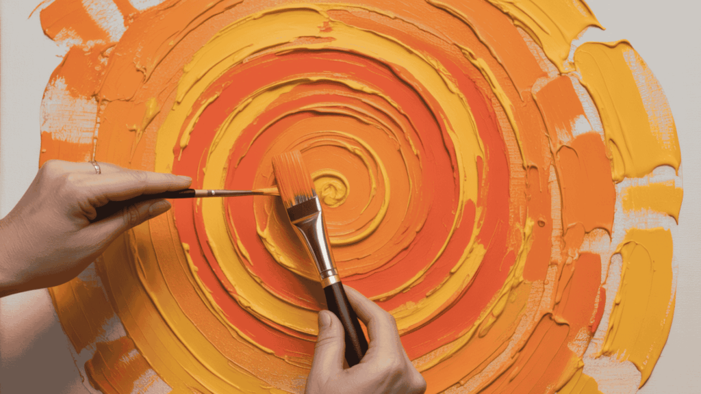
Variations & Techniques to Try
The spectrum of orange extends far beyond basic mixing, offering artists everything from electric neon to terracotta. Mastering these variations changes your palette into a powerful tool for any creative vision.
Creating Bright Oranges
For maximum brightness and saturation in your orange mixtures:
- Choose warm-biased primaries: Cadmium red light paired with cadmium yellow medium delivers the most intense, saturated orange possible
- Avoid blue undertones: Any paints containing even trace amounts of blue will instantly dull the brightness of your orange
- Layer thin glazes: Achieve luminous depth through multiple transparent applications rather than thick, opaque paint layers
- Keep pigments pure: Use undiluted paint for maximum intensity, adding medium sparingly only when necessary for flow
Achieving Burnt & Earthy Tones
Modify basic orange into calm, muted variations perfect for natural subjects:
- Create burnt orange: Add the tiniest dot of ultramarine blue, testing incrementally as even one drop too many shifts orange to brown
- Mix rust and terracotta: Blend in raw umber or burnt sienna for authentic weathered effects
- Deepen with purple: Use purple rather than black to darken orange while maintaining its essential character without muddying
- Excel in landscapes: These earthier variations create natural, weathered looks that ground compositions with authenticity and visual weight
The Last Mix
You’ve unlocked the core principle behind creating orange and probed the color theory that changes a simple blend into an infinite spectrum of expressive shades.
With this knowledge, you can confidently craft everything from radiant brights to deep, earthy tones, making orange a powerful tool for art, design, and decoration.
Time to put theory into practice. Challenge yourself to mix three distinct oranges: a bright electric orange, a rich burnt orange, and a soft pastel peach, using your preferred medium.
Notice how different red-yellow combinations and additives change each shade.