Purple has always been the rebel of the color wheel. Unlike red or blue, you can’t just squeeze purple from a tube in nature. It demands creativity.
This mysterious hue once cost more than gold, making it the ultimate status symbol for royalty and emperors.
Today, purple pops up everywhere from Instagram logos to lavender lattes, but most people still can’t explain what colors make purple.
No matter if you are mixing paints for your next masterpiece or just curious about color theory, understanding purple opens up a whole world of artistic possibilities.
From deep royal purples to soft lilacs, this color family holds secrets that every creative person should be aware of, including the magic behind making purple.
How to Make Purple: Know About the Basics
What two colors make purple? It’s just red and blue having a color party. But like any good recipe, the magic happens in the details.
Getting the perfect purple isn’t about randomly mixing colors. .it’s about understanding how these two primary colors dance together to create something entirely new.
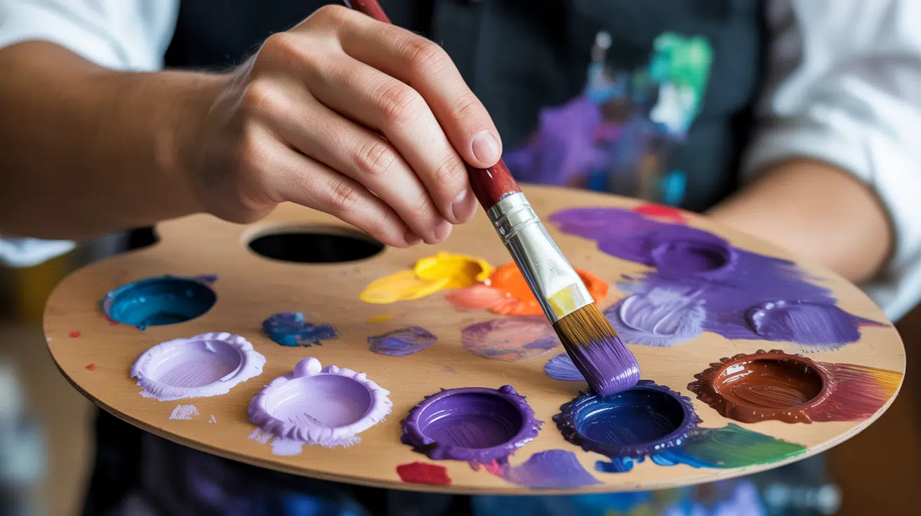
Purple combines two primary colors to create an endless array of possibilities. Understanding the fundamentals of purple mixing gives you complete control over this color family.
The key to successful purple mixing lies in understanding ratios and color temperature. Small changes in your red-to-blue ratio can shift your purple from warm and energetic to cool and calming.
The Psychology Behind the Color Purple
It’s a color that does some serious work on your brain. Have you ever noticed how certain purple rooms make you feel more creative, or how luxury brands often incorporate deep purple into their packaging?
That’s no accident. Purple has a unique way of triggering specific emotions and thoughts, from sparking your imagination to evoking a sense of spirituality or contemplation.
Whether it’s the soft lavender in a spa that calms your nerves or the rich plum in a high-end store that makes everything feel more expensive, purple knows how to push our psychological buttons.
Let’s probe what’s really happening in your head when you see this magical color
Step-by-Step Process of Making Purple
This step-by-step guide will walk you through what colors make purple and how to blend them, helping you avoid common mistakes and achieve that gorgeous shade every time.
Let’s break it down into simple, foolproof steps anyone can follow.
Tools and Materials Required
| Category | Items |
|---|---|
| Primary Colors | Quinacridone Magenta, Phthalo Blue, Ultramarine Blue, Cerulean Blue, Cobalt Blue Hue |
| Mixing Aids | Titanium White (for tints), Ivory/Carbon Black (for deep shades), Permanent Green (for neutralizing) |
| Optional Colors | Cadmium Red Medium (to see why it doesn’t work well), Dioxazine Purple (for comparison) |
| Tools | Palette, Mixing Knife or Brush, Water/Medium (for blending), Paper or Canvas for swatches |
| Surfaces | Watercolor paper, Canvas, or Acrylic pad, depending on medium |
| Other | Rag or Paper Towels for cleanup |
Step 1: Understand Why Red and Blue Don’t Always Work
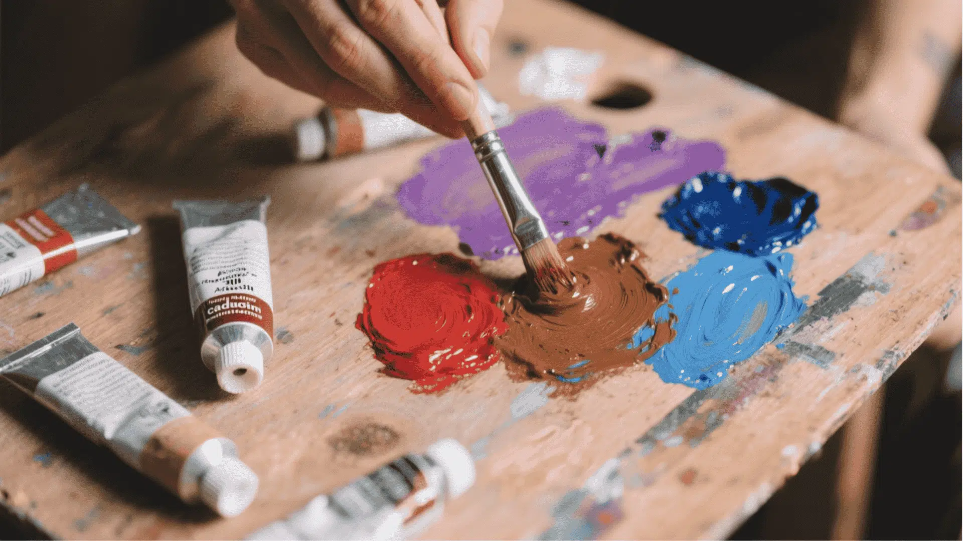
Most people try mixing “red + blue” to get purple, but often end up with a muddy brown. This happens because many reds, like Cadmium Red Medium, contain traces of yellow.
When yellow is combined with blue, it dulls the purple. That’s why your mixture may look chocolate-like instead of lively.
Step 2: Choose the Right Colors
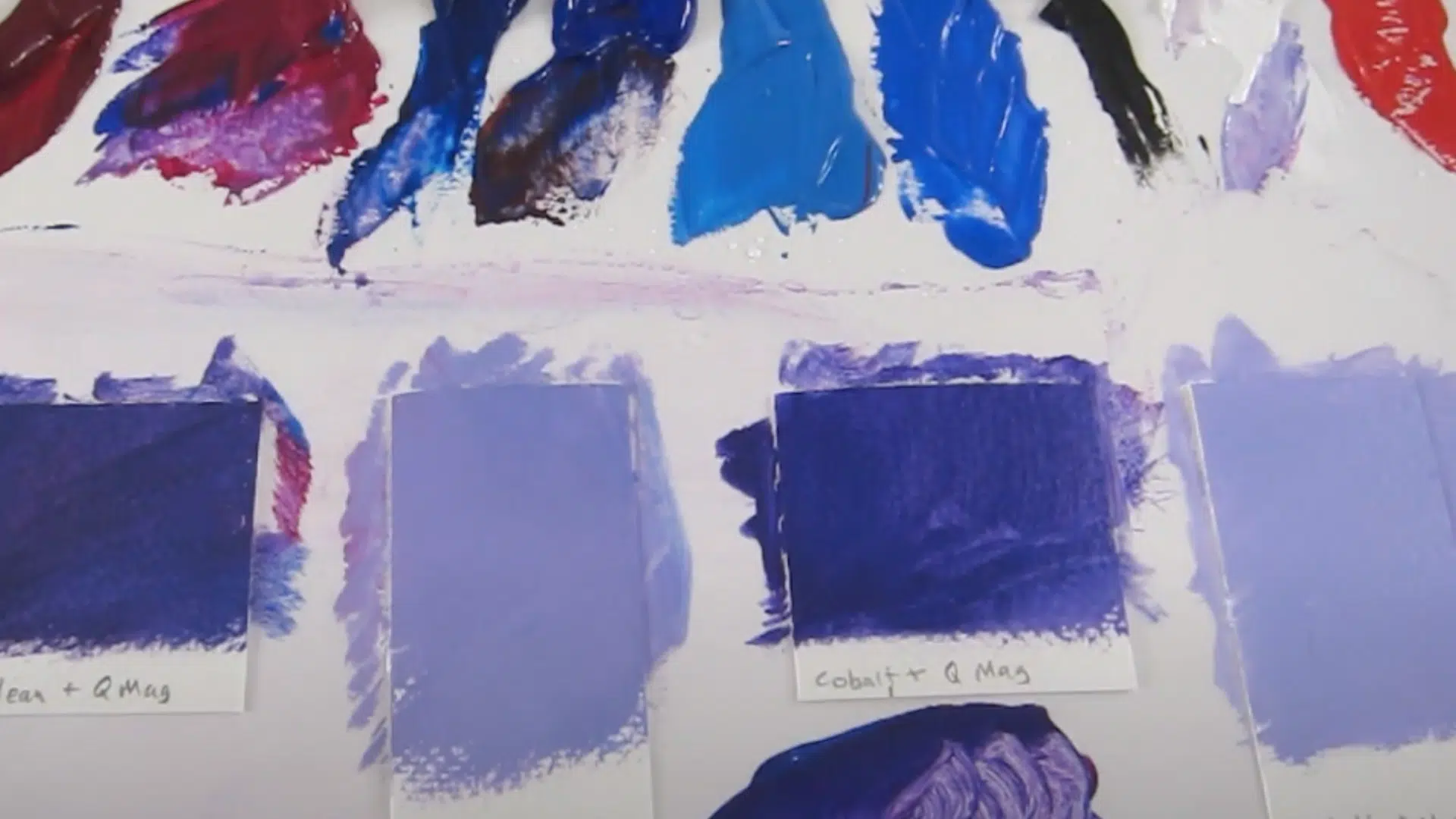
Instead of red, start with Quinacridone Magenta. This is closer to the “true primary” used in printing (magenta, cyan, yellow). Pairing magenta with the right blue will give you a brilliant purple every time.
Different blues give you different results:
- Phthalo Blue: It creates a rich, darker purple (great for dioxazine-like tones).
- Ultramarine Blue: It is lightly red-biased, but still makes strong purples.
- Cerulean or Cobalt Blue: It is softer, granulating purples, especially in watercolor.
Both warm and cool blues will work beautifully with magenta.
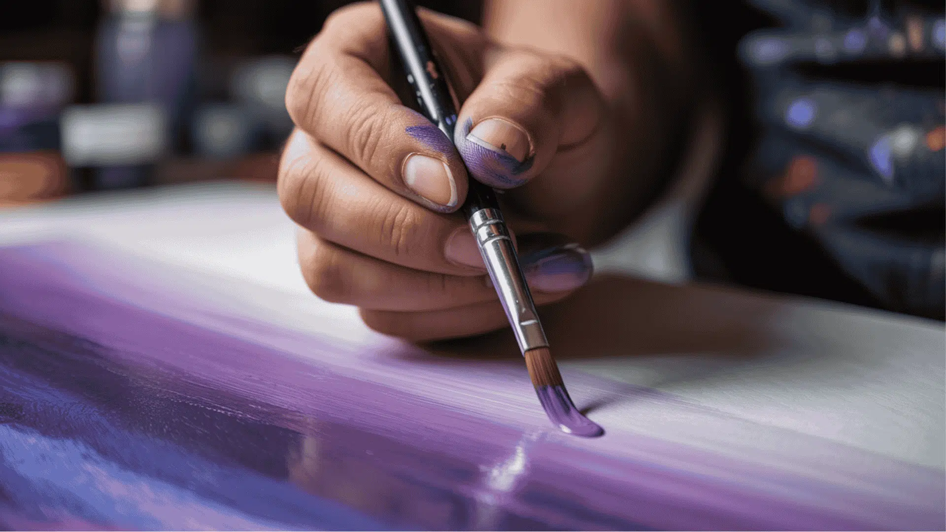
Step 3: Adjust the Balance of Magenta and Blue
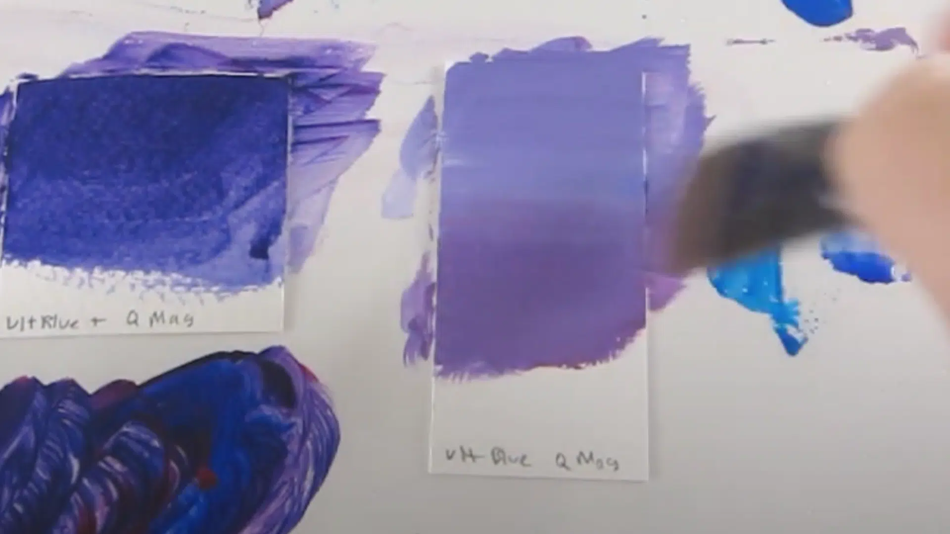
The beauty of purple lies in your control. Experiment to find your favorite balance.
- More Magenta: pinkish or lighter purples.
- More Blue: deeper, cooler purples.
Step 4: Create Shades and Tints
- To create light purples (such as lavender and lilac), simply add Titanium White.
- To create dark purples (such as wine, maroon, or burgundy), add a touch of black.
- To mute or neutralize purple, mix in a complementary green.
This provides a full range of purple shades from a single starting point.
Step 5: Learn the Color Theory Behind It
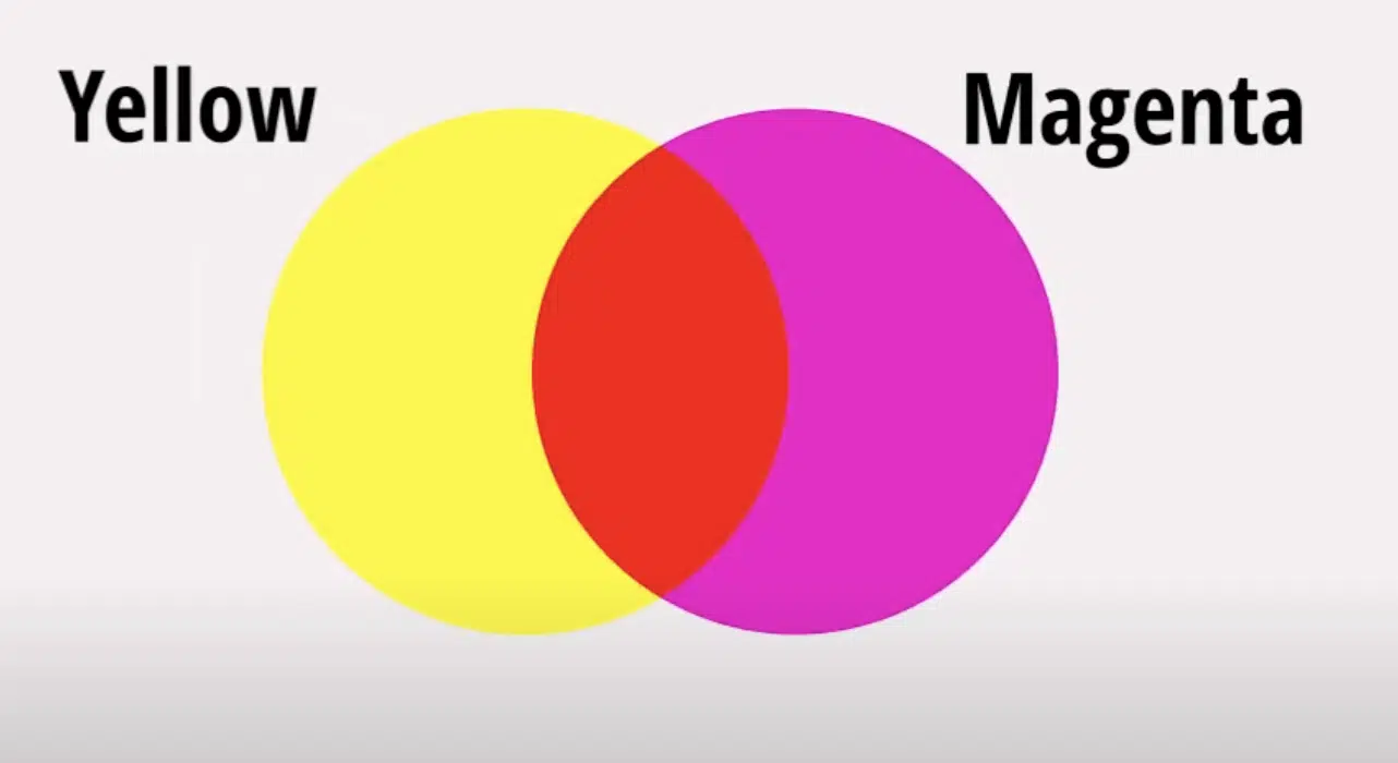
Here’s why magenta + blue works better than red + blue:
- Red is not a pure primary; it’s actually yellow + magenta.
- When you add blue to red, you’re essentially mixing all three primaries (yellow, magenta, blue), which muddies the color.
- By removing yellow and using pure magenta, your purples stay lively.
- Think of it like the printing industry: magenta and cyan combine to form a shade of purple. That’s the secret to brilliant mixing.
For more detailed instructions, refer to the YouTube video below:
Tips & Creative Tricks for Perfect Purple
Want to mix purples like a pro? These insider tricks will help you avoid common mistakes and create stunning shades every time.
- Soften with complementary colors for sophisticated, muted tones
- Avoid muddy browns by skipping orange-based reds like cadmium, vermillion, and scarlet
- Touch of yellow produces earthy, natural purples ideal for landscapes
- Keep additions minimal, just a whisper of complementary color changes everything
- Test first: Always mix small amounts before committing to larger batches
- Clean brushes between colors to prevent contamination that dulls your purples
The Last Mix
Purple might start with a simple formula (red plus blue), but that’s just the beginning of the story.
As we’ve seen, tweaking those ratios opens up a whole universe of possibilities, from soft lilacs that whisper to bold plums that demand attention.
Every adjustment, whether it’s adding white for pastels or yellow for warmth, creates a completely different personality.
Now it’s your turn to play color scientist. Don’t stress about getting it “right.” Purple is forgiving and full of surprises.
No matter if painting a canvas, choosing an outfit, or redesigning your space, you’ve got the knowledge to create exactly the purple you need. Time to get mixing!