Ever wondered how artists create every color imaginable? It all starts with just three mysterious colors that hold incredible power: red, yellow, and blue.
These aren’t just any ordinary colors. They’re special in a way that makes them absolutely essential to every artist and designer.
Here’s where it gets interesting: these three colors have a secret ability that no other colors possess. They’re like the VIP members of the color world, with exclusive privileges that make all other colors possible.
When you understand their magic, you unlock the door to creating thousands of different shades. Here’s a mind-blowing fact: your eyes have special cells designed specifically to detect these three powerful colors!
Ready to uncover the secrets of these color champions? Let’s dive into this rainbow mystery!
What Are Primary Colors?
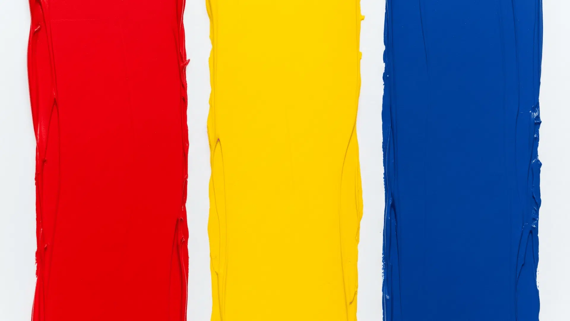
What are primary colors? Primary colors are the most basic colors that cannot be made by combining other colors. These fundamental colors are red, blue, and yellow; they stand alone as pure colors.
Primary colors are called “primary” because they serve as the foundation for all other colors. Just like letters make words, primary colors make new colors when mixed together.
You can’t break them down into simpler colors because they’re already in their most basic form. When artists or designers mix two primary colors, they create secondary colors.
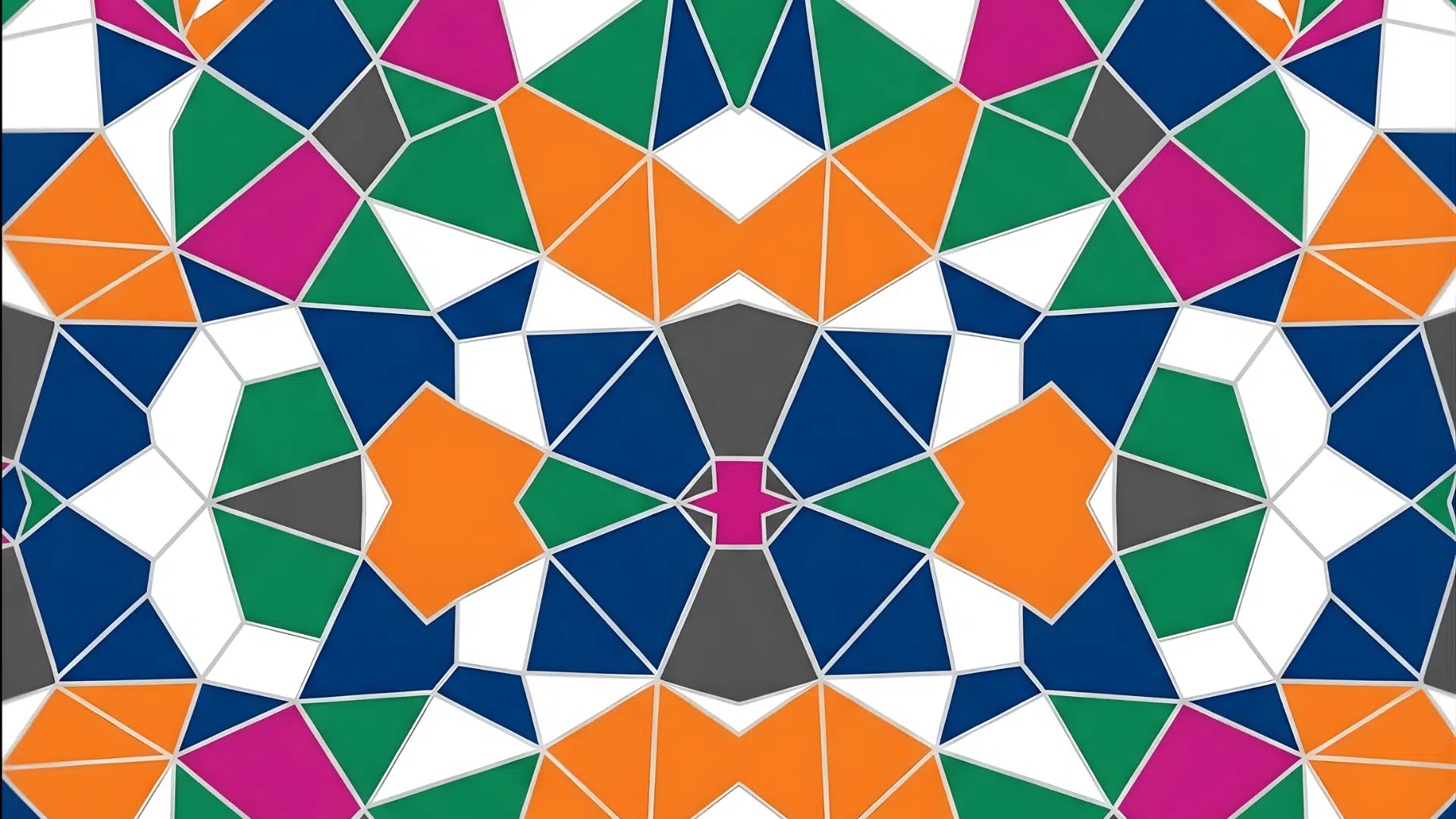
Red mixed with yellow produces orange, blue combined with yellow makes green, and red plus blue creates purple. Understanding primary colors helps us learn how the entire color spectrum works in art and nature.
The 3 Primary Colors Decoded
The 3 primary colors each have unique qualities that make them special in art and everyday life.
- Red: It is bold and energetic. It grabs attention and represents passion, love, and power. You see red in fire trucks, stop signs, and ripe strawberries. Red makes people feel excited and alert.
- Yellow: It is bright and cheerful like sunshine. It symbolizes happiness, warmth, and creativity. Yellow appears in sunflowers, bananas, and school buses. This color helps people feel optimistic and energetic.
- Blue: It is calm and peaceful. It represents trust, stability, and wisdom. Blue shows up in the sky, ocean, and many corporate logos. This color evokes feelings of relaxation and confidence.
Together, these 3 primary colors create the foundation for understanding all other colors in our world.
Understanding Primary Colors Across Different Systems
n
Primary colors behave differently depending on how they are used. Artists, computer screens, and printers each use their own special system with different primary colors.
- Traditional Art Colors (RYB): Artists use red, yellow, and blue as primary colors. This system works when mixing paints, crayons, or colored pencils. These colors absorb light, so when you mix them, they create darker colors.
- Digital Screen Colors (RGB): Computer screens and TVs use red, green, and blue light. These colored lights combine to create brighter colors. When all three mix, they create white light.
- Printing Colors (CMYK): Printers use cyan, magenta, yellow, and black ink. This system works best for creating colors on paper and magazines.
Each system exists because light and pigments work differently. Understanding these systems enables artists, designers, and printers to create the exact colors they desire.
From Primary to Secondary: The Color Mixing Magic
When you mix two primary colors together, you create completely new colors called secondary colors. This color mixing process is the foundation of all art and design work.
| PRIMARY COLOR MIX | SECONDARY COLOR RESULT | MIXING TIPS | COLOR EXAMPLES |
|---|---|---|---|
| Red + Yellow | Orange | Use equal parts for true orange; add more red for red-orange | Pumpkins, carrots, autumn leaves |
| Yellow + Blue | Green | Equal amounts make balanced green; more yellow creates lime green | Grass, leaves, emeralds |
| Blue + Red | Purple/Violet | Start with blue, slowly add red; creates range from lavender to deep violet | Grapes, flowers, amethyst |
Mixing Ratios and Techniques
- Always start with the lighter color first
- Add darker colors slowly in small amounts
- Test your mix on paper before using large quantities
- Remember: it’s easier to darken than lighten colors
Understanding how primary colors create secondary colors gives you the power to make any color you need. This knowledge forms the basis for all color theory in art and design.
Using Primary Colors in Art, Design, and Everyday Life

Primary colors appear everywhere around us, from famous paintings to everyday products. Artists and designers use these powerful colors to create memorable experiences and communicate strong messages.
- Interior Design: Red accent walls energize living rooms, yellow kitchens create warmth, and blue bedrooms promote relaxation. Primary colors make bold furniture statements and eye-catching focal points.
- Brand Recognition: McDonald’s red and yellow create hunger appeal, IKEA’s blue and yellow represent trust and happiness, while Coca-Cola’s red signals excitement and energy.
- Fashion Statements: Classic red dresses command attention, yellow accessories brighten outfits, and blue jeans remain timeless. Primary colors create confident, memorable looks.
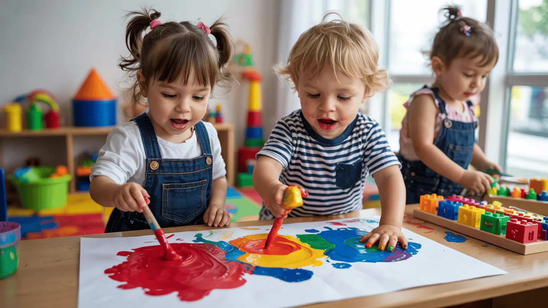
- Educational Tools: Children’s toys, alphabet blocks, and learning materials use bright primary colors to capture attention and aid memory development.
- Famous Artworks: Piet Mondrian’s geometric paintings featured pure primary colors, while Mark Rothko used bold color blocks to evoke deep emotions in viewers.
Bold, bright, and endlessly versatile, primary colors are the building blocks of creativity, shaping how we see and feel the world.
Why Knowing Primary Colors Matters?
Understanding primary colors is akin to possessing a superpower in art and design. Knowing how red, blue, and yellow work helps create better art, make smarter choices, and communicate ideas more clearly.
Primary colors boost creativity by giving you the foundation to mix any color you need. Artists use this knowledge to paint realistic scenes or create mood-setting artwork.
Color psychology taps into emotions: red excites, blue builds trust, and yellow sparks joy, helping designers craft impactful logos and ads.
If you’re decorating your room, creating school projects, or simply trying to understand the world around you, knowing primary colors helps you make more informed visual decisions.
Final Brushstroke
Now you know the secret behind the primary colors: those three powerful building blocks that create our entire visual world!
Red, yellow, and blue aren’t just colors; they’re the foundation of every masterpiece, every sunset, and every rainbow you’ve ever seen.
These three primary colors work like a team, mixing to create endless possibilities. From the orange of a basketball to the purple of your shirt, it all traces back to these color champions.
The best part? You can start experimenting right now! Grab some paint, crayons, or even food coloring and watch the magic happen when you mix these incredible colors together.
What intriguing color will you create first? Drop a comment below and share your colorful discoveries with us!