Most people look at a painting and see the full image. But what if that image was made entirely of dots?
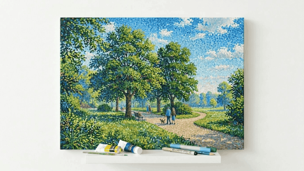
That is exactly what pointillism art is. Artists place tiny, pure color dots directly on the canvas, and the viewer’s eye blends them into a complete image from a distance.
No mixing on the palette. No blending on the surface. Just dots doing all the work. And the results? Far more vibrant and structured than most traditional painting methods can achieve.
This blog covers the history, the key artists, the techniques, and the science behind one of the most method-driven styles in painting history.
The History and Origin of Pointillism
Pointillism began in the late 19th century as part of the Post-Impressionist movement.
Georges Seurat introduced the technique around 1886, and Paul Signac later expanded on it by applying color theory more systematically.
Both artists moved away from traditional painting methods and centered on how the human eye perceives color naturally.
The core idea was simple and clear. Instead of mixing colors on a palette, artists placed unmixed dots of pure color directly onto the canvas.
The viewer’s eye would then blend those colors from a distance. This made pointillism art both a scientific approach and a visual one, setting it apart from every other painting style of its time.
Famous Pointillism Artists and Their Paintings
Pointillism produced some of the most recognized names in art history, each leaving a clear mark on the style’s development.
1. Georges Seurat
Georges Seurat is widely considered the father of pointillism, developing the technique in the mid-1880s through a focused study of color science.
His most celebrated work, A Sunday Afternoon on the Island of La Grande Jatte (1886), took two full years to complete and remains one of the most analyzed paintings in art history.
2. Paul Signac
Paul Signac worked closely alongside Seurat and became the leading figure in spreading pointillism across Europe after Seurat’s death in 1891.
His painting, Entrance to the Grand Canal, Venice (1905), remains among his most recognized works, demonstrating his strong use of color contrast in architectural subjects.
3. Vincent van Gogh
Vincent van Gogh briefly adopted pointillism during his time in Paris, using broader and more expressive dots that reflected his personal approach to color.
Works like Self-Portrait (1887) show clear traces of the influence, though he eventually moved toward a more emotionally driven style.
4. Henri-Edmond Cross
Henri-Edmond Cross pushed pointillism toward bolder color combinations, working with larger dots than most of his contemporaries.
His painting The Beach at Cabasson (1891) is a strong example, and his use of color directly influenced Henri Matisse and the Fauvist movement.
5. Maximilien Luce
Maximilien Luce stood apart by applying pointillism to industrial and urban subjects rather than landscapes or leisure scenes.
His work, A Paris Street (1887), captures working-class city life through carefully placed dots, expanding the range of subjects the style could effectively address.
Key Characteristics of Pointillism Art
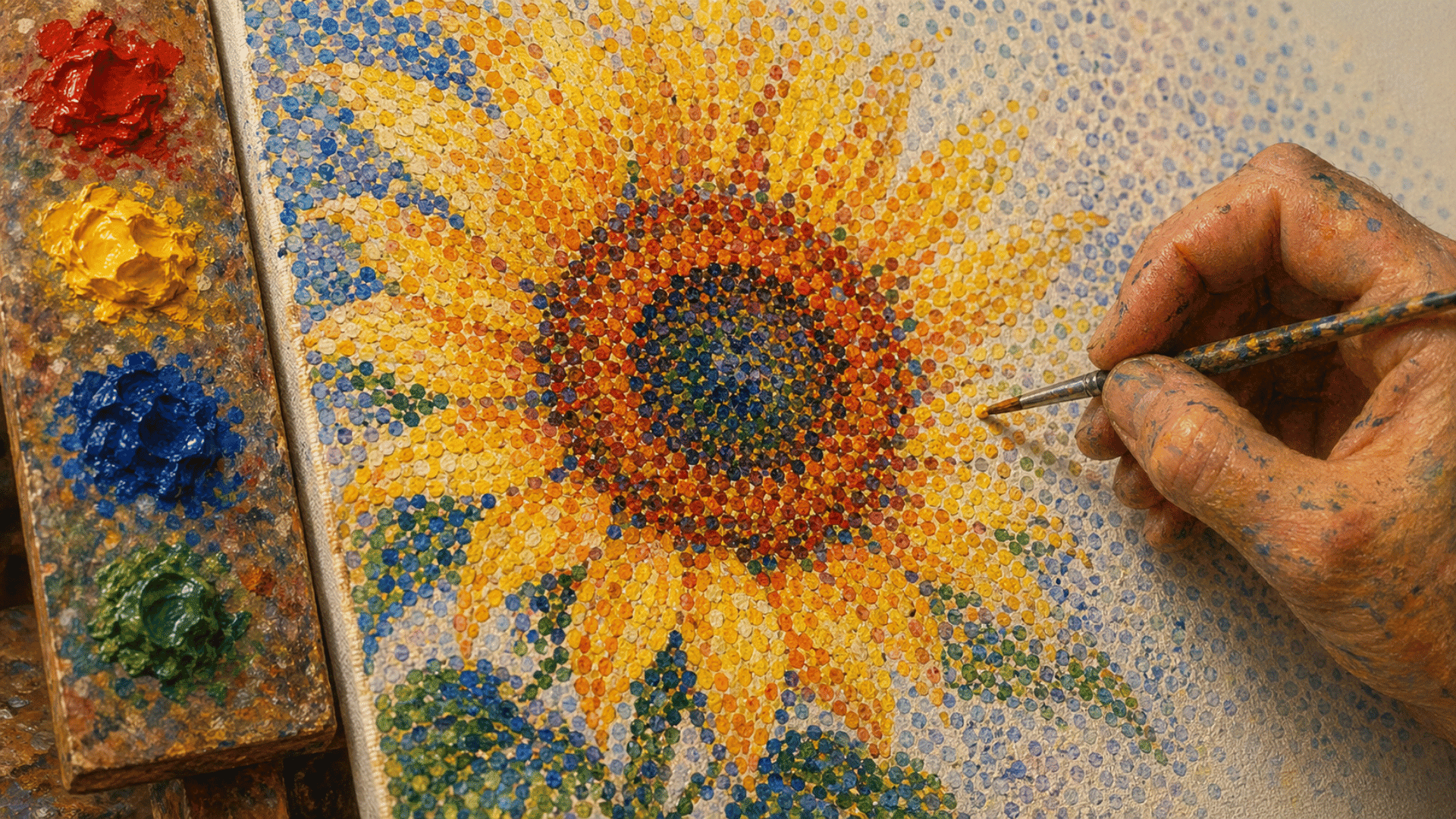
Pointillist art follows distinct principles that define its visual outcome.
- Use of Small Dots: Artists apply small, clearly visible dots instead of traditional brush strokes to form the full image step by step.
- Optical Color Blending: Colors are not mixed on the canvas. The viewer’s eye blends them naturally when looking at the work from a distance.
- Controlled Light and Tone: Careful dot placement allows artists to manage how light and shadow appear across different areas of the composition.
- Spacing and Composition: The distance between dots plays a key role in how the final image reads, making spacing just as important as color choice.
- Patience and Precision: The process is slow and detailed by nature, requiring consistent attention to dot size, placement, and color at every stage.
Color Theory in Pointillism
Pointillism is built entirely on the science of how the human eye processes color.
Instead of mixing pigments on a palette, artists place pure, unmixed dots of color directly onto the canvas and let the viewer’s eye do the blending from a distance.
This approach is rooted in the findings of French chemist Michel Eugène Chevreul, who studied how colors placed next to each other interact visually rather than physically.
Complementary colors such as blue and orange, or red and green, appear more intense when placed side by side rather than mixed together.
Pointillist artists used this principle to create compositions that felt brighter and more vibrant than traditional painting methods could achieve.
The result was a technique grounded equally in scientific observation and visual perception, giving the style a precision that set it apart from every other approach of its time.
Techniques and Styles Related to Pointillism Art
This style includes several techniques that expand its core method of dot-based application, each offering a different way to build form and structure.
1. Classic Dot Application
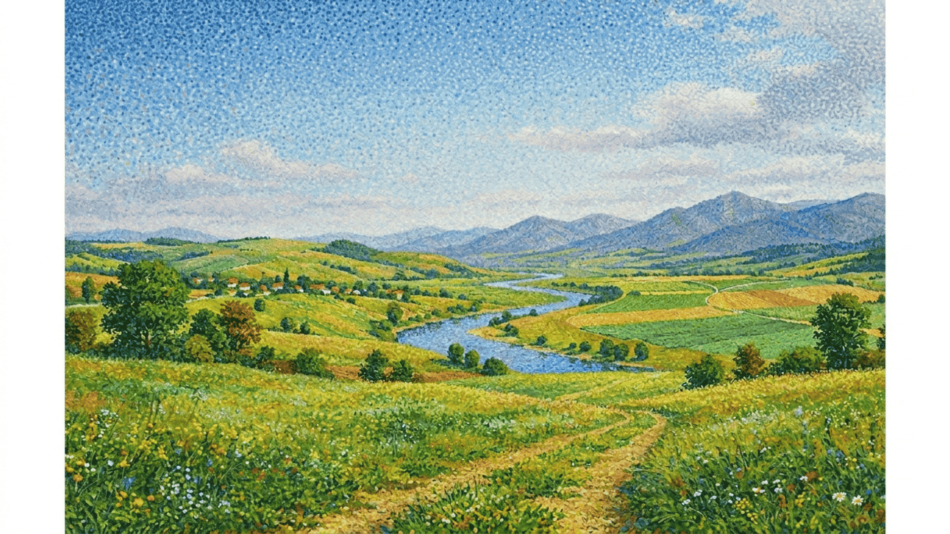
Classic dot application is the most commonly used technique in pointillism paintings. Uniform dots are evenly spaced across the surface to maintain consistency throughout the work.
The spacing between dots remains steady, which helps create smooth color transitions when the work is viewed from a distance.
This approach forms the foundation of the entire pointillist method. It is most widely applied in landscape and portrait paintings where balanced color distribution is the main goal.
2. Varied Dot Density
Varied dot density is a method where dot spacing changes to meet the tonal needs of the composition. Dots are placed closer together in darker areas and farther apart in sections that require more light.
This contrast in spacing builds depth across the surface without using shading or blending in the traditional sense.
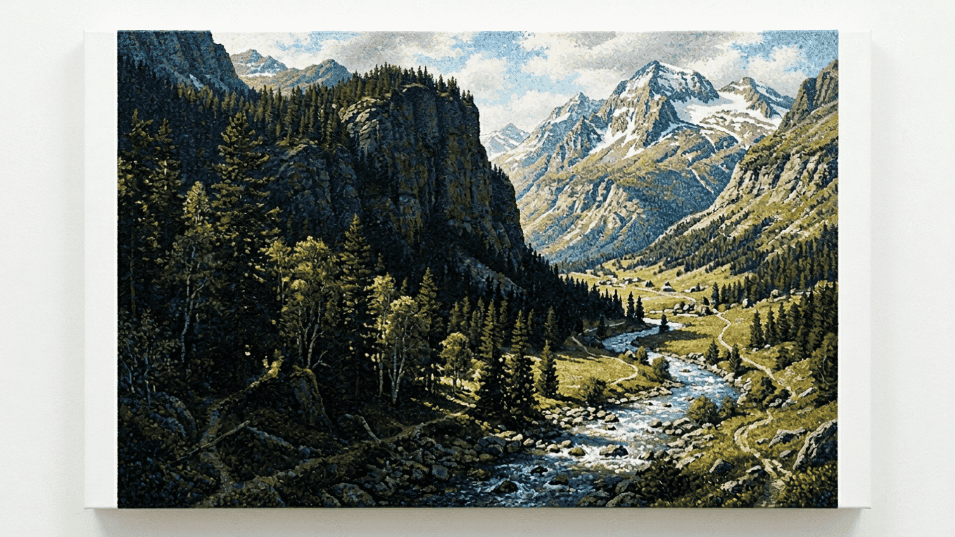
It is widely applied in outdoor and nature paintings where strong light and shadow relationships make certain areas stand out more clearly than others.
3. Color Layering with Dots
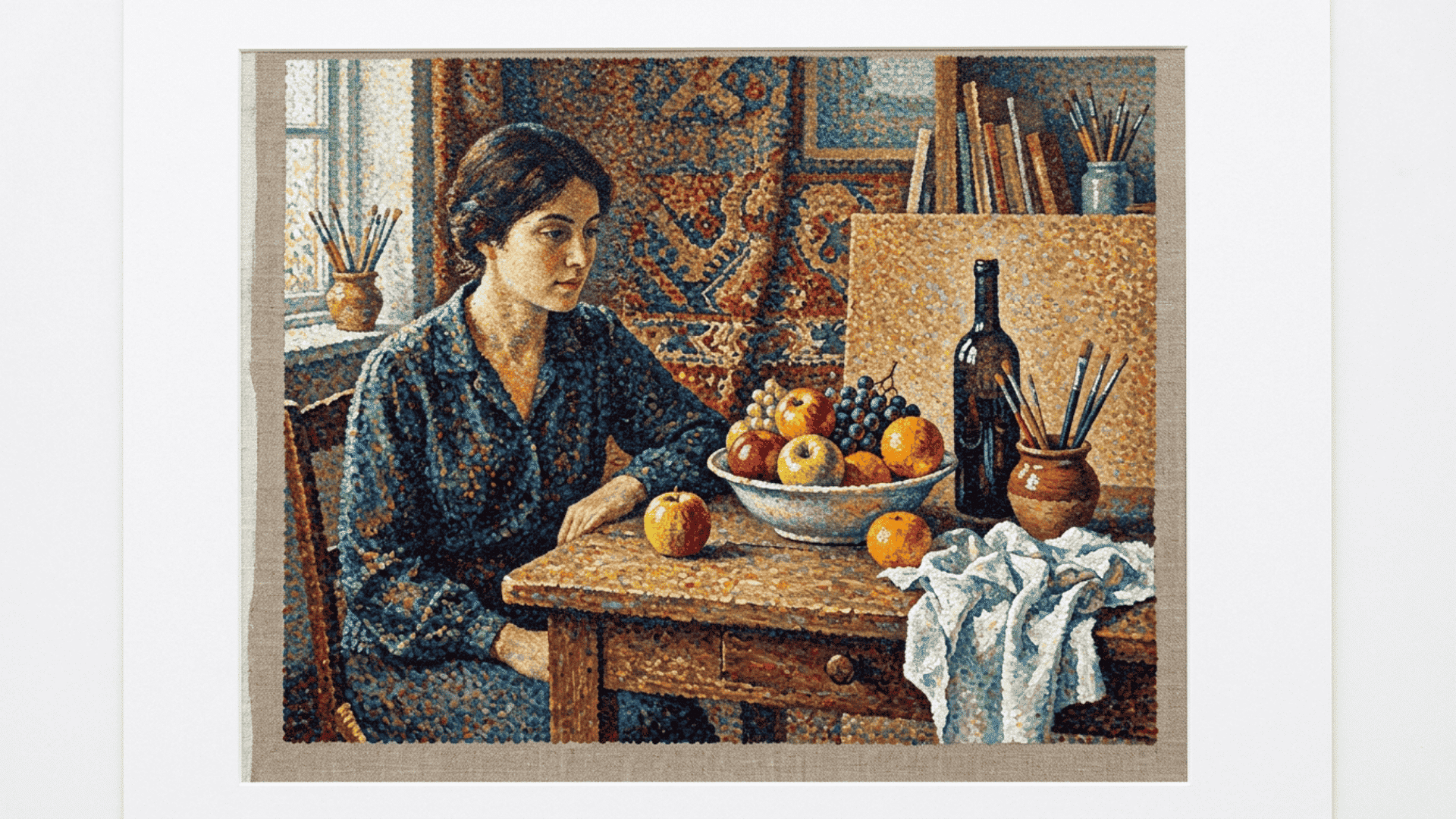
Color layering involves adding multiple rounds of colored dots on top of or beside each other to build richer tones. Each layer contributes a slightly different shade, creating gradual color shifts within the work.
This technique avoids direct paint mixing while still producing complex color results that feel full and varied.
It is frequently used in still-life and figure paintings, where depth and warmth are created through color alone rather than through physical blending.
4. Directional Dot Placement
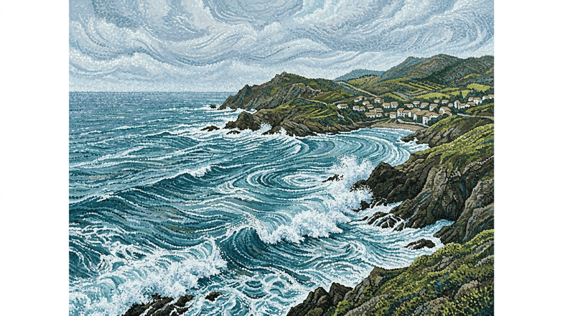
Directional dot placement is a pointillist technique in which dots follow subtle patterns across the surface. Instead of random placement, dots are arranged to guide the viewer’s eye through the composition.
This adds a sense of movement and flow to the work without disrupting the overall dot-based structure.
It is often seen in water and seascape paintings where visual direction plays an important role in carrying the overall feel of the work.
5. Mixed Media Pointillism
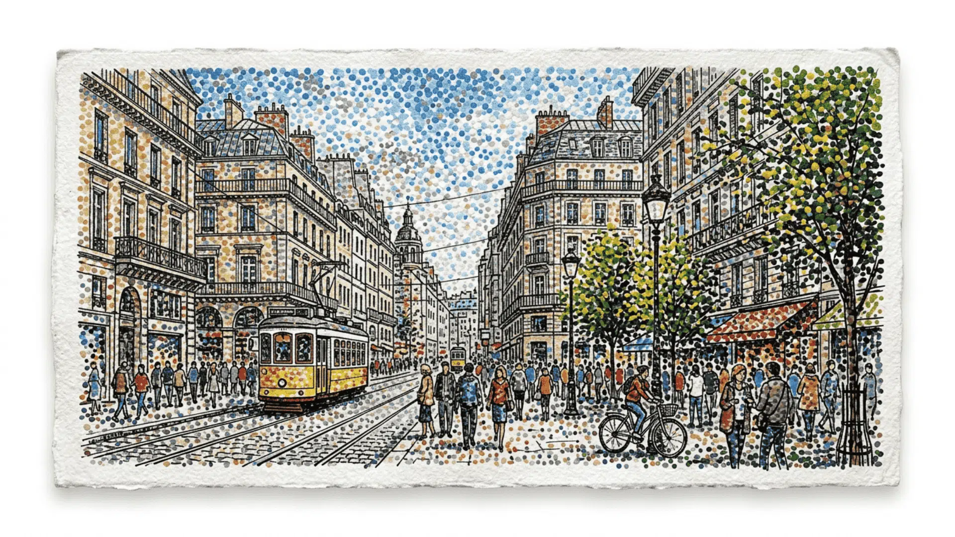
Mixed-media pointillism art combines the traditional dot technique with other tools and materials to add variety to the composition. Artists may use ink, digital tools, or textured surfaces alongside dot application.
This approach keeps the core structure intact while allowing more flexibility in how the final image is built.
It is commonly seen in contemporary works, where artists seek to expand the dot-based method beyond its original boundaries while staying true to its core.
Pointillism Vs Traditional Painting
Pointillism and traditional painting may share the goal of creating visual images, but their approaches are quite different.
| Aspect | Pointillism Art | Traditional Painting |
|---|---|---|
| Technique | Small dots of pure color | Brush strokes and blended paint |
| Color Approach | Visual blending by the eye | Physical mixing of colors |
| Detail Creation | Controlled through dot placement | Controlled through strokes |
| Viewing Distance | Best seen from a distance | Clear at close and far range |
| Process | Slow and structured | Flexible and varied |
| Tools Used | Fine pointed brushes or pens | Broad and flat brushes |
| Time Required | lengthy due to the dot-by-dot application | Faster with broader strokes |
Why Professional Artists are Drawn to the Pointillist Style?
Pointillist art offers a structured way to manage color relationships and visual effects without relying on traditional blending techniques.
Artists can create precise light and tone variations by simply adjusting dot size, spacing, and color placement within the work.
It also gives artists full control over how viewers experience the work. The final image shifts with viewing distance and angle, giving each piece a distinct visual identity.
This level of depth and perception is something most other methods cannot offer. It is a key reason why professional artists continue to find pointillism art worth exploring and practicing.
Common Mistakes While Making Pointillism Art
Pointillism art requires careful attention at every stage, and even small oversights can affect the clarity and balance of the final work.
- Inconsistent Dot Size: Applying dots of varying sizes without intention disrupts visual consistency, making the composition look uneven.
- Poor Dot Spacing: Placing dots too close or too far apart in the wrong areas weakens the visual blending of colors within the work.
- Ignoring Contrast: Failing to consider color contrast while placing dots results in a flat composition that lacks depth and dimension.
- Overcrowding Certain Areas: Adding too many dots in a single section creates visual noise that distracts from the focal point.
- Neglecting Viewing Distance: Failing to account for distance results in a composition that loses its intended effect when viewed from afar.
It’s a Wrap
Pointillism art stands out for one simple reason: it turns tiny dots into something much larger than the sum of its parts.
Each dot plays a role, the spacing, the color, the placement, all of it works together to create an image that only comes together when viewed as a whole.
For anyone looking to understand how structure and perception can shape a painting, pointillist art is a clear example of that balance done right.
It is precise, methodical, and continues to hold its place in art history for good reason.


