If you’ve ever looked at a painting and wondered why one feels flat while another seems full of depth and light, the answer usually comes down to one thing: “Value.”
But what does value mean in art? If you have this question, you’re really getting to the core of how artists create dimension and realism.
Once you understand value, you start seeing it everywhere, from drawings and photographs to everyday light and shadow.
This blog breaks it down, covering definitions, value scales, key terms, and how great artists have used it.
What Does Value Mean in Art?
Value in art refers to the relative lightness or darkness of a color or tone.
It is one of the seven fundamental elements of art alongside line, shape, form, texture, color, and space, and many artists and teachers would argue it is the most important of all.
It is value, not color, that creates the illusion of light falling on a surface, gives objects the appearance of three-dimensional form, and makes a composition readable at a glance.
Without value, everything flattens into an undifferentiated surface regardless of how many colors are present.
The Importance of Value in Art
Value does more visual work than most beginners realize. Here is why getting it right matters more than almost any other element.
- It creates the Illusion of Three-Dimensional Form: Light and shadow, defined by value, making a flat circle look like a sphere and a flat square look like a cube
- It Establishes Mood and Atmosphere: High contrast dark values feel dramatic and intense, while close soft values feel calm, quiet, and atmospheric
- It Directs the Viewer’s Eye: The eye moves naturally toward areas of highest contrast, so controlling value means controlling where attention goes in a composition.
- It makes a Painting Readable without Color: A strong value structure communicates the subject clearly, even in greyscale, while weak value relationships make a composition confusing, regardless of how good the color is
- It is the Foundation of Realistic Light: Understanding how value shifts as surfaces turn away from a light source is what separates convincing, realistic painting from flat, decorative work
Key Value Terms Every Artist Should Know
Before you can use value confidently in your work, you need to understand the language around it. These are the six terms that come up most, along with ten, and what each one actually means.
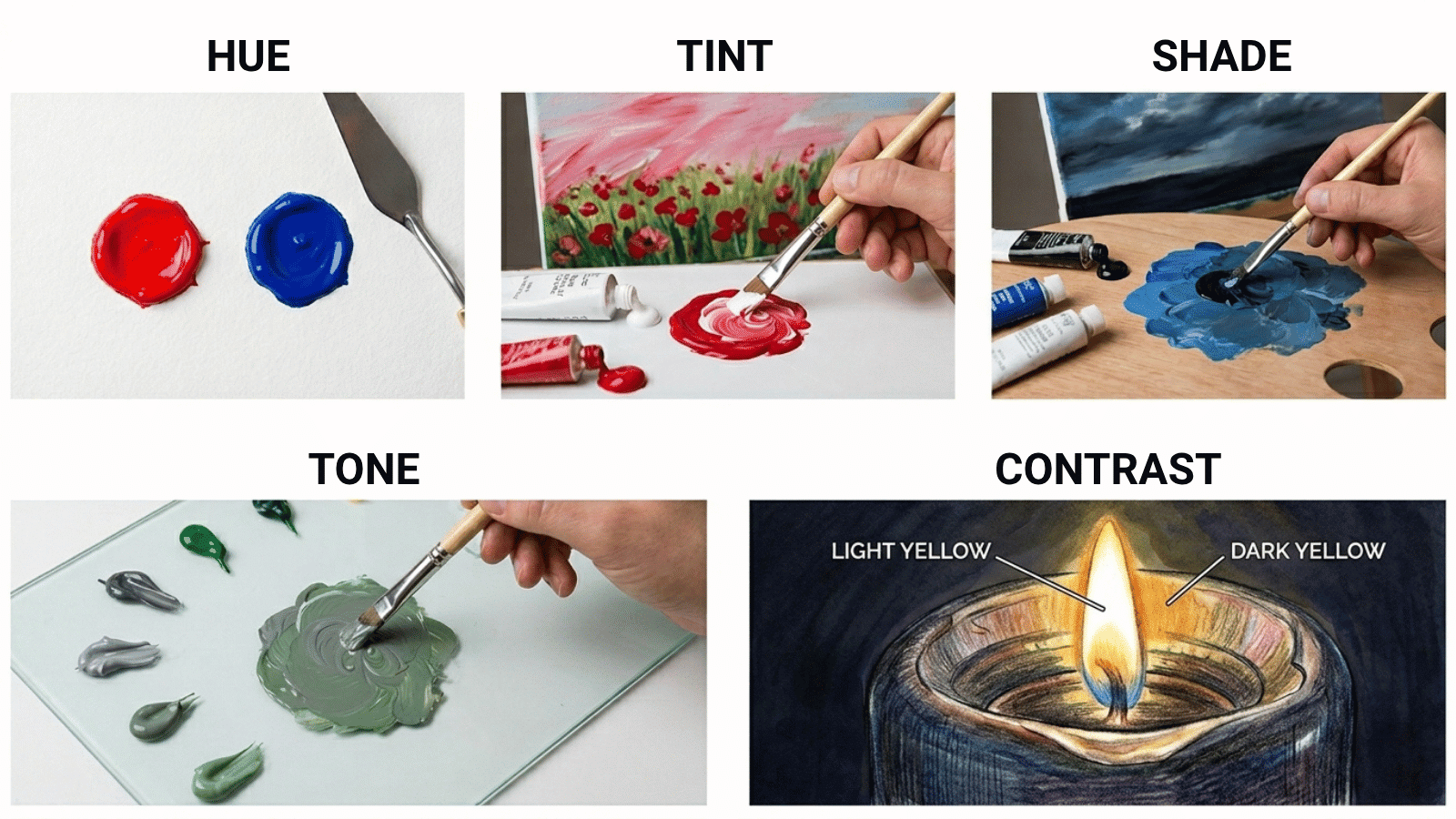
1. Hue
Hue is simply the color itself: red, blue, yellow, green. It is what most people mean when they say “color.” Value is a completely separate quality that describes how light or dark a color is.
A pale pink and a deep crimson are both the same hue: red, but they sit at completely different points on the value scale.
2. Tint
A tint is created by mixing a color with white to lighten it, moving it up the value scale toward the lighter end. Pink is a tint of red, sky blue is a tint of blue, and pale yellow is a tint of yellow.
In painting, tints are used to suggest areas where light falls directly on a surface; the lighter the tint, the more intense the light source appears.
3. Shade
A shade is created by mixing a color with black to make it darker, moving it down the value scale toward the darker end.
Deep navy is a shade of blue, burgundy is a shade of red, and forest green is a shade of green. Shades are used to suggest shadow, depth, and the parts of a form that turn away from the light source.
4. Tone
A tone is created by mixing a color with grey; this reduces the intensity or saturation of the color without dramatically shifting it up or down the value scale.
The result is softer and more muted than either a tint or a shade. Tones are particularly useful in realistic painting for creating the subtle transitions between lit areas and shadows that do not jump too dramatically from light to dark.
5. Contrast
Contrast in value terms refers to the difference between the lightest and darkest areas in a composition. High contrast and large jumps between light and dark create drama, tension, and visual energy.
Low contrast, values that sit close together on the scale, creates harmony, subtlety, and a quieter mood.
Artists deliberately use contrast to create focal points because the eye is naturally drawn to the areas of highest contrast in any composition.
The Relationship Between Value and Color
Color and value are closely related, but not the same thing, and understanding the difference between them is one of the most important shifts a developing artist can make.
Every color has an inherent value; yellow sits naturally near the light end of the value scale, while violet sits naturally near the dark end.
When you mix white into a color, or its value rises, and when you mix black, its value falls; though adding black often shifts the hue as well, many painters prefer to darken colors using complementary mixtures rather than black.
The Value Scale Explained
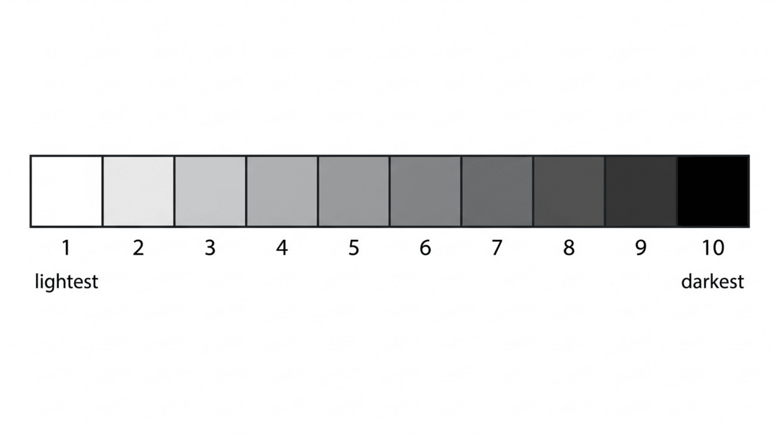
The value scale is a graded strip running from pure white at one end to pure black at the other with a series of evenly spaced grey steps between them.
Most scales show nine to ten steps in total.
The scale gives artists a concrete reference point for identifying where any given color or tone falls on a lightness-darkness scale, making it easier to compare values accurately rather than guess.
One of the most effective ways to use a value scale is to squint at your subject. Squinting reduces detail and simplifies what you see into broader value masses, making it easier to match what you observe to a point on the scale.
The Value Scale in Different Art Mediums
Value works differently depending on the medium you are working in, but the underlying principles stay the same across all of them.
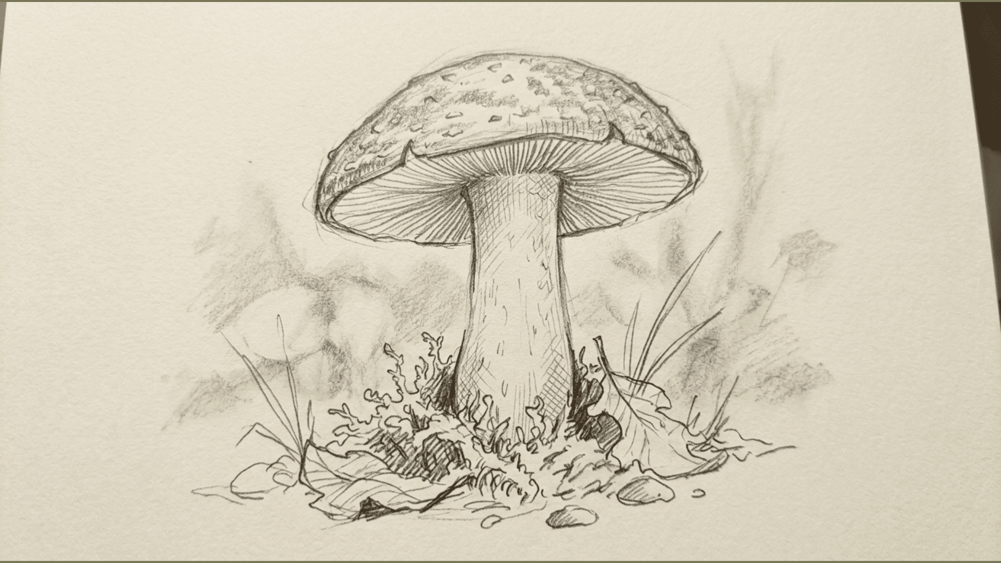
- Value in Drawing: Built through pencil pressure, hatching, cross-hatching, blending, and stippling, graphite offers a wide but reflective range; charcoal produces deeper blacks and softer transitions; and ink creates the highest contrast of all
- Value in Painting: Controlled through mixing, white raises value, black or dark complements lower it, with watercolor being the most challenging because the lightest values must be planned from the start by leaving the paper untouched
- Value in Digital Art: Brightness and luminosity sliders control value directly. Many digital artists build a greyscale value study first before adding any color, then check relationships at any point by converting to greyscale instantly
- Value in Photography: Controlled through light direction, exposure, and post-processing, strong directional light creates dramatic value contrast, while flat overcast light compresses the value range; the same compositional principles that apply to drawing and painting apply equally here
Famous Examples of Value in Art
Looking at how Master artists use value to make the concept click more effectively than theory alone. These examples show value working at its most powerful.
1.Rembrandt: Chiaroscuro and Dramatic Value Contrast
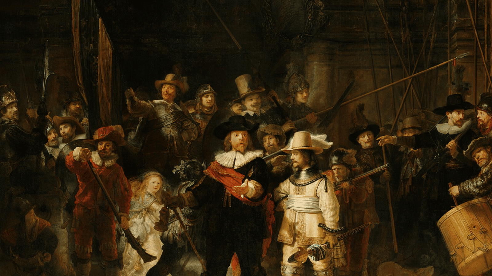
Source: Wikipedia
Rembrandt is perhaps the most celebrated master of chiaroscuro, the technique of using extreme contrasts between light and dark to model form and create dramatic atmosphere.
Works like The Night watch and his self-portraits demonstrate how a limited palette of dark tones with concentrated light can evoke psychological depth and make the subject seem genuinely illuminated rather than painted..
2. Leonardo da Vinci: Sfumato and Subtle Value Transitions
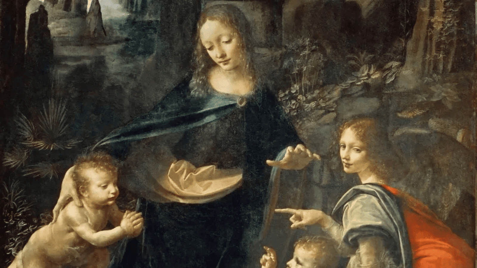
Source: SimplyKala
Leonardo used sfumato, a technique of blending values so gradually and smoothly that edges dissolve into soft atmospheric haze with no hard lines visible anywhere.
The Mona Lisa is the most famous example; the transitions between light and shadow across the face are so gradual as to be almost imperceptible, which gives the painting its uncanny sense of life and presence.
The Virgin of the Rocks shows the same technique applied to an entire atmospheric landscape disappearing into misty distance.
3. Georges Seurat: Value Through Pointillism
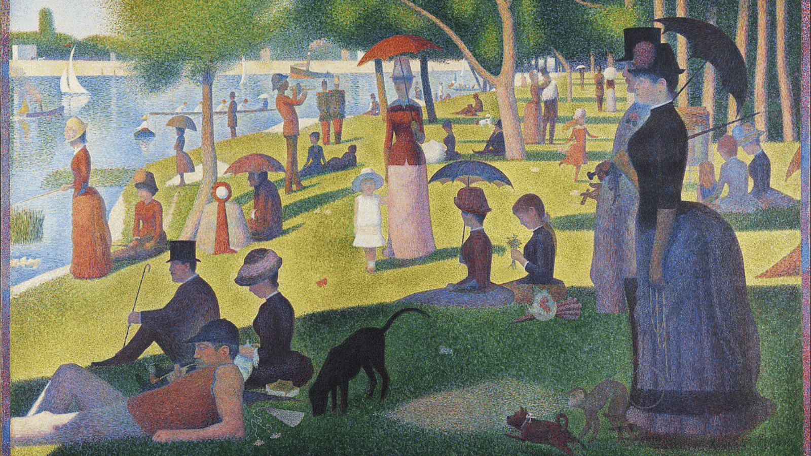
Source: Wikipedia
Seurat built his value relationships not through mixing paint on a palette but through the optical blending of thousands of small colored dots placed directly on the canvas.
In A Sunday on La Grande Jatte, the eye perceives value relationships across the entire surface by blending adjacent dots, dark clustered dots read as shadow, and lighter spaced dots read as light.
4. Ansel Adams: Value in Black and White Photography
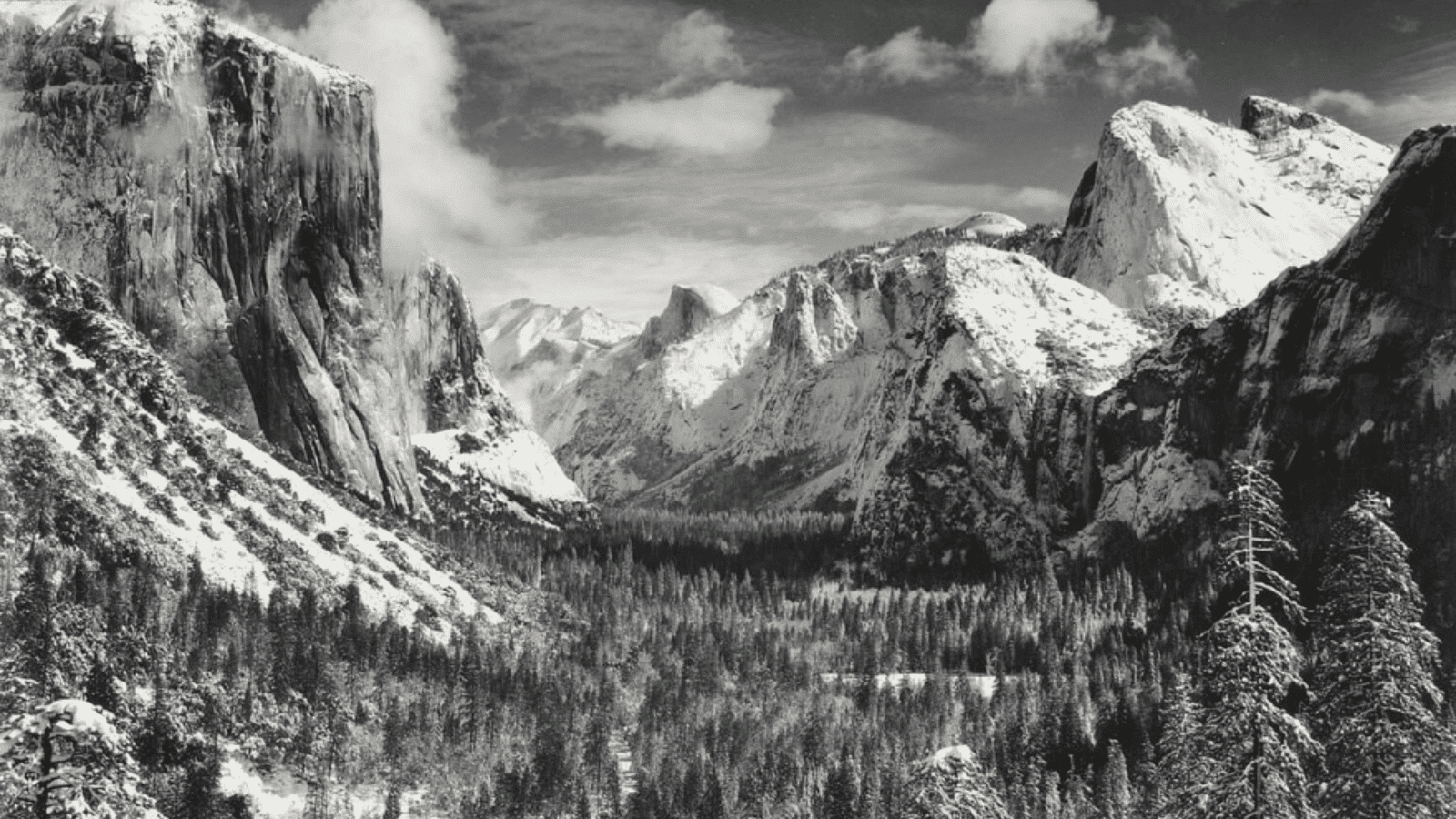
Source: Yosemite
Ansel Adams developed the Zone System, a technical framework for controlling the full value range from pure white to pure black across ten distinct zones in black and white photography.
His landscape photographs of Yosemite and the American West demonstrate how mastery of value relationships can make a black-and-white image feel more complete and emotionally powerful than many full-color photographs.
How to Practice and Improve Your Understanding of Value?
Building a strong instinct for value takes deliberate practice. Here are the most effective exercises to develop it.
- Make a Value Scale by Hand: Controlling the gradation manually builds more intuitive understanding than any printed reference.
- Do Greyscale Studies: Paint or draw from black and white photographs to remove color as a distraction and focus entirely on value
- Squint at Your Subject: Squinting simplifies what you see into broader value masses and makes relationships easier to identify and compare.
- Do Value Thumbnails Before Starting: Small, quick greyscale sketches of your planned composition help you resolve value problems before committing to a full piece
The Bottom Line
Asking what value means in art changes the way you see and create. Value is what gives artwork its depth, mood, and visual impact, turning simple shapes into something lifelike and expressive.
Master artists didn’t just use it technically; they used it to guide emotion and storytelling. As you start noticing value in everyday scenes, from soft shadows to strong contrasts, you’ll naturally improve your artistic eye.
With practice, recognizing and applying value becomes instinctive, helping you create more balanced, dynamic, and visually engaging art.
Frequently Asked Questions
What Value Best Defines Art Value?
Value in art is the range from the lightest tones to the darkest tones in an artwork. It includes high (light) and low (dark) values that work together to create depth.
How to Show Value in a Drawing?
Artists show value using a scale from white to black, applying different levels of light and dark. Techniques like shading, hatching, and blending help create realistic light and shadow.
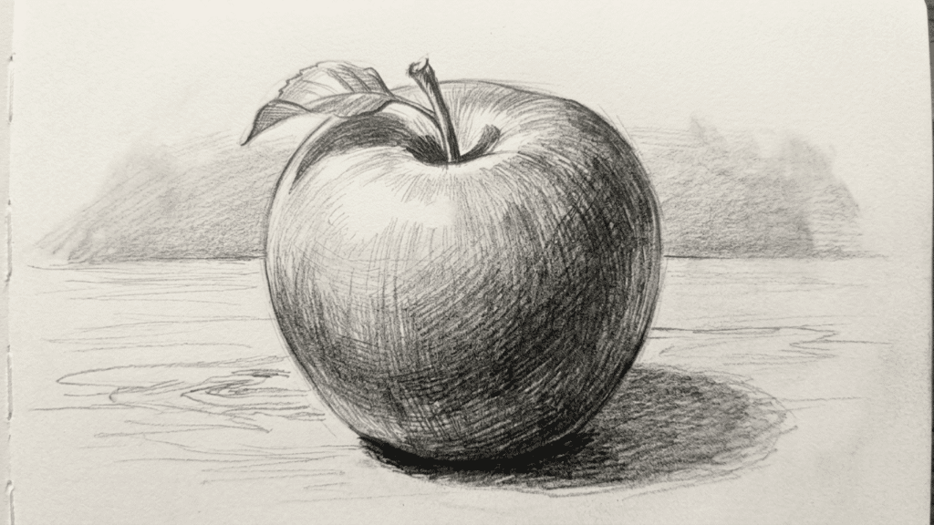
What is an Example of Value in Art for Beginners?
A simple example is a grayscale gradient from white to black with shades in between. For instance, highlights and shadows on an apple create a three-dimensional effect.