Artists have wrestled with one fundamental challenge for centuries: how to make their work feel just right.
Scale and proportion in art form the invisible foundation that separates amateur sketches from masterpieces that stop viewers in their tracks.
When Michelangelo carved David, he didn’t just chip away marble randomly. He understood how scale in art could change a simple figure into something extraordinary. Yet many art enthusiasts still find these concepts puzzling and hard to grasp.
This guide breaks down scale and proportion into simple, practical insights. Readers will learn how master artists apply these principles and recognize them in famous works.
Most importantly, they’ll understand why getting these elements right makes all the difference in creating compelling art.
Why Are Scale And Proportion Important in Art?
Scale and proportion in art create emotional responses and guide the viewer’s perception. When artists manipulate these elements, they control how audiences feel and what catches their attention first.
The Main Key Benefits Are:
- Visual harmony: Proper proportion ensures portraits feel natural and pleasing
- Hierarchy and emphasis: Larger objects naturally draw focus and suggest importance
- Emotional impact: Scale relationships trigger specific feelings in viewers
These principles also communicate meaning and mood. Towering mountains dwarfing tiny human figures convey the power of nature and human vulnerability.
Without understanding these relationships, viewers miss crucial artistic messages and emotional depth that artists carefully embed within their creative works
Understanding Scale in Art
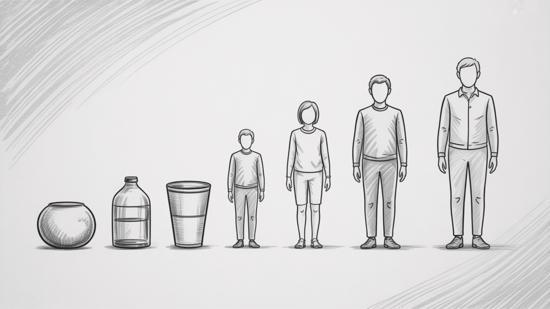
In art, scale refers to the size of an object in relation to other objects, its surroundings, or the viewer.
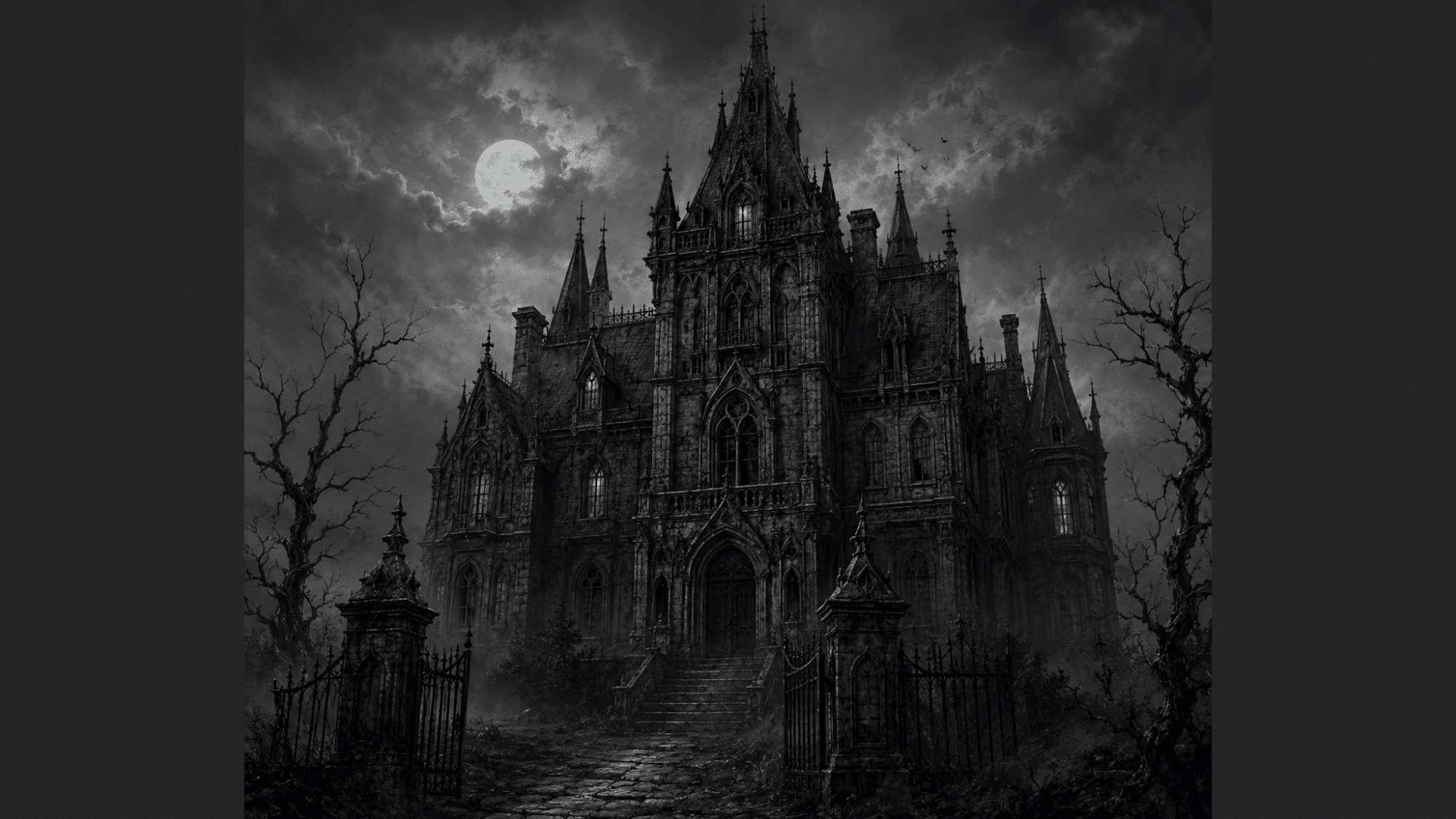
It plays a crucial role in how we perceive importance, meaning, and emotion in a work. Artists use scale to create emphasis, drama, or perspective, whether through monumental sculptures like Michelangelo’s David or miniature paintings that invite intimate observation.
Scale can be realistic, matching life-size proportions, or deliberately altered to challenge expectations.
For example, oversized installations by contemporary artists like Claes Oldenburg change everyday objects into larger-than-life experiences, changing how we connect with the familiar.
Similarly, traditional art forms like Egyptian paintings used a hierarchical scale to show power, making rulers appear larger than common people.
Ultimately, scale is a powerful tool that shapes the viewer’s interaction and emotional response to art.
What is Proportion in Art?
Proportion in art refers to the relationship between the sizes of different parts within a whole.
It ensures that figures, objects, and compositions feel balanced, realistic, or intentionally distorted. When proportions are accurate, as in classical Greek sculpture or Renaissance paintings, the work reflects harmony and naturalism.
Artists like Leonardo da Vinci studied mathematical systems such as the Golden Ratio to define ideal human proportions, seen in his famous Vitruvian Man. However, proportion isn’t limited to realism; many artists exaggerate or distort it to create emotional impact, humor, or symbolic meaning.
Caricatures, for example, enlarge features to highlight personality, while surrealist painters like Salvador Dalí used warped proportions to inspect the subconscious.
Whether realistic, idealized, or abstract, proportion guides how viewers interpret relationships within a composition and shapes the overall aesthetic experience.
Scale vs. Proportion: The Crucial Difference
| Aspect | Scale | Proportion |
|---|---|---|
| Definition | The size relationship between objects | Mathematical relationship between parts |
| Focus | How big or small something appears | How parts fit together harmoniously |
| Purpose | Creates depth and emphasis | Ensures visual balance and believability |
| Example | A tiny person next to a huge building | The head is sized correctly for the body |
| Effect | Controls viewer attention | Maintains realistic or stylistic harmony |
| Measurement | Compared to real life or other elements | Based on ratios and proportional systems |
How Artists Use Scale and Proportion in Art: Practical Technique
Artists don’t just think about what to create, but also how big or how balanced it should be. By adjusting scale and proportion, they guide the viewer’s eye, set the mood, and add layers of meaning to their work.
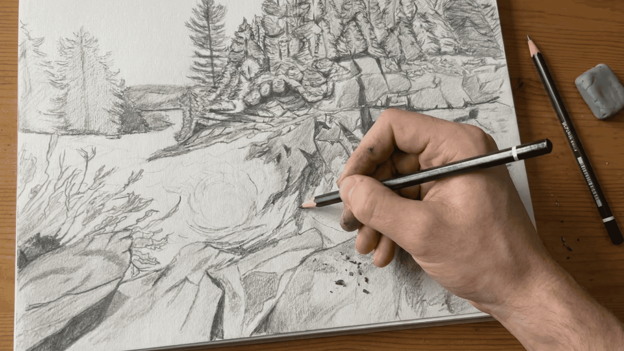
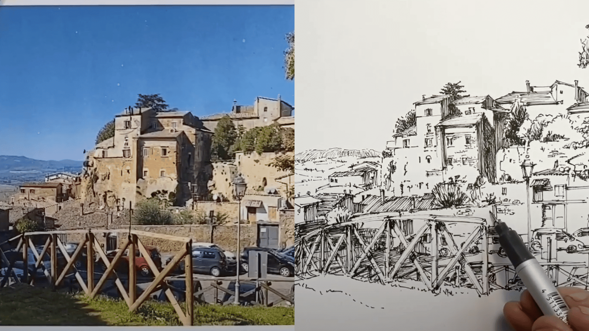
Step 1: Begin at the Center
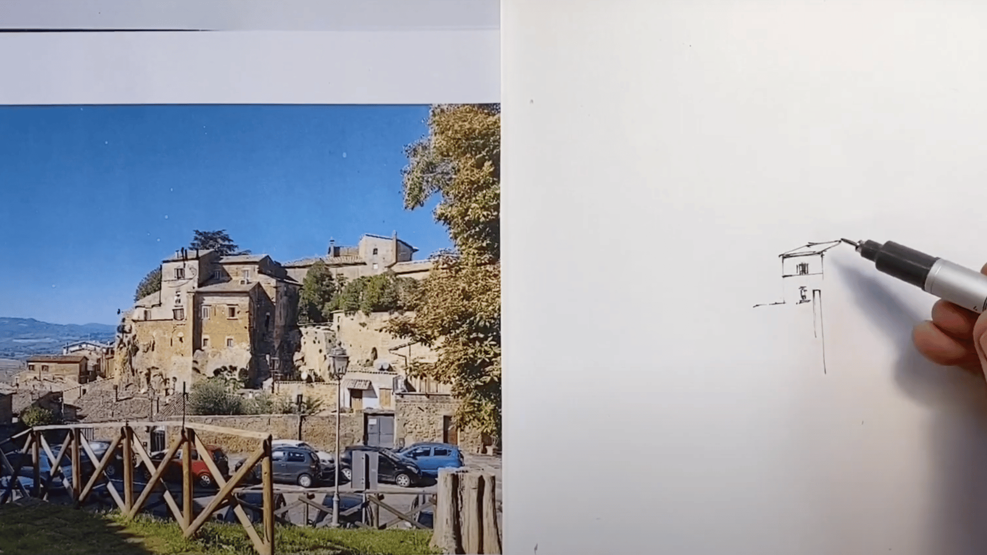
Start your drawing from the central subject of the scene, often a key building or structure. By working outwards, small errors remain contained within half the page instead of multiplying across the entire drawing.
This central anchor gives balance and makes expansion more manageable.
Step 2: Block in Simple Shapes First
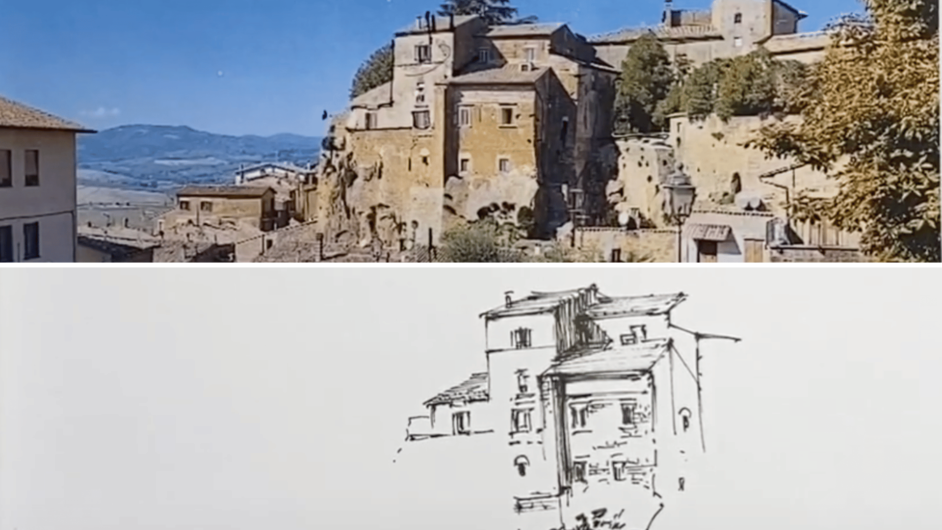
Identify the most basic geometric forms (rectangles, triangles, etc.) in your central subject. Draw them lightly and in correct proportion.
These foundational shapes act as measuring units for the rest of the scene, helping you build accurate alignments.
Step 3: Work Outwards with Alignment Checks
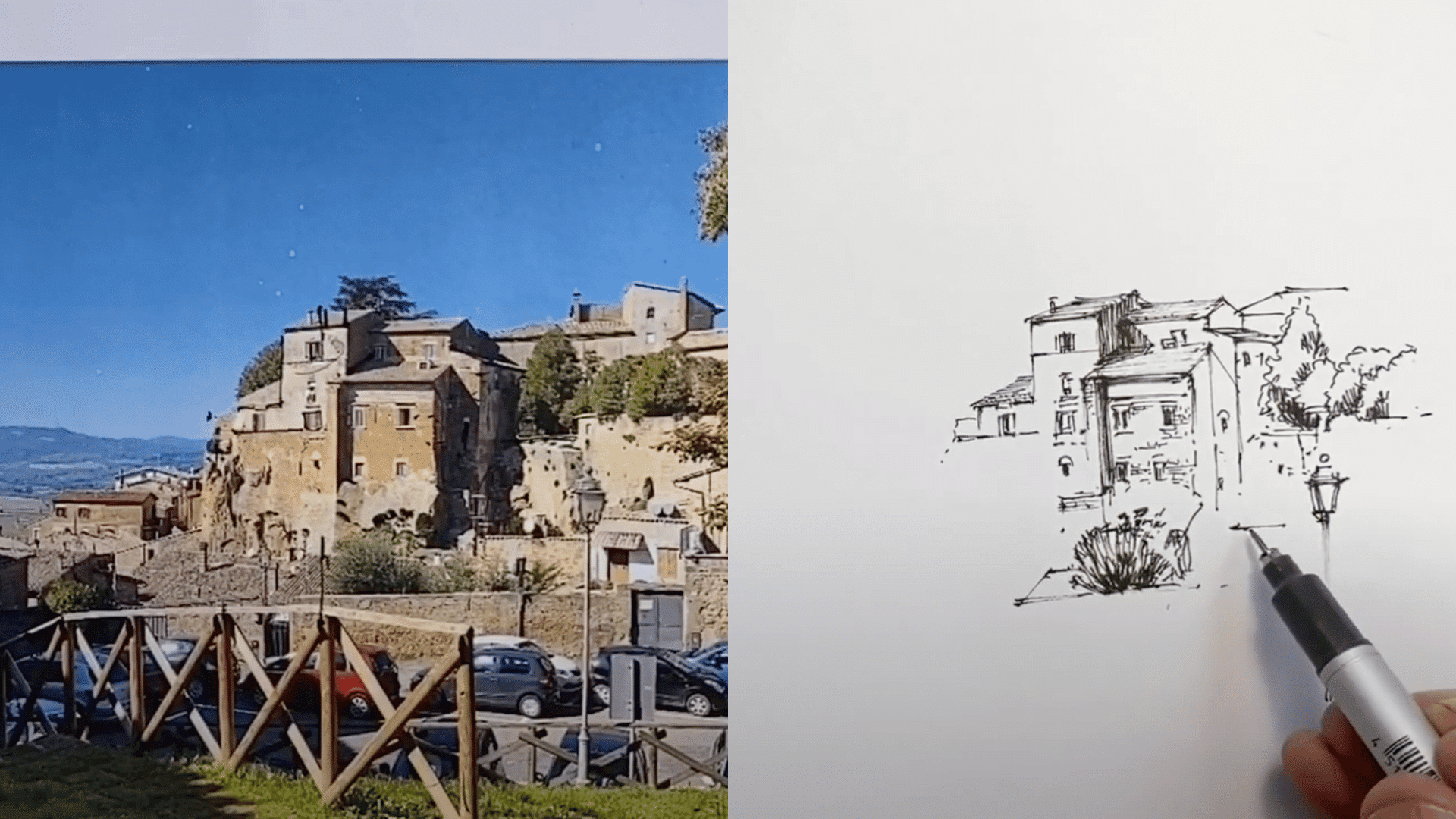
Expand the drawing both horizontally and vertically from the center, constantly checking proportions against what’s already drawn.
Use windows, rooflines, or edges as guides. Remember to keep windows or repeated details slightly smaller than you think they will appear, as they often seem larger once inked.
Step 4: Adjust for Organic Forms Thoughtfully
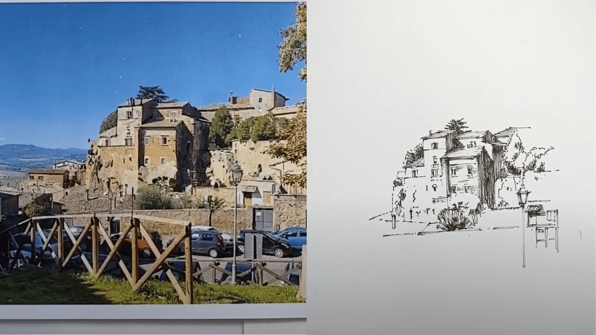
When you encounter irregular shapes, such as trees, shrubs, or natural contours, slow down and observe them carefully. Use varied hatching to separate values and textures.
Allow some flexibility here; organic forms don’t need perfect precision, just credible placement and character.
Step 5: Give Foreground Elements More Weight
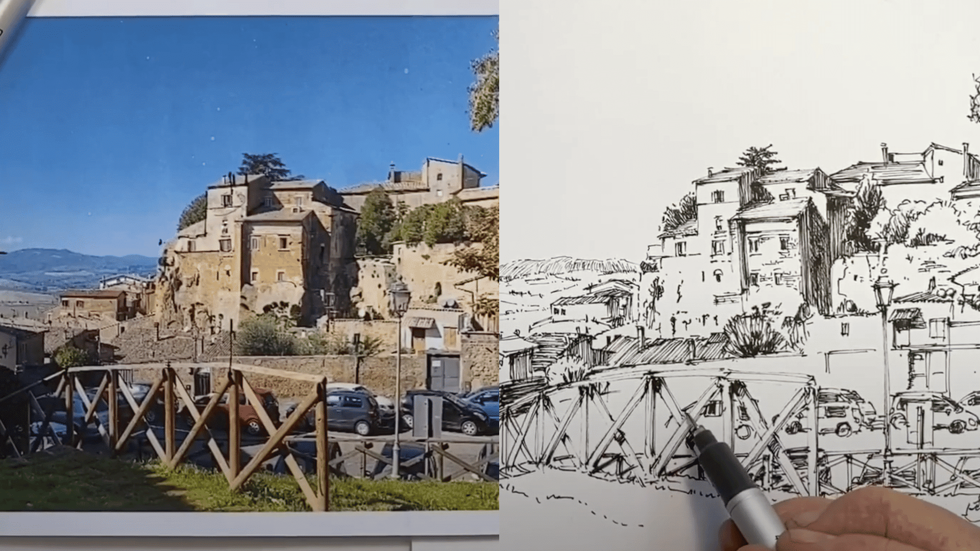
Always draw foreground objects (lampposts, fences, cars) before those behind them. Use a slightly thicker pen or darker lines to make them visually stronger.
This establishes depth and prevents background elements from overwhelming the main focus.
Step 6: Balance Light and Shadow with Hatching
Since ink can’t show color, rely on contrast. Use darker hatching against bright walls or highlights to create depth and dimension.
Aim for strong value contrasts (light beside dark) to emphasize forms and guide the viewer’s eye naturally through the composition.
Step 7: Refine with Patience and Perspective
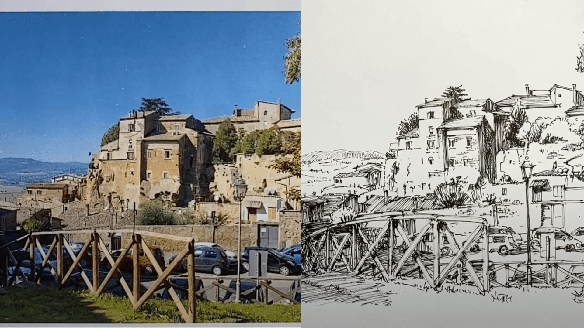
As you progress to denser areas (like overlapping fences, cars, or ground-level details), rely on alignment and spacing.
Ensure that cars, people, and other features appear believable in relation to one another. Adjust the proportions slightly, if needed, to preserve overall harmony. Accuracy builds confidence, but credibility is the goal.
Artists employ specific methods to effectively manipulate scale and proportion, utilizing time-tested techniques that create a visual impact and guide the viewer’s experience.
For more detailed instructions, refer to the YouTube video below:
Psychological and Symbolic Impact of Scale and Proportion in Art
| Aspect | How It Works | Emotional / Symbolic Effect | Example(s) |
|---|---|---|---|
| Emotional Response | Adjusting size creates an immediate emotional impact; large forms feel imposing, while small ones invite closeness. | Large = power, awe, dominance; Small = fragility, vulnerability, intimacy | Monumental statues like Michelangelo’s David vs. delicate miniature paintings |
| Symbolism in Disproportion | Deliberately altering body parts or objects communicates meaning beyond realism. | Can represent humor, tension, spirituality, or inner conflict | Picasso’s cubist portraits, African ritual masks with enlarged features |
| Viewer Perception | Scale shifts challenge how the mind interprets relationships within the work. | Forces viewers to re-think reality, perspective, and meaning | Salvador Dalí’s The Persistence of Memory, with melting clocks, surreal landscapes |
Practical Tips for Artists
Mastering scale and proportion takes practice, but a few simple techniques can make a big difference. No matter if you’re aiming for realism or exploring abstraction, these tips will help you apply scale and proportion effectively in your art.
- Start with Observation: Study real-life objects and figures to understand natural scale and proportion.
- Use Grids and Guidelines: Break down your canvas into sections to keep proportions accurate.
- Experiment with Distortion: Play with exaggerated or abstract proportions to add mood or symbolism.
- Balance Harmony and Tension: Decide whether your composition needs realistic balance or intentional imbalance.
- Think About the Viewer: Large-scale elements can create drama, while small details invite closer engagement.
- Apply the Golden Ratio: Use mathematical systems for ideal, harmonious proportions if desired.
- Practice with Sketches: Do quick studies to test scale relationships before committing to the final piece.
- Use Objects for Comparison: Place familiar items next to subjects to guide scale consistency.
The Bottom Line
Mastering scale and proportion in art transforms the way we see and experience creativity. These principles explain why some works captivate while others feel unbalanced, turning passive viewing into active discovery.
Suddenly, Dalí’s melting clocks, Egyptian rulers drawn larger than their subjects, or Chuck Close’s magnified details reveal purposeful choices.
By practicing observation, whether in a gallery, museum, or even online, you begin to notice how scale directs focus and proportion shapes emotion.
This awareness deepens personal appreciation and adds richness to every encounter with art. Most importantly, sharing what you’ve learned not only reinforces your own understanding but also spreads a greater appreciation for the craftsmanship and intention behind every masterpiece.