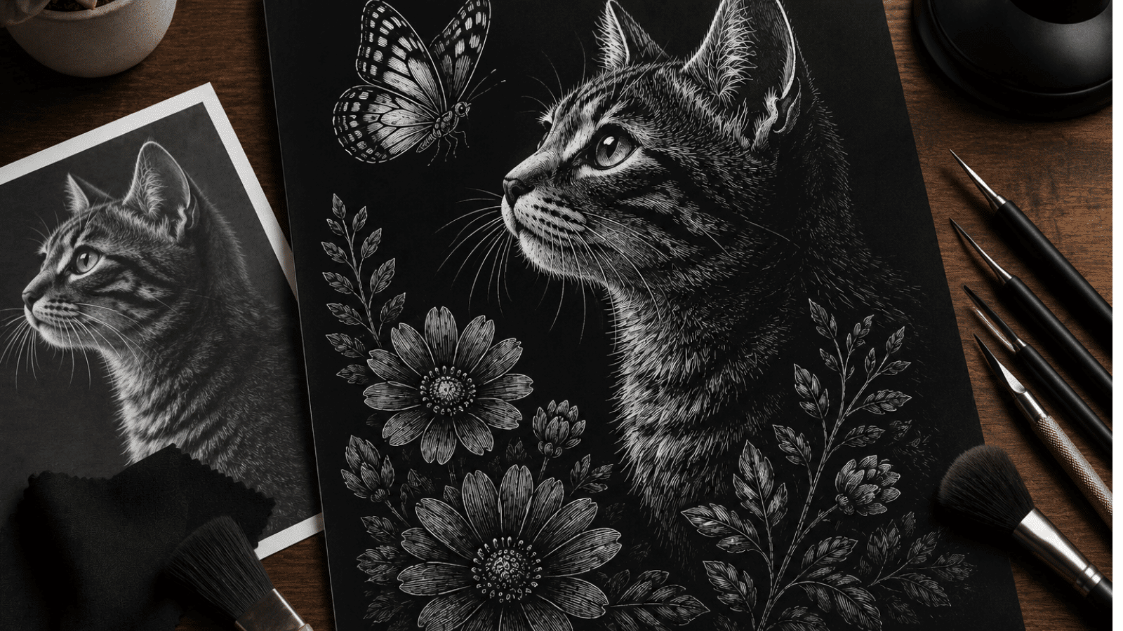
Many artists create work that looks good. But only some create art that truly stands out. The difference isn’t talent alone. It’s knowing the fundamental rules that make art powerful.
This blog will show you the 7 principles of art that turn ordinary artwork into something special.
These aren’t complex theories. They’re practical guidelines that every great artist uses.
You’ll learn about balance, contrast, emphasis, and four other key principles. Each one comes with clear examples and simple ways to use them. By the end, you’ll understand why some art grabs attention while other pieces get ignored.
You’ll also know how to apply these principles to make your own work more compelling.
What are the Principles of Art?
The 7 principles of art are basic rules that guide how artists create their work. Think of them as a recipe for making good art. Just like cooking needs ingredients and methods, art needs these principles to work well.
These principles help artists organize visual elements in their artwork. They show how to arrange colors, shapes, and lines so they look pleasing to the eye. Artists use them to create mood, tell stories, and grab attention.
There are seven main principles that most art teachers agree on. Each one serves a specific purpose. Some create visual interest. Others help guide the viewer’s eye around the artwork. When artists understand these principles, they can make stronger, more effective pieces.
These aren’t strict rules that can’t be broken. They’re tools that help artists communicate better with their audience
Why are the Principles of Art Important?
The 7 principles of art matter because they serve as the bridge between having an idea and creating something people actually want to look at.
Many artists skip learning these basics. Then they wonder why their work doesn’t connect with viewers. These principles solve that problem.
Here’s why they’re essential:
- They create visual appeal – Art without principles often looks messy or confusing
- They guide the viewer’s eye – Good art leads people exactly where you want them to look
- They help communicate emotions – Each principle can create different feelings in viewers
- They make art memorable – Pieces that follow these rules stick in people’s minds longer
- They work across all art forms – From painting to digital design, these principles apply everywhere
Artists who master these principles can break them effectively when needed. But you need to know the rules before you can bend them. That’s what separates amateur work from professional art that truly impacts people.
Inside the Principles: How Each One Modifies Your Art
Now let’s break down each principle one by one. You’ll see how balance creates stability, why contrast makes art pop, and how emphasis grabs attention instantly.
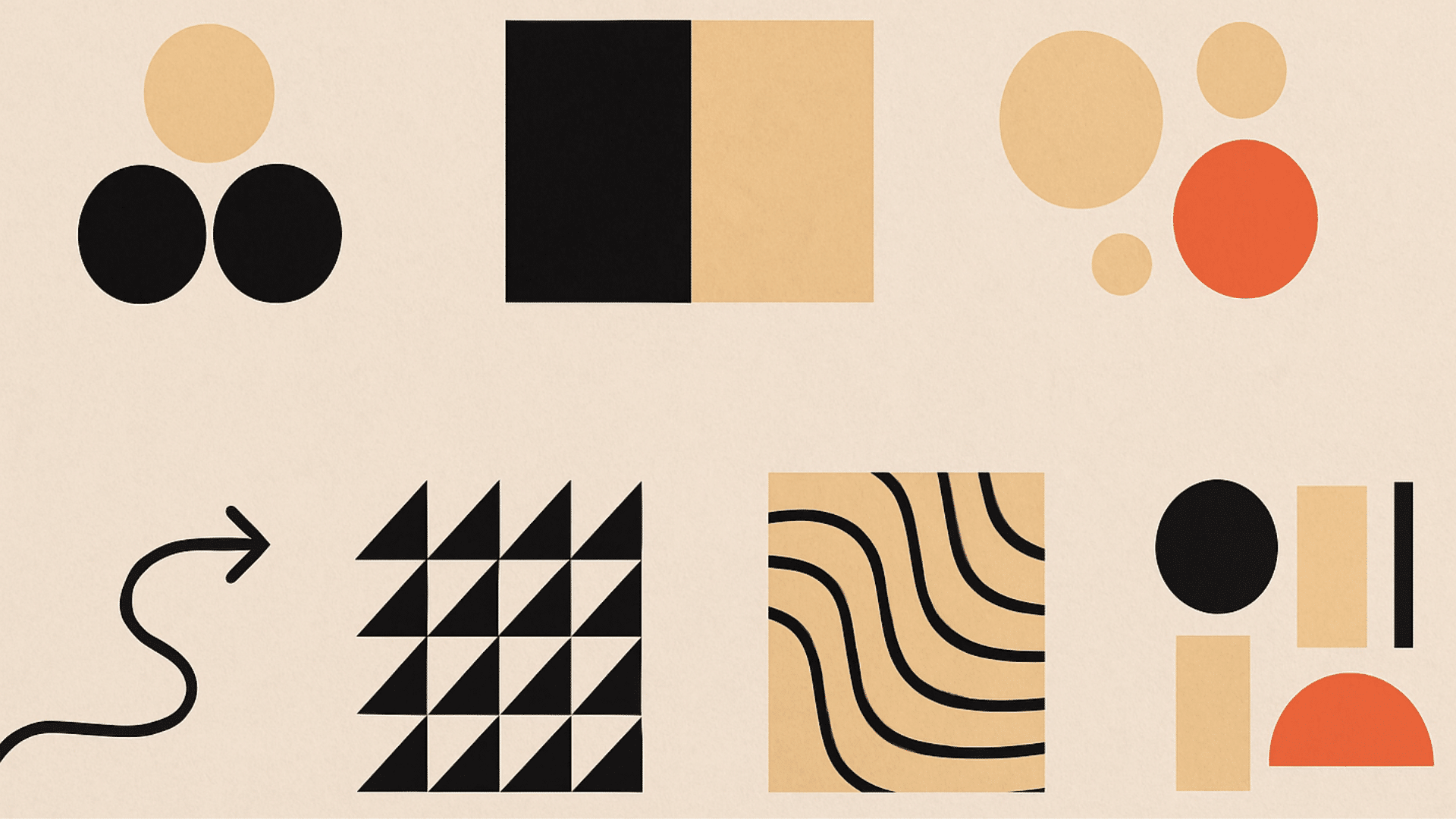
Balance
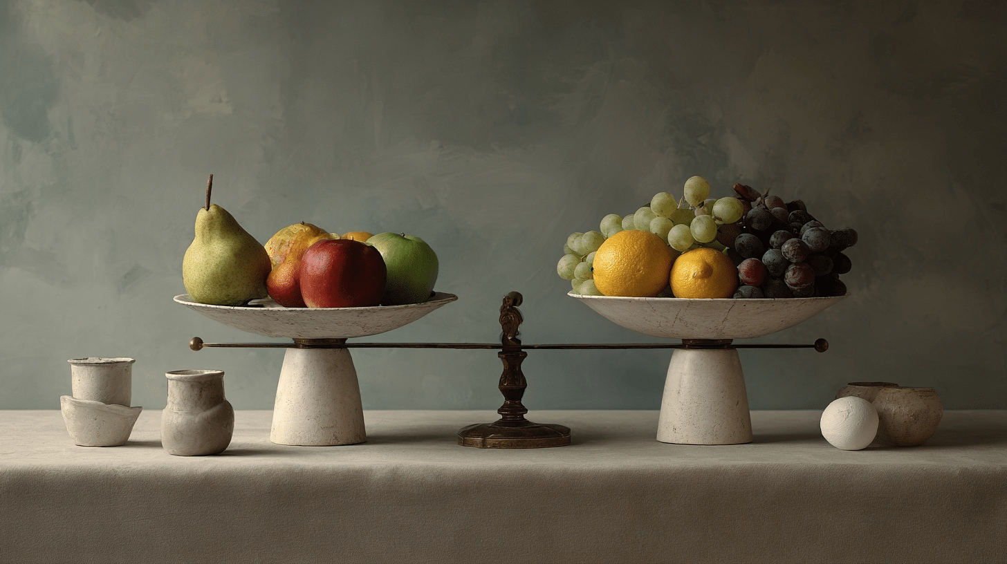
Balance in art means distributing visual weight evenly across a composition. It creates stability and harmony that feels comfortable to viewers.
When elements are balanced, nothing feels like it’s about to tip over or fall out of place.
- Types or Approaches: Symmetrical, asymmetrical, and radial balance approaches
- Purpose: Creates visual stability and guides the viewer’s experience through calm or energetic feelings
- Examples in Art: “The Last Supper” (symmetrical), “The Great Wave” (asymmetrical), mandalas (radial)
Contrast
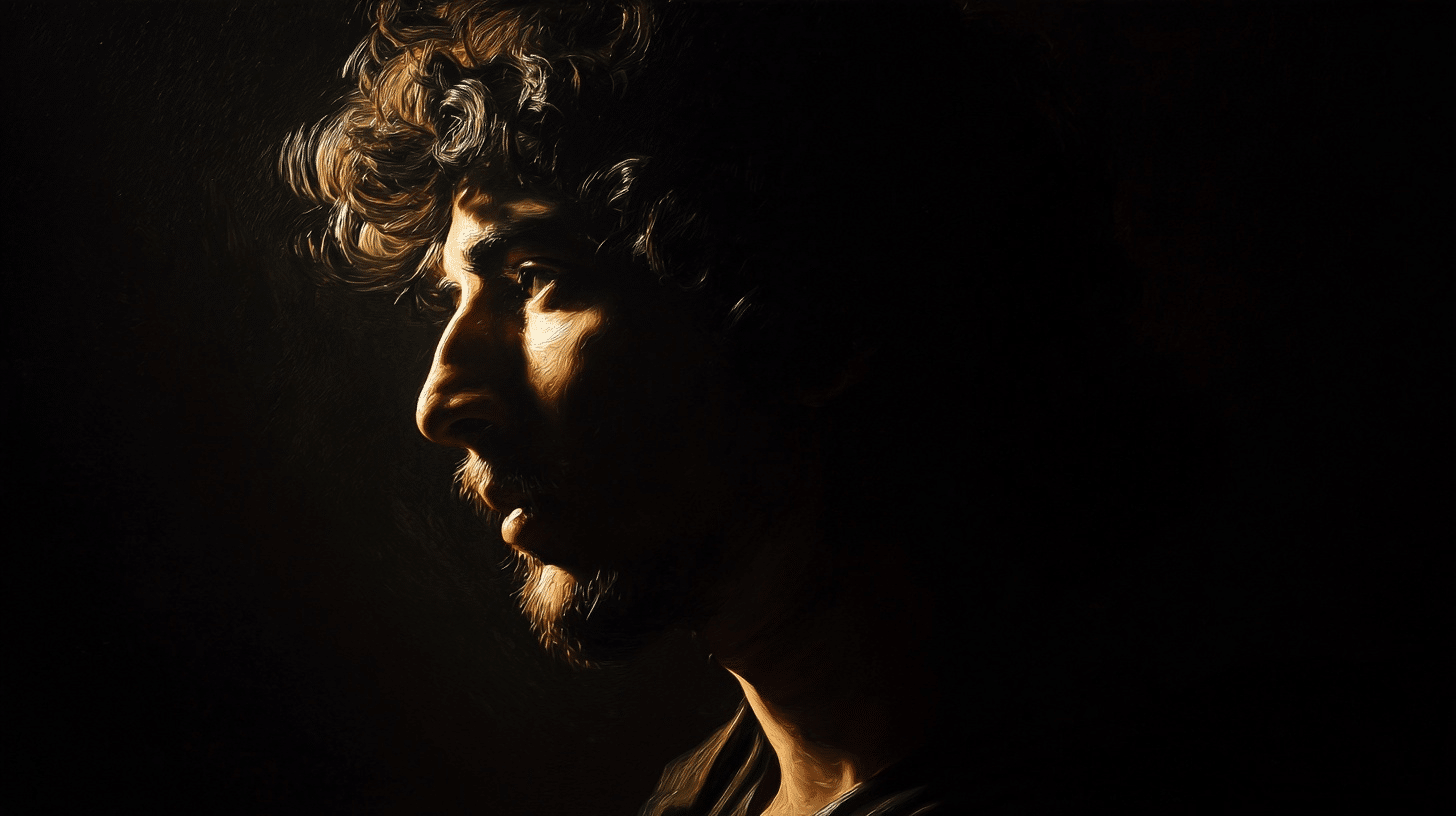
Contrast refers to the differences between elements in an artwork. It’s what makes some parts stand out while others recede. Strong contrast creates visual interest and prevents art from looking flat or boring.
- Types or Approaches: Value, color, size, and texture contrast methods
- Purpose: Creates focal points, adds drama, and directs attention to important areas
- Examples in Art: Caravaggio’s light-dark drama, Van Gogh’s color contrasts, Ansel Adams’ value contrasts
Emphasis
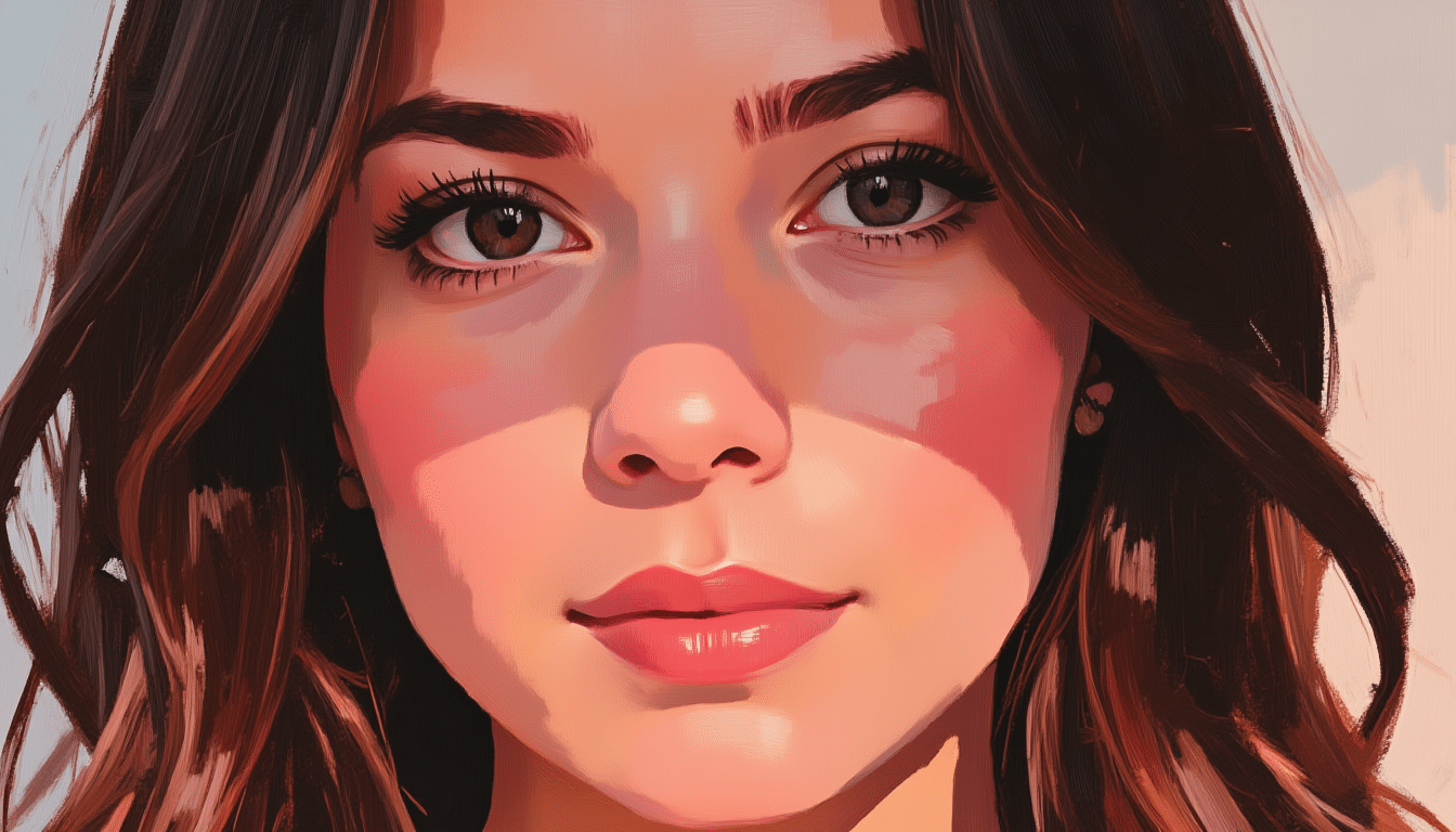
Emphasis is the principle that makes certain elements the main focus of an artwork. It’s what your eye notices first and remembers most.
Every strong piece of art needs a clear emphasis to guide viewers.
- Types or Approaches: Contrast, isolation, placement, and size emphasis techniques
- Purpose: Prevents confusion by showing what’s most important and creates a clear visual hierarchy
- Examples in Art: Mona Lisa’s emphasized face, “American Gothic’s” central couple positioning
Movement
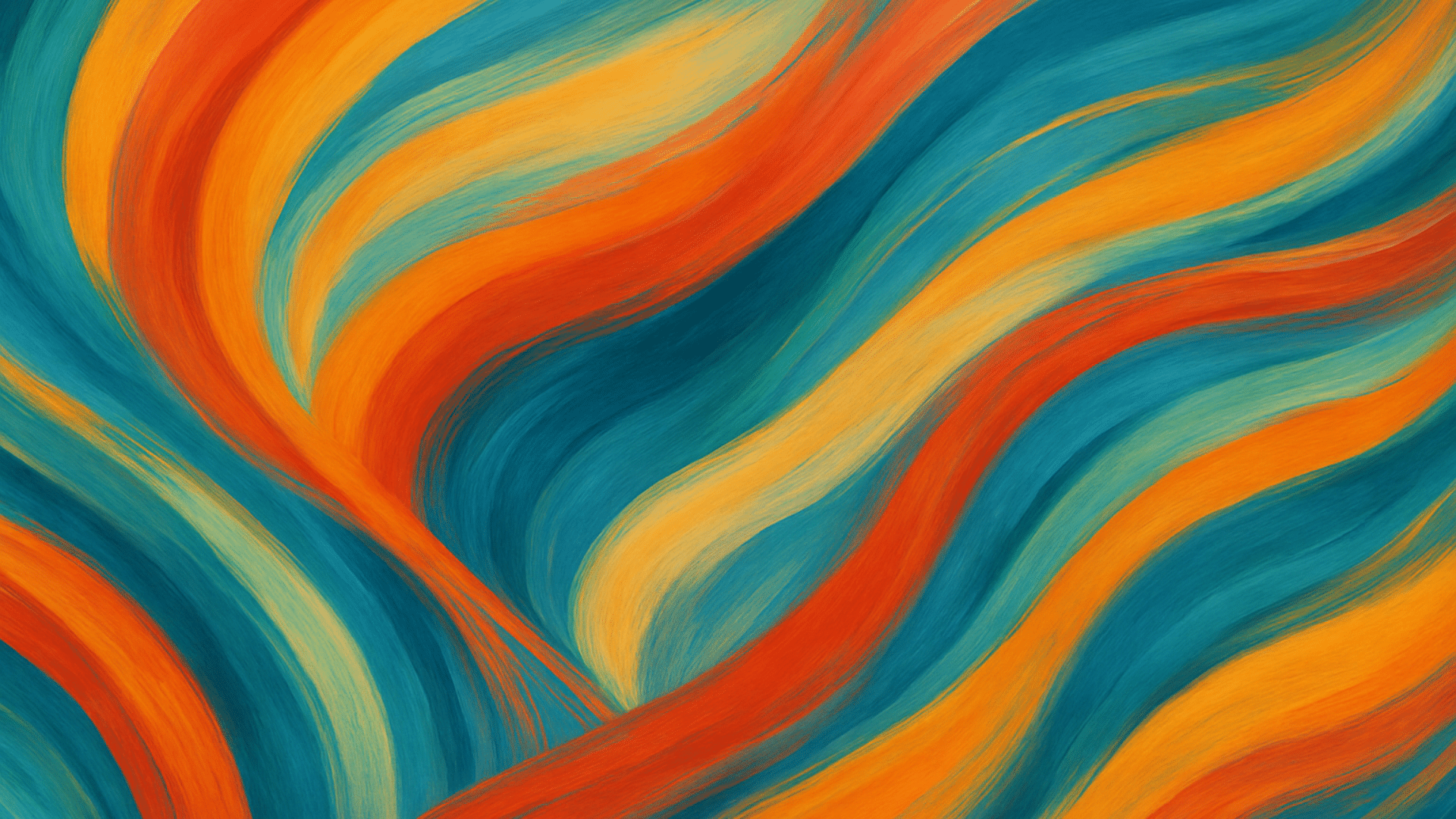
Movement guides the viewer’s eye through an artwork along a planned path. It doesn’t mean things actually move, but rather how your vision flows from one area to another. Good movement keeps viewers engaged longer.
- Types or Approaches: Directional, rhythm, and implied movement techniques
- Purpose: Controls artwork experience over time, creates energy, and ensures proper viewing sequence
- Examples in Art: “Great Wave’s” directional flow, Mondrian’s rhythmic grids, Pollock’s dynamic movement
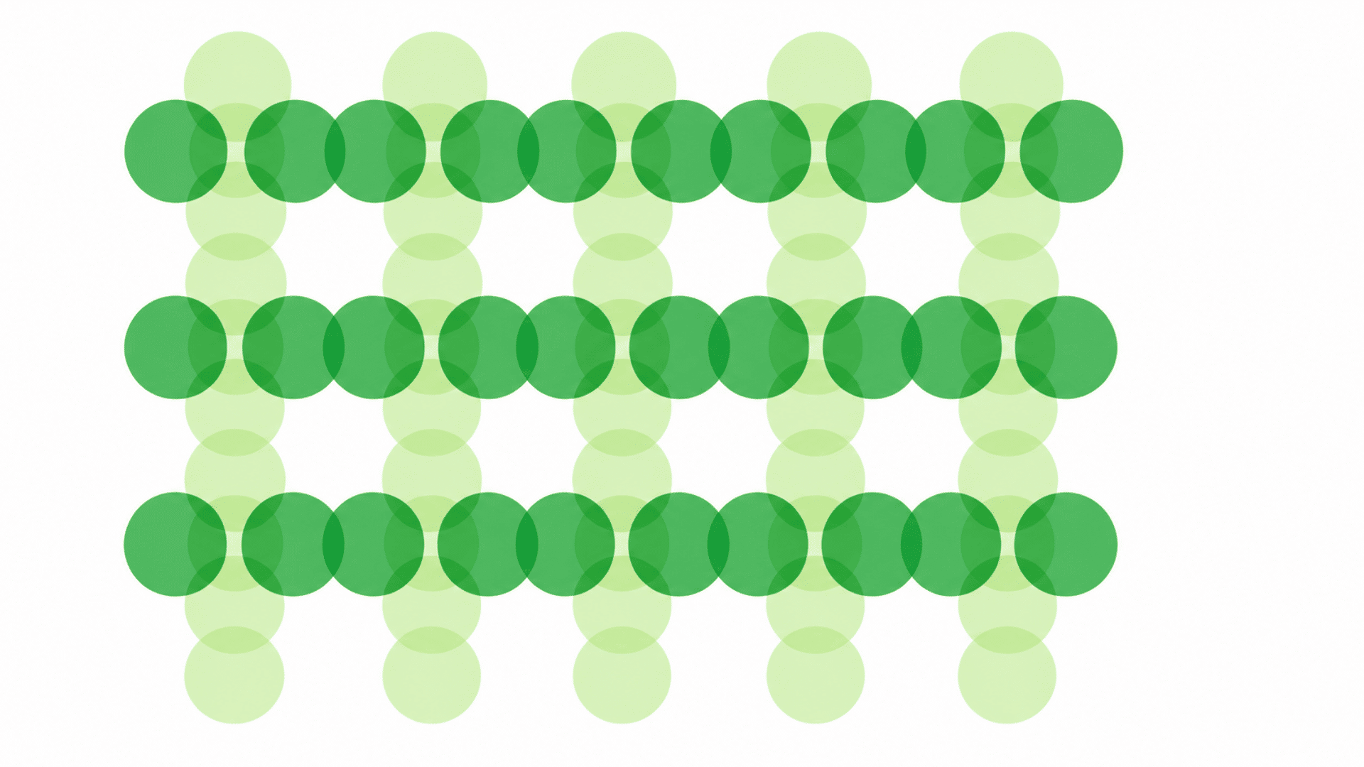
Pattern
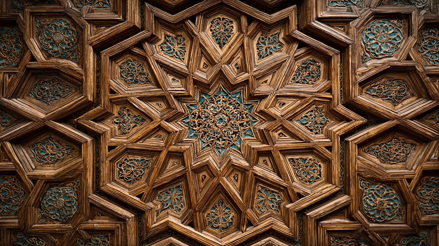
Pattern is the repetition of visual elements throughout an artwork. It creates rhythm, unity, and visual interest through organized repetition.
Patterns can be simple or complex, regular or varied.
- Types or Approaches: Regular, irregular, random, and progressive pattern variations
- Purpose: Creates visual unity, rhythm, texture, and decorative appeal in compositions
- Examples in Art: Islamic geometric patterns, Aboriginal dot paintings, William Morris wallpaper designs
Proportion
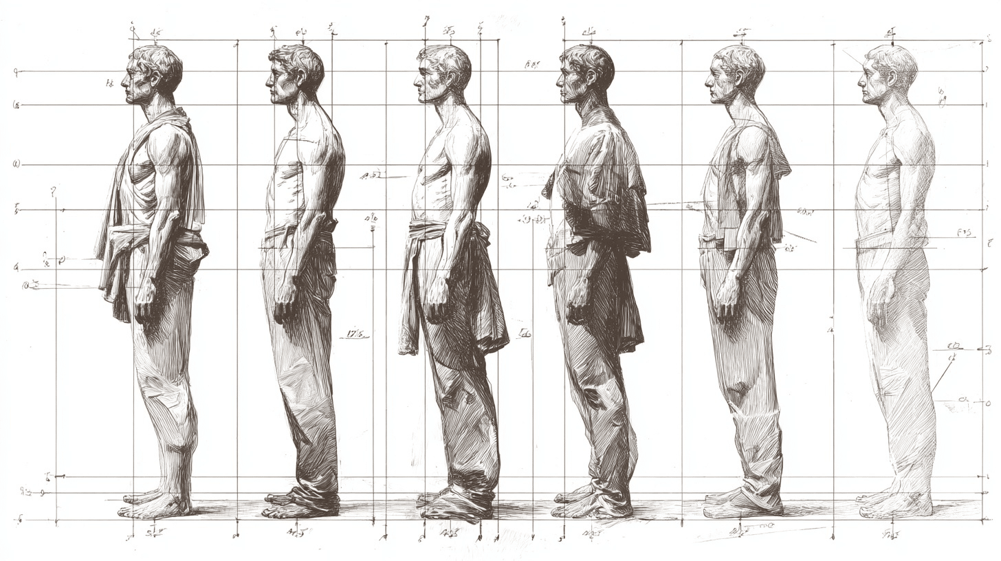
Proportion deals with the size relationships between different parts of an artwork. It determines how elements relate to each other and to the whole composition. Good proportion creates harmony and believability.
- Types or Approaches: Classical, hierarchical, and distorted proportion methods
- Purpose: Creates visual harmony and conveys meaning through size relationships and mood
- Examples in Art: Greek sculptures (classical), Medieval art (hierarchical), Picasso portraits (distorted)
Unity
Unity makes all elements in an artwork feel like they belong together as a cohesive whole.
It’s what prevents art from looking like random pieces thrown together. Unity creates visual harmony across the entire composition.
- Types or Approaches: Color, shape, style, and thematic unity approaches
- Purpose: Creates visual coherence that helps viewers understand the artwork as a complete statement
- Examples in Art: Monet’s water lilies (color/thematic), Cubist paintings (style), Japanese woodblocks (compositional)
How Elements & Principles Interact
Art elements and principles don’t work alone. They team up to create powerful visual experiences. Elements are the basic building blocks, like color, line, and shape. Principles are the rules that organize these elements into meaningful art.
Think of it like cooking. Elements are your ingredients – flour, eggs, sugar. Principles are your techniques – mixing, baking, timing. You need both to make something delicious. The same goes for creating great art.
Key interactions that make art work:
- Balance uses color and shape: Artists balance warm colors with cool ones, or large shapes with small ones
- Contrast combines multiple elements: Light values against dark values, rough textures next to smooth surfaces
- Movement flows through lines and forms: Curved lines create gentle movement, angular shapes make sharp directional changes
- Pattern repeats any element: Colors, shapes, textures, or lines can all become patterns
- Emphasis relies on contrast: The brightest color, largest shape, or most detailed area becomes the focal point
- Unity connects through similarity: Similar colors, repeated shapes, or consistent line quality tie everything together
- Proportion compares sizes and spaces: How big shapes are compared to each other and the overall artwork
When elements and principles work together well, viewers understand the art immediately. When they fight each other, the artwork feels confusing or unfinished.
Master artists know how to make these partnerships create exactly the effect they want.
Modern Interpretations of the Principles of Art
| Art Form | Balance | Contrast | Emphasis | Movement | Pattern | Proportion | Unity |
|---|---|---|---|---|---|---|---|
| Digital Art | Screen layouts and UI balance | Glowing pixels vs dark backgrounds | Bright elements on digital canvas | Actual animation and transitions | Repeated digital brushes | Screen size relationships | Consistent digital style |
| Interactive Media | Stable interface layouts | Dark mode vs light themes | Important buttons highlighted | User navigation paths | Repeated UI elements | Content fits screen sizes | Consistent brand experience |
| Social Media Art | Centered compositions for phones | High contrast for small screens | Grab attention in seconds | Stories and reels flow | Branded visual elements | Thumbnail to full-size ratios | Recognizable personal style |
| Environmental Art | Elements across landscapes | Natural vs artificial materials | Focal points in vast spaces | Paths through outdoor installations | Repeated forms across terrain | Human scale vs nature | Connects scattered art pieces |
| Virtual Reality | 3D space navigation | Real world vs virtual elements | Immersive focal experiences | Literal walking through art | 3D repeated objects | User size in the virtual world | Seamless virtual environment |
The Bottom Line
These 7 principles of art are your roadmap to creating work that truly connects with people. You now understand how balance creates stability, contrast adds drama, and emphasis guides attention.
Movement, pattern, proportion, and unity work together to make your art feel complete and purposeful.
The best part? You don’t need to master all seven at once. Pick one principle and focus on it in your next piece. Notice how it changes the way people respond to your work. Then gradually add more principles as you grow.
Remember, even master artists started with these same basics. The principles haven’t changed, but your interpretation of them will be uniquely yours.
Ready to put these principles into practice? Start your next artwork today and see how these evergreen rules can change your creative expression into something truly memorable.